HOW TO USE PACKAGING AS YOUR SILENT … · themes of recent years has been towards personalisation:...
98
HOW TO USE PACKAGING AS YOUR SILENT SALESMAN
Transcript of HOW TO USE PACKAGING AS YOUR SILENT … · themes of recent years has been towards personalisation:...

HOW TO USE PACKAGING
AS YOUR SILENT SALESMAN

Contents
Principles for pack design
Writing a design brief
Key themes for 2016
Slide
3 Slide
17 Slide
89 Slide
Appendix 101 Slide

Name the brand…
Coca Cola Marmite Heinz Ketchup
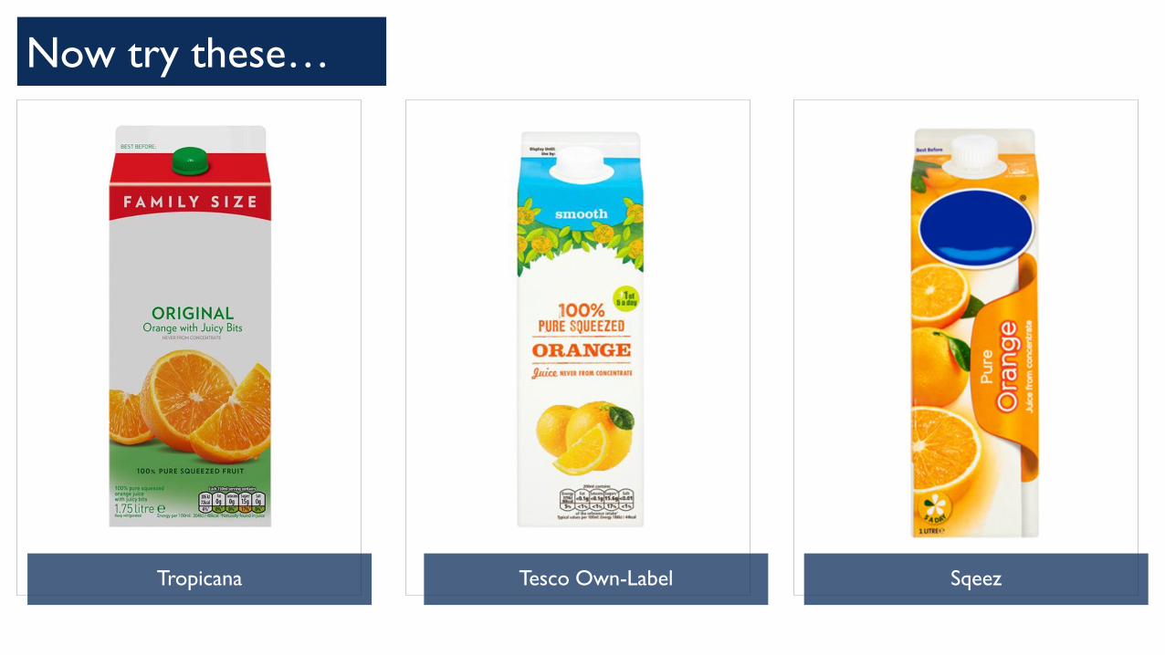
Now try these…
Tropicana Tesco Own-Label Sqeez

innocent co-founder Richard
Reed says “it is crazy how
significant packaging is”
When innocent launched their
juice range in a classic tetrapak it
tanked and was de-listed, three
years later having re-launched
with a ‘carafe’ they turned over
£40m and captured the
public’s attention.
"The only thing we did
differently was put it in a
plastic bottle – we called it a
carafe to make it sound posh
– the little details matter,"
says Reed.
Why packaging is so important: innocent’s £40m packaging win

What is the importance of packaging?
What role does packaging currently play for your business?
Does it add value –
For customers, for retailers, for your overall brand?

Andrew Knowles JKR Global
pack design is potentially a game
changer, take control of it

In today’s over-proliferated market
place where consumers have more
choice than ever before packaging is
no longer simply about containing a
product, it must be so much more.
Changing lives: from functional to value added packaging
Packaging is an opportunity for
brands to communicate their values,
to grab the consumer’s attention
and to influence how the product is
purchased, consumed and stored.
Effective packaging can add value in
a multitude of ways – from stand
out design to innovative structural
changes like the innocent carafe.

James Pryor Touch Pack Design
there’s a huge risk in being left behind… and its difficult to
claw your way back
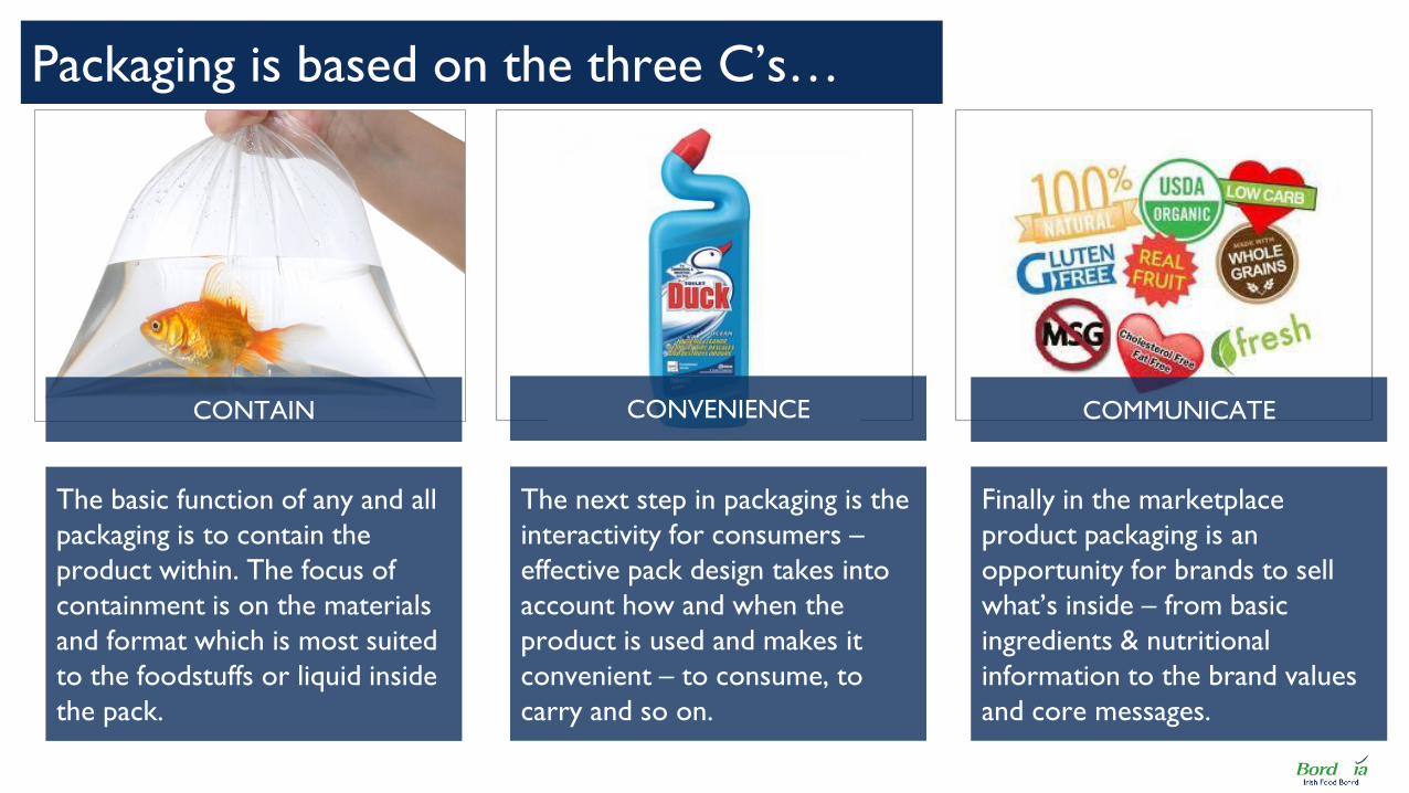
The basic function of any and all
packaging is to contain the
product within. The focus of
containment is on the materials
and format which is most suited
to the foodstuffs or liquid inside
the pack.
Packaging is based on the three C’s…
CONTAIN CONVENIENCE
Finally in the marketplace
product packaging is an
opportunity for brands to sell
what’s inside – from basic
ingredients & nutritional
information to the brand values
and core messages.
The next step in packaging is the
interactivity for consumers –
effective pack design takes into
account how and when the
product is used and makes it
convenient – to consume, to
carry and so on.
COMMUNICATE

Beyond the three C’s effective packaging and pack design can
act as a “silent salesman” for your brand – engaging the
consumer, differentiating you from competitors and
ultimately driving sales.
But truly effective packaging goes further

Katie Klenchewski SMAKK Studios
effective design is about cutting
through the noise on the shelf

Beyond the three C’s: what are the objectives for your packaging?
To differentiate your brand from competitors & similar products
To stand out on shelf & catch the eye of would-be customers
To communicate your brand values / identity and engage customers
To draw attention to the product within: the quality and character
Silent Salesman: using packaging to build your brand & engage the consumer
To demonstrate to retailers that your product adds value for them
To encourage re-purchase by making consumer’s lives more convenient
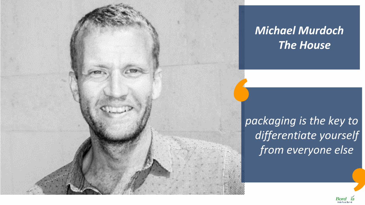
Michael Murdoch The House
packaging is the key to differentiate yourself from everyone else

Finding a packaging sweet spot is a balance of multiple considerations
“Does the packaging help
consumers clearly identify my brand
and motivate them to purchase?” “Does my packaging differentiate
us from other competitors with
similar products?”
“Is my packaging easy to transport,
easy to handle and cost efficient to
stock and display on shelf?”
“Is my packaging affordable &
convenient for consumers?”

Chris Mettrick Ziggurat Brands
retailers buy into your product and pack
design; they determine where
you’re going to sit on shelf

KEY PACKAGING & PACK DESIGN THEMES

We’ve done some research into the latest packaging themes…
PACKAGING INDUSTRY TRADE PRESS SPEAKING TO LEADING PACK DESIGN EXPERTS
MARKET PLACE IMMERSION & OBSERVATION CONSOLIDATING PAST EXPERIENCE

Personalisation
Authenticity & Storytelling
New Health
Less Is More
Experiential Packaging
Sustainability
On-the-go Lifestyles
We identified seven key themes influencing pack design:

Many of these matched up to Bord Bia’s lifestyle trends:
On-The-Go
Lifestyles
Authenticity &
Storytelling
Personalisation Sustainability
New Health
Experiential
Packaging
Less Is
More
Two additional
themes

For each trend we have put together:
Inspirational
Case Studies
Theme Overview • A short description
• How this adds value for consumers
• A practical thought starter
Inspiring Parallel
Category Example

PERSONALISATION
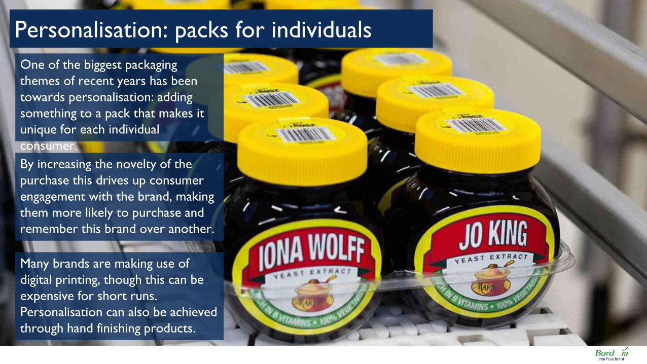
One of the biggest packaging
themes of recent years has been
towards personalisation: adding
something to a pack that makes it
unique for each individual
consumer.
Personalisation: packs for individuals
By increasing the novelty of the
purchase this drives up consumer
engagement with the brand, making
them more likely to purchase and
remember this brand over another.
Many brands are making use of
digital printing, though this can be
expensive for short runs.
Personalisation can also be achieved
through hand finishing products.
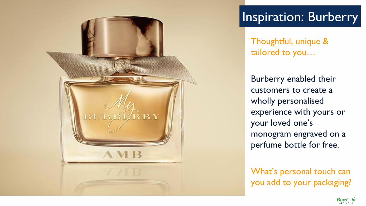
Thoughtful, unique &
tailored to you…
Burberry enabled their
customers to create a
wholly personalised
experience with yours or
your loved one’s
monogram engraved on a
perfume bottle for free.
What’s personal touch can
you add to your packaging?
Inspiration: Burberry

Absolut Vodka created 4
million bottles uniquely
spray painted during
production. This creates
value for the consumer by
enabling them to purchase
a limited edition product
that nobody else has.
Key Learning:
Is there an interesting twist
you can add to the
packaging process that will
result in unique or limited
edition products?
Absolut Unique Bottles
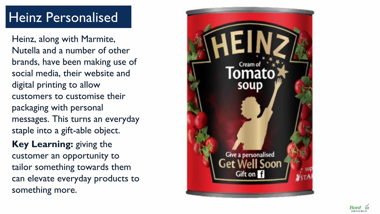
Heinz, along with Marmite,
Nutella and a number of other
brands, have been making use of
social media, their website and
digital printing to allow
customers to customise their
packaging with personal
messages. This turns an everyday
staple into a gift-able object.
Key Learning: giving the
customer an opportunity to
tailor something towards them
can elevate everyday products to
something more.
Heinz Personalised

Moet released bottles of their
iconic champagne in a gift pack
with markable labels, a
notepad and pen to write a
personalised message on the
bottle. Much like the Heinz
soup personalisation this
makes the product gift-able
and stands out in the category.
Key Learning: Can you
provide the means so your
consumers can personalise
your product?
Moet Messages
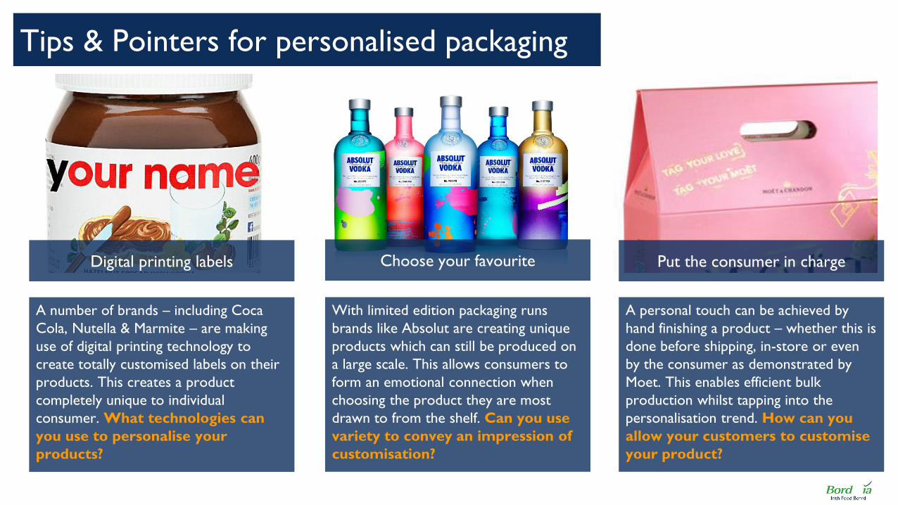
A number of brands – including Coca
Cola, Nutella & Marmite – are making
use of digital printing technology to
create totally customised labels on their
products. This creates a product
completely unique to individual
consumer. What technologies can
you use to personalise your
products?
Tips & Pointers for personalised packaging
Digital printing labels Choose your favourite Put the consumer in charge
A personal touch can be achieved by
hand finishing a product – whether this is
done before shipping, in-store or even
by the consumer as demonstrated by
Moet. This enables efficient bulk
production whilst tapping into the
personalisation trend. How can you
allow your customers to customise
your product?
With limited edition packaging runs
brands like Absolut are creating unique
products which can still be produced on
a large scale. This allows consumers to
form an emotional connection when
choosing the product they are most
drawn to from the shelf. Can you use
variety to convey an impression of
customisation?

AUTHENTICITY & STORYTELLING

With consumers ever more
informed about the products they
purchase, there is an increasing
demand for authenticity: products
with a strong story attached.
Authenticity & Storytelling
The most effective brands make use
their packaging to tell stories about
where the product is from, and the
brand’s history & heritage which
can be a strong differentiator.
Brands can use pack design
effectively to communicate
authenticity through allegoric
images, tight copy and even
effective use of typography.
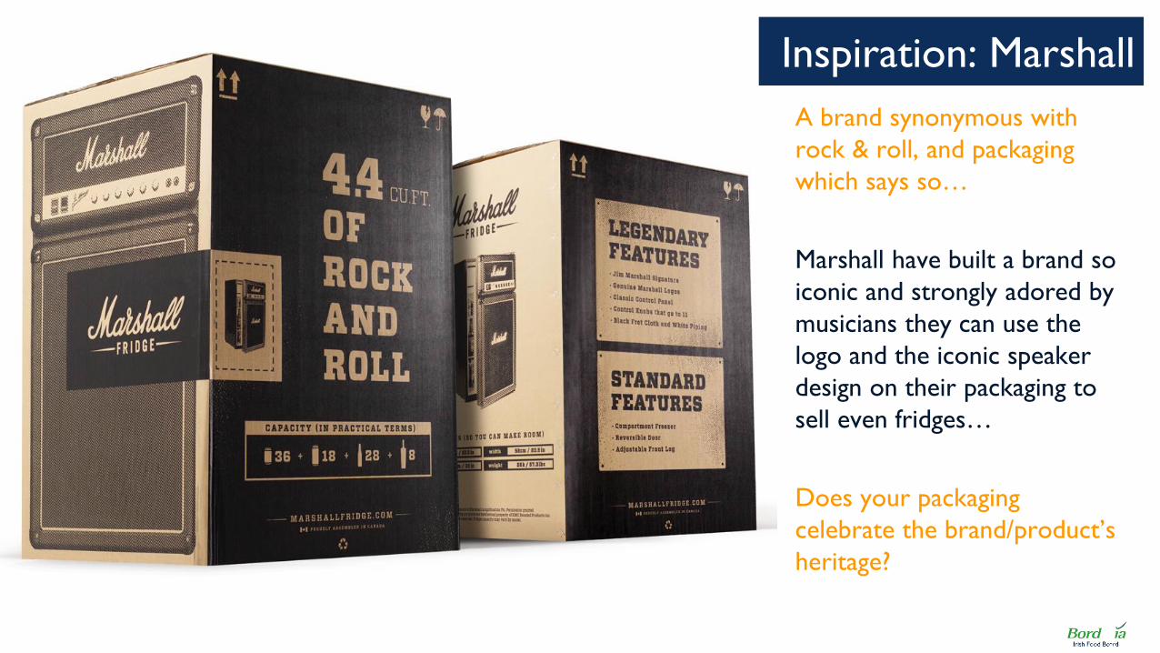
A brand synonymous with
rock & roll, and packaging
which says so…
Marshall have built a brand so
iconic and strongly adored by
musicians they can use the
logo and the iconic speaker
design on their packaging to
sell even fridges…
Does your packaging
celebrate the brand/product’s
heritage?
Inspiration: Marshall
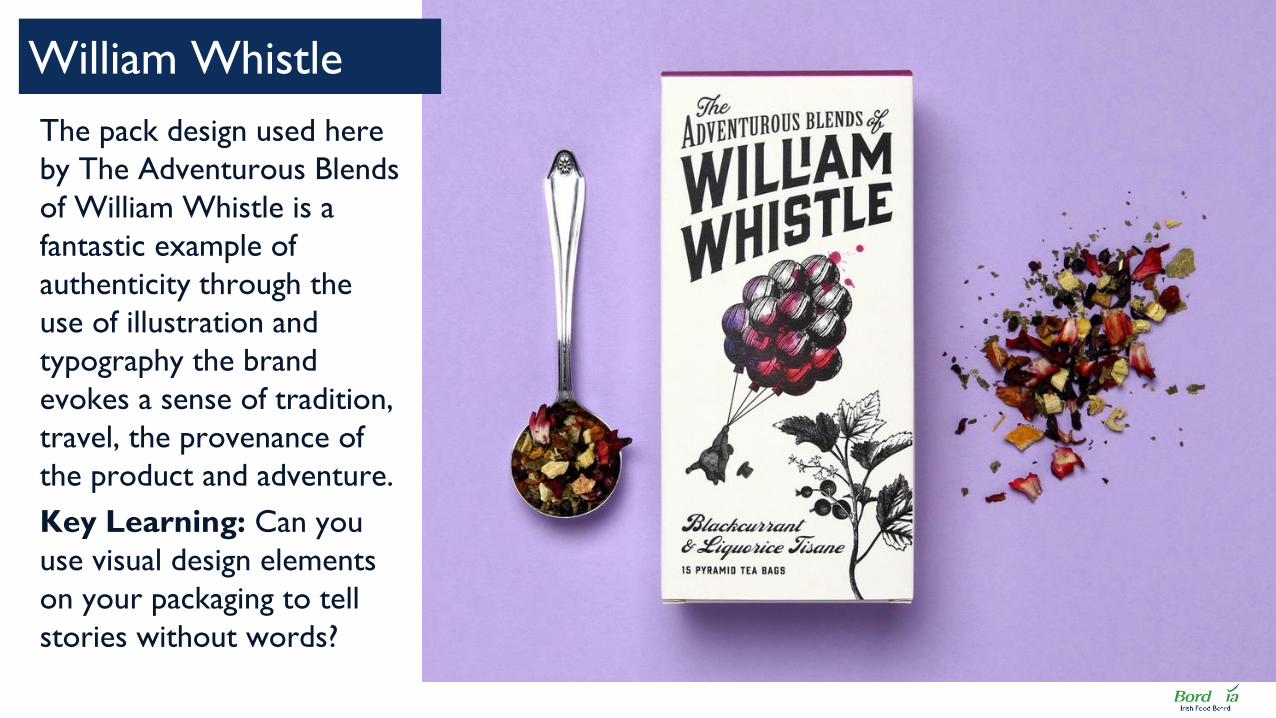
The pack design used here
by The Adventurous Blends
of William Whistle is a
fantastic example of
authenticity through the
use of illustration and
typography the brand
evokes a sense of tradition,
travel, the provenance of
the product and adventure.
Key Learning: Can you
use visual design elements
on your packaging to tell
stories without words?
William Whistle

Jameson released this
limited edition St Patrick’s
Day bottle, celebrating
Dublin and the brand’s Irish
heritage. By creating this
short run seasonally themed
packaging Jameson are
telling consumers about the
authenticity and provenance
of their product.
Key Learning: Can you
link your packaging to an
event that has strong ties to
your brand.
Jameson Ltd Edition
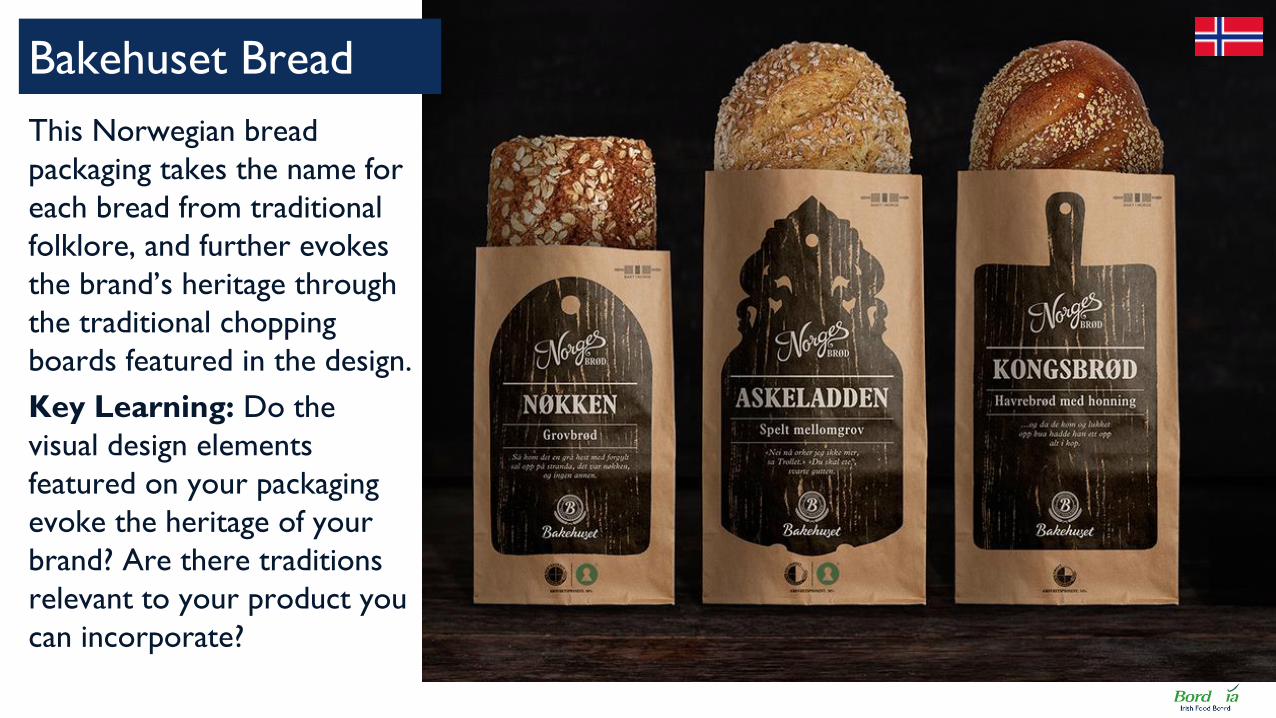
This Norwegian bread
packaging takes the name for
each bread from traditional
folklore, and further evokes
the brand’s heritage through
the traditional chopping
boards featured in the design.
Key Learning: Do the
visual design elements
featured on your packaging
evoke the heritage of your
brand? Are there traditions
relevant to your product you
can incorporate?
Bakehuset Bread

Kallo is a Dutch organic
foods brand. Once again
using visual storytelling in
the form of simple print
pictures and minimal text
the brand evokes the
European heritage of the
brand as well as the
healthier, organic aspect of
their products.
Key Learning: Does the
overall look & feel of your
packaging evoke a sense of
where it is produced?
Kallo Rice Cakes

Typographic elements – the fonts used
on packs, the layout and emphasis of text
– can communicate more than the
words themselves. William Whistle uses
this Victorian style font with an
‘adventurous’ twist.
How can you use traditional and/or
a variety of typefaces to convey
authenticity?
Tips & Pointers for authenticity & storytelling
Effective use of typography Storytelling with images Authenticity aesthetics
Using colours, textures and packaging
materials which have strong links to the
heritage of your brand or product can be
a strong tool for communicating
authenticity – such as the recycled paper
and wooden chopping boards pictured
here.
What ‘natural’ materials can you
use which suggest authenticity?
Similarly on-pack images are not simply
filling space, but can be used more
effectively to highlight key aspects of the
product – such as where it is from, what
kind of brand it is, who it is for and so
on.
Can you use illustration to tell your
story?

NEW HEALTH

With health and wellbeing
becoming more of a relevant
opportunity for consumers brands
are using a new range of visual pack
cues to communicate “healthiness”.
A new look & feel for healthy products
Traditionally health-oriented brands
traditionally take cues from medical
products with clinical, often white
labels, New health puts healthiness
in a wider context.
New colours, materials and imagery
as well as putting ingredients at the
centre of the pack messaging is
creating a new type of packaging for
healthy products.

Brands that belong to the
new, healthier you…
Yoga headbands &
accessories brand KooShoo
have thrown out clichés of
women stretching for a
simpler, more “mindful”
approach to their packaging.
Can your packaging break
free of established category
rules and do something new?
Inspiration: KooShoo
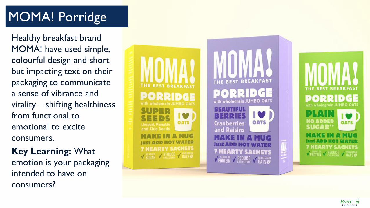
Healthy breakfast brand
MOMA! have used simple,
colourful design and short
but impacting text on their
packaging to communicate
a sense of vibrance and
vitality – shifting healthiness
from functional to
emotional to excite
consumers.
Key Learning: What
emotion is your packaging
intended to have on
consumers?
MOMA! Porridge
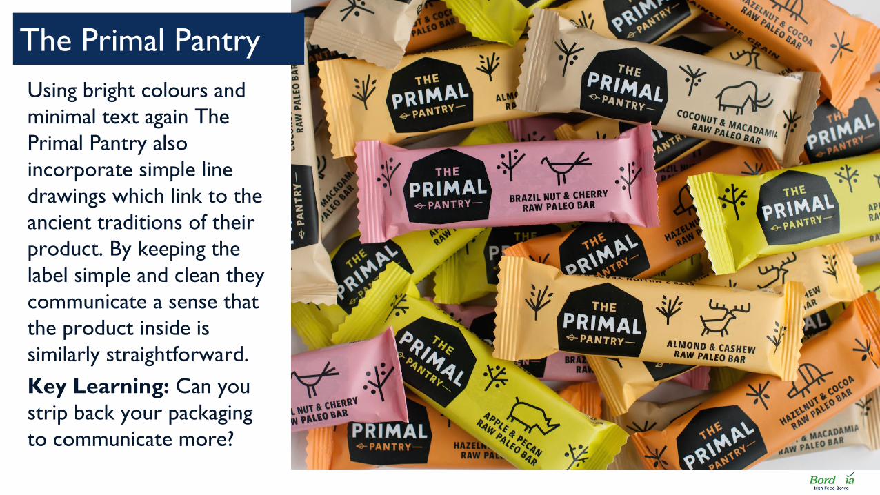
Using bright colours and
minimal text again The
Primal Pantry also
incorporate simple line
drawings which link to the
ancient traditions of their
product. By keeping the
label simple and clean they
communicate a sense that
the product inside is
similarly straightforward.
Key Learning: Can you
strip back your packaging
to communicate more?
The Primal Pantry

Consistent with the
“stripped back” simple
designs that are shaping a
number of new health and
wellbeing products, The
Food Doctor brand have
used a simple print design
on a card sleeve wrapped
around their packs.
Key Learning: Additional
sleeves and packaging can
give your product a clean
finish and inform consumers
about the product.
The Food Doctor
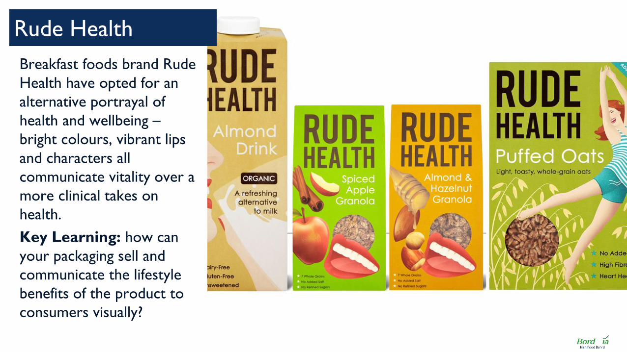
Breakfast foods brand Rude
Health have opted for an
alternative portrayal of
health and wellbeing –
bright colours, vibrant lips
and characters all
communicate vitality over a
more clinical takes on
health.
Key Learning: how can
your packaging sell and
communicate the lifestyle
benefits of the product to
consumers visually?
Rude Health

There is often a strong overlap between
consumers drawn to health and
wellbeing products and environmentally-
friendly brands. Recycled / sustainable
packaging can be a great way of tapping
into the values of these consumers.
Look for recycled/sustainable
packaging options.
Tips & Pointers for ‘new health’ packaging
Sustainable Packaging Don’t be afraid of colour! Focus on Key Ingredient(s)
Emphasising the key ingredient through
on-pack messaging (images, copy or even
transparent windows) can be used to
communicate quality and champion the
inherent goodness of the product within.
Identify your key healthy ingredient
and focus on it.
From modern pastel shades to brighter
upbeat tones new health brands are not
afraid to use colour to inspire and
engage consumers. By using brighter
colours selectively (ie not too many or
too garish) you can excite and engage
consumers.
Develop your palette of colours and
one key contrast / stand out colour.

LESS IS MORE

Effective pack design – including
beautiful visual elements and well
thought out copy – is often
undermined by trying to squeeze
too much into too little space.
Less is more: let design do the talking
There is often a chance to engage
consumers by embracing more
minimalist pack design and allowing
the product to ‘sell itself’ instead of
confusing over-communication.
Brands can put this principle into
action by selecting a few key
elements of their on-pack
communication and choosing to
emphasise these more effectively.

Think different: the brand
that harnessed design to
transform its industry…
Apple products are
renowned for their design
aesthetics and clean,
minimalist look. This carries
across from product design
to the packaging that
carries it.
Can your packaging speak
louder by saying less?
Inspiration: Apple
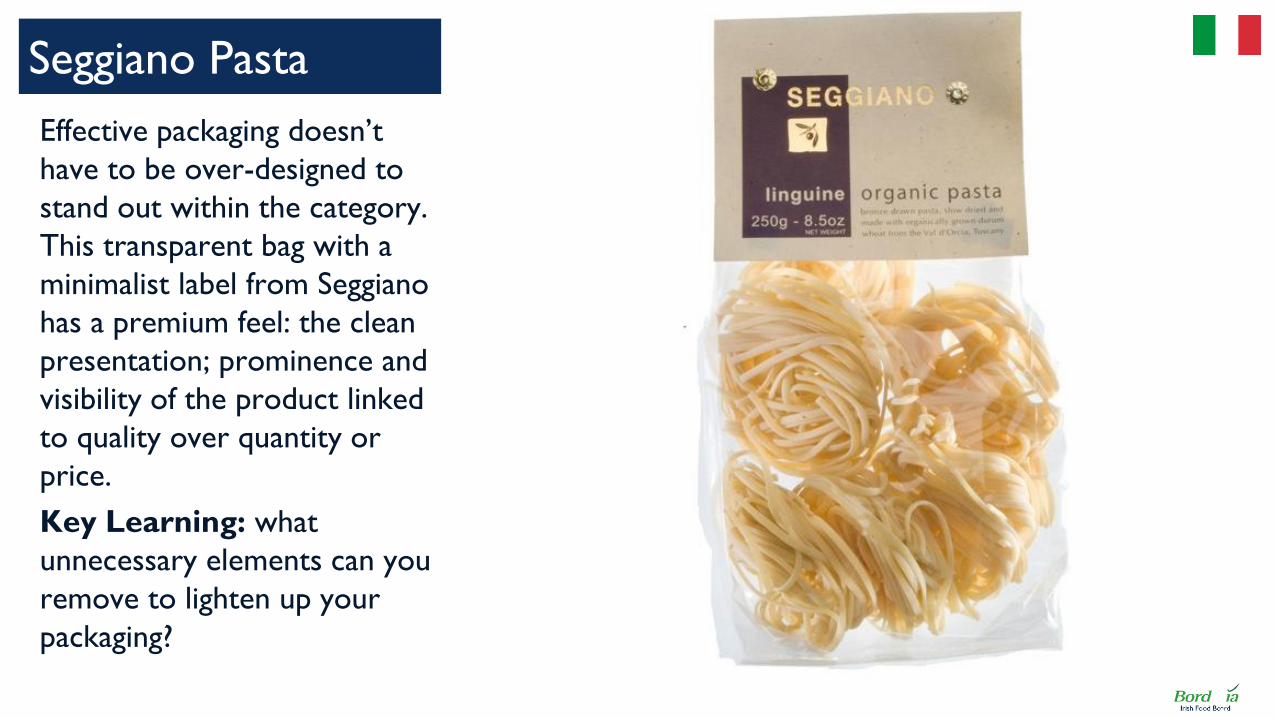
Effective packaging doesn’t
have to be over-designed to
stand out within the category.
This transparent bag with a
minimalist label from Seggiano
has a premium feel: the clean
presentation; prominence and
visibility of the product linked
to quality over quantity or
price.
Key Learning: what
unnecessary elements can you
remove to lighten up your
packaging?
Seggiano Pasta

With their coffee
concentrate, Press’d offer
both an innovative product
and packaging which
reinforces it. The compact
packaging with
straightforward copy and
uncomplicated design
speaks to the simplicity of
using the product.
Key Learning: is your
packaging as
straightforward as the
product itself?
Press’d Coffee

Accolade Wines feature
bespoke artwork on their
Da Luca brand bottles. This
reinforces the premium
positioning of the brand and
creates personalised value
for the consumer by
allowing them to choose a
design which speaks to
them.
Key Learning: How can
your packaging go beyond
the product to create
unique value for customers?
Da Luca Wine Bottles

The packaging of Corella
meat lets you know exactly
what part of the animal this
cut came from.
Not only is this informative
for the consumer, it also
gives an impression of
transparency between
brand and consumer, as
well as a feeling authenticity
of the product itself.
Key learning: what can
you do to make your brand
more transparent?
Corella meat

Undoubtedly the world’s
most iconic can, Coca
Cola’s new design have
been stripped and allow the
iconic script and swish to
communicate the brand
and colourways to signpost
your choice.
Key Learning: How can
your provide the simplest
easiest means of choosing
your brand and selecting
the right variety or flavour
on shelf?
Coca Cola Cans

Dairy brand Valio
competes in a particularly
crowded category and so
this design overhaul which
emphasises the transparent
window in a fun shape and
strips back other elements
to seemingly hand written
text creates a cut through
look on the shelf.
Key Learning: What is
the central element of your
packaging, and how can you
give this emphasis?
Valio Cheese

Whilst some cereal brands
feature cartoon characters,
quizzes and lots of eye-
grabbing features, Dorset
Cereals feels decidedly
more adult and
sophisticated by using
minimal messaging on the
pack and a transparent
window to show-off the
product quality.
Key Learning: can your
packaging cut through the
noise by saying less?
Dorset Cereals

Strip out non essential pieces of
communication or move them to back of
pack to allow you to focus on fewer
elements
What are the most interesting,
useful elements to focus your on-
pack design on?
Tips & Pointers for ‘less is more’ design
Strip Away Non Essentials Using A Minimal Number Of
Colours On Any One Pack Transparency Looks Like Less
Transparent panels as part of your
packaging appear to be the ultimate in
less is more – Nothing! (but beware of
potential degradation of your product
quality)
Can you use transparency to great
effect?
One way of simplifying the design is to
restrict the number of colours used –
often less is more design styles will use
monochrome or two tones only
Can you restrict your colour
palette but still create something
impactful?

EXPERIENTIAL PACKAGING

Technological advances have
opened up a whole new range of
possibilities and functions for
packaging beyond the traditional
contain/convenience/communication
Experiential Packaging
From QR codes to beacon
technology brands and consumers
may both feel overwhelmed by the
technology available, but it is
beginning to transform products.
As a minimum brands can engage
with consumers by using on-pack
messaging to direct them towards
websites to find out more about the
products & interact with the brand.
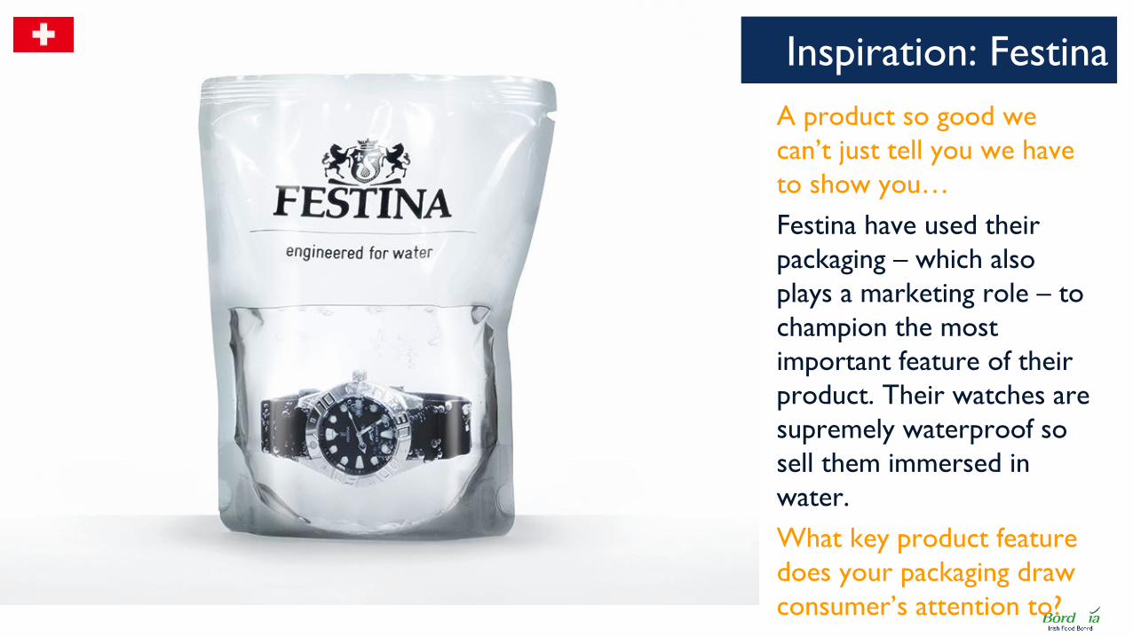
A product so good we
can’t just tell you we have
to show you…
Festina have used their
packaging – which also
plays a marketing role – to
champion the most
important feature of their
product. Their watches are
supremely waterproof so
sell them immersed in
water.
What key product feature
does your packaging draw
consumer’s attention to?
Inspiration: Festina

Leading whisky brand
Johnnie Walker have used
NFC sensor tags to create
a “smart bottle” which
allows consumers to
further interact with the
brand online using their
smart phones.
Key Learning: Mobile
technology has changed the
way we live, is there a way
your packaging can
incorporate future facing
technology?
Johnnie Walker

Demonstrating that
experiential packaging
doesn’t have to cost a
fortune this premium
bakery packaging features
air-holes through which
consumers can smell the
freshly baked bread.
Key Learning: Can you
enhance and showcase the
quality of your product by
using elements of the
packaging to influence
consumer behaviour?
Triticum Bakery

Beer brand Coors have
used heat-sensitive labelling
which changes colour to
tell the customer when the
product has reached “super
cold” level, avoiding beer
cans being left in the
freezer for too long.
Key Learning: are there
packaging technologies
your brand can take
advantage which are
relevant to the habits and
rituals of your customers?
Coors Light Cans

Australian winemaker
Taylor’s have incorporated
a touch-activated,
temperature sensitive strip
onto their label. This
combines with a
temperature scale to
inform customers when the
wine should be drunk.
Key Learning: can your
packaging influence / offer
guidelines on the optimal
serving of your product?
Taylor’s Wine

Extrem Iberian Ham
Xtrem meat take
presentation to the next
level with this upscale
packaging for premium
slices of ham.
This will evoke a sense of
high quality for consumers
as well as unforgettable
novelty.
Key learning: how can
your brand create a quality
experience for your
consumer?

Frozen food brand Birdseye
have used this simple
innovation in their frozen
packaging to capture and
communicate freshness in a
category not normally
associated with it.
Key Learning: are there
formats or new materials
you can talk to packaging
manufacturers about which
will help tackle
preconceptions of your
product category?
Birdseye Stir Bags

Another low-cost yet high-
impact packaging solution
which encourages the
consumer to interact with
it beyond the basic
functions. Kissan Jam is
placed in a giftable box
which folds out into a
board game.
Key Learning: what role
can packaging play for your
customer beyond
containing the product?
Kissan Board Game

Using foil bags ready to go
straight into the oven The
Saucy Fish Co have created
packaging which takes the
fuss away from preparing
fish and guides the way it is
consumed. This adds both
convenience and shapes the
customer experience.
Key Learning: Can your
packaging incorporate a
functional benefit that will
drive consumers to your
product / category?
The Saucy Fish Co

The interface between technology and
packaging is rapidly evolving, unlocking a
range of possibilities from relatively low-
cost (printing QR codes on-pack) to
more expensive (beacon technology),
investing in this can drive engagement
and differentiation.
How could your packaging harness
the latest digital technologies?
Tips & Pointers for experiential packaging
Using the latest digital technology Focussing the senses Packaging technology possibilities
It is not only the technology integrated
into the packaging itself, but the
technology used to produce packaging
which is evolving. Do manufacturers
have new technology which can
transform your product packaging?
Are there packaging materials
which would enhance your product
experience?
Old fashioned theatre and great product
design can achieve more than the latest
technology if executed well. By focussing
on the key sensory experience which
relates to your product it is possible to
create an experience through packaging.
What sense does your product
appeal to – can you deliver this
through your packaging?

SUSTAINABILITY

The environmental impact and
carbon footprint of packaging is on
consumer’s radar more so than it
has ever been, meaning brands must
communicate sustainability efforts.
Save the planet through sustainability
Sustainability can play a key role in
tapping into consumer’s emotional
needs: reassuring them of the
positive impact of products they
buy and alleviating guilt.
With more sustainable packaging
solutions becoming available, such
as biodegradable and sustainably
sourced materials, making an ethical
choice can win over consumers.

Looking beautiful whilst
saving the planet…
Make up brand Zao use
bamboo packaging to
enhance their
environmental credentials
and make their customers
feel good as well as look
good.
Can your packaging
communicate one of the
key values of your brand?
Inspiration: Zao

This eco refill coffee pack
from Kenco is cleverly
designed to show the
customer that it links to
the glass jar product which
they have previously
purchased. It encourages
both re-purchase and
environmentally friendly
behaviour.
Key Learning: can pack
variations encourage your
customers to interact with
the product in a new way?
Kenco Eco Refill

Beer brand Grolsch have
slimmed down their bottles
with a dual effect of reducing
environmental impact as well
as cost of shipping. By
updating the design of the
bottle in the process they
offer something new and
maintain relevance with
consumers.
Key Learning: what
message do changes to your
packaging send to your
customers?
Grolsch Lightweight

Made from compressed
paper and natural inks
Paperboy wine has gone
against the category norm
(glass) but in so doing
created a unique identity
on the shelf with
environmentally friendly
materials.
Key Learning: Can you
win by breaking the
packaging rules of your
category and creating
something different?
Paperboy Wine

This children’s cereal brand
is in fact two products: the
oats inside the packaging,
and the packaging itself
which contains seeds and
can be re-planted inside of
the box itself. This is an
opportunity to delight
customers and offer
something other products
don’t.
Key Learning: can your
packaging be a product in
itself?
Mighty Oats Cereal

In 2015, Finnish dairy brand Valio
(Arla Foods), began selling its
products in the fully renewable
Tetra Rex Bio-base, which is
made from a combination of
paperboard- and plant-derived
plastics, such as wood fibre and
sugar cane.
Consumers can enjoy their milk
with the reassurance that their
consumption is having minimal
impact on the planet.
Key learning: how can your
packaging go the extra mile for
the good of the planet?
Valio Eila
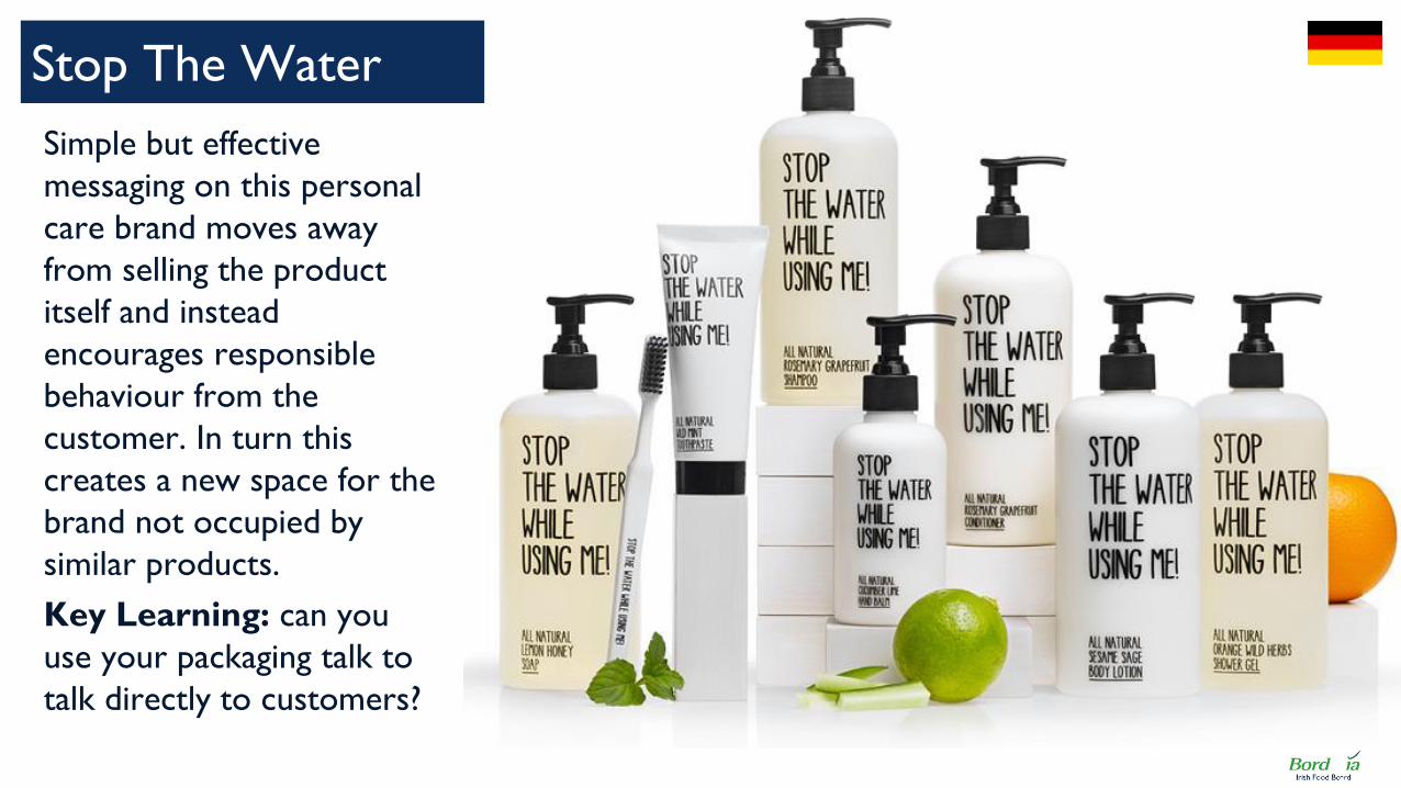
Simple but effective
messaging on this personal
care brand moves away
from selling the product
itself and instead
encourages responsible
behaviour from the
customer. In turn this
creates a new space for the
brand not occupied by
similar products.
Key Learning: can you
use your packaging talk to
talk directly to customers?
Stop The Water

Perhaps the most obvious investment in
the sustainability credentials of your
brand is to use packaging materials which
are recycled and/or sustainably sourced.
The brand values this communicates will
draw consumers who share them.
What existing or new sustainable
materials can you use?
Tips & Pointers for sustainable packaging
Recycled & sustainable materials Slim-line pack design Influencing consumer behaviour
Even the most sustainably packaged
product is still reliant on consumers
actually recycling it after consumption.
Brands seeking to improve their
sustainability can use on-pack messaging
to influence consumers to be
responsible.
Can you use your pack to convey a
sustainable message?
Leading FMCG companies around the
world frequently review and improve
their pack design to reduce overheads
(e.g. cost of shipping) and boost their
brand’s sustainability credentials in the
process – can your brand align the two?
Are there lateral ways you can
enhance the sustainability of your
packs?

ON-THE-GO LIFESTYLES

Consumers are living ever busier
lifestyles, increasing the demand for
food &&drink formats which can be
consumed on-the-go: be that in the
car, on a train or between meetings.
Catering To On-The-Go Lifestyles
Products and pack designs that
facilitate easy on-the-go
consumption are more likely to fit
consumer lifestyles and earn their
loyalty and repurchase.
On-the-go packaging can mean
anything from minimal fuss and
unwrapping, to innovative solutions
and added-value packaging that
makes it easier to consume.

Toothbrushes designed to
be used by travellers…
OHSO are an innovative
brand of toothbrushes,
using packaging to create a
toothbrush which can be
used by those on the move.
Does your packaging have
to be thrown away after
use? Can it continue to add
value to the product?
Inspiration: OHSO

Designed for busy, on-the-go
professionals who want to
grab a healthy breakfast or
snack Nomadic yoghurts offer
a complete solution: with the
packaging also functioning as a
bowl and spoon to eat any
time, anywhere.
Key Learning: if your
product is eaten out of home,
does it need further
implements to consume or
can these be incorporated
into the packaging?
Nomadic Yogurts

This flat-pack coffee
packaging adds
considerable value to coffee
drinkers simply by adding a
spout and handle to the
existing pack design. This
creates a “just add water”
pack to create a pot of
coffee.
Key Learning:
Can small tweaks to your
packaging deliver a whole
new end benefit for
consumers?
Grower’s Cup Coffee

A highly effective size and
shape specification for this
multipack of Wrigley’s
Gum means it fits perfectly
within the cup holder of
any car, meaning it easy for
consumers to use whilst
driving – thus increasing
sales and consumption
occasions.
Key Learning: is your
packaging the right size and
shape to fit wherever your
customers most use it?
Wrigley’s Gum

Another product for busy,
on-the-go consumers this
drinkable Weetabix protein
shake is contained within a
single-serving bottle with
grippable design. Similar
products are completely
disrupting the traditional
breakfast market and
catering to busier lifestyles.
Key Learning: how could
you package your product
to allow it to be consumed
in new ways and occasions?
Weetabix On The Go

Based on the insight that
their products are often
purchased at drive-thru and
eaten in the car, KFC have
designed this “Go Cup”
which reduces the amount
of packaging and enables
their customers to easily
eat it still in the car.
Key Learning: can you
reduce the amount of
packaging and make it
easier for customers to
consume you product?
KFC Go Cup

Creating packaging which is easy to be
consumed on-the-go requires a good
initial understanding of where it is your
consumers actually interact with the
product. Can you design your packaging
to facilitate consumption in this moment?
Where and when could your
product be eaten – how would you
design the ideal packaging?
Tips & Pointers for on-the-go packaging
Where is your product consumed? What are they missing? Does it fit?
Eliminating frustrations your consumers
might come across can increase the
likelihood they will buy and continue to
buy your product – is your packaging
convenient to store in cars, in pockets,
on desks or in other convenient places?
Where do people spend a lot of
time, can you adapt packaging to
those environments?
The insight behind much of the emerging
on-the-go breakfasts category is that
many rushed people are not finding the
time to have a traditional breakfast. New
packaging formats can create new
consumption occasions.
When are the big time pressure
points? How do you make your
products fit them?

OVERVIEW OF KEY PACKAGING TRENDS

A reminder of our top tips & pointers…
On-The-Go
Lifestyles
Personalisation
Experiential
Packaging
New Health
Sustainability
Authenticity &
Storytelling
Less Is
More
Digital printing labels
Choose your
favourite
(limited runs)
Allow the consumer
to customise
Effective use of
typography/font
Storytelling with
images
Authentic materials &
aesthetics
Sustainable packaging
Don’t be afraid of
colour!
Focus messaging/
design on key
ingredient(s)
Strip away non
essentials
Using a minimal
number of
colours on pack
Transparent windows
to show
product
Using the latest digital
technology
Focus on the key
sense
experience
Explore packaging
technology
possibilities
Recycled &
sustainable
materials
Slim-line packaging
Influencing
responsible
consumer
behaviour
Packaging designed
for where it is
consumed
Pack formats that
relieve time
pressures
Pack formats adapted
to the spaces
they’re stored

WRITING A DESIGN BRIEF

Writing a Design Brief - introduction
So you’re suitably inspired and ready to write a
design brief?
What follows is an introduction to some of the key
things you will need to think about during the
design process.
Whilst it is not comprehensive, and each agency
you work with will have their own tailored
approach, this aims to give you some basic pointers
and an overview of the process.

Your guide to getting started (contents)
1. Stages of the design process
2. The four types of brief
5. Setting objectives
3. Design brief template 4. Creative brief template
6. Questions to ask yourself
7. Working with agencies

Processes vary with each agency and each client, but broadly speaking
this is the flow of a project:
From here the next step is to move to Implementation / Artworks
(NB excludes any research, which if undertaken is normally done after
the creative brief) 92
The stages of the design process
Selection & Appointment of Design Agency
The Creative Brief (see template)
Concept Design
Concept Review
Design Development
Final Approval
The Design Brief (see template)
Client (with agency pitch)
Client + Agency
Agency
Client
Agency
Client
Client
Who is responsible?
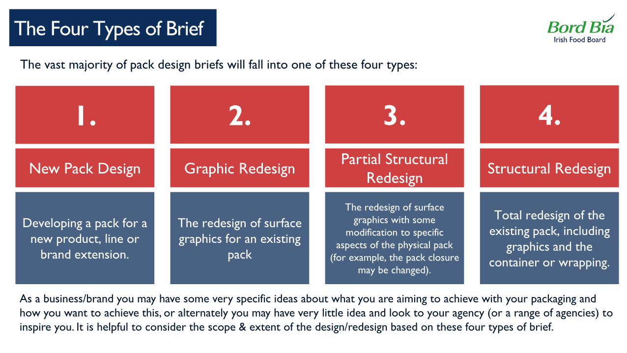
The Four Types of Brief
93
Total redesign of the
existing pack, including
graphics and the
container or wrapping.
The redesign of surface
graphics with some
modification to specific
aspects of the physical pack
(for example, the pack closure
may be changed).
The redesign of surface
graphics for an existing
pack
Developing a pack for a
new product, line or
brand extension.
New Pack Design Graphic Redesign Partial Structural
Redesign Structural Redesign
1. 2. 3. 4.
The vast majority of pack design briefs will fall into one of these four types:
As a business/brand you may have some very specific ideas about what you are aiming to achieve with your packaging and
how you want to achieve this, or alternately you may have very little idea and look to your agency (or a range of agencies) to
inspire you. It is helpful to consider the scope & extent of the design/redesign based on these four types of brief.

Design brief
94
Project Background
Project Objectives
Market Background
Target Audience
Competition
Services Required / Scope
Budget
Constraints
Measurement & Outcomes
Introduction
This is your chance to explain what is driving the need for change and what you are hoping to achieve
Specific outcome from the project – refer to our “four types of brief ” for guidance here
Give some context – where does your product retail? For how much? How many units do you produce?
Who are your core customers? What kind of audience/customer are you aiming to appeal to?
Who are you competing with for shelf space? Are there any brands you admire/take inspiration from?
Reinforcing exactly what you are after – including number of concepts, scope of design, do you have a packaging
supplier/ manufacturer or do you need help in finding one?
How much do you have to spend? It is generally helpful to be upfront & specific.
Are there any musts/must-nots in the design (eg logos, materials, brand guidelines)
What will be your success criteria for this project?
A short introduction to your business & brand

Creative brief
96
Market background
Competitive set
Target Consumers – key learnings & insights
Brand positioning (including proposition, tone of
voice, desired personality)
Scope
Deliverables (inc number of concepts across what
formats at each stage)
Medium/substrate details
Creative ‘must-haves’ / constraints
Design objectives – may include a hierarchy of
communication
Reason for the brief - purpose
Give some context – where does your product retail? For how much? How many units do you produce?
Who are you competing with for shelf space? Are there any brands you admire/take inspiration from?
Any specific market research or consumer insights you have collected
Your brand guidelines & details of your brand to influence & guide the creative output
Scope of the design/redesign – graphics only? Structural redesign? Partial or radical changes?
What do you want to see from the agency at each stage? (see Stages of the Design Process)
Details that need to go onto the pack (eg expiration dates, legalities etc)
Are there any logos/images/assets that must be included?
Is there anything to steer clear of – legally, in context of competitors (too similar) or customers (eg offensive)?
What are the most important things for your packaging to achieve, and in what order?
What are you trying to achieve through your packaging?

Beyond the classic needs to communicate who you are and what you
do, other specific objectives:
98
Setting objectives: things to think about
To communicate something new / a specific feature or change
(e.g move to all natural ingredients)
To stand out on shelf & catch the eye of would-be customers
To create more differentiation versus competition
To re-position your brand (e.g. more premium, more modern, younger)
To demonstrate to retailers that your product adds value for them
To encourage re-purchase by making consumer’s lives more convenient
To deliver better efficiency/practicality for the trade/distribution

99
Questions to ask yourself (at concept review) CHECKLIST
-Is the brand name in a
prominent position and in a clear
and unique style?
– Is it practical for production and
manufacture?
– Are the various product
attributes correctly weighted in
terms of size and prominence?
- Does the pack communicate
clearly and quickly what the
product is?
– Does the pack conform to
generic rules for colour and
format? – or is it breaking the
rules to good effect?
– Does the pack have the right
positioning in terms of quality vs
value;
– Does it communicate the
product qualities and points of
difference?
– Is it practical for production and
manufacture?
– Does the new pack fit into the
existing range, if it’s a sub-brand is
the relationship communicates as
desired, is its heritage
recognisable?
- Will it has impact and stand-out
on shelf – from 2m away? – Does it meet legal requirements?
– Does any supporting product
illustration display the product
clearly?
– Does the design work across
national boundaries, if this is
required
- Have environmental factors
been taken into account?
– Where a unique pack shape has
been created, will this be
acceptable to the retailer?
When you reach the concept review stage, these are some of the questions it may be useful to ask of each design:

100
Overall tips for getting the best results from your agency
Make sure the designers truly understand your company and your
product(s)
Make sure you really understand your customers and why they will be
interested in the product
Make sure the designs know all about your chosen pack (if you have one)
and the specifications of it
Be clear on what you want to communicate and the hierarchy of that
communication
Discuss what you are looking for with the designers – what sort of
designs you like and why
Provide (draft) copy as early as you can, be clear on what scope they have
to adapt/change it
Clarify what needs to be delivered & when
These are some final tips for working successfully with your agency: