Development of fc
13
Development of Front Cover
-
Upload
tommy-simpson -
Category
Documents
-
view
5 -
download
1
Transcript of Development of fc
Development of Front Cover

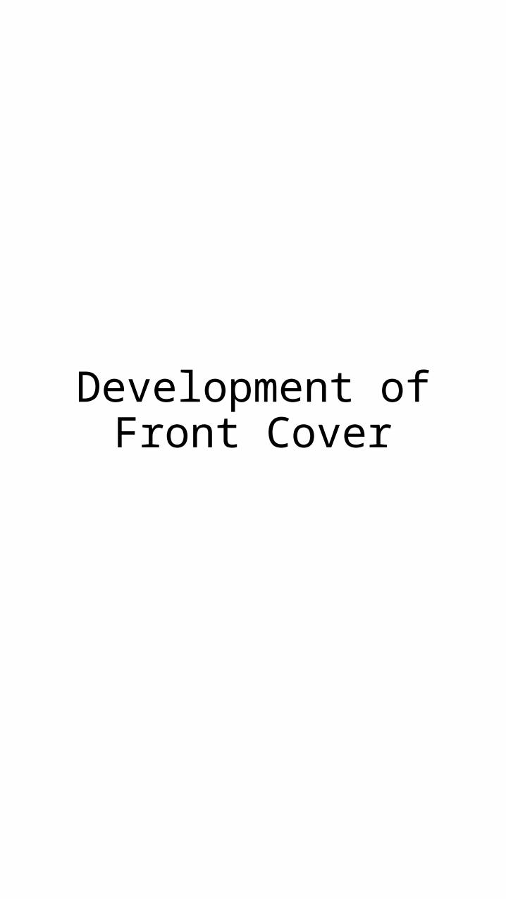
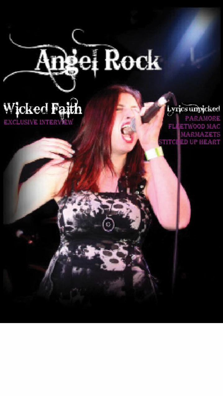
I began by merging the Title of my magazine, written in my chosen font, with the image that I decided to use as my cover image. This was done
in Photoshop, where I also removed any blemishes from my subject and adjusted the brightness and contrast of the photo.
This I then imported into Indesign to begin working with the layout.
• I added the words ‘Wicked Faith, Exclusive interview’ because it was short and snappy, giving little information away to the reader about what went on in the interview. I also put this on the left of my magazine because it stoop
alone, showing it was most important, but also is adjacent to the lead singers head, showing relation between her and
the title.
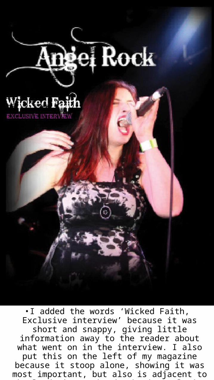
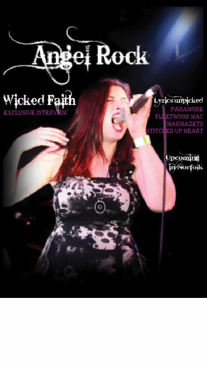
• I began adding my chosen Cover lines, followed by a short sentence about them.

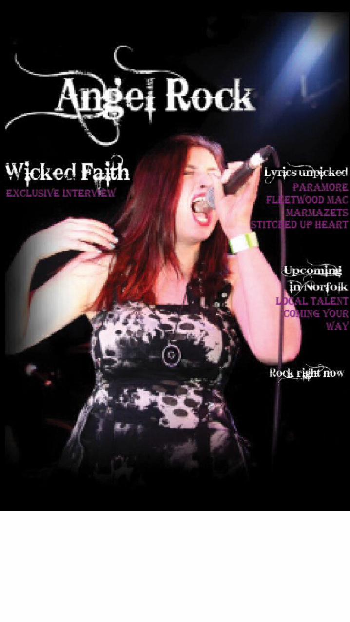
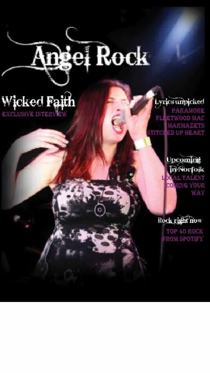
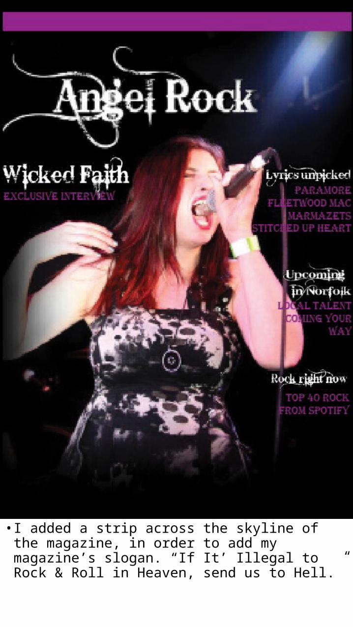
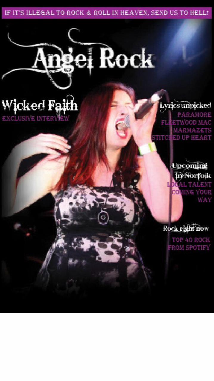
• I added a strip across the skyline of the magazine, in order to add my magazine’s slogan. “If It’ Illegal to Rock & Roll in Heaven, send us to Hell.”
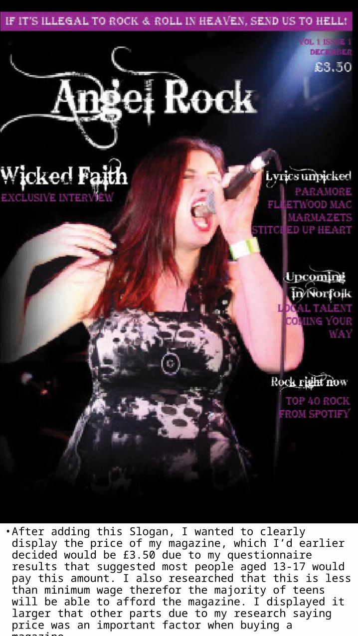
• After adding this Slogan, I wanted to clearly display the price of my magazine, which I’d earlier decided would be £3.50 due to my questionnaire results that suggested most people aged 13-17 would pay this amount. I also researched that this is less than minimum wage therefor the majority of teens will be able to afford the magazine. I displayed it larger that other parts due to my research saying price was an important factor when buying a magazine.
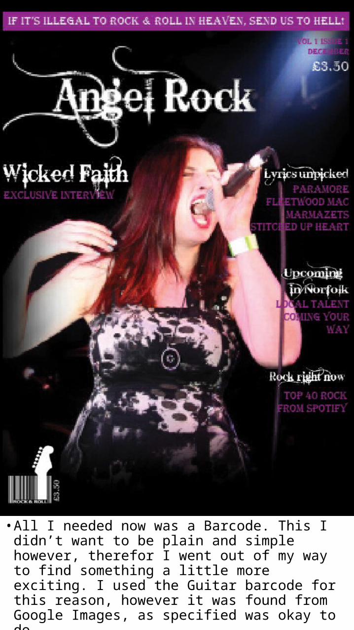
• All I needed now was a Barcode. This I didn’t want to be plain and simple however, therefor I went out of my way to find something a little more exciting. I used the Guitar barcode for this reason, however it was found from Google Images, as specified was okay to do. • My Magazine Front Cover was now finished.