


Languages
Pages
Legal


Visualization of Power Systems
Final Project Report
Power Systems Engineering Research Center
A National Science FoundationIndustry/University Cooperative Research Center
since 1996
PSERC
����
Power�Systems�Engineering�Research�Center�
������
Visualization�of�Power�Systems�����
Final�Report������
Thomas�J.�Overbye,�Project�Leader�University�of�Illinois�at�Urbana-Champaign�(UIUC)�
��
Project�Team�Members��
Douglas�A.�Wiegmann�(UIUC)�Robert�J.�Thomas�(Cornell)�
�����
PSERC�Publication�02-36�����
November�2002�

Information about this Project For information about this project contact: Tom Overbye University of Illinois at Urbana-Champaign Department of Electrical and Computer Engineering 1406 W. Green St. Urbana, IL 61801 Phone: 217 333 4463 Fax: 217 333 1162 Email: [email protected] Power Systems Engineering Research Center This is a project report from the Power Systems Engineering Research Center (PSERC). PSERC is a multi-university Center conducting research on challenges facing a restructuring electric power industry and educating the next generation of power engineers. More information about PSERC can be found at the Center’s website: http://www.pserc.wisc.edu. For additional information, contact: Power Systems Engineering Research Center Cornell University 428 Phillips Hall Ithaca, New York 14853 Phone: 607-255-5601 Fax: 607-255-8871 Notice Concerning Copyright Material Permission to copy without fee all or part of this publication is granted if appropriate attribution is given to this document as the source material. This report is available for downloading from the PSERC website.
2002 University of Illinois at Urbana-Champaign. All rights reserved.

i
Acknowledgements
The work described in this report was sponsored by the Power Systems Engineering Research
Center (PSERC) and the U.S. DOE through its Consortium for Electric Reliability Technology
Solutions (CERTS) program. We express our appreciation for the support provided by PSERC’s
industrial members, by the National Science Foundation under grant NSF EEC 0120153 received
under the Industry/University Cooperative Research Center program, and by the U.S. DOE
CERTS program. We would also like to thank the many industrial advisors who helped to
contribute to the success of this project, as well as the University of Illinois at Urbana-
Champaign students who participated in the human factors experiments. We would like to give
special thanks to the PSERC industrial member co-authors of several of the project publications:
David Schoole of Exelon, Ray Klump and Jamie Weber of PowerWorld Corporation, and Greg
Dooley and Warren Wu of TVA.

ii
Executive Summary
Effective power system operation requires power system engineers and operators to analyze
vast amounts of information. In systems containing thousands of buses, a key challenge is to
present this data in a form such that the user can assess the state of the system in an intuitive and
quick manner. This is particularly true when trying to analyze relationships between actual
network power flows, the scheduled power flows, and the capacity of the transmission system.
With restructuring and the move towards having a single entity, such as an independent system
operator or pool, operate a much larger system, this need has become more acute. This report,
along with the project publications listed in Chapter 7, describes the results of the research
performed to address this need.
The original goals of this project were 1) the development and/or enhancement of techniques
for visualizing power system data using two-dimensional (2D) displays, 2) the development of
techniques for visualizing power system data using three-dimensional (3D) displays, and 3) the
performance of formal human factors experiments to assess the performance of some of these
new visualization techniques. The report describes how each of these goals were met, with the
new 2D display techniques covered in Chapter 2, 3D techniques covered in Chapter 3, and the
results of the human factors experiments covered in Chapter 5. In addition, as the project
progressed the opportunity arose to implement several of the techniques in the EMS control
centers of two PSERC members, Exelon and TVA. Results of these implementations are
covered in Chapter 4.
Much progress has been made in the development, implementation and testing of new power
system visualization techniques. But much work still remains as well. The amount of data
generated by the restructuring power system continues to grow. There is an ongoing need for
further research to develop new and improved visualization techniques, along with an ongoing
need for further human factors testing to quantify their effectiveness.
iii
Table of Contents
1 Introduction ............................................................................................................................. 1
2 Two-Dimensional Power System Visualization ..................................................................... 2
2.1 One-line Animation and Dynamically Sized Components ............................................. 2
2.2 Contouring Bus Data....................................................................................................... 9
2.3 Contouring Transmission Line/Transformer Data ........................................................ 13
2.4 Contouring Tabular Display Data ................................................................................. 15
3 Three-Dimensional Power System Visualization ................................................................. 20
3.1 Interactive 3D Visualization Environment Architecture............................................... 20
3.2 Voltage and Reactive Power Visualization................................................................... 25
3.3 Visualizing Available Transfer Capability.................................................................... 28
4 EMS Implementations........................................................................................................... 30
5 Human Factors Testing ......................................................................................................... 37
5.1 Bus Voltage Contour Experiments................................................................................ 37
5.2 Motion Experiments...................................................................................................... 50
6 Conclusions ........................................................................................................................... 58
7 Project Publications and Presentations.................................................................................. 59

iv
Table of Figures
Figure 1: Thirty Bus System Line Flows ........................................................................................ 3
Figure 2: TVA 500/161 kV Transmission Grid .............................................................................. 4
Figure 3: TVA 500 kV Transmission Grid ..................................................................................... 4
Figure 4: Zoomed View of Southwest Kentucky Transmission ..................................................... 5
Figure 5: Generation of Reactive Power by a 500 kV Line ............................................................ 6
Figure 6: Northeast Transmission System Pie Charts..................................................................... 7
Figure 7: Zoomed View of New York City with Standard Pie Charts ........................................... 8
Figure 8: Zoomed View of New York City with Dynamic Pie Chart Zoom Control..................... 8
Figure 9: Voltages Magnitudes at 115/138 kV Buses in New York and New England .............. 10
Figure 10: Voltage Magnitudes at 115/138 kV with Values below 0.98 per unit......................... 10
Figure 11: Hypothetical Northeast LMPs Using a Continuous Contour Key............................... 12
Figure 12: Hypothetical Northeast LMPs Using a Discrete Contour Key.................................... 12
Figure 13: Subdued Northeast LMP Contour with Line Pie Charts ............................................. 13
Figure 14: Eastern Interconnect Line Loading Contour................................................................ 14
Figure 15: Transmission Line/Transformer PTDFs for a Transfer from Wisconsin to TVA....... 15
Figure 16: Bus Records Tabular Display ...................................................................................... 16
Figure 17: Bus Records Display with Color Contour of Per Unit Voltage................................... 16
Figure 18: Two-Dimensional Tabular Display with Color Contour ............................................. 17
Figure 19: Two-Dimensional Tabular Display Zoomed Out ........................................................ 18
Figure 20: Contour of Complete LMP Results ............................................................................. 18
Figure 21: Traditional One-line View of Thirty Bus System........................................................ 21
Figure 22: 3D View of Thirty Bus System ................................................................................... 22
Figure 23: Thirty Bus System with Lighting ................................................................................ 23
Figure 24: Thirty Bus System without Lighting ........................................................................... 24
Figure 25: 3D View of Midwest Electric Grid.............................................................................. 25
Figure 26: Thirty Bus System Generator Reactive Reserves........................................................ 26
Figure 27: IEEE 118 Bus Generator Reactive Reserves ............................................................... 27
Figure 28: Visualizing ATC and Generation Reserves................................................................. 29
Figure 29: Contour Plot of ComED Real-Time Bus Voltages...................................................... 30
Figure 30: 3D Plot of Reactive Power Reserves at ComED Generators in Northeast Illinois Superimposed on a Voltage Magnitude Contour .................................................................. 31

v
Table of Figures (continued)
Figure 31: ComEd Real-Time Phase Shifter Flow Display .......................................................... 32
Figure 32: Advanced Visualization Displays in the ComEd Control Room................................. 33
Figure 33: Close-up of Advanced Visualization Displays ............................................................ 33
Figure 34: Line Contours of TVA Transmission System Flows................................................... 34
Figure 35: Contour of TVA Buses with Voltages Below 1.0 Per Unit......................................... 34
Figure 36: Tabular Group View of the 30 Bus System................................................................. 38
Figure 37: Oneline Group View of the 30 Bus System................................................................. 39
Figure 38: Contour Group View of the 30 Bus System ................................................................ 40
Figure 39: First Experiment Time in Seconds to Acknowledge All Violations ........................... 41
Figure 40: Time in Seconds to Completely Correct Low Voltages .............................................. 41
Figure 41: Mean Number of Capacitors Closed............................................................................ 42
Figure 42: 118 Bus One-line Used in the Second Experiment ..................................................... 42
Figure 43: Experiment Two Number-only One-line..................................................................... 44
Figure 44: Experiment Two Contour-only One-line..................................................................... 45
Figure 45: Experiment Two Number-Plus-Contour One-line....................................................... 46
Figure 46: Third Experiment Number-only Display Condition.................................................... 50
Figure 47: Third Experiment Thirty Bus System One-line........................................................... 51
Figure 48: Acknowledgement and Solution Time By Display Condition for Single Line Overloads .............................................................................................................................. 52
Figure 49: Acknowledgement and Solution Time By Display Condition for Multiple Line Overloads .............................................................................................................................. 53
Figure 50: Fourth Experiment Display.......................................................................................... 54
Figure 51: Time to Select Both Seller and Buyer ......................................................................... 55
Figure 52: Erroneous Buyer/Seller Selections .............................................................................. 56
Figure 53: Time to Select Path Between Buyer and Seller ........................................................... 56

Visualization of Power Systems
Chapter 1 Introduction
Effective power system operation requires power system engineers and operators to analyze vast amounts of information. In systems containing thousands of buses, a key challenge is to present this data in a form such that the user can assess the state of the system in an intuitive and quick manner. This is particularly true when trying to analyze relationships between actual network power flows, the scheduled power flows, and the capacity of the transmission system. In many regions deregulation has resulted in the creation of much larger markets under the control of an independent system operator. This has resulted in even more buses and other devices to monitor and control. Simultaneously, the entry of many new players into the market and the increase in power transfers has added to the amount of data that needs to be managed. Finally, system operators and engineers have come under increased scrutiny since their decisions, such as whether to curtail particular transactions, can have a tremendous financial impact on market participants. Power system software in general, and the EMS in particular, need to be modified in a number of different ways to handle these new challenges. One such modification concerns how system information is presented to the user.
This report, along with the published publications list in Chapter 7, present results from the PSERC “Visualization of Power Systems” project. The original goals of this project were 1) the development and/or enhancement of techniques for visualizing power system data using two-dimensional (2D) displays, 2) the development of techniques for visualizing power system data using three-dimensional (3D) displays, and 3) the performance of formal human factors experiments to assess the performance of some of these new visualization techniques. We believe all three of these goals were met, with the 2D display techniques covered in Chapter 2, the 3D techniques covered in Chapter 3, and the results of the human factors experiments covered in Chapter 5. In addition, as the project progressed, the opportunity arose to implement several of the techniques in the EMS control centers of two PSERC members, Exelon and TVA. Initial results describing these installations are discussed in Chapter 4.

2
Chapter 2 Two-Dimensional Power System Visualization
As was mentioned in the Introduction, the project focused on developing new methods and enhancing existing methods for both 2D and 3D visualization. This chapter discusses the 2D techniques. Two-dimensional visualization has a key advantage in that it is intuitively understandable to essentially all potential viewers. People are very accustomed to 2D displays through their previous interaction with computer displays and through their familiarity with other techniques for information presentation such as books. Another important advantage is the ability to relatively quickly display 2D computer images.
For the visualization of power system operational information, such as the results of power flow studies or SCADA data, the traditional visualization approach has been to use either tabular displays or substation-based one-line diagrams. In an EMS control center this information is often supplemented with an essentially static mapboard. Historically the only dynamic data shown on a mapboard has been the application of different colored lights to indicate the status of various system devices. This section describes some 2D techniques that could be used to supplement, or in some cases replace, such displays. The emphasis in this research was the display of large amounts interrelated information, with the information relationships usually due to either the presence of an underlying electrical gird, or inter-temporal interactions. Techniques considered included animation of static line flow information, dynamic resizing of one-line components, contouring of system one-line information, inter-temporal animation, and contouring of tabular information.
2.1 One-line Animation and Dynamically Sized Components
Key to understanding the state of the transmission system is knowing the current flows and percentage loading of the various transmission lines. This can, however, be quite difficult particularly for larger systems. By far the most common means for representing transmission system flows is through the use of the one-line diagram. Traditionally MW/Mvar/MVA flows on transmission line/transformer (lines) have been shown using digital fields. Such a repre-sentation provides very accurate results and works well if one is only interested in viewing a small number of lines. In a typical EMS system this representation is supplemented with alarms to call attention to lines violating their limits.
One newer technique is to supplement such representations though the use of animation to illustrate how power is actually flowing in a system. As an example, Figure 1 shows a one-line diagram of a small 30 bus, 41 line system. To indicate the direction of real power flow (MW) on each transmission line/transformer, small arrows are superimposed on each device, with the arrow pointing in the direction of the flow and with the size of the arrow proportional to the MW flow on the line. The advantage of this one-line approach is that even when using a static representation, such as a figure in a report, one can quickly get a feel for the flows throughout a large portion of the system.
3
39.55 MW 59.52 MW
18.06 MW
5.00 MW
41.00 MW
29.00 MW
30-Bus Case Demo Case
3
1
4
2
576
28
10
119
8
22 2125
26
27
24
15
14
16
12
17
18
19
13
20
23
29 30
15 MW
10 MW
10 MW
1 MW
5 MW 8 MW
189.40 MWDemand
15 MW
192.14 MWGeneration
982.97 $/hr Cost
70%
66%
2.74 MWLosses
89%
93%
83%
92%
100%
Figure 1: Thirty Bus System Line Flows
However, a much more dramatic affect is achieved when the flows are animated. With modern computer equipment, animation rates of greater than ten times per second have been achieved when using a relatively fast PC, even on relatively large systems. Smooth, almost con-tinuous, animation is achieved by updating the display using bitmap copies. The effect of the animation is to make the system appear to "come to life". Our experience has been that at a glance a user can gain deep insight into the actual flows occurring on the system. The use of panning, and zooming with conditional display of objects gives the user the ability to easily study the flows in a large system.
The application of such animated flows to larger systems has to be done with some care. It is certainly possible to create one-lines in which the presence of the flow arrows results in more clutter than insight. For example, Figure 2 shows a one-line diagram of the TVA 500/161 kV transmission system (with a few 345/230 kV buses as well). Overall the display shows slightly more than 800 buses and about 1000 transmission lines and transformers. From just viewing the static representation shown in the figure it is relatively difficult to detect flow patterns since the flows from the different voltage levels tend to intermingle. When the display is animated this intermingling is less apparent, but it is still a challenging display to interpret.
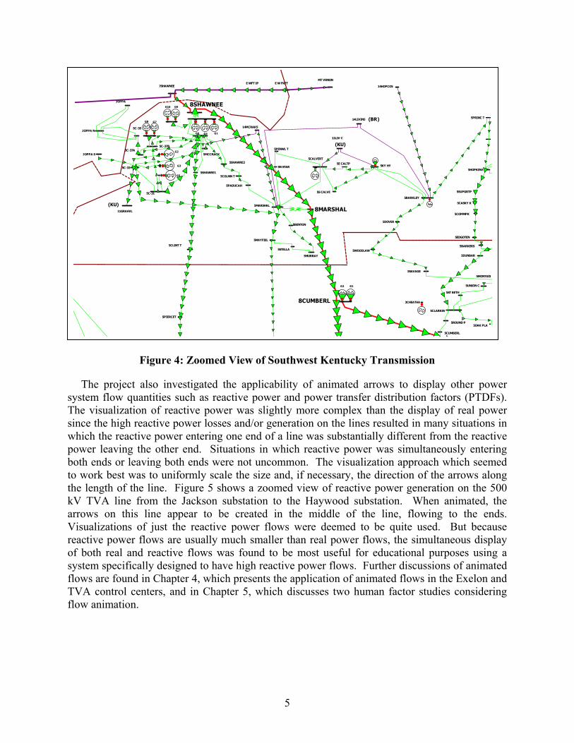
But if the view is restricted to just a particular voltage level, or zooming is utilized to focus on a particular portion of the grid, then the animated flow arrows can again be quite helpful. As examples, Figure 3 shows just the flows on approximately 75 of the 345/500 kV transmission lines, while Figure 4 shows a zoomed view of all the transmission line flows in southwest Kentucky.
(APC)( KU)
( EK)
(LGE)
(LGE)
(BR)
(KU)
(BR)
G9G10
G6 G4 G1
G8G7
G2
G3
G5
G1G2
05STI N N E11PIN EV
20RUSSEL
20BLIT C
11PAD D YS
5PARAD I S
14N . H AR5
5ABERD T
5E BO W L
5BRSTO T
5BO W L GR
5RUSVKYT
8PARADIS
5SBO W L T5H O PKIN V 5LEW ISBG
5CAD I ZT
5PRIN C T
5KY H Y
14H O PCO 5
14LI VIN 5
5CALVERT
11LI V C
5PEN W L T
5N STAR
5LO GAN A
8SHAWNEE
5C- 33
14M CRAK5
5CO LM N T
5SH AW RE2
5M CCRACK
5C- 37A5C-37B
5SH AW RE1
JO PPA S
7SH AW N EE
JO PPA N5C- 35
JO PPA
JO PPA TS
KELSO
5E CALTP
Figure 2: TVA 500/161 kV Transmission Grid
( D U
(EK)
(GPC)
(KU)
(EES)
(APC)
MO
K
( M PL)
G1G2G1
G2G3
G4
G2
G1
G5G6
G1 G2 G3
G2 G3
G4G7
G5G2
G1CTs
G3 G4
CT
G5 G6 G7
G8 G9 G10
G1 G2
G4G3
G1 G2 G3 CT
CT
G1
G8
8VOLUNTE
5D UM PLIN5N I XO N R
5PIGEO N
5N . PI GT
5S. SEVI E
5N VI EW
5CH ER H Y
5KN O X
8BULL RU
8WBNP 1
5N KN O X
5BULL RU
5TAZEW EL
5SN EED VL
5M O RRI ST
8ROANE
8SNP
5H N D S VT
5N O RRIS
5RI VER T
5UN VLLYT
5LAFO LLE
5PIN EVIL
5VO LUN TE
5W EST H L
5LO N SD AL
5EBN ZR T
5KARN S T
8WILSON
5CH AN D LE
5RO CKFO R
5ALCO A S
5ALCO A
5CH ILH O W
5CALD ERW
5CH EO AH
5H I W AY
5FO N TAN A
5SAN TEET
5RO
5RO CKW T
5KN G U5-
5H ARM N T
5BLAIR R
5KI N GCBT
5KN G U8-
F7KI N GST
F8KI N GST
F9KI N GST
5 LO UD O N
5SW EETW A
5AE STLY
5ATH N TN
5KI M B CL
5FT LO UD
5FRI EN D T
5D EN SO T
5SO LW Y T
5W ELLSVI
5TELLI CO
5H I W ASSE
5ELZA
5X-10
5EATO N X
5K-27
5KN GSTN
5ST CL T
5CRO SSVI
5W BH P
F5KI N GST
F6KI N GST
F1KI N GST
F2KI N GST
F3KIN GST
F4KIN GST
5BRAYTO W
5H UN T TN
5W O LF CR
5W AYN E C
5M CCREAR
5JELLICO
5RO YAL B
5CARYVI L
5JACKS T
5RO CKW O O
5SUM M ER
5TM PKN T
20SSH AD E
20SSH AD T
5BEAR CR
5FRED O N I5M O N TERE5W CO O KV
5W SPART
5GREAT F
5SPRN G C
5PIKVL T
5W O O D BUR
5SM TH TN
5CEN TER
5GO RD VLT
5W ATER T
5LEBAN O N
5SLEBIPT
5LEB IPT
5GALLATI 5GALLAT2
5CO RD ELL
5BAXTER
5D BLE
5O CAN A T
5H N D RV T
5N N ASH
5LASCASS
5M URFREE5M URFI T
5E M URFR
5CH RISTI
5W ARTRAC 5N . TUL T
5M AN CH ES
5RED H LTP
5M O RRI SO
5BRI D GES
5M CM IN N V
5EM CM N T
5N TUL T
5FRAN KLI
8FRANKLI
8MAURY
8DAVIDSO5GLAD V T
5H ERM ITA
5D O N ELSO5S N ASH
5M URF RD
5PIN H O O
5CEN T PK
5SM YRN A
5H URRI CA
5IN TERCH
5TN M I L T
5ATH N IPT
5LAM O N TV
5CH ARLES
5H ARRTAP
5H ARTSVI
5LAFAYET
5W ESTM O R
5PO RT SS
5FO UN TAI
5PO RTLAN
5FRN K KY
5EGALLAT
5GALTN P
5LAKEVI E
5LKEVI E
5SAUN D ER
5GO O D LET
5W H ITES
5SPRN GFD
5CRO SSPN
5GLASG T
8MONTGOM
5APALACH
5O CO EE 3
5BASI N
5E CLEVE
5SUGAR G
5APSN TP1
5CATO O SA
5S. CLEVE
5CO N CO RD
5APSN TP2
5H AM ILTO
5J . C. ED W
5O GLETH R
5RID GD L1
5RI D GED A
5CH ICK H
5VAAP T
5M O CCASI
5FALLI N G
8BOWEN
8WID CRK
8RACCOON
5M EM JUN C
5D UN BAR
5SUPGRTP
5BARKLEY
5D O VER
5S CALVE
5M ARSH AL
5CO O PERT
5KRKW D T
5M O N TGO M
5SAVAGE
5UN I O N C
5ST BETH
5CLARKSV
8CUMBERL
8JVILLE
8MARSHAL
5PAD UCAH
5BEN TO N
5M AYFI EL
5C-31
5CLIN T T
11GRAH VL
5PARI S
5STELLA
5M URRAY
5BSN D Y T
5J VIL 2
8SHELBY
5W IN CH ES
5W I D CRK1
5W I D CRK2
5M O RGAN V
5W ALLACE
5JASPER
5N ICJACK
8BFNP
8MADISON8LIMESTO
5D AYTN T
5SKYLIN E
5BRUSH TP
5CO ALM O N
5FAYETTV
5M CBURG
5LN CH BGT
5BELFAST
5CO LLIN S
5LIM ESTO
5ATH N AL
5PEACH O
5ARD M O RE
5PULASKI
5W ALTER
5M T PLEA
8BNP 2
8LOWNDES8W POINT
8TRICO S
8TRINITY
8JACKSON
8HAYWOOD
8CORDOVA
8UNION
8FREEPOR
5M AD ISO N
5N H UN TV
5CH ASE A
5GURLEY
5LI M RK T
5FARLEY
5D ECATUR
5GEN M TR
5JETPO RT
5RED ST T
5H UN T AL
5LAW REN C
5H RTSLT1
5PEN CE T
5LCYSP T
5RED STO N
5CED AR L
5N EEL AL
5IRO N M AN
5CULLM AN
5H RTSLT2
5E. CULLT
5SO LUTI A
5RTLFF T
5FI N LY T
5AD D ISO N
5M O ULT T
5N AN CE
5SPRIN G
5BN P
5SCO TTSB
5GO O SE P
5AKZO AL
5M EAD
5STEVEN S
5SYLVN IA
5CO LM B C
5N . ALBER
5ALBERTV
5FT PAYN
5H EN AG T
5GUN T H P
5ARAB
5GUN TERV
5CO LN SVL
5FYFFE T
5AIRPRT1
5ATTALLA
3BLO UN T
5W N ASH
5W . CO LUM
5M AURY
5S. CO LUM
5H EN PECK
5M O N SN T
5E. FRAN K
5BREN TW O
5RAD N O R
5ELYSI AN
5GRASL T
5D AVID SO
5CAD D O T
5W H EELER
5M TPLP T
5FIVEPTS
5D UN N
5ELGI N
5W I LSN H P5CO LBERT
5SH O ALS
5O AKL AL
5FO RD CY
5REYN O LD
5PH I L CT
5TUSCUM B
5RUSVA T
5BELGRN
5LO W N D ES
5W AYN ESB
5PI CKW I C
5GATTM AN
5RED BAY
5BARTN T
5CH ER AL
5SELM ER
5TULU
5H EBRO N
5BO LIV T
5SO M RV T
5O AKLN T
5CAN AD AV
5M O SCO W T
5H I CK VL 5RAM ER
5CO UN CE
5SAVAN N A
5N . AD AM
5N . AD AM T5STR 49
5H EN D R T
5S JACKS
5JACKSO N
5ALUM X T
5D AN CY T
5BEECH B
5N LEX T
5CH ESTER
5H USTB T
5IUKA M S5BURN SVL
5H I LLS C
5GLEN M S
5N ASA M
5N CRO SS
5JR PARN
5CO RIN TH
5S. CO R T
5N ECO R T
5KI M BERL
5KO SSUTH
5LO RETTO
5CRO CKET
5O N LY
5H ILLTO P
5CEN TERV
5LO BELT
5H O LAD AY
5D ICKSO N
5J VIL 1
5TRACE T
5ERI N
5D RYCK T
5CLARKSB
5PO M O N T
5KN G SPR
5D AVSN 2
5D AVSN RD
5FRN K TN
5ASPN G T
5CURD LA
5RLLYH LT
5N O LN VLE
5CAN E RI
5CRAI GH E
5CUM BERL
5RO UN D P
5W O O D LAW
5PIERCET
5M ARTI N
5N D RES T
5CAM D N T
5W EAKLEY
5UN O N CTY
5N EW BN T
5RUTH F T
5D YERSBU
8WEAKLEY
5TIPTN VL
5H IGH W AY5D YRS I P
5D O UBLE
5RIPLY T
5E I P TP
5CO VI N GT
5ATO KA T
5BRI GH TP
5BRN P T
5SH ELBY1
5BRN VL T
5BRN PST
5ALAM O
5FRUI TLD
5M I LAN
5H UM BO T
5BRO W N SV
5H UN TN T
5N . E. GAT
5FI TE RD
5M I LLIN G 5YALE RD
5N . FRAYS
5RALEI GH5N . PRI M A
5ELM O RE
5SO UTH ER
5UN I VERS
5CH ELSA
5S. E. GAT
5SH AD Y G
5FREEPO R
8PLSNTHL
5ALLEN S
5S. PRI M A
5M TCO RN T 5M ILLER
5O LIVE B
5BYH ALIA
5CO LR M S
5RO SSV T
5N . CO LLI
5N H O LLSP
5H O LLY S
5W O O D SO N
5H I CKFLT5N W N AL T
5N EW ALB
5E. RI PL
5BLUE SP
5RIPLYM S
5UN I O N
5N . O XTP
5O XFO RD
5M CGREGO
5PO N TO TO
5BN KH D T5BISSELL
5TUPELO
5SW TUPE
5M ED I CAL
5BAY SPR
5M O O REVT
5N . SH AN N
5GUN TO W N
5O KO LO N A
5BLM N T T
5N . LEE
5BALD W YN
5BO O N EVL
5FULTO N
5EGYPT P
5H O USTO N
5CALH O UN
5CO FFEEV
5EUPO RA
5W ATERVA
5TEN N TP5GREN AD A
5N EW SPRI
3BATESVI
5SM TH M S
5BILLIE
5AM O RY
5W PO I N T
8MILLER
5H AM I L T
5KERR- M C
5ACKERM N
5RED H I LL
5M AGBEE
5E CO LUM
5LEW SBSS
5TRI N ITY
5BRYAN T
5W I N CH P
5KIM BL T
5SPRCRK
5H AM ILT
3GUN TERV
6M I LLER
5KI N GVLL
3KETO N A
3ATTALLA
5RO CK SP
6O GLETRP
6W . RIN GO
6ALPH A 2
3W . RI N GG
3BAN D Y T3KI KER G
3ALPH A G
6W ID CRK
6CRAW FIS6KEN SN GN
6E D ALTO
6O O STAN A
6TUN N ELH
5BUO Y ST
5M CLEM O R
6BO W EN
6H AM M O N D
6RO CKSPR
6PI N SO N
6TI O GA
8UNIONCY
8VILLARI
6CED RTW N
6UN IO N CY6FLATSH O
6W ELCM AL
6FI FTY- 4
5O AK RI D
5UN VLLYT
5H ARRI M A
5REESF T
8GLEASON
5LUSVLRD
5LAFAYSP
5SEO XFRD
5W O XFO RD
5SARD I T5BATESVI
5LSPW R
3BATESV
5H N LAK
3H N LAK
8DELL 5
8NEWMAD
5SH ELBY2
5W I N GTTP
5N RI PLYT
5N EW M AD
5RI D GELY
5N AUVO O 2
5ELKTN TP
5H O EGAN T
5SCKVLLE
5SO RCKW D
5SN FRD TP
5M EAD TP
5H ELLTAP
5CALD N IA
5FAI RTAP
5TRICO TP
7N EW M AD
6RCKSPSS
6CARTERS
5RO LN STP
8LAG CRK
5TM PSN ST
5BLCKM N T
5AIRPO RT
5H ALVLTS
5CASKY K
5CO M M PK
5ED GO TEN
5BARKERS
5O AK PLA
5FLETCH R
5M URPYN C
5M URPYTP
5M URPH Y2
5W O AKRGE
5ETO W AH
5GO O D FTP
5H AN EYTP
5BFN P
5M ALRD T
5PH I LCAM
5M AD ISN W
5CARRIAG
5M O IZECR
5ARLI N GT
5PO PLAR
5PO PLR E
5SH ELTO N
5CO LGATE
5W I N CH RD
5TRN TYRD
5N BARTLE
5H O LM ES
H 1 CH ATU
H 1TIM FD
2CH EATH A
2D ALE H O
2M ELTO N
2O LD H IC
(BR)
(BR)
G9G10
G6 G4 G1
G8G7
G1G28PARADIS
8SHAWNEE
7SH AW N EE
JO PPA TS
KELSO
4
Figure 3: TVA 500 kV Transmission Grid
(APC)( KU)
( D U
( EK)
(LGE)
(LGE)
(EK)
(GPC)
(KU)
(KU)
(EES)
(APC)
MO
K
( M PL)
G2
G3
G5
G1G2 G1
G2G3 G4
G2
G1
G5 G6
G1 G2 G3
G2 G3
G4
G7
G5G2
G1CTs
G3 G4
CT
G5 G6 G7
G8 G9 G10
G1 G2
G4G3
G1 G2 G3 CT
CT
G1
G8
8VOLUNTE
8BULL RU
8WBNP 1
8ROANE
8SNP
8WILSON
8FRANKLI
8MAURY
8DAVIDSO
8MONTGOM
8BOWEN
8WID CRK
8RACCOON
8CUMBERL
8JVILLE
8MARSHAL
8SHELBY
8BFNP
8MADISON8LIMESTO
8BNP 2
8LOWNDES8W POINT
8TRICO S
8TRINITY
8JACKSON
8HAYWOOD
8CORDOVA
8UNION
8FREEPOR
8WEAKLEY
8PLSNTHL
8MILLER
8UNIONCY
8VILLARI
8GLEASON
8DELL 5
8NEWMAD
7N EW M AD
8LAG CRK
5
Figure 4: Zoomed View of Southwest Kentucky Transmission
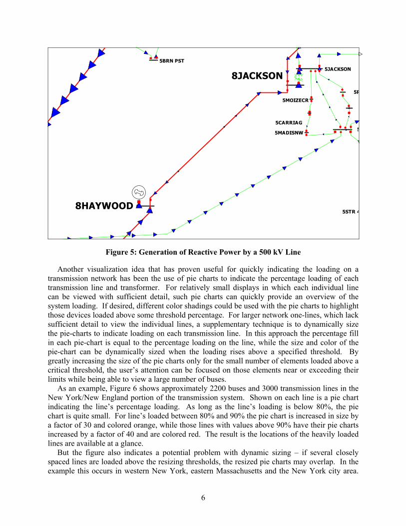
The project also investigated the applicability of animated arrows to display other power system flow quantities such as reactive power and power transfer distribution factors (PTDFs). The visualization of reactive power was slightly more complex than the display of real power since the high reactive power losses and/or generation on the lines resulted in many situations in which the reactive power entering one end of a line was substantially different from the reactive power leaving the other end. Situations in which reactive power was simultaneously entering both ends or leaving both ends were not uncommon. The visualization approach which seemed to work best was to uniformly scale the size and, if necessary, the direction of the arrows along the length of the line. Figure 5 shows a zoomed view of reactive power generation on the 500 kV TVA line from the Jackson substation to the Haywood substation. When animated, the arrows on this line appear to be created in the middle of the line, flowing to the ends. Visualizations of just the reactive power flows were deemed to be quite used. But because reactive power flows are usually much smaller than real power flows, the simultaneous display of both real and reactive flows was found to be most useful for educational purposes using a system specifically designed to have high reactive power flows. Further discussions of animated flows are found in Chapter 4, which presents the application of animated flows in the Exelon and TVA control centers, and in Chapter 5, which discusses two human factor studies considering flow animation.
(KU)
(BR)
(KU)
G9G10
G6 G4 G1
G8 G7
G2
G3
G5
G1G2
5HOPKINV
5DUNBAR
5SUPGRTP
5PRINC T
5BARKLEY
5KY HY
5DOVER
14HOPCO5
14LIVIN5
5CALVERT
5S CALVE
11LIV C
5PENWL T
5MARSHAL
5N STAR
5MONTGOM
5SAVAGE
5UNION C
5ST BETH
5CLARKSV
8CUMBERL
8MARSHAL
8SHAWNEE
5C-33
5PADUCAH
5BENTON
5MAYFIEL
14MCRAK5
5COLMN T
5SHAWRE2
5MCCRACK
5C-31
5C-37A5C-37B
5SHAWRE1
5CLINT T
11GRAHVL
JOPPA S
7SHAWNEE
JOPPA N5C-35
JOPPA
5STELLA
5MURRAY
5CUMBERL
5ROUND P
5WOODLAW
5PIERCET
E WFT IP E W FKFTMT VRNON
5E CALTP
5CASKY K
5COMMPK
5EDGOTEN
5BARKERS
5OAK PLA
2CHEATHA
6
8JACKSON
8HAYWOOD5STR 4
5
5JACKSON
5
5BRN PST
5R
5MADISNW
5CARRIAG
5MOIZECR
Figure 5: Generation of Reactive Power by a 500 kV Line
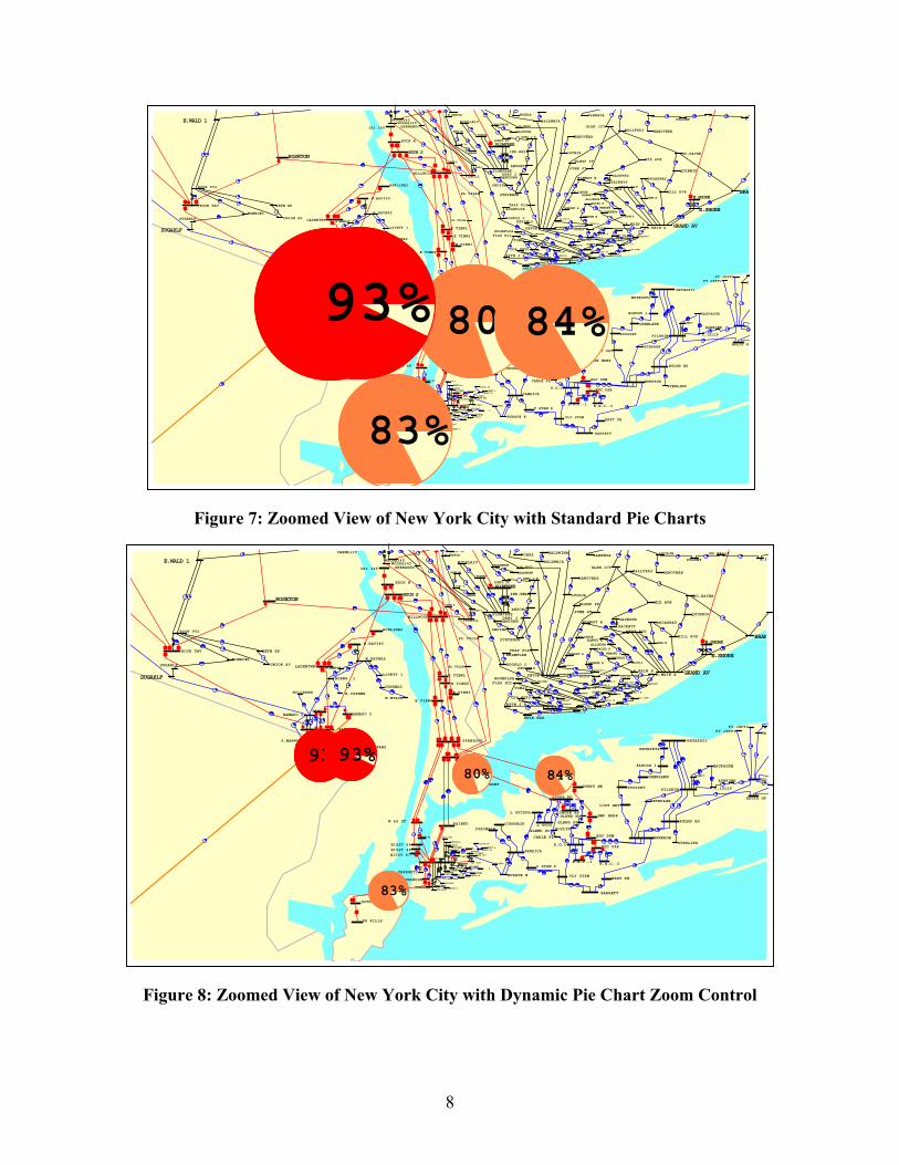
Another visualization idea that has proven useful for quickly indicating the loading on a transmission network has been the use of pie charts to indicate the percentage loading of each transmission line and transformer. For relatively small displays in which each individual line can be viewed with sufficient detail, such pie charts can quickly provide an overview of the system loading. If desired, different color shadings could be used with the pie charts to highlight those devices loaded above some threshold percentage. For larger network one-lines, which lack sufficient detail to view the individual lines, a supplementary technique is to dynamically size the pie-charts to indicate loading on each transmission line. In this approach the percentage fill in each pie-chart is equal to the percentage loading on the line, while the size and color of the pie-chart can be dynamically sized when the loading rises above a specified threshold. By greatly increasing the size of the pie charts only for the small number of elements loaded above a critical threshold, the user’s attention can be focused on those elements near or exceeding their limits while being able to view a large number of buses.
As an example, Figure 6 shows approximately 2200 buses and 3000 transmission lines in the New York/New England portion of the transmission system. Shown on each line is a pie chart indicating the line’s percentage loading. As long as the line’s loading is below 80%, the pie chart is quite small. For line’s loaded between 80% and 90% the pie chart is increased in size by a factor of 30 and colored orange, while those lines with values above 90% have their pie charts increased by a factor of 40 and are colored red. The result is the locations of the heavily loaded lines are available at a glance.
But the figure also indicates a potential problem with dynamic sizing – if several closely spaced lines are loaded above the resizing thresholds, the resized pie charts may overlap. In the example this occurs in western New York, eastern Massachusetts and the New York city area.

One partial solution is to render the display so that the most heavily loaded pie charts are always shown on top. While this does not eliminate the problem, it does ensure that the user’s attention is drawn to the most heavily loaded element.
Ftrss
rdscifdTF
CHA73555
CHA31555
HAWTHORN
MASS 765
CHA-NY82
DETROIT
MADSN PH
S 63B TP
WILLIAMS
WYMANBIGELOW
GORBELL
HARTLAND
S83B TAP
LAKEWOOD
MADISON
S83C TAP
SDW SOMS
WINSLOW
S67A TAP
RICERIPS
IBM K21
GEORG TPFAIRFAX
ST ALBAN
HIGHGATE
LOST NAT
WHITEFLD
POTOK PH
BERLIN
SMITH HY
MOOREU199 TAP
IRASBURG
ST.JOHNS
ST.J PHHIGHL
FRFX CAP
WILL 115
CHATP115
FLATR115
ASHLY115
NOEND115
WILLIS E
WILLIS W
ANDRWS-4
MOS 115
ALCOA N
GR-TAP2
MASS-115REYN T#3
REYN T#1
GM T#1GM T#2
REYN T#2
85%
7
Figure 6: Northeast Transmission System Pie Charts
There are two other potential problems with dynamic pie chart resizing that bear mentioning. irst, care must be taken when applying resizing to radial devices such as generator step-up
ransformers. Such transformers are designed to be regularly loaded at a high percentage of their atings, but because of their radial connection, they are in no danger of overloading. A traightforward solution to this problem is to either not show pie charts on such devices or to pecify that the pie charts should not be dynamically resized.
The second problem is unless care is taken during zooming, a pie chart that is appropriately esized for a high level overview, such as shown in Figure 6, may completely dominate that isplay when it is zoomed. Such a zoomed view of the New York City area on Figure 6 is hown in Figure 7 with the pie charts now covering a large portion of the transmission grid in the ity. A solution to this problem is to proportionally reduce the amount of resizing as the display s zoomed. For example, one approach would be for the user to specify a maximum zoom value or full resizing. Once the display is zoomed past this value the amount of pie chart resizing is ynamically reduced until reaching some threshold value, such as the size of a normal pie chart. he visual effect during zooming is the resized pie chart remains the same size on the screen. igure 8 demonstrates this approach for the Figure 6 display.
SUNBURY
SUSQHANA
WESCOVLE
BERKSHRE
NRTHFLD
LUDLOW
STNY BRK
MILLSTNE
MANCHSTR
NOBLMFLD
CARD
MIDDLTWN
MEEKVL J
LONG MTN
FRSTBDGESOUTHGTN
E.SHORE
SCOVL RK
MONTVILE
PLUMTREE
HADDM NK
MANH381
VT YANK
COOLIDGE
SCOB 345
AMHST345
W MEDWAY
BRAYTN P
DRFLD345
BUXTON
SEBRK345
TIMBR345
NWGTN345
SANDY PD
S.GORHAM
WYMAN
SUROWIEC
ME YANK
MASON
MAXCYS
BOWMANVL
DARLNGH2
DARLNGH3DARLNGH4DARLNGH1
LENNOX
WATRC345
OAKDL345
FRASR345
STOLE345
COOPC345
LAFAYTTE
DEWITT 3
ELBRIDGE
CLAY
EDIC
GILB 345
MARCY T1
MARCY765
PLTVLLEY
LEEDS 3
N.SCOT99
N.SCOT77
ROCK TAV
SHOEMTAP
RAMAPO
ROSETON
BUCH N
WALDWICK
SMAHWAH1 SMAHWAH2
BUCH S
BOWLINE2
W.HAV345
LADENTWN
E VIEW1
E VIEW2
E VIEW3
E VIEW4
SPRBROOK
W 49 ST
TREMONT
DUNWODIE
IP2 345
RAMAPO 5
MILLWOOD
E15ST 46
RAINEY
E15ST 48E15ST 47
GOWANUSN
GOTHLS N
EGC DUM
HMP HRBR
DVNPT NK
FR KILLS
EGC PAR
E.G.C.-1 E.G.C.-2
VLY STRM
E.G.C.
BARRETT
JAMAICA
CORONA1RCORONA2R
V STRM P
L SUCSPH
L SUCS
SHORE RD
SHORE RD
NEWBRGE
BRRT PH
RULND RD
PILGRIM
NRTHPRT1
ELWOOD 1
NRTHPRT2
SYOSSET
GRENLAWN
LCST GRVHOLTS GT
BRKHAVEN
RVRHD
SHOREHAM
HOLBROOK
PANNELL3
9MI PT1
VOLNEY
ROCH 345
NIAG. 9
KINTI345
NIAG 345
PORT JCT
OS POWER
CTRI347
SHERMAN
KENT CO.
WFARNUM
MILLBURY
BRIDGWTR
WWALP345
NEA 336
NEA
PILGRIM
CANAL
JORDN RD
CARP HL
BELCH301
ALPS345
MANY393
MAXCYS
AUG E S
NORT AUG
BOWMAN
PUDDLDK
BRNS CRG
GULF ISL
CROWLEYSLEW LWR
HOTEL RD
S61A TAPNORWAY
KIMBL RD
SUROWIEC
RAYMOND
WOODSTK
RUMF PH
BOISE CA
S89A TAPLIVERMOR
STURTVNT
LOVELL
SACO VLY
SACO VLY
WHITE LK
INTERVALTAMW PF
BEEBE
ASH TAP
PEMI
WEBSTER
ASHLAND
NORTH RDASCUTNEY
OAK HILL
MERRMACK
MERMK230DUNBARTN
COMERFRDINTNL PP
S200A TP
AEI HSB
WARDHILL
TEWKS
GLDN HIL
MYSTIC
BOURNE
HORSE PD
MANOMETTREMONT
ROCH 114
CRYST114
WNGLN114
ACUSHNET
DEXTER W
BENT L14
SOMERSET
TIVT L14TIVRTN B
BELLROCK
SYKES RD
HATHWY B
HATHWY A
BATES B
HIGH HIL
DPA 111DPA
CRRD 111
DPA 109
CRRD 109
FISHER
IND PARK
ROCH 112
INDPK112
WING LN
ARSEN112
CANON114
CANON112
PINE MA
OAK STSANDWICH
PAVEPAWS
VALLY MA
WAREH113HATCH
FLMTH TP
FAL GE
FAL FPE
OTIS
COOLIDGEW RUTLND
BLISSVIL
W RUT TP
FLORENCE
MIDDLBRY
RUTLANDCOLD RIV
NEW HAVN
MDBY CAP
WILLISTN
ESSEX
SAND BAR
GRANITE
GRANITE
BARRE
MIDDLSEX
IBM K24MIDDL PH
BERLIN
BRLN CAP
BARR CAP
ESSX CAP
EAST AVE
BURL ICU
MOOREC03
COMRF 1T
COMRF 2T
COMRF 3T
COMRF 4T
COMF DC
LITTLTN
WOODSTKH
LITTLETN
LITT TP4MOORED04
KENT CO
DAVIST85
W.KINGST
MONTVLLE
WAWECS J
LISBN PF
TUNNEL
CARD
DUDLEY T
BEAN HLL
FRYBRT16
FRY BR16
FRYBRT15
FRY BR15
EXETR PF
TRACY
BROOKLYN
STKHOUSE
MYSTICCTBUDDGTN
BUDDGTN2
WHIP JCT
BUDDGTNB
COHNZ JB
FLANDRSB
WILIAMSB
COHNZ JA
FLNDRSA
WILIAMSA
KENYON
WOOD RIV
OBAPT 85
DAVIS 85
S.GORHAM
LOUDEN
S250A TP
MAGUIRE
3 RIV 2
Q HILL
W.BUXTON
CAPE
HINKL PDSEWALL
P HILL
SPRNG PF
3 RIVERS
DOVER
MADBURY
DEERFELD
PRATT
140-250
WATRBORO
SANFORD
BRNCHBRK
163-250
MOSHERS
MASON
TOPS81TP
TOPS69TP
BATH
S69A TAP
ELM ST
YARMOUTH
S167A TP
PRIDESCR
BOLT HL
KEENE
VT YANKV.RD.TAP
CHSNT HLWESTPORT
SWANZEY
JACKMAN
GREGGS
BELLOWS
MONADNCK
MONADTAP
ASC TAP
SLAYTON
MTSUP149
MT.SUPPT
WILDER
HARTFORD
CHELSEA
PINE HIL
SCHILLER
SCOBIE2
OCEAN ERKINGSTON
KNGSTNTP
SCOBE2A
MAMTH RD
HUSE RD
RESISTCENEWTN SS
HUDSON
RIMMON
EDDY
RDS FERY
MILFD TP
S MILFRD
ANHUS BHBRIDGTAP
G192 TAP
BRIDG ST
WARD HIL
E MTHN33
TEWKSBRY
LONG HL
SCOBIE1
SCOBE1A
CHESTER
OCEAN UH
KINGSTON
NO. CAMBLEXINGTN
WALTHAM
GLDN HLS
MIDD-155
SDNVRS55
W SALM46BART T46
WKFLDJ46GH TP 46
KINGTP55MIDD-154IPSWHR54
SDNVRS54WATER154
WATRS RV
WATER155WRV55/PE
SALEM HR
N RIVR54
EBEV192
LYNN
AUBURN
HOLBROOK
RESCO
GH TP 69MELROST3
MYSTC MA
CHSEA MAREVERE
RIVRWK69GE 169GE 179
RIVRWK79
PALMER
CARP HIL
SNOW 23SNOW 73
WCHARLTN
LILRSTRD
THRNDIKE
BLCHX176
LUDLOW
BARBR HL
MANCHSTR
ENFIELD
WNDSRLKSO.WNDSR
ROCKVILL
BRANFORD
GREEN HL
BOKUM
HADDAM
DEVON
STNY BRK
BERKSHIR
DOREEN
BRSWAMP
BRSWAMP
PRATTS J
ROTRDM.2
E.SPGFLD
SGTN B
LUCHJA
HANOVERA
BRISTOL
U.A.C.TP
U.A.C.FORESTVL
CHIPP TP
CHIP HIL
THOMASTN
CAMPV PH
BLACK RKCANAL
N.BLMFLD
TORR TER
FRKLN DR
WEINGART
CANTON
PLUMTREE
E.SHORE
GRAND AV
SOUTHGTN
WALLFRDJ
WLNGF PF
NO.HAVEN
QUINNIP
MILL RVR
BROADWAY
WEST RIV
GLEN JCT
JUNE ST
MIX AVE
SACKPHSSACKETT
BERLIN
RES RD J
BLRKHIB
FARMNGTN
NEWINGTN
E.NBRITN
N.BLMFLD
BLM JCT
S.MEADOW
1775 TAP
RIVDRHIA
ROCKY HL
BLOOMFLD
MIDDLTWN
HOPEWELL
PORTLAND
WESTSIDE
DOOLEY
E.HTFD
1786 TAP
RIVDRHIB
NW.HTFDCDECCA
SW.HTFD
CONN YAN
P+W MIDD
LUCHJB
COLONY E.MERIDN
HANOVERB
NWLK HAR
E.MAIN B
ELMWST B
E.MAIN A
FREIGHTCARMHILL
MIDDLRIV
RDGFLD J
RDGEFLDB
RDGEFLDA
STEVENSN
DRBY J A
TRAP FLS
SNDYHK
NEWTOWN
FLAX HIL
RYTN J BCDR HGTS
TOMAC
LACONIA
GARVINS
ROCHESTR
ROCH TAP
ASCUT PF
WINDSOR
ASCT CAP
BLRKHIA
STOLE115
DAVIS115
LANGN115
GARDV115
GRDNVL2
DUNKIRK
S RIPLEY
GLBRT ML
CLAY
MILLER T
HALEY115
GRNDG115
FLATS115
EELPO115
MEYER115
MORAI115
BENET115
BATH 115
S.PER115STA 162
ALLEGENY
HOUGHTON
INDEC115
KAMIN115
WATRC230
OAK3M115
OAKDL115OAKDL230
GOUDY115
ROBBL115
N.END115
OAK2M115
RANGH115MORGN115
LANGD115NSIDE115
S.OWE115
PALMT115
ANDOVER1
NILE115
DUGN-157
HOMERHIL
SALMANCA
FALCONER
WSTFIELD
BERRY RD
DUNKIRK1
INDEK-OL
W.OL-156
W.OL-155
MCHS-165
ARCADESLVRC115
SPVL-151SPVL-152
COBHL115
NANG-141
NANG-142DELMTR-1
DLTR-142SHALTNTP
CLVB-142
CLVB-141
S139-141S139-142
MORTIMER
HUNTLEY1
COOPC115
KATEL115
JENN 115
AFTON115
STILV115
HANCO115
HAZEL115
FERND115
W.WDB115
MTNDL115
ROCKH115
FRASR115
FRA T115
DELHI115
SIDNT115
VIN T115
VINEGAR
COLER115
INGHAM-E
RICHF115E.SPR115
E.NOR115
C.LIN115
BROTH115
WILET115
ETNA 115
LAUREL L
GRDNVL1
BETH-150
HARBFRT0
BETH-149
HARBFRT9
N.WAV115
LOUNS115
MONTR115
CODNT115
CORN TP1
E.ITH115
EUCLID
BELMNT 4
ELBRIDGE
GERES LK
HARRIS
TILDEN
DEWITT 1OCWE #15
DUGUID
BORDR115HYATT115
PANNELLI
FRMGTN-4STATE115
WRIGH115
MILKN115
AUBST115
TULLY CT
CORTLAND
LABRADOR
TULLER H
LAPER115
OSWEGOSCRIBA
JA FITZP
INDEPNDC
MALLORY
LTHSE HL
OSW 3&4
S OSWEGO
PALOMATP
HAM-CKTP
9 MI PTLEE SCHL
HMMRMILL
WINE CRK
PALOMA
ALCAN
CLTNCORNCLYDE199
SLEIG115
CLNTN115
PTSFD-24
PTSFD-25
STA 89
GINNA115
S204 908
S216S204-909
STA 424
S204 911
S42 115
STA 23 1
QUAKER
PTSFD-23
S82-2115
STA 158S
STA 158N
S82-1115
MACDN115
S80 1TR
S80 2TR
JCT 921
S67-2115
RUS 115
S37 115
S48-2115
S48-1115S69 917
S71 115
S70 115
S113 115
S418 115
S67-1115S33 902
ANHBSH-9
A/B_LYS9
A/B_LY13
ANHBS-13
CRS HNDSTEALL
CURTIS
SOLVAY
ELECT PK
LAWLER-2
FRPRT-L2
WHITAKER
HPKNS-11PIN G-10
BUTTERNT
ONEIDA
BRDGPORT
PETRBORO
LOCKPORT
GETZTP36
GETZTP37
S138-37
OAKFLDTP
BATAVIA1
GOLAH115
EBAT-119
SENECAP
EBAT-107
TELRDTP1
NAKR-108
NAKR-107
SOUR-114
TELRDTP1
NIAG115E
NIAGAR2E
MTNS-120
SWAN-103
SHAW-103
SANBORNTPACK(N)E
CASCAD85
HOOKNRTH
HOOKRN85
PRAXAIR5
CASCAD86
HOOKNRTH
HOOKRN86
PRAXAIR6
PACK(S)W
NIAG115W
PACKARD2
MLPN-129
WALDENTP
S154-38
MCHS-152
BNNT-142
LUDLUM62
SPECMETLLUDLUM61
EDNK-161MOON-162
BNNT-162
EDNK-162
CARR CRN
COLDS115
W.ERI115
HICK 115
CATON115
HILSD115
RIDGT115
CHEMU115
RIDGR115
ERIE 115
DEPEW115
DEPEW-54
WALDENTP
N.BRW115
ECWA-181ECWA-182
AM.S-182
SWDN-111
SOUR-111
SHEL-113
SWDN-113
SWAN-104
HINMN115
HARIS115
A.LUD TP
ROBIN115
DELPHI
WHITMAN
ROME
BOONVL
PORTER 1
BOONVLE
STITTVL
MADISON
AVA-USAF
REVERE
GRIFFISS
LOWVILLE
TAYLORVL
BREMEN
BU+LY+MO
BRNS FLS
FLAT RCK
HIGLEY
COLTON
S COLTON
FIVE FLS
RAINBOW
BLAKE
STARK
HUNTLEY2
SUNY-80SUNY-79
PARISHVL
NICHOLVL
MALONE
LK COLBY
BRAIN115
KENTS115SARANAC
PLAT 115
PLAT T#3
GRAND IS
S HERO
REACTOR
T MIL RD
PMLD 2
PMLD 3
PMLD 1
SAND CAPPLAT T#1
PLAT T#4NORFOLK
LWRNCE-B
LWRNCE-A
SANDST-5
SANDST-4
MCINTYRE
MC ADOO
LTL RV-F
PYRITE-6
BATTL HL
N GOUVNR
DE KALB
E WTRTWNCOFFEEN
BLACK RV
NY AIR BGLEN PRK
DENNISON
BRADY
N.O-BRG
LTL RV-G
PYRITE-7
MRA-CANT
FT. DRUM
DEFERIET
MOSH-SUN
N CARTHG
CLIMAX
RTRDM1CHURCH-W
W. UTICA
E.SAYRE
TOWANDANO MESHO
LENOX
TIFFANYTHOMPSON
N.MESHPNETP LINE
E.TWANDA
LACKAWNA
OXBOW
MOUNTAIN
SUSQ T10
MONTOUR
ELIMSPOR
LYCOMING
WARREN
WARREN
GLADE
GLADE TP
SENECA
FOREST
FOREST
LEWIS RN
LEWIS RN
FARM.VLY01POTTER
SOUTH TR
MANSFIELNILES VA
SABINSVIGOLD
OSCEOLA
RIDGWAY
GARDV230
STOLE230
MEYER230
HILSD230
CLEARWTR
ASHTEMPLE
FLY
PIN G-3
CARR STBRST LAB
GEN MTRS
HAMLT115
FARMGTN1
LAWLER-1
FRPRT-LI
PORTER 2
ADRON B1ADRON B2
COLTON G
HURLEY 3
HURLEY 1
CTNY398
PT JEFF1PT JEFF2
BETHPAGE
WADNGRV1WADNGRV2
WILDWOOD
NYPAHOLTRONKONK
C.ISLIP
HAUPAGUE
STERLING
ROSLYNGLNWD GTGLNWD NO
GLNWD SOCARLE PL
FARRGUT2HUDAVE E
WHITEHAL
COMSTOCK
MOHICAN
N. TROY
BATKILL
BUTLER
SPIER
QBURY
SHERMANOGN BRK5
GRT MDWS
BURGOYNE
CEDAR
TICN+OTN
HAGUE4
NLEAD115
PORT HEN
REPUBLIC
BARTN115
DEERFLD4
BROOK E
BROOK2
SMITHBR2
WEIBEL2
BROOK W
BAL TP W
BROOK1
SMITHBR1
WEIBEL1
SWAGRT E
FRONT ST
ROCK TV1
UNION AV
BETH RD
SHOEMTAP
MONROE1SUGARLF
SUGARLF
SHOEM
MODENA 1
E.WALD 1
OHIOVLE1
RAMAPO 1
S.MAHWAH
W.HAVERS
LOVETT 1
CONGERS
W.NYACK
BURNS 1
H.CORNERHILLBURN
LINCOLN
E.KINGST
RHINEBK1ULST.RES
N.CAT. 1
MILAN
PL.VAL 1
N.SCOT1
ALBANY
BETHLEHE
ADM
HUDSON
GBSH+LGE
CETI
CASLTN
VALKIN
BL STR E
CHURC115
SCHOD-E
WOODB345WOODA345
PL VILLE
HIGHLAND
REYNOLDSINWOOD
DANSKAMA
CHAD.LAK
MARLBORO
W.BALMVL
N.CHELSEDC CBLTP
MANCHEST
KNAPPS 1
DUT. RES
AC CBLTP
FORGEBRK
SHENANDO
TODD HIL
SYLVN115PAWLN115
CROTN115UNION115
CARML115
BNNINGTN
BOYNTONV
HOOSICK
ADAMS117
ADAMS131
E131 TAP
PRATTS J
OSWALD J
WOODLAND
OSWALD
GRANVL J
SOUTHWCK
PLEASANT
BLANDFRD
ELM
AGAWM PF
SO.AGAWM
POCHASSC
BUCK PND
SOUTHMPT
GUNN
MIDWAY
MT TOM
FRMNT SOHOLYOKE
INGLESDE
PINESHED
FRMNT NO
SHAWINGN
ESPJ1723
PIPER RD
SILVER82
ORCHARD
ESPJ1254
CHICOPEE
BRECKWD
FLORENCE
5CRNR34
AMHRST S
5CRNR13
ADAMS132
LANEBORO
PARTRDGEPARTRDGE
G.E.CO.
SLVRLKE
FRANCONA
SCITICO
HARRIMAN
MILLBURY
N.OXFORD
CABT JCTSHERMAN
ASHFIELD
MONTAGUE
YANKEEINDECK
FRENCK28
BARRE128
PLNFLDTPCUMBRLND
PODICK A
AMHRST N
AIRCO 2T
JMC2+9TP
OW CRN E
UNVL 7TP
BLUES-8
INDEP C
AIRCO 7T
JMC1+7TP
MCKOWNVL
PATRN 11
MENANDS
REY. RD.TRINITY
RIVSDE T
WYANT115
SYCA-14
N.SAL115
MULBR115
REN WAST
ARSENAL
MAPLWOOD
JOHNSON
SIL. TAPPROSPCT
ROSA RDPBUSH W
WOODLAWNCURRY RD
FRENCH KWENDEL27
BARRE127
PAXTON
WEBSTR S
WENDELL
IP CORIN
INDECK-C
EJ WEST
BURDECK
ALTAMONT
BLOMTP41
NASHUAST
GREENDAL
STRLNG41
MILLT1T2MILLT3T4
MILLT6
WLTHM PS
WALTHAM
MDWLT230
NEEDHAM
MDFRM230
FRMNGHAM
FRMNGHAM
NEED TAP
SUDBURY
SPEEN ST
MAYNRD BMAYNRD A
SHERBORN
MEDWAY
E157M165
WG TP42WYMN GOR
WG TP57
E MAIN57
NBORO RDW FRMNGH
W WALPOL
BPT3 MID
BRAYTN P
DEPT30TP
ENRON130
ENRON
ENRON129
DEPT29TP
MILL3
BVER PND
S WREN29
S WREN81
N ATTL81
MNSFLD81
CHARTLEY
MANSFLD1
NATTLBOR
S WREN82
N ATTL82
MEDJ3TAP
DEPOT129
MNSFLD82MANSFLD2
DOVER MA
HOLBROOK
BLOMTP42
ROLFE AV
BOYLSTONWACHUSET
STRLNG42
AUBURN B
DRUMROCK
KENT T1
WOONSCKT
MINK 183WCRAN 71
JOHNS171
HARTAVE
ADMIRAL4
FRSQ
ADMIRAL3WFARTAP1
FARPIKE1
WOLF 171
WFARNUM
WOLF 172
WOLFHILL
WFARTAP2
FARPIKE2
JOHNSTN1WCRAN 72
JOHNS172
FARNUM T
WITNPD43
UXBRIDGE
WHITN PD
H-L190
DAVIST90
OBAPT 90
DAVIS 90
PONT188
LINC188
SOCK188
PONTIAC2
PONT187
LINC187
SOCK187
PONTIAC1
PASCOAG
WARRENT6
WASH 148ROB AVE
WARRN 84
MINK 184
READ ST
SWANSEA
ROBNSN A
P11 TAP
PAWTUCKT
STAPLES
VALLEY
RIVERSID
PHILPX3
PHILP T1
TIVT M13
TIVRTN A
BENT M13
BATES ST
DEXTER E
WASHNGTN
WARRENT5
BRIST RI
EBWTRE20
BELMTF19
DUPONT
NORWOOD8
EDGAR
TOWER 1
EWYM-508
E WEY T1
HINGHAM
EHOLBRK1
EHOLBRK2
AMES ST
E BRGWTR
MILL M1
MDLBR M1
SANDY PD
TEWKSBRY
WKFLD 46
RAILYD46
MELROST2
K-ST-2ANDRW-24
DEWAR A
NMARLBRO
HUDSON
WHLBRT65
VERNHILLWHLBRATR
AYER
N DRCT64W ANDV64
S BRDW64
LITCHTP
LITCHFLD
FLAGG PD
ASHBR136
E.WINCTP
E.WINCH
E WINCHS
SILVER81
DEVON10
WILLMNTC
REYNLD3
NEWCASTL
ME YANK
CARVER
KINGS CE
BROOK ST
BELMONT
HRTFD PH
INGMS-CDVALLEY
SALISBRY
ILIONKELSEY H
CHURCH-E
MECO 115
VAIL 115
STONERCENTER-S
TAP T79
ST JOHNS
MARSH115
CLINTON
DEERFD-H
DEERFD-I
BIDD I P
S80 3TR
S33 901
S23-901
FRA S345
MILTN-18
WLST CAP
Q CITY
PECKVLLE
BLMNG GR
BUSHKILL
KITATINY
STANTON
SUSQHNA
JENKINS
HARWOOD
SIEGFREDMTN CRK
COLUMBIA
SUNBURY
MILTON
YEAGRTWN
80%
83%
84%
85%80%
81%
88% 90%
82%82%
81%81%
93%93%
93%91%
8
Figure 7: Zoomed View of New York City with Standard Pie Charts
Figure 8: Zoomed View of New York City with Dynamic Pie Chart Zoom Control
E.SHORE
PLUMTREE
ROCK TAV
RAM PAR
RAMAPO
ROSETON
BUCH N
WALDWICK
SMAHWAH1 SMAHWAH2
BUCH S
BOWLINE2
W.HAV345
LADENTWN
E VIEW1
E VIEW2
E VIEW3
E VIEW4
SPRBROOK
W 49 ST
TREMONT
DUNWODIE
IP2 345
RAMAPO 5
MILLWOOD
E15ST 45
E15ST 46
RAINEY
FARRGUT1E15ST 48E15ST 47
FARRAGUT
GOWANUSN
GOWANUSS
GOTHLS N
EGC DUM
HMP HRBR
DVNPT NK
FR KILLS
EGC PAR
E.G.C.-1 E.G.C.-2
VLY STRM
E.G.C.
BARRETT
JAMAICA
CORONA1RCORONA2R
V STRM P
L SUCSPH
L SUCS
SHORE RD
SHORE RD
NEWBRGE
BRRT PH
RULND RD
PILGRIM
NRTHPRT1
ELWOOD 1
NRTHPRT2
SYOSSET
GRENLAWN
LCST GRV
HOLTS GT
HOL
BRAN
DEVON
NOERA
LUCHJA
HANOVERA
PLUMTREE
TRIANGLE
E.SHORE
GRAND AV
WALLFRDJ
WLNGF PF
NO.HAVEN
QUINNIP
MILL RVR
BROADWAY
WATER ST
WEST RIV
GLEN JCT
JUNE ST
MIX AVE
SACKPHS
SACKETT
LUCHJB
COLONY
NO.WALLF
E.M
HANOVERB
NWLK HAR
WESTON
NORWALK
RYTN J A
TRMB J A
PEQUONIC
TRMB J B
OLD TOWN
HAWTHORN
E.MAIN B
CONGRESS
BAIRD B
BARNUM B
DEVON179
MILVON B
WDMONT B
ALLINGSB
ELMWST B
ELMWST AALLINGSA
WDMONT A
MILVON A
DEVON178
BARNUM A
BAIRD A
CONGRESS E.MAIN A
SO.NAUG
STONY HL
W.BRKFLD
MIDDLRIV
BATES RK
SHEPAUG
PEACEABL
RDGFLD J
RDGEFLDB
RDGEFLDA
BALDWNJB
BCNFL PFDRBY J B
BALDWINB
STEVENSN
BALDWNJA
BALDWINA
IND.WELL
ANSONIA
DRBY J A
TRAP FLS
SNDYHK
NEWTOWN
RKRIV PF
GLNBROOK
FLAX HIL
RYTN J B
COMPO
DARIENSO.ENDCDR HGTSWATERSDE
COS COB
TOMAC
ELYAVE
SASCO CR
CRRA JCT
ASHCREEK
CRRA XFO
BLRKHIA
PT JEFF1PT JEFF2
BETHPAGE
WAD
WA
RONKONK
C.ISLIP
HAUPAGUE
PILGRM P
STERLING
ROSLYN
GLNWD GT
GLNWD NO
GLNWD SO
CARLE PL
FARRGUT2F/S38M11
SEPRT-T3TDCTR-A
F/S38M12SEPRT-T1
SEPRTDM1TRCTR-B
FGT/BRT1
BRNVL1&9
FGT/BRT4
BRNVL4&8
FGT-HUD9
HUDAVE E
HAE TR2
FAR-HUD1
FGT/BRT3
F/S38M15
SEPRT-T4SEAPT 4
TDCTR SPFGT/BRT2
BRNVL2&6
FGT/HAT1
FAR-PLY3
HUDSON1
FGT/HAT2
FAR-PLY2
FGT/HAT3HUD 4
FGT/HAT4WATST 4
FGT/HAT5
ROCK TV1
UNION AV
BETH RD
MONROE1
SUGARLF
SUGARLF
E.WALD 1
RAMAPO 1
S.MAHWAH
W.HAVERS
LOVETT 1
CONGERS
W.NYACK
BURNS 1
H.CORNER
N.HEMPST
HILLBURN
WOODB345
PL VILLW
WOOD A
WOODA345
PL VILLE
FISHKILL
E FISH I
SHENANDO
CARML115
DEVON10
80%
83%
84%93%93%
E.SHORE
PLUMTREE
ROCK TAV
RAM PAR
RAMAPO
ROSETON
BUCH N
WALDWICK
SMAHWAH1 SMAHWAH2
BUCH S
BOWLINE2
W.HAV345
LADENTWN
E VIEW1
E VIEW2
E VIEW3
E VIEW4
SPRBROOK
W 49 ST
TREMONT
DUNWODIE
IP2 345
RAMAPO 5
MILLWOOD
E15ST 45
E15ST 46
RAINEY
FARRGUT1E15ST 48E15ST 47
FARRAGUT
GOWANUSN
GOWANUSS
GOTHLS N
EGC DUM
HMP HRBR
DVNPT NK
FR KILLS
EGC PAR
E.G.C.-1 E.G.C.-2
VLY STRM
E.G.C.
BARRETT
JAMAICA
CORONA1RCORONA2R
V STRM P
L SUCSPH
L SUCS
SHORE RD
SHORE RD
NEWBRGE
BRRT PH
RULND RD
PILGRIM
NRTHPRT1
ELWOOD 1
NRTHPRT2
SYOSSET
GRENLAWN
LCST GRV
HOLTS GT
HO
BRAN
DEVON
NOERA
LUCHJA
HANOVERA
PLUMTREE
TRIANGLE
E.SHORE
GRAND AV
WALLFRDJ
WLNGF PF
NO.HAVEN
QUINNIP
MILL RVR
BROADWAY
WATER ST
WEST RIV
GLEN JCT
JUNE ST
MIX AVE
SACKPHS
SACKETT
COLONY E.
HANOVERB
NWLK HAR
WESTON
NORWALK
RYTN J A
TRMB J A
PEQUONIC
TRMB J B
OLD TOWN
HAWTHORN
E.MAIN B
CONGRESS
BAIRD B
BARNUM B
DEVON179
MILVON B
WDMONT B
ALLINGSB
ELMWST B
ELMWST A
ALLINGSA
WDMONT A
MILVON A
DEVON178
BARNUM A
BAIRD A
CONGRESS E.MAIN A
SO.NAUG
STONY HL
W.BRKFLD
MIDDLRIV
BATES RK
SHEPAUG
PEACEABL
RDGFLD J
RDGEFLDB
RDGEFLDA
BALDWNJB
BCNFL PFDRBY J B
BALDWINB
STEVENSN
BALDWNJA
IND.WELL
ANSONIA
DRBY J A
TRAP FLS
SNDYHK
NEWTOWN
GLNBROOK
FLAX HIL
RYTN J B
COMPO
DARIENSO.ENDCDR HGTSWATERSDE
COS COB
TOMAC
ELYAVE
SASCO CR
CRRA JCT
ASHCREEK
CRRA XFO
BLRKHIA
PT JEFF1PT JEFF2
BETHPAGE
WA
W
RONKONK
C.ISLIP
HAUPAGUE
PILGRM P
STERLING
ROSLYN
GLNWD GT
GLNWD NO
GLNWD SO
CARLE PL
FARRGUT2 F/S38M11
SEPRT-T3TDCTR-A
F/S38M12SEPRT-T1
SEPRTDM1TRCTR-B
FGT/BRT1
BRNVL1&9
FGT/BRT4
BRNVL4&8
FGT-HUD9
HUDAVE E
HAE TR2
FAR-HUD1
FGT/BRT3
F/S38M15
SEPRT-T4SEAPT 4
TDCTR SPFGT/BRT2
BRNVL2&6
FGT/HAT1
FAR-PLY3
HUDSON1
FGT/HAT2
FAR-PLY2
FGT/HAT3HUD 4
FGT/HAT4WATST 4
FGT/HAT5
ROCK TV1
UNION AV
BETH RD
MONROE1
SUGARLF
SUGARLF
E.WALD 1
RAMAPO 1
S.MAHWAH
W.HAVERS
LOVETT 1
CONGERS
W.NYACK
BURNS 1
H.CORNER
N.HEMPST
HILLBURN
WOODB345
PL VILLW
WOOD A
WOODA345
PL VILLE
FISHKILL
E FISH I
SHENANDO
DEVON10
80%
83%
84%93%93%

9
2.2 Contouring Bus Data
Pie charts to visualize values can be quite useful, but this technique does run into difficulty when a large number values need to be simultaneously displayed. To remedy this, an entirely different visualization approach is useful: contouring. For decades, power system engineers have used one-line diagrams with digital numerical displays next to each bus to represent bus-based values. The advantage of this numerical display is that the results are highly accurate and are located next to the bus to which they refer. The disadvantage of such a display is it not useful when one wants to examine the values at more than a handful of buses, say to find a patterns in the power system. In order to overcome this problem the use of contouring is presented.
Of course, contours have been used extensively for the display of spatially distributed continuous data. One common example is the contour of temperatures shown in many newspapers. The problem with displaying power system data with a contour is that it is not spatially continuous. For example, voltage magnitudes only exist at buses. Therefore, virtual values must be created to span the entire two-dimensional contour region. The virtual value is a weighted average of nearby data points, with different averaging functions providing different results. Once these virtual values are calculated, a color-map is used to relate the numeric virtual value to a color for display on the screen. A wide variety of different color maps are possible, utilizing either a continuous or discrete scaling. One common mapping is to use blue for lower values and red for higher values.
An example of the application of contouring to power systems is shown in Figure 9, which contours the voltages at approximately 1000 of the 115 and 138 kV buses in the New York and New England regions. As can be seen, an overview of the voltage profile of the entire region is available at a glance using the contour. Of course, other contour mappings could be used. For example, Figure 10 shows the same case, but with a color mapping such that only those buses with voltage magnitudes below 0.98 per unit are contoured using a different color mapping. Over the course of this project two human factors studies were performed investigating the effectiveness of contouring for bus voltage magnitude visualization. The results of these studies are discussed in Chapter 5.
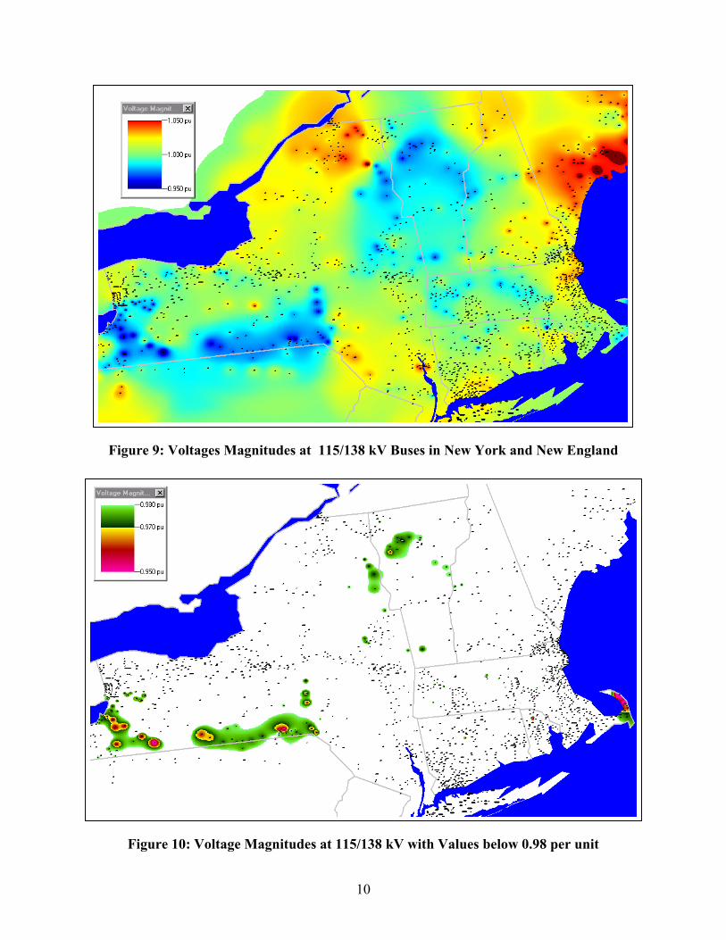
Figure 9: Voltages Magnitudes at 115/138 kV Buses in New York and New England
10
Figure 10: Voltage Magnitudes at 115/138 kV with Values below 0.98 per unit
11
Contouring of bus information need not be restricted just to voltage magnitudes. Electricity markets are increasingly moving towards spot-market based market mechanisms with the United Kingdom, New Zealand, California Power Exchange in the Western US, and PJM Market in the Eastern US as current examples. In an electricity spot-market, each bus in the system has an associated price. This price, denoted as the locational marginal price (LMP), is equal to the marginal cost of providing electricity to that point in the network. Contouring this data could allow market participants to quickly assess how prices vary across the market. As an example, Figure 11 shows a contour of hypothetical LMPs at about 2200 buses in the U.S. Northeast (data for Canadian buses was not included in this study). From the figure the areas of high and low prices are readily apparent.
However, Figure 11 also indicates a potential shortcoming with using a continuous color contour. That is, while the areas of high and low prices are readily apparent, it would be relatively difficult from the contour to even approximate the actual LMP at a particular bus. This is due to the continuous color variation in the contour key, along with the lack of significant color variation in the midrange of the key. One partial solution to this problem is to use the so-called “hint” functionality in which a small popup window automatically appears indicating the contour’s numerical value anytime a user positions the cursor on the desired bus. This hint functionality was added to the Chapter 4 EMS implementations at the request of the system operators.
An alternative approach to the use of a continuous contour color key is to use a discrete color key. A discrete key is one which maps all the values within a particular range to a single color. A common application of a discrete color key is again the temperature maps shown in many newspapers. The advantage of the discrete key is it allows ready identification of the location of values within a specified range. The disadvantage is it is impossible to determine the exact value within the range. Figure 12 shows a discrete contour of the Figure 11 LMP data with all values with a $ 5/MWh range mapped to a single color. For many power applications, including bus voltage magnitude and LMP visualizations, a discrete color key is probably preferable.
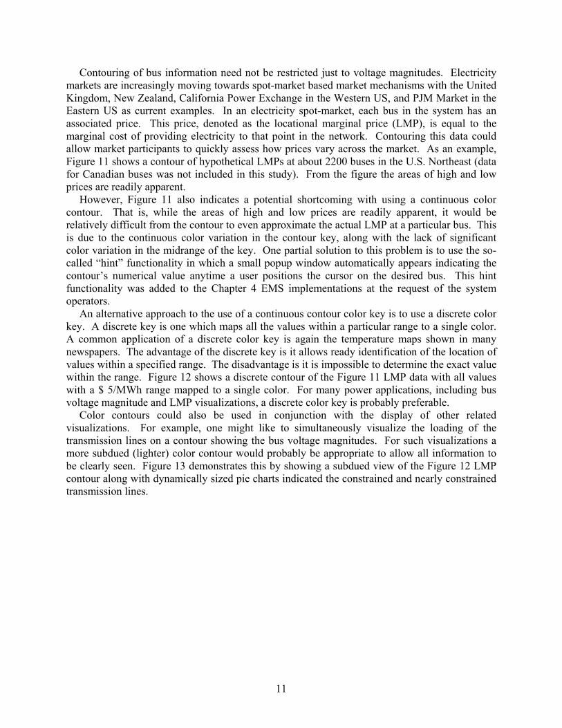
Color contours could also be used in conjunction with the display of other related visualizations. For example, one might like to simultaneously visualize the loading of the transmission lines on a contour showing the bus voltage magnitudes. For such visualizations a more subdued (lighter) color contour would probably be appropriate to allow all information to be clearly seen. Figure 13 demonstrates this by showing a subdued view of the Figure 12 LMP contour along with dynamically sized pie charts indicated the constrained and nearly constrained transmission lines.

Figure 11: Hypothetical Northeast LMPs Using a Continuous Contour Key
12
Figure 12: Hypothetical Northeast LMPs Using a Discrete Contour Key
2
bpctlSagsd5cs
ORRINGTN
DETROIT
BELFAST
GRAHAM
WILLIAMS
WYMANBIGELOW
CONUS
HARRIS
GUILF PH
GORBELLHARTLAND
S83B TAP
LAKEWOOD
MADISON
S83C TAP
S67A TAP
RICERIPS
LOST NAT
POTOK PH
SMITH HY
S86B TAP
SEA
13
Figure 13: Subdued Northeast LMP Contour with Line Pie Charts
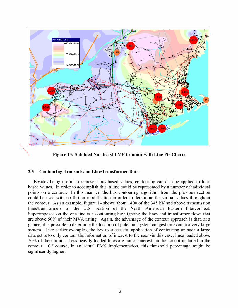
.3 Contouring Transmission Line/Transformer Data
Besides being useful to represent bus-based values, contouring can also be applied to line-ased values. In order to accomplish this, a line could be represented by a number of individual oints on a contour. In this manner, the bus contouring algorithm from the previous section ould be used with no further modification in order to determine the virtual values throughout he contour. As an example, Figure 14 shows about 1400 of the 345 kV and above transmission ines/transformers of the U.S. portion of the North American Eastern Interconnect. uperimposed on the one-line is a contouring highlighting the lines and transformer flows that re above 50% of their MVA rating. Again, the advantage of the contour approach is that, at a lance, it is possible to determine the location of potential system congestion even in a very large ystem. Like earlier examples, the key to successful application of contouring on such a large ata set is to only contour the information of interest to the user -in this case, lines loaded above 0% of their limits. Less heavily loaded lines are not of interest and hence not included in the ontour. Of course, in an actual EMS implementation, this threshold percentage might be ignificantly higher.
WAYNE
02SHNAGO
02HOYTDL
KEYSTONE
01CABOT
JUNIATA
LIMERICK
SUNBURY
SUSQHANA
ALBURTIS
WHITPAIN
ELROY
HOSENSAK
WINDSOR
DEANS
WESCOVLE
LUDLOW
MILLSTNE
MANCHSTR
NOBLMFLD
MEEKVL J
LONG MTN
FRSTBDGE SOUTHGTN
E.SHORE
PLUMTREE
MANH381
VT YANK
SCOB 345
AMHST345
W MEDWAY
BRAYTN P
BUXTON
TIMBR345
NWGTN345
SANDY PD
S.GORHAM
ME YANK
MASON
MAXCYS
HOMER CY
WATRC345
OAKDL345
COOPC345
GILB 345
LEEDS 3
SHOEMTAP
ROSETONBUCH S
VOLNEY
OS POWER
SHERMAN
WFARNUM
MILLBURY
NEA
PILGRIMCARP HL
BRANCHBG
MAXCYS
AUG E S
BOWMAN
GULF ISL
HOTEL RD
NORWAY
KIMBL RD
SUROWIEC
RAYMOND
WOODSTK
RUMF PH
BOISE CA
S89A TAP LIVERMOR
STURTVNT
MADSN PH
S 63B TP
WINSLOW
LOVELL
SACO VLY
SACO VLY
WHITE LK
INTERVALTAMW PF
BEEBE
ASH TAP
PEMI
WEBSTER
ASHLAND
NORTH RDASCUTNEY
OAK HILL
MERRMACK
MERMK230
COMERFRDINTNL PP
S200A TP
BOURNE
ACUSHNET
SOMERSET
BRNSTBL
WELLFLT
ORLEANS
HARWC TP
HARWIC A
HYNGE3TP
HYN GE3
MASHPEE
HATCH
FLMTH TP
FAL GE
FAL FPE
OTIS
HYN GE2
COOLIDGEW RUTLND
BLISSVIL
W RUT TP
FLORENCE
MIDDLBRY
RUTLANDCOLD RIV
NEW HAVN
MDBY CAP
WILLISTN
ESSEX
GRANITE
GRANITE
MIDDLSEX
IBM K24 MIDDL PH
BERLIN
BRLN CAP
IBM K21
GEORG TP FAIRFAX
ST ALBAN
HIGHGATE
MOOREC03
COMRF 1T
COMRF 2TCOMRF 3T
COMRF 4T
COMF DC
WHITEFLD
BERLIN
MOORE
LITTLTN
WOODSTKH
U199 TAP
IRASBURG
ST.JOHNS
ST.J PH
LITTLETN
LITT TP4MOORED04
W.KINGST
MYSTICCT
WHIP JCT
KENYON
WOOD RIV
PARK ST.
S206A TP
HIGHLAND
DRAG CEM
S.GORHAM
S250A TP
3 RIV 2
Q HILL
W.BUXTON
3 RIVERS
DOVERMADBURY
PRATT
140-250
SANFORD
BRNCHBRK
163-250
MASON
TOPS81TP
TOPS69TP
BATH
S69A TAP
S167A TP
PRIDESCR
BOLT HL
JACKMAN
SLAYTON
MTSUP149
MT.SUPPT
WILDER
HARTFORD
CHELSEA
PINE HIL
SCHILLER
SCOBIE2
KNGSTNTP
SCOBE2A
RESISTCENEWTN SS
RIMMON
EDDY
S MILFRD
BRIDG ST
CHESTER
WALTHAM
EBEV192
BRANFORD
GREEN HL
BOKUM
BRSWAMP
CHIPP TP
CHIP HIL
CAMPV PH
TORR TER
FRKLN DR
WEINGART
CANTON
E.SHORE
GRAND AV
FARMNGTN
NEWINGTN
N.BLMFLD
LACONIA
GARVINS
ROCHESTR
ROCH TAP
ASCUT PF
WINDSOR
ASCT CAP
GRDNVL2
CLAY
HALEY115
GRNDG115
FLATS115
EELPO115
MORAI115
BENET115
BATH 115
STA 162
ALLEGENY
HOUGHTON
INDEC115
KAMIN115
WATRC230
OAKDL230
ROBBL115
OAK2M115
RANGH115
MORGN115
LANGD115
S.OWE115
PALMT115
ANDOVER1
NILE115
DUGN-157
HOMERHIL
ARCADE
SPVL-152
MORTIMER
KATEL115
HAZEL115
MTNDL115
ROCKH115
VIN T115
VINEGAR
COLER115
RICHF115 E.SPR115
E.NOR115
C.LIN115
BROTH115
WILET115
ETNA 115
LAUREL L
GRDNVL1
BETH-150HARBFRT0
BETH-149
HARBFRT9
N.WAV115LOUNS115
MONTR115
CODNT115
CORN TP1
E.ITH115
HYATT115
FRMGTN-4
MILKN115
TULLY CT
CORTLAND
LABRADOR
TULLER H
MALLORY
LTHSE HL
HAM-CKTP
9 MI PT
SLEIG115
S216
STA 424
PTSFD-23
S82-2115
STA 158S
STA 158N
S82-1115
S113 115
S418 115
S33 902
BATAVIA1
EBAT-119
SENECAP
EBAT-107
NAKR-108
SHAW-103HOOKRN85
PRAXAIR5HOOKRN86
PRAXAIR6
CARR CRN
COLDS115
W.ERI115
HICK 115
CATON115
HILSD115
RIDGT115
RIDGR115
ERIE 115
DEPEW115
N.BRW115
ECWA-181
DELPHI
MADISON
AVA-USAF
LOWVILLE
BU+LY+MO
BRNS FLS
FLAT RCK
FIVE FLSBLAKE
STARK
FRFX CAP
PARISHVL
NICHOLVL
MALONE
LK COLBY
WILL 115
CHATP115
BRAIN115
KENTS115
FLATR115
REACTOR
ASHLY115
NOEND115
PMLD 2
PMLD 3
PMLD 1
WILLIS W
MCINTYRE
COFFEEN
BLACK RV
NY AIR BGLEN PRK
BRADY
N.O-BRG
MRA-CANT
FT. DRUM
DEFERIET
N CARTHG
CLIMAX
E.SAYRE
TIFFANY
STOLE230
MEYER230
HILSD230
HAMLT115FRPRT-LI
ADRON B2
COLTON G
MOS 115
HURLEY 3
WHITEHAL
COMSTOCK
MOHICAN
BATKILL
BUTLER
SPIER
QBURY
SHERMANOGN BRK5
GRT MDWS
BURGOYNE
CEDAR
TICN+OTN
HAGUE4
NLEAD115
PORT HEN
REPUBLIC
BARTN115
BROOK W
BAL TP W
BROOK1
SMITHBR1
WEIBEL1
SWAGRT E
SHOEMTAP
SUGARLF
SHOEM
MODENA 1
E.WALD 1
OHIOVLE1
N.CAT. 1
MILAN
PL.VAL 1
HUDSON
HIGHLAND
MARLBORO
BNNINGTNHOOSICK
WOODLAND
GRANVL J
SOUTHWCK
PLEASANT
BLANDFRD
ELM
AIRCO 2T
BLUES-8
INDEP C
N.SAL115
MULBR115
INDECK-C
BURDECK
ALTAMONT
WLTHM PS
WALTHAM
DAVIS 90
WASHNGTN
AYER
FLAGG PD
ASHBR136
E WINCHS
NEWCASTL
ME YANK
KINGS CE
BROOK ST
HRTFD PH
MECO 115
BIDD I P
WLST CAP
Q CITY
HARWOOD
SIEGFRED
FRCKVLLE
MTN CRK
ELDRED
SUNBURY
JUNIATA
LEWISTWN
YEAGRTWN
DAUPHIN
HUMELSTN
N.HERSHY
LYONS
ALBURTIS
96%
96%
98%98%
96%
97%
96%95%96%
99%99%
100%
100%
100%
100%
98%
99%
100%100%
100%

14
Figure 14: Eastern Interconnect Line Loading Contour
Line contouring can also be used to visualize transmission line power transfer distribution factors (PTDFs) for a large system. In short, a PTDF value shows the incremental impact a power transfer from a specified source to a specified sink would have upon each power system element. For example, if a line has a PTDF value of 10% that means that 10% of the power transfer would flow on that line. Thus, if the power transfer is 300 MW, the line’s MW loading would change by 30 MW. Figure 15 shows the PTDFs for a proposed transaction from Wisconsin to TVA. The PTDFs are calculated using the 30,000 bus, 41,000 line model used earlier. From the figure it is readily apparent how the transfer flows throughout the system. PTDF contours are especially useful because of their more continuous nature. One can quickly look at this contour map and see which parts of the system experience increases in line loadings.
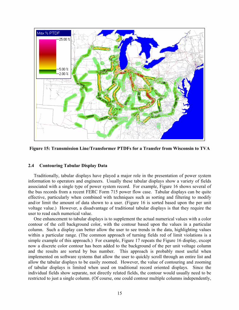
Fig
2.4
Tinfoassothe effeandvoltuser
Oconcoluwithsimnowandimpalloof tindirest
15
ure 15: Transmission Line/Transformer PTDFs for a Transfer from Wisconsin to TVA
Contouring Tabular Display Data
raditionally, tabular displays have played a major role in the presentation of power system rmation to operators and engineers. Usually these tabular displays show a variety of fields ciated with a single type of power system record. For example, Figure 16 shows several of bus records from a recent FERC Form 715 power flow case. Tabular displays can be quite ctive, particularly when combined with techniques such as sorting and filtering to modify /or limit the amount of data shown to a user. (Figure 16 is sorted based upon the per unit age value.) However, a disadvantage of traditional tabular displays is that they require the to read each numerical value. ne enhancement to tabular displays is to supplement the actual numerical values with a color
tour of the cell background color, with the contour based upon the values in a particular mn. Such a display can better allow the user to see trends in the data, highlighting values in a particular range. (The common approach of turning fields red of limit violations is a
ple example of this approach.) For example, Figure 17 repeats the Figure 16 display, except a discrete color contour has been added to the background of the per unit voltage column
the results are sorted by bus number. This approach is probably most useful when lemented on software systems that allow the user to quickly scroll through an entire list and w the tabular displays to be easily zoomed. However, the value of contouring and zooming abular displays is limited when used on traditional record oriented displays. Since the vidual fields show separate, not directly related fields, the contour would usually need to be ricted to just a single column. (Of course, one could contour multiple columns independently,
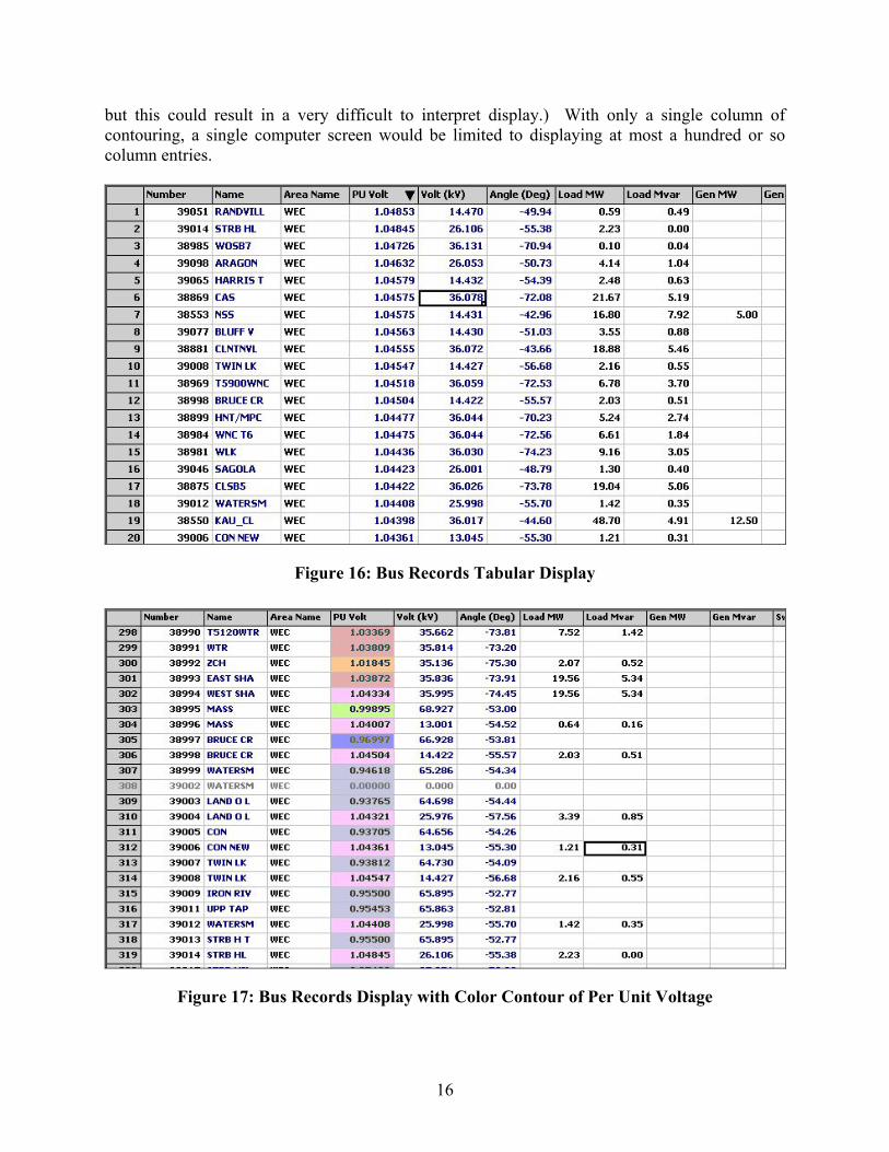
16
but this could result in a very difficult to interpret display.) With only a single column of contouring, a single computer screen would be limited to displaying at most a hundred or so column entries.
Figure 16: Bus Records Tabular Display
Figure 17: Bus Records Display with Color Contour of Per Unit Voltage
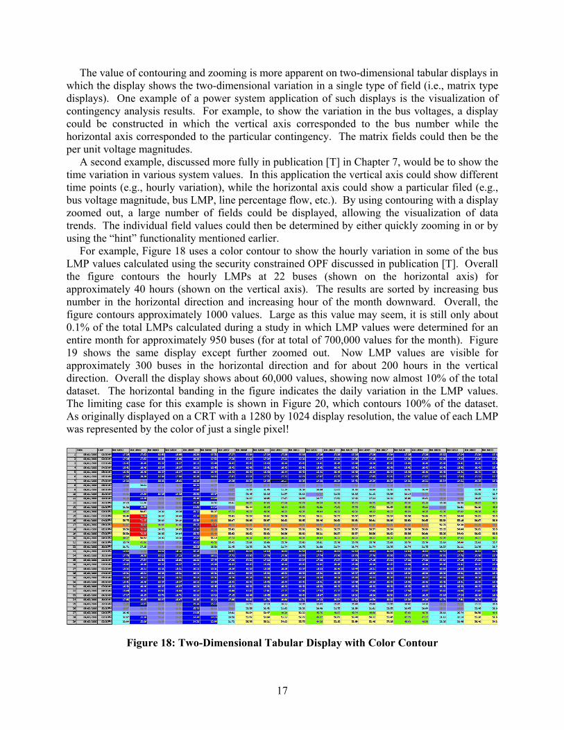
17
The value of contouring and zooming is more apparent on two-dimensional tabular displays in which the display shows the two-dimensional variation in a single type of field (i.e., matrix type displays). One example of a power system application of such displays is the visualization of contingency analysis results. For example, to show the variation in the bus voltages, a display could be constructed in which the vertical axis corresponded to the bus number while the horizontal axis corresponded to the particular contingency. The matrix fields could then be the per unit voltage magnitudes.
A second example, discussed more fully in publication [T] in Chapter 7, would be to show the time variation in various system values. In this application the vertical axis could show different time points (e.g., hourly variation), while the horizontal axis could show a particular filed (e.g., bus voltage magnitude, bus LMP, line percentage flow, etc.). By using contouring with a display zoomed out, a large number of fields could be displayed, allowing the visualization of data trends. The individual field values could then be determined by either quickly zooming in or by using the “hint” functionality mentioned earlier.
For example, Figure 18 uses a color contour to show the hourly variation in some of the bus LMP values calculated using the security constrained OPF discussed in publication [T]. Overall the figure contours the hourly LMPs at 22 buses (shown on the horizontal axis) for approximately 40 hours (shown on the vertical axis). The results are sorted by increasing bus number in the horizontal direction and increasing hour of the month downward. Overall, the figure contours approximately 1000 values. Large as this value may seem, it is still only about 0.1% of the total LMPs calculated during a study in which LMP values were determined for an entire month for approximately 950 buses (for at total of 700,000 values for the month). Figure 19 shows the same display except further zoomed out. Now LMP values are visible for approximately 300 buses in the horizontal direction and for about 200 hours in the vertical direction. Overall the display shows about 60,000 values, showing now almost 10% of the total dataset. The horizontal banding in the figure indicates the daily variation in the LMP values. The limiting case for this example is shown in Figure 20, which contours 100% of the dataset. As originally displayed on a CRT with a 1280 by 1024 display resolution, the value of each LMP was represented by the color of just a single pixel!
Figure 18: Two-Dimensional Tabular Display with Color Contour

18
Figure 19: Two-Dimensional Tabular Display Zoomed Out
Figure 20: Contour of Complete LMP Results

19
The value of such high density tabular contours depends upon the application in general, and more particularly, upon the relationship between adjacent values. In the last example there was a strong relationship in the vertical direction since vertically adjacent cells represent the LMP values at the same bus for the preceding and next hour. Certainly we would expect at least some correlation in these values, which indeed is evident by the daily banding. In contrast, the correlation between values in the horizontal direction is completely dependent upon the ordering scheme used in assigning bus numbers. In this case, in which bus numbers were assigned at least somewhat geographically (e.g., with adjacent generators numbered consecutively) there is at least some vertical banding. Indeed, two of the results apparent from Figure 20 are 1) the LMPs at most buses vary in synchronism, and 2) there are groups of buses that have fairly consistent LMPs, indicated by the vertical bands in the figure. The application of this type of display to other power system dataset requires further research. The next chapter explores the application of 3D visualization to power systems.
20
Chapter 3 Three-Dimensional Power System Visualization
In analyzing power systems, one is usually confronted with a large amount of multivariate data. For example, in a simple power flow data of interest could include a potentially large list of independent and dependent variables, such as bus voltage magnitudes, transmission line loadings, generator real and reactive reserves, transformer tap and phase positions, scheduled and actual flows between areas, and interface loadings. In more advanced applications, such as the optimal power flow (OPF), contingency analysis, and available transmission capacity (ATC) calculations, this list of variables is even longer. This chapter presents results on the use of an interactive 3D visualization environment to assist in analyzing this vast amount of information.
3.1 Interactive 3D Visualization Environment Architecture
In developing such an environment, several key issues must be addressed. First and foremost, in visualizing power system data there is usually no corresponding “physical” representation for the variables. For example, there is no physical representation for the reactive power output of a generator, or for the percentage loading of a transmission line. Rather, these values are typically shown as a numerical value on either a one-line diagram or in a tabular display. This contrasts with the use of interactive 3D for power system operator training in which the 3D environment seeks to mimic, as closely as possible, an existing physical environment. It also differs from the use of interactive 3D for some types of scientific visualization in which the purpose of the environment is to visualize physical phenomena, such as flows in a wind tunnel or molecular interactions. To address this issue, an environment based upon the common one-line representation serves as a starting point. The new environment differs from the one-line in that a one-line is a 2D representation, whereas the new one is 3D. How this third dimension can be ex-ploited is covered in the remainder of this chapter.
The second issue is the 3D environment must be highly interactive. In power systems there is simply too much data to simultaneously display all the data that may be of interest. Rather the user should be able to quickly and intuitively access the data of interest.
A third issue is the decision on the hardware and software to use to implement it. For pragmatic reasons, such as budget constraints and the ability to use existing software, the environment described here is based upon the widely available PC platform and uses standard input devices, such as a mouse and keyboard, for the interactive control. A benefit to this approach is that it allows the potential to make it available to a wide variety of users, without requiring new hardware. Furthermore, there is nothing that precludes augmenting the environment in the future to include more specialized hardware, such as 3D mice, shutter glasses to simulate stereoscopic vision, and head-mounted displays.
For software, an existing power system analysis platform was modified to allow 3D drawing and interaction using OpenGL. With OpenGL, most of the software modifications necessary to support a 3D environment, such as viewpoint perspective transformations, hidden surface removal, lighting, and the transformations for stereoscopic viewing, are handled almost transparently. Building upon an existing platform allowed easy development of 2D one-lines, that could then be seamlessly used as the basis for the 3D environment and also allowed it to be interactive so that, for example, when the user clicked on a circuit breaker, a power flow is solved, resulting in a new system state.

21
To introduce the environment, Figure 21 shows a traditional 2D one-line for a small thirty bus system, augmented using animation to show the system flows. Figure 22 shows the same one-line in the 3D environment, with the exception that now, generators are represented using cylinders of potentially varying heights. The one-line has been mapped into 3D using a perspective projection. The one-line is now oriented in the xy-plane (horizontal plane), while the generators extend in the z (vertical ) direction. In Figure 22 the height of each generator cylinder is proportional to its maximum real power capacity. The height of the orange portion of the cylinder is proportional to current output of the generation, while the green portion indicates reserve capacity available.
Figure 21: Traditional One-line View of Thirty Bus System
5.10 MW 63.69 MW
12.42 MW
12.42 MW
35.58 MW
20.74 MW
30-Bus Case Demo Case
N 1.000
3
1
4
2
576
28
10
119
8
22 2125
26
27
24
15
14
16
12
17
18
19
13
20
23
29 30
6 MW
13 MW
12 MW
1 MW
1 MW 31 MW
197.70 MWDemand
13 MW
199.95 MWGeneration
1268.94 $/hr Cost
61%
64%
61%
52%
2.25 MWLosses
80%
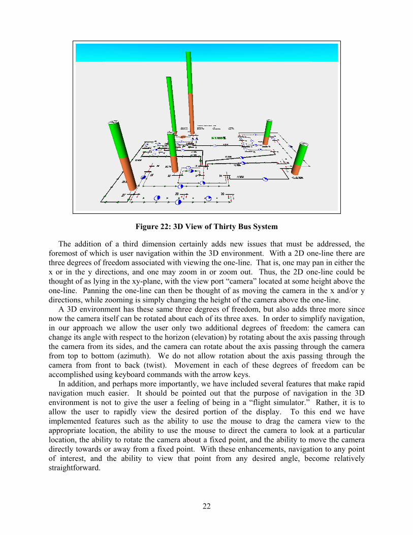
The foremosthree dex or in thoughtone-linedirectio
A 3Dnow thein our change the camfrom tocamera accomp
In adnavigatienvironallow timplemapproprlocationdirectlyof interstraightf
22
Figure 22: 3D View of Thirty Bus System
addition of a third dimension certainly adds new issues that must be addressed, the t of which is user navigation within the 3D environment. With a 2D one-line there are grees of freedom associated with viewing the one-line. That is, one may pan in either the the y directions, and one may zoom in or zoom out. Thus, the 2D one-line could be of as lying in the xy-plane, with the view port “camera” located at some height above the . Panning the one-line can then be thought of as moving the camera in the x and/or y ns, while zooming is simply changing the height of the camera above the one-line. environment has these same three degrees of freedom, but also adds three more since
camera itself can be rotated about each of its three axes. In order to simplify navigation, approach we allow the user only two additional degrees of freedom: the camera can its angle with respect to the horizon (elevation) by rotating about the axis passing through era from its sides, and the camera can rotate about the axis passing through the camera p to bottom (azimuth). We do not allow rotation about the axis passing through the from front to back (twist). Movement in each of these degrees of freedom can be lished using keyboard commands with the arrow keys. dition, and perhaps more importantly, we have included several features that make rapid on much easier. It should be pointed out that the purpose of navigation in the 3D ment is not to give the user a feeling of being in a “flight simulator.” Rather, it is to he user to rapidly view the desired portion of the display. To this end we have ented features such as the ability to use the mouse to drag the camera view to the iate location, the ability to use the mouse to direct the camera to look at a particular , the ability to rotate the camera about a fixed point, and the ability to move the camera towards or away from a fixed point. With these enhancements, navigation to any point est, and the ability to view that point from any desired angle, become relatively orward.
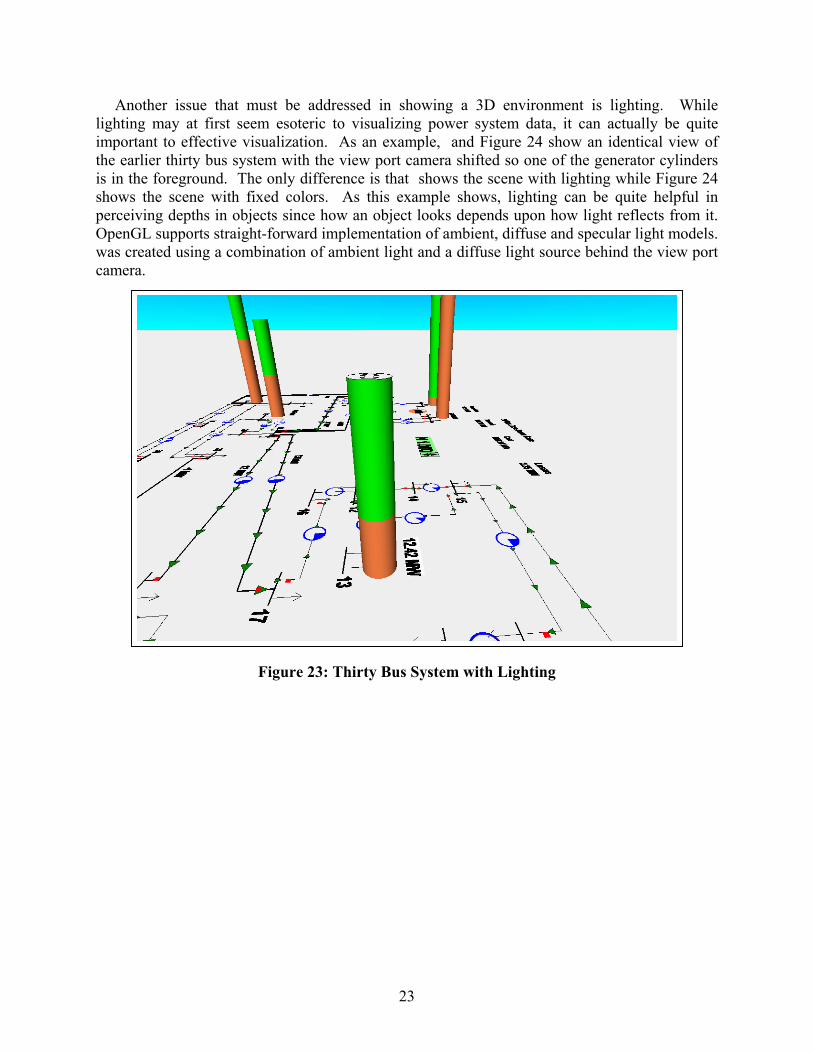
Another issue that must be addressed in showing a 3D environment is lighting. While lighting may at first seem esoteric to visualizing power system data, it can actually be quite important to effective visualization. As an example, and Figure 24 show an identical view of the earlier thirty bus system with the view port camera shifted so one of the generator cylinders is in the foreground. The only difference is that shows the scene with lighting while Figure 24 shows the scene with fixed colors. As this example shows, lighting can be quite helpful in perceiving depths in objects since how an object looks depends upon how light reflects from it. OpenGL supports straight-forward implementation of ambient, diffuse and specular light models. was created using a combination of ambient light and a diffuse light source behind the view port camera.
23
Figure 23: Thirty Bus System with Lighting
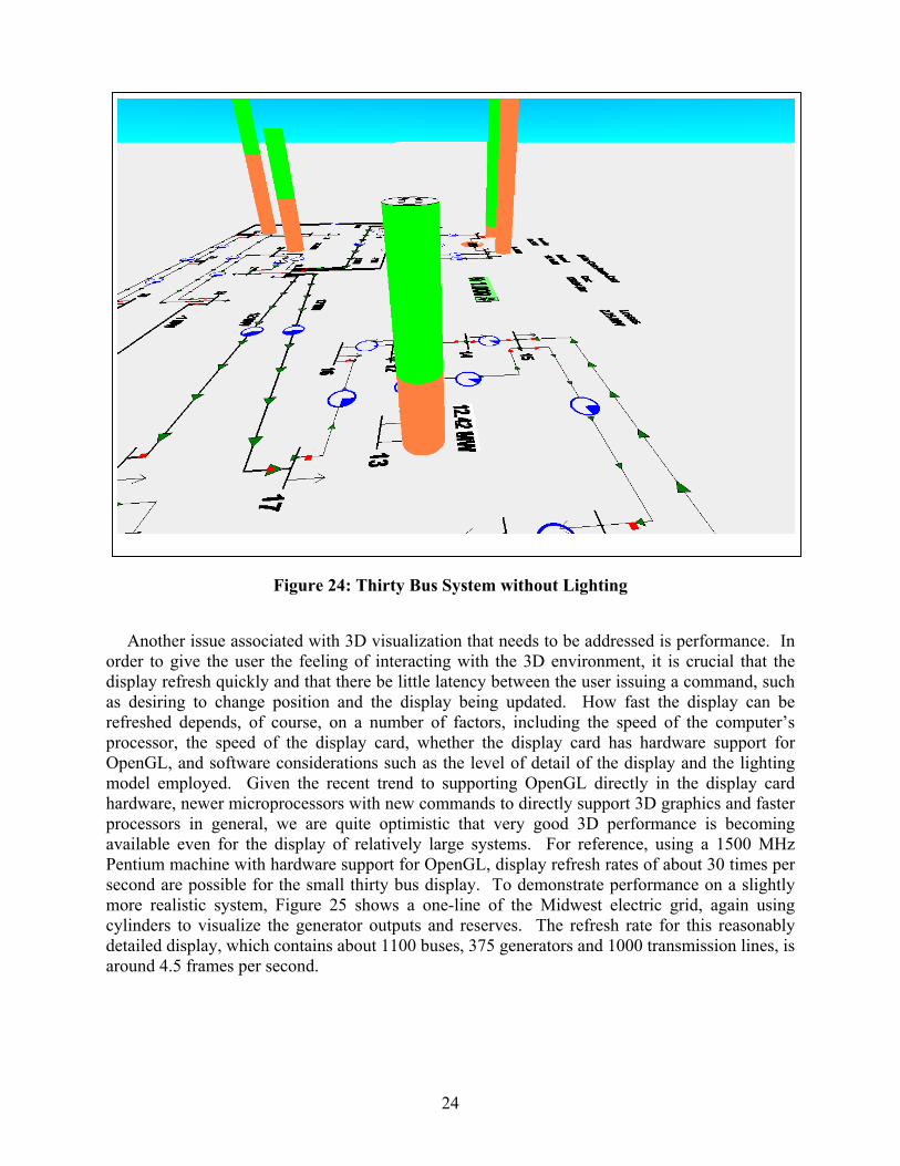
24
Figure 24: Thirty Bus System without Lighting
Another issue associated with 3D visualization that needs to be addressed is performance. In order to give the user the feeling of interacting with the 3D environment, it is crucial that the display refresh quickly and that there be little latency between the user issuing a command, such as desiring to change position and the display being updated. How fast the display can be refreshed depends, of course, on a number of factors, including the speed of the computer’s processor, the speed of the display card, whether the display card has hardware support for OpenGL, and software considerations such as the level of detail of the display and the lighting model employed. Given the recent trend to supporting OpenGL directly in the display card hardware, newer microprocessors with new commands to directly support 3D graphics and faster processors in general, we are quite optimistic that very good 3D performance is becoming available even for the display of relatively large systems. For reference, using a 1500 MHz Pentium machine with hardware support for OpenGL, display refresh rates of about 30 times per second are possible for the small thirty bus display. To demonstrate performance on a slightly more realistic system, Figure 25 shows a one-line of the Midwest electric grid, again using cylinders to visualize the generator outputs and reserves. The refresh rate for this reasonably detailed display, which contains about 1100 buses, 375 generators and 1000 transmission lines, is around 4.5 frames per second.

25
Figure 25: 3D View of Midwest Electric Grid
3.2 Voltage and Reactive Power Visualization
The next sections present two additional examples of how interactive 3D could be used for the display of power system information. These include examples of both power system security and power system ATC information. The first example concerns the visualization of power system voltage magnitudes and generator reactive power outputs and reserves. It is well known that generator reactive power injections and bus voltage magnitudes are related. In studying the voltage security of a system, one is often interested in knowing both the location and magnitude of any low system voltages, and also the current reactive power output and the reactive reserves of the generators. Of course, if the system is extremely small, all of this information could be shown numerically on a one-line.
As was mentioned in the last chapter, an alternative for larger systems is to visualize the voltage magnitudes using a color contour. However, a difficulty with using a color contour on a 2D display is that it makes the display of other information difficult. An supplementary approach is to use 3D with the voltage contour shown in the xy-plane (actually slightly below the xy-plane in which the one-line resides). The z direction can then be used to show generator or other reactive information. Such an implementation is shown in Figure 26 where the height of each generator cylinder is now proportional to the maximum reactive capacity of the generator; the darker region on the lower portion of the cylinder is proportional to the current reactive output, while the lighter top portion represents the var reserves. The bus voltage values are
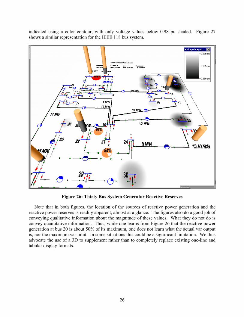
26
indicated using a color contour, with only voltage values below 0.98 pu shaded. Figure 27 shows a similar representation for the IEEE 118 bus system.
Figure 26: Thirty Bus System Generator Reactive Reserves
Note that in both figures, the location of the sources of reactive power generation and the reactive power reserves is readily apparent, almost at a glance. The figures also do a good job of conveying qualitative information about the magnitude of these values. What they do not do is convey quantitative information. Thus, while one learns from Figure 26 that the reactive power generation at bus 20 is about 50% of its maximum, one does not learn what the actual var output is, nor the maximum var limit. In some situations this could be a significant limitation. We thus advocate the use of a 3D to supplement rather than to completely replace existing one-line and tabular display formats.
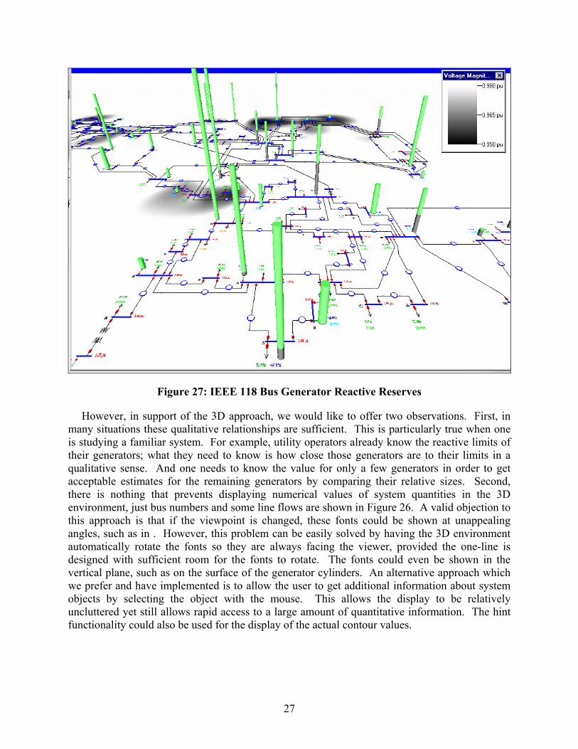
27
Figure 27: IEEE 118 Bus Generator Reactive Reserves
However, in support of the 3D approach, we would like to offer two observations. First, in many situations these qualitative relationships are sufficient. This is particularly true when one is studying a familiar system. For example, utility operators already know the reactive limits of their generators; what they need to know is how close those generators are to their limits in a qualitative sense. And one needs to know the value for only a few generators in order to get acceptable estimates for the remaining generators by comparing their relative sizes. Second, there is nothing that prevents displaying numerical values of system quantities in the 3D environment, just bus numbers and some line flows are shown in Figure 26. A valid objection to this approach is that if the viewpoint is changed, these fonts could be shown at unappealing angles, such as in . However, this problem can be easily solved by having the 3D environment automatically rotate the fonts so they are always facing the viewer, provided the one-line is designed with sufficient room for the fonts to rotate. The fonts could even be shown in the vertical plane, such as on the surface of the generator cylinders. An alternative approach which we prefer and have implemented is to allow the user to get additional information about system objects by selecting the object with the mouse. This allows the display to be relatively uncluttered yet still allows rapid access to a large amount of quantitative information. The hint functionality could also be used for the display of the actual contour values.
28
3.3 Visualizing Available Transfer Capability
The next 3D example is the display of available transfer capability (ATC) and generation reserves. ATC measures the ability of an energy market participant to transact power with other market participants given the limited capacity of the transmission system. ATCs set upper bounds on how much a market participant, for example a transmission-owning control area, can export to or import from another market participant, given the limited capacity of the transmission system.
While ATCs play a key role in helping mitigate congestion on the transmission system, the limits they impose can have profound implications on days when system conditions are sufficiently stressed that a region has inadequate reserves to meet its load. For example, if a control area that has insufficient generation to meet its load also has inadequate ATC to import power from its neighbors, it will have to shed load to alleviate the deficiency. However, even if the deficient area does have positive ATC for importing power from a neighbor, it will be unable to receive support if that neighbor also has inadequate generation reserves. In this case, the area's import capability is limited by generation constraints rather than transmission constraints. ATC values do not convey this limit because ATCs are purely transmission quantities.
One approach to visualizing this situation in 3D is to represent each of the operating areas using a bubble diagram approach. However, rather than showing the areas using ellipses in 2D space, they can be shown in 3D space as scaled cylinders whose heights are proportional to the generation reserves in each area. ATC for imports to or exports from, a particular area can then be shown in the xy-plane using a contour. For example, Figure 28 shows the generation reserves for several areas in the Midwest portion of the Eastern Interconnect. The ATC values for imports to a particular area (Illinois Power in this example) are then shown using the contour. Thus, Figure 28 provides the participant a single view of the system that considers both types of transfer capability limitations.
One could employ similar views of transfer capability that provide equally valuable information. For example, a market participant, such as area A, might actually have excess capacity that it wishes to sell to other regions. A view that contours area A's export ATC in the XY plan and depicts generation costs along the Z axis would help match participant A with entities that would likely be most interested in purchasing its power for economic reasons. Alternatively, if power transfer distribution factors are contoured on the XY plane and import ATCs are represented as cylinders along the Z axis, area A can readily identify sources from which it can purchase energy without being subjected to line-loading relief curtailments, which typically use PTDF values as the criterion for deciding which transactions to freeze, curtail, or prohibit.
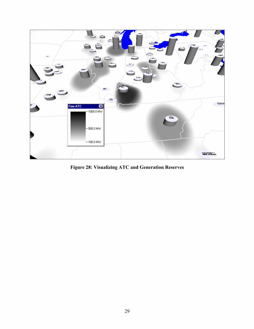
29
Figure 28: Visualizing ATC and Generation Reserves
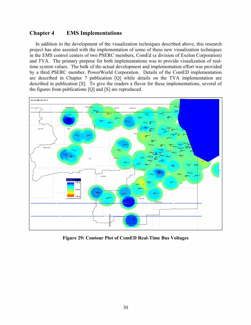
30
Chapter 4 EMS Implementations
In addition to the development of the visualization techniques described above, this research project has also assisted with the implementation of some of these new visualization techniques in the EMS control centers of two PSERC members, ComEd (a division of Exelon Corporation) and TVA. The primary purpose for both implementations was to provide visualization of real-time system values. The bulk of the actual development and implementation effort was provided by a third PSERC member, PowerWorld Corporation. Details of the ComED implementation are described in Chapter 7 publication [Q] while details on the TVA implementation are described in publication [S]. To give the readers a flavor for these implementations, several of the figures from publications [Q] and [S] are reproduced.
Figure 29: Contour Plot of ComED Real-Time Bus Voltages
McHenry Lake
CookKane
BooneWinnebago
Dekalb
Kendall
Lee
DuPage
Will
LaSalle
Carroll Ogle
Stephenson
Whiteside
Bureau
Grundy
Kankakee
LASCO; B BRAID; B
PLANO; B
LOMBA; B
LISLE; B
ITASC; B
PALAT; R
MONTG; B
SANDW; B
WOLFS; R
WAYNE; B
DIXON; B
W600 ; RN AUR; B
MARSEILE
ELECT; B
LOCKP; B
DRESD; B
NELSO; B
CHERR; B
WEMPL; B
BYRON; B
SILVE; B
R FAL; B
FREEP; SABRO; B
TOLLW; B
DP 46; B
NB159; B
WAUKE; B
LIBER; B
SCHAU; B
ZION ; B
JO 29; B
ROUND; B
SHORE; R
MCHEN; B
WOODS; BBELVI; B
MAREN; B
PH117; B
LANCA; R
WATER; B
BEDFO; B
BURNH; BB ISL; B
BLOOM; B
UNIVE; B
ROCKD; B
E ROC; B
GOLF ; B
WOODR; B
BOLIN; B
G ELL; B
DOWNE; BFRONT; B
PONTI;
MAZON; B
GLIDD; B
E FRA; B
GOODI; B
W CHI; B
MATTE; B
WILTO;
COLLI;
RIDGE; B
MCCOO; B
17SHEFLD
HENNE; T
OGLES; T
MARYL; B
CRYST; B
ELGIN; B
DUNDE; BHUNTL; B
ELMHU; B
SK 88; B
CONGR; B
C HEI; B
CLYBO; B
JEFFE; B
WARRE; B
BELLW; B
NATOM; B
TAYLO; B
CROSB; B
WHEEL; B
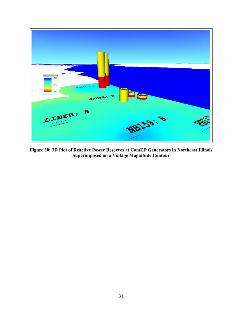
31
Figure 30: 3D Plot of Reactive Power Reserves at ComED Generators in Northeast Illinois Superimposed on a Voltage Magnitude Contour

ComEd Phase Shift Operation - 138 KV
32
Figure 31: ComEd Real-Time Phase Shifter Flow Display
NORTH;2I
CLYBO; R
CROSB; R
X440 ; R
JEFFE; R TAYLO; R
WASHI; R
SLINE;CALUM; R
WASHI; B
UNIVE; B
TAYLO; B
CLYBO; BCLYBN
X440 ; BDVRSY
CROSB; BCRSBYJEFFE; BJEF38 TAYLR UNIVR
HARBR
WSHPK
CALUM; BCALMT ST
FISK ; RFISK ; B
CRAWF;8ICRAWF;6ICRAWF;0I
CRAWF;7I
ROCKW; BROCKW; RRCKWL
FISK
CRWFD
NORTH;3SNORTH;8SNORTH;7INWEST
NATOM; R
NORRI; R
F PAR; RDP198;1I
NATOM; B
HIGGI; B
O PAR; B
RIDGE; B
DP 46;7IDS 46
HIGNS
DS198
NORRGNATMA
FRKPK OAKPK
CRAWF;YSCONGR; R
CONGR; B RIDGE; RRIDGE;9CRAWF;GS
CRWGY RIDGECNGRS
BEDFO; RBEDFO; B
SAWYE; RSAWYE; BBDFPK
4018
82074013
3705
45254527
8221
8223
1530315302
15301 17008
17404
13701
0708
1322
1324
1318
1317
0702
0
1326
1320
13151306
19209
1323
1321
1141311418
11417
11412
3706
3707
4607
19801
3709
67216723
4523
4522
3709
1320
1326
5825
5827
GRAND
45 MW 7 MVR 46 MVA
106 MW 7 MVR 106 MVA
-1 MW 0 MVR 1 MVA
-119 MW -29 MVR 123 MVA
-118 MW -8 MVR 118 MVA
-18 MW -1 MVR 18 MVA
-10 MW -17 MVR 20 MVA 0 MW
0 MVR 0 MVA
0 MW 0 MVR 0 MVA
47 MW -3 MVR 47 MVA
47 MW -17 MVR 50 MVA
-172 MW -16 MVR 173 MVA
-176 MW 5 MVR 176 MVA
-212 MW -54 MVR 219 MVA
-199 MW
204 MVA -43 MVR -69 MW
-7 MVR 69 MVA
-62 MW -14 MVR 64 MVA
96 MW -5 MVR 96 MVA
121 MW 7 MVR 121 MVA
70 MW 1 MVR 70 MVA
89 MW 8 MVR 90 MVA
-18 MW 14 MVR 23 MVA
-52 MW -37 MVR 64 MVA 18 MW
5 MVR 19 MVA
-94 MW -19 MVR 96 MVA
-93 MW -13 MVR 94 MVA
15 MW 2 MVR 15 MVA
7 7
87 MW 2 MVR -87 MVA
29 MW -17 MVR 34 MVA
9 -310
29 MW -4 MVR 29 MVA
208 MW 25 MVR 210 MVA
194 MW -22 MVR 195 MVA 72 MW
-72 MVR 102 MVA
-68 MW -4 MVR 68 MVA
0 MW 0 MVR 0 MVA
16 MW -17 MVR 23 MVA
-77 MW 38 MVR 86 MVA
29 MW -23 MVR 37 MVA
125 MW -79 MVR 148 MVA
66 MW -42 MVR 78 MVA
-65 MW -45 MVR 79 MVA
-44 MW 23 MVR 50 MVA
-131 MW -72 MVR-131 MVA
-13 MW -19 MVR 23 MVA
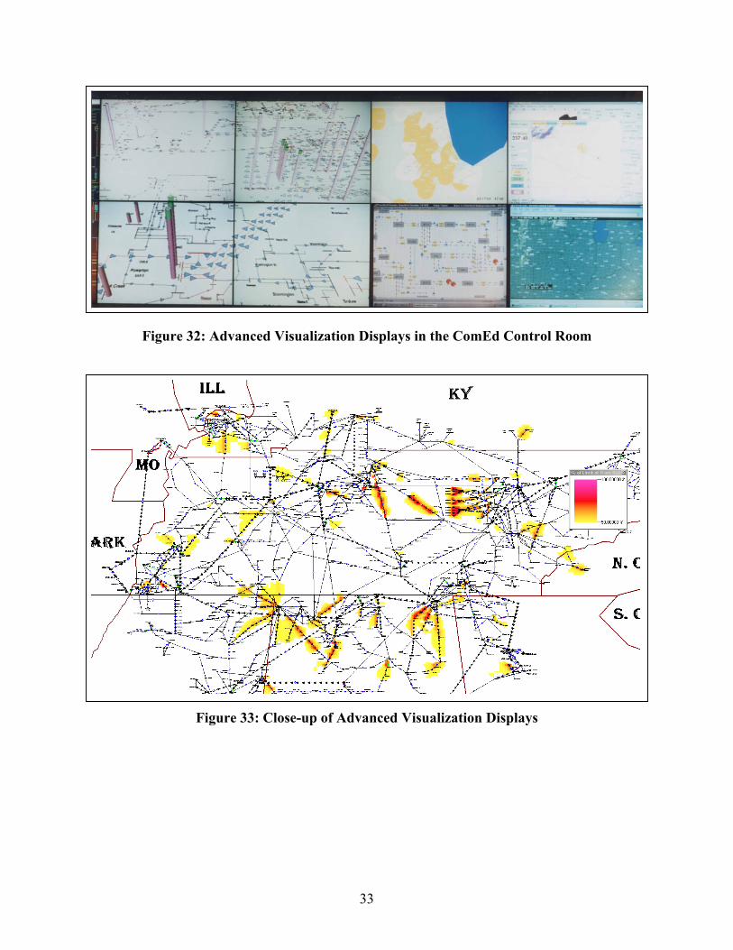
33
Figure 32: Advanced Visualization Displays in the ComEd Control Room
Figure 33: Close-up of Advanced Visualization Displays
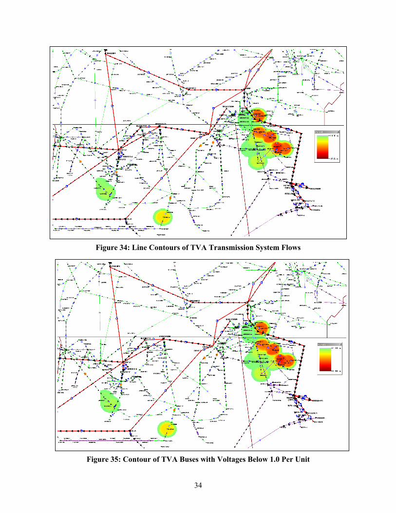
34
Figure 34: Line Contours of TVA Transmission System Flows
Figure 35: Contour of TVA Buses with Voltages Below 1.0 Per Unit

35
An important aspect of these EMS implementations was developing a productive relationship with the end user, the system operators. Overall the operators recognized the new displays as a significant enhancement of their previous system views. Beyond fashioning a quality deliverable, however, the development process also underscored important general guidelines that may benefit any data visualization effort. These emerged most often through the close dialog that transpired between the developers of the application and the operators who use it. The remainder of this chapter details these guidelines as reported in publication [Q].
When designing a visualization platform for real-time operations, it is imperative to keep system operators in the decision loop. This should perhaps be an obvious objective, but, unfortunately, it is often neglected. After all, the operators are the ones who will be using the platform and depending on it for guidance in performing their jobs. Since they work on the front lines of system security, they recognize and can express their needs most clearly. To maximize the benefit of the tool, therefore, the developer must seek and respond to the recommendations of those who will ultimately use the product.
There is also a behavioral benefit to embracing this philosophy. It is perhaps natural for professionals to resent and ultimately ignore tools and technologies that have been foisted upon them if they have not been consulted for their opinions and expertise. Legislating that an expert group adapt the way they perform their jobs carries an aura of, if not an actual element of, condescension. Neglecting to poll the target audience for its opinions not only sacrifices the quality of the resulting platform, but it also risks compromising its eventual acceptance. The effort to include the operators in designing the application resulted in a superior tool, immediately useful displays, and a more enthusiastic response.
How to seek and acquire input from the operators is primarily a question of style and company culture. The developer and the client may elect to take a formal approach involving interviews, formal specification documents, written requests for comment, and frequent prototypes. With this approach, the developer would first review the characteristics and uses of existing displays and how they apply to the operators’ responsibilities. He or she would then submit written surveys to operators requesting that they evaluate their current tools and prioritize their needs by answering close-ended questions. These surveys would then be supplemented by interviews with operators to gain additional detail. The results of the surveys and interviews would then be codified in formal requirements documents that the developer, the client’s management team, and the operators review for completeness and accuracy. Once the requirements are established, the developer would then begin crafting the application and the displays, offering the client opportunities to review prototypes to verify progress.
While the formal approach to soliciting operator involvement may certainly have merit in some situations, a far less formal approach was taken for this project. The operators’ dissatisfaction with the existing displays was well-known to management through frequent discourse. The key concerns that the operators raised were how cluttered the existing displays were, how difficult they were to see from across the room, and how their lack of flexibility limited the types of information they could show. The developer demonstrated its planning-mode visualization tool for the operators during an afternoon, and their positive comments and suggestions for applying the same ideas to their environment justified pursuing the development. Once the application had been written and the phase shifter and contouring displays were assembled, they were shown to the operators continuously on the video display board over several days. During this time, the developer and the client personnel who oversaw the project talked with the operators in the control room, asking for their comments, suggestions, and

36
questions. The developer then responded to their input by modifying the application and the system displays accordingly. This process continued over a few iterations, until an acceptable set of displays and the desired program behavior were realized. This iterative, prototype-intensive approach worked extremely well.
The operators were particularly helpful regarding the appearance and content of the one-line diagrams. The opinions they offered during trial runs of the application suggested a number of ideas regarding what constitutes an effective display. These include the following:
• Be wary of clutter. The benefit of tools such as line flow pie charts and animated arrows is that they convey not only the absolute sizes of transmission flows but also how the flows compare with device ratings. This benefit must not be compromised by filling the display with numerous, difficult-to-read text analogs that add no new information. While distinguishing useful features from clutter is somewhat subjective, the key criteria to consider are (1) whether the addition of a display item adds new, vital information or simply restates already existing information, and (2) when it is desirable to show the same information in multiple ways, can this be accomplished without consuming additional display area.
• Adhere to the theme of a display. For example, voltage contours show the variation of bus voltage with location. Showing transmission devices on such a display detracts from its purpose, adding extraneous components to what should be purely a bus-related plot.
• Exclude complicated details where appropriate. For example, notice how the phase shifter display of 0 represents buses not individually but rather as substations drawn as labeled boxes. The arrangement of buses within a substation is not relevant to the phase shifter display which aims to show how power flows into a chosen location, such as Chicago. Including individual bus connections would obfuscate the display’s primary content.
• Use color to focus the user’s attention, not to monopolize it. Color-coding flows, pie charts, and analogs to reflect warning conditions help sharpen the operator’s awareness of emerging problems. However, if a display employs an awkward mix of colors, exhibits poor color contrast, or employs a counter-intuitive color scheme that operators must ponder to interpret, the display will miss its mark. For example, the voltage contour originally shaded high voltages red and low voltages blue. This conflicted with the operators’ normal interpretation of red as suggesting the highest state of concern. Thus, the color scheme was changed to concur with the operators’ expectations.
• Respect the importance of time. Data can be called “real-time,” of course, only if it has been retrieved recently. The application’s displays include a time stamp in the upper left corner that indicates the time at which the data currently showing was fetched. The developer added this feature to increase operators’ awareness of the timeliness of the data before them.
Respecting these guidelines will result in more effective and expressive displays of real-time power system data. These will assist operators in recognizing and responding to system trends quickly and appropriately.

37
Chapter 5 Human Factors Testing
The last portion of this project focused on the performance of formal human factors experiments to evaluate the effectiveness of the new visualizations developed in Chapters 2 and 3, and implemented in Chapter 4. Overall, four experiments were conducted over the length of the project (one per semester) with each experiment involving undergraduate electrical engineering students recruited from the power systems classes at the University of Illinois at Urbana-Champaign. Each participant was required to have either completed, or be currently enrolled in, at least one class in the electric power systems area. Therefore, all participants had at least some familiarity with basic power system terminology and the use of one-line system models. The participants worked independently and were paid a nominal amount for their one hour participation in the experiments. This chapter provides the key results from these experiments, with more details provided in the Chapter 7 publications. For reference, publications [G], [M], and [R] refer to the first experiment, [N], [O] and [U] refer to the second experiment, while publication [P] describes the last two experiments.
5.1 Bus Voltage Contour Experiments
The first two experiments focused on quantifying the usefulness of color contours to display bus voltage magnitude information. The first experiment was done using a 30 bus power system model. During the course of that experiment the 30 bus system was subjected to a variety of different contingencies, each causing low voltage (defined as being below 0.95 per unit) at one or more buses. All but one of these contingencies involved line outages; the remaining contingency was a generator outage. Following each contingency the participants needed to perform two tasks: 1) acknowledge all the low voltage violations, and 2) switch in one or more capacitors in order to correct the low voltage violations. The system had a total of seven capacitors, all initially out-of-service, and was designed so each contingency could be corrected with the insertion of a single capacitor. The students were told to assume that the impedance of each transmission line was proportional to its length on the system one-line diagram, and that the capacitor that was electrically closest was always the correct choice.
Each participant saw one of three different visualizations of the system, Tabular, Oneline or Contour. As shown in Figure 36 the Tabular group only saw a tabular visualization of the system voltages and capacitors. The leftmost column on the display showed the 30 bus voltage magnitudes, sorted by bus number, while the column immediately to its right showed the status of the seven capacitors, again sorted by bus number. The remaining column showed the line(s) outaged by the contingency. (These data were needed for the students to correctly determine the electrically closest capacitor in the post-contingent system.) Voltages below the 0.95 threshold were shown using a red font, while those above this threshold were shown in blue. Following each contingency, the participants first had to acknowledge all the low voltage violations by clicking anywhere in the bus’s row. For each of the groups, the computer continually “beeped” until all the voltage violations were acknowledged. Then they had to correct the voltage violation by clicking on one or more capacitors to change the capacitor’s status. The tabular group did have access to a static system one-line diagram shown on a piece of paper taped to their desk. This diagram was identical to the one-line seen by the Oneline and Contour groups except it was obviously not dynamic and hence did not show the bus voltage magnitudes.

38
Figure 36: Tabular Group View of the 30 Bus System
As shown in Figure 37, the Oneline group only saw a dynamic one-line visualization of the system, with the bus voltage magnitude shown immediately to the right of the bus on the one-line. Voltages below the 0.95 threshold were drawn using a red font, while those above the threshold were drawn in black. Again, following each contingency the participants first had to acknowledge all the low voltage violations. This was done by clicking on the voltage magnitude field on the one-line. Then they had to correct the voltage violation by clicking on the capacitor’s circuit breaker symbol to change its status. Lines outaged by each contingency were drawn on the one-line using a dashed line (e.g., line 22 to 26 in the figure).
As shown in Figure 38, the Contour group saw the exact same representation as the Oneline group except in addition to seeing the voltage magnitude fields on the one-line, their one-line also contained a color contour of the voltage magnitudes. The contour color was chosen so buses with voltages below the threshold had a dark blue contour, while those above the threshold were contoured using a light cyan or yellow. The low voltage acknowledgement and capacitor switching procedures were identical to the Oneline group.
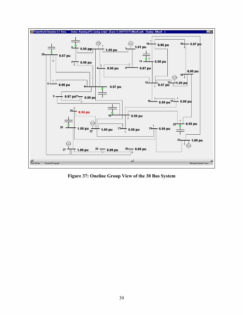
39
Figure 37: Oneline Group View of the 30 Bus System
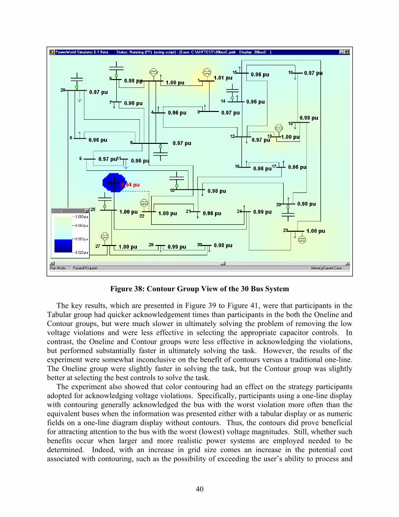
40
Figure 38: Contour Group View of the 30 Bus System
The key results, which are presented in Figure 39 to Figure 41, were that participants in the Tabular group had quicker acknowledgement times than participants in the both the Oneline and Contour groups, but were much slower in ultimately solving the problem of removing the low voltage violations and were less effective in selecting the appropriate capacitor controls. In contrast, the Oneline and Contour groups were less effective in acknowledging the violations, but performed substantially faster in ultimately solving the task. However, the results of the experiment were somewhat inconclusive on the benefit of contours versus a traditional one-line. The Oneline group were slightly faster in solving the task, but the Contour group was slightly better at selecting the best controls to solve the task.
The experiment also showed that color contouring had an effect on the strategy participants adopted for acknowledging voltage violations. Specifically, participants using a one-line display with contouring generally acknowledged the bus with the worst violation more often than the equivalent buses when the information was presented either with a tabular display or as numeric fields on a one-line diagram display without contours. Thus, the contours did prove beneficial for attracting attention to the bus with the worst (lowest) voltage magnitudes. Still, whether such benefits occur when larger and more realistic power systems are employed needed to be determined. Indeed, with an increase in grid size comes an increase in the potential cost associated with contouring, such as the possibility of exceeding the user’s ability to process and

41
compare multiple contour colors, as well the potential for increased clutter produced by multiple contour locations. The second experiment was formulated to try to address these issues.
0
0.5
1
1.5
2
2.5
3
Tabular Oneline Contour
Figure 39: First Experiment Time in Seconds to Acknowledge All Violations
0
2
4
6
8
10
12
Tabular Oneline Contour
Figure 40: Time in Seconds to Completely Correct Low Voltages

42
Figure 41: Mean Number of Capacitors Closed
The second experiment again focused on examining the impact of different voltage visualizations on the participant’s ability to detect and resolve voltage violations. Here the study system consisted of a modified version of the IEEE 118 bus system, with the system augmented to include thirteen switched capacitors. A one-line of this system is shown in Figure 42. During the experiment, the participants were each presented with a sequence of thirty different contingencies, with each contingency causing low voltages at one or more buses (with low defined here as being below 0.96 p.u.). The contingencies consisted of line and/or generator outages. The number of voltage violations per contingency ranged between one and thirteen with an average of 5.2.
0.96 pu
0.98 pu0.97 pu
1.00 pu
0.99 pu
1.01 pu 0.99 pu
0.99 pu
0.99 pu
1.04 pu0.98 pu
1.06 pu
0.97 pu
0.97 pu
0.97 pu
1.05 pu
0.98 pu 0.99 pu
0.99 pu
0.98 pu 0.97 pu
0.98 pu
0.96 pu 0.96 pu
1.02 pu
1.03 pu
0.99 pu
1.00 pu
0.97 pu
0.97 pu
0.98 pu
0.99 pu 0.99 pu
0.98 pu
0.99 pu
0.96 pu
0.98 pu
0.99 pu
1.03 pu
1.00 pu
1.00 pu
1.00 pu
0.96 pu
0.97 pu
0.97 pu
1.01 pu
0.99 pu
0.98 pu0.98 pu
1.00 pu
0.97 pu
0.98 pu
1.00 pu
1.01 pu
1.00 pu
1.00 pu
1.00 pu
1.00 pu
0.96 pu
0.97 pu
0.99 pu0.96 pu
1.00 pu0.99 pu
0.97 pu 0.97 pu
0.97 pu
1.05 pu
1.00 pu
1.00 pu
1.00 pu0.98 pu
0.98 pu
0.99 pu 1.00 pu 1.01 pu
0.98 pu
0.96 pu 0.98 pu
0.99 pu
1.00 pu
0.99 pu
0.98 pu0.98 pu
0.97 pu1.01 pu
1.00 pu
1.00 pu
0.99 pu
1.00 pu
0.99 pu
0.97 pu
0.99 pu
0.99 pu
0.98 pu0.98 pu
0.97 pu
0.96 pu
0.96 pu
0.99 pu
0.97 pu
0.98 pu
1
3
2
4
5
11 12
8
6
7
9
10
117
13
14
1516
17
30
113
31
29
28
27
32
114 115
18 19
33
20
21
22
23
25
26
35
36
41 42
44
45
46
47
48
49
52
5354
5051
57 58
56
55
59
60
61
62
64
63
67
66
65
6869
24
72
70
71
73
74
75118
76
77
78
116
79
80
81
82
83
84
85
86
87
97
96
98 99
95 94
8889
90
92
91
93
100
101102 103
104
105
106
107
110
108
109
111 112
40 0.97 pu
39
0.97 pu
0.96 pu
0.97 pu34 0.98 pu
0.96 pu
0.96 pu
0.97 pu
0.99 pu
1.02 pu
43 0.97 pu
0.96 pu0.99 pu0.98 pu
37 0.98 pu
38 0.99 pu
Figure 42: 118 Bus One-line Used in the Second Experiment
11.05
1.11.15
1.21.25
1.31.35
1.4
Tabular Oneline Contour

43
Following each contingency the presence of voltage violations was indicated both audibly (having the computer beep) and visually on the one-line using one of the three display conditions described below. The participants were then required to perform two consecutive tasks. First, in the detection task, they had to acknowledge the bus with the worst (lowest) voltage magnitude. This task indicated that they had identified the location of the worst voltage violation. A bus voltage violation was acknowledged by clicking on the one-line at (or near) its bus symbol. Upon acknowledgement of the correct bus the audible alarm was terminated and the second or solution task begun. In the solution task participants had to take corrective control action to restore the all the bus voltages to values above 0.96 per unit. The voltages were corrected by closing one or more capacitors, with all capacitors initially in the open state at the start of each contingency. Elapsed time and level of accuracy for both the detection and the solution tasks were recorded.
Participants in the study completed the task using one of three display conditions, all of which were derived from the one-line diagram shown in Figure 42. The different display conditions were 1) number-only (a one-line diagram with numbers showing the per unit voltages), 2) contour-only (a one-line diagram with color contours showing the per unit voltages), and 3) number-plus-contour (a one-line diagram with both numbers and color contours).
In the number-only group the Figure 42 one-line was augmented to include numeric bus voltage magnitude fields for each of the 118 buses. The bus voltage values were shown as black numbers beside the associated buses, each with three digits to the right of the decimal point. Voltage values dynamically changing as the system state varied. Initially, all the voltages were above the 0.96 p.u. limit. Then, following the contingency, one or more of the voltages would be below this limit. Voltage values below the limit were shown using a larger, bolded red font, with their height on the one-line changed from 2mm to 4mm. Figure 43 shows an example of the number-only display. Following the contingency, the participants were firstly requested to acknowledge the bus that had the worst (lowest) per unit voltage by clicking the one-line on either the bus symbol itself or the associated red numeric voltage field. Once the worst voltage violation had been acknowledged the beeping would stop.
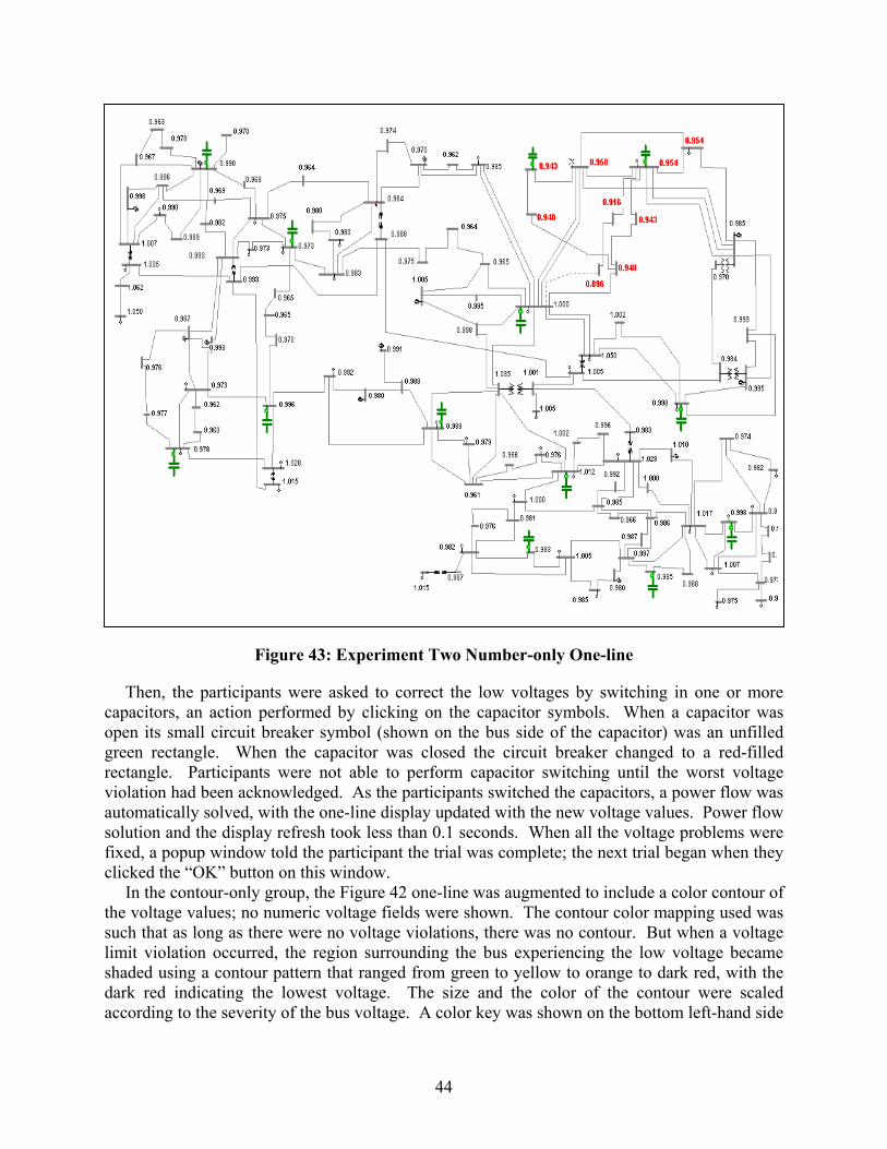
cogrvasfc
tslsda
44
Figure 43: Experiment Two Number-only One-line
Then, the participants were asked to correct the low voltages by switching in one or more apacitors, an action performed by clicking on the capacitor symbols. When a capacitor was pen its small circuit breaker symbol (shown on the bus side of the capacitor) was an unfilled reen rectangle. When the capacitor was closed the circuit breaker changed to a red-filled ectangle. Participants were not able to perform capacitor switching until the worst voltage iolation had been acknowledged. As the participants switched the capacitors, a power flow was utomatically solved, with the one-line display updated with the new voltage values. Power flow olution and the display refresh took less than 0.1 seconds. When all the voltage problems were ixed, a popup window told the participant the trial was complete; the next trial began when they licked the “OK” button on this window.
In the contour-only group, the Figure 42 one-line was augmented to include a color contour of he voltage values; no numeric voltage fields were shown. The contour color mapping used was uch that as long as there were no voltage violations, there was no contour. But when a voltage imit violation occurred, the region surrounding the bus experiencing the low voltage became haded using a contour pattern that ranged from green to yellow to orange to dark red, with the ark red indicating the lowest voltage. The size and the color of the contour were scaled ccording to the severity of the bus voltage. A color key was shown on the bottom left-hand side
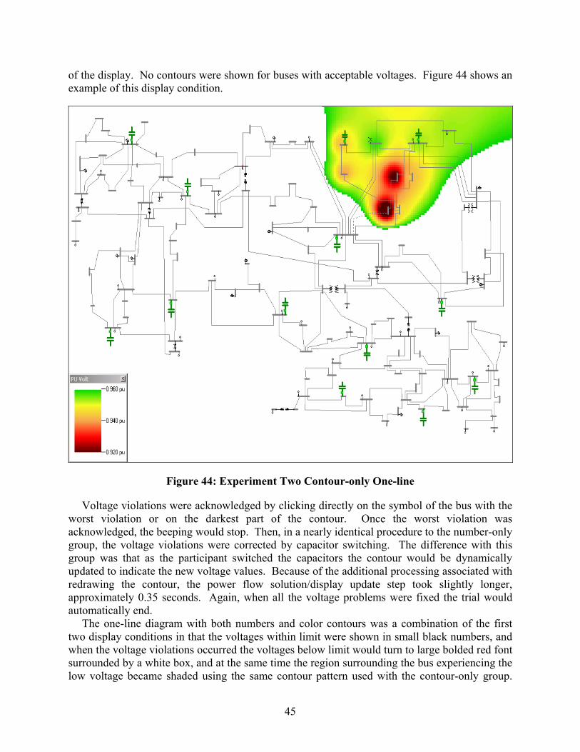
45
of the display. No contours were shown for buses with acceptable voltages. Figure 44 shows an example of this display condition.
Figure 44: Experiment Two Contour-only One-line
Voltage violations were acknowledged by clicking directly on the symbol of the bus with the worst violation or on the darkest part of the contour. Once the worst violation was acknowledged, the beeping would stop. Then, in a nearly identical procedure to the number-only group, the voltage violations were corrected by capacitor switching. The difference with this group was that as the participant switched the capacitors the contour would be dynamically updated to indicate the new voltage values. Because of the additional processing associated with redrawing the contour, the power flow solution/display update step took slightly longer, approximately 0.35 seconds. Again, when all the voltage problems were fixed the trial would automatically end.
The one-line diagram with both numbers and color contours was a combination of the first two display conditions in that the voltages within limit were shown in small black numbers, and when the voltage violations occurred the voltages below limit would turn to large bolded red font surrounded by a white box, and at the same time the region surrounding the bus experiencing the low voltage became shaded using the same contour pattern used with the contour-only group.
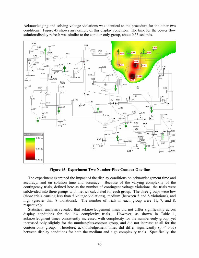
46
Acknowledging and solving voltage violations was identical to the procedure for the other two conditions. Figure 45 shows an example of this display condition. The time for the power flow solution/display refresh was similar to the contour-only group, about 0.35 seconds.
Figure 45: Experiment Two Number-Plus-Contour One-line
The experiment examined the impact of the display conditions on acknowledgement time and accuracy, and on solution time and accuracy. Because of the varying complexity of the contingency trials, defined here as the number of contingent voltage violations, the trials were subdivided into three groups with metrics calculated for each group. The three groups were low (those trials causing less than 5 voltage violations), medium (between 5 and 8 violations), and high (greater than 8 violations). The number of trials in each group were 11, 7, and 8, respectively.
Statistical analysis revealed that acknowledgement times did not differ significantly across display conditions for the low complexity trials. However, as shown in Table 1, acknowledgment times consistently increased with complexity for the number-only group, yet increased only slightly for the number-plus-contour group, and did not increase at all for the contour-only group. Therefore, acknowledgement times did differ significantly (p < 0.05) between display conditions for both the medium and high complexity trials. Specifically, the

47
average time for the contour-only group was significantly less on both medium and complex tasks than that of the number-only group and the number-plus-contour group. Although the average acknowledgment time for the number-plus-contour group was also generally less than that of the number-only group, this difference was particularly significant (p < 0.05) only for the high complexity trials.
Table 1: Average Acknowledgement Time in Seconds per Contingency
Complexity Group Display Condition Low Medium High
All Groups
Number 2.49 3.68 5.74 3.81 Contour 2.33 2.47 2.33 2.37
Number & Contour 2.58 3.23 3.38 3.00
The number of acknowledgements that participants made per trial was used as a measure of acknowledgement accuracy, with fewer acknowledgments reflecting a greater level of accuracy. As shown in Table 2, acknowledgements within the contour-only, and number-plus-contour groups differed only slightly across different complexity levels, but the number of acknowledgements for the number-only group increased consistently with trial complexity. Statistical analysis revealed that for the high complexity trials the number of acknowledgements for the number-only group was consistently higher (p < 0.05) than for those of the contour-only group and the number-plus-contour group, whereas the number of acknowledgments for the number-plus-contour group was not significantly different from that of the contour-only group. Note, on the thirty contingent trials, the use of three digits to the right of the decimal point insured the bus with the lowest voltage magnitude was always uniquely identifiable for number-only and number-plus-contour groups. The higher level of wrong acknowledgments for these groups was not due to two buses having the same apparent voltage value displayed on the one-line.
Table 2: Average Number of Acknowledgements per Contingency
Complexity Group Display Condition Low Medium High
All Groups
Number 1.01 1.11 1.28 1.12 Contour 1.06 1.06 1.03 1.05
Number & Contour 1.06 1.06 1.06 1.06
The finding that participants performed the voltage acknowledgement task both quicker and more accurately with just the contours is noteworthy because previous reaction-time research has shown a speed-accuracy trade-off. That is, as people respond more rapidly, they tend to make more errors. This reciprocity between response latency and errors, however, was not evident in the contour-only group. This finding indicates that participants in this group were not just quickly and haphazardly attempting to located the bus with the lowest voltage magnitude. Rather, the contours allowed them to quickly and consistently focus their attention on the bus with the lowest voltage.
A second noteworthy finding is the independence of the contour-only group between acknowledgement time and contingency complexity. Regardless of the number of voltage violations (at least up to the maximum of thirteen considered here) the contour-only group was

48
able to quickly and accurately identify the lowest voltage bus, performing the task in less than half the time of the number-only group. This is exactly the type of performance one would like from a visualization, particularly for use in an EMS.
The second task in the experiment examined the impact the display conditions had on solution time and accuracy. Here, the solution task required the participant to close in one or more capacitors to correct the contingent voltage violations; usually the contingent violations could be corrected with the insertion of one or two capacitors. The results revealed solution times for the number-only group were significantly faster (p < 0.05) than for the number-plus-contour group and the contour-only group. However, solution times were not significantly different between the contour-only and the number-plus-contour groups. As shown in Table 3, except for the number-plus-contour group, solution times increased as the contingencies became more complex.
Table 3: Average Solution Time in Seconds per Contingency
Complexity Group Display Condition Low Medium High
All Groups
Number 2.26 3.52 5.11 3.48 Contour 3.36 5.60 8.63 5.58
Number & Contour 4.78 8.63 7.80 6.75
This finding was surprising given the exact numeric voltage values were not needed to remedy the problem. One possible explanation was the contours created display clutter that hindered solution times by covering up the capacitors necessary to solve the violations. This explanation is also consistent with comments in a post-experiment questionnaire in which some noted display clutter as a problem.
To examine this hypothesis, the scenarios were parsed according to whether the contours significantly covered the capacitors (n = 6) or did not cover any capacitors (n = 20). As shown in Table 4, the differences in solution times between the groups were much less on trials in which the capacitors were uncovered than on trials in which they were covered. Nevertheless, solution times were still significantly faster for the number-only condition. It should be noted that the presence of the contour on the contour-only and number-plus-contour displays did impose a slightly increased refresh time (0.35 seconds versus 0.10 seconds for number-only). This time delay may have contributed at least partially to the increased times for the contour display conditions.
Table 4: Average Solution Time in Seconds per Contingency as a Function of Capacitor Coverage
Capacitor Status Display Condition Uncovered Covered
Both States
Number 3.64 2.93 3.48 Contour 5.38 6.26 5.58
Number & Contour 5.78 9.96 6.75
The number of capacitors used per trial to solve the voltage violations was examined as a measure of performance efficiency, with fewer capacitors closed reflecting more judicial use of system components. As shown in Table 5, the average number of capacitors used per trial for

49
the number-only group was significantly lower than that of the number-plus-contour group and the contour-only group. But the number-plus-contour group did not significantly differ from the contour-only group.
Solution accuracy was also analyzed as a function of the capacitor status (covered vs. uncovered) to explore issues of contour clutter. As expected, the number of capacitors used to solve the contingency did not significantly differ between the display conditions for the uncovered trials, but did differ significantly for the covered trials. Specifically, on the covered trials, the number of capacitors used to solve for the number-only group was significantly less than that of the number-plus-contour group and the contour-only group. The number-plus-contour group did not significantly differ from the contour-only group.
Table 5: Average Number of Capacitor Switchings per Contingency
Complexity Group Display Condition Low Medium High
All Groups
Number 1.16 1.45 1.98 1.49 Contour 1.23 1.84 2.04 1.64
Number & Contour 1.24 1.87 2.01 1.65
Table 6: Average Number of Switchings per Contingency as a Function of Capacitor Coverage
Capacitor Status Display Condition Uncovered Covered
Both States
Number 1.52 1.40 1.49 Contour 1.59 1.83 1.64
Number & Contour 1.54 2.00 1.65
The significance of the increased solution time between the number-only condition and the contour-only conditions depends upon the application. In an EMS implementation, in which switching is usually performed on a detailed substation one-line, the impact might not be significant. The contour could be used on a system overview display, helping to quickly show the operator the areas of concern. Then, perhaps by using poke points, the operator could switch to the pertinent, detailed substation one-line, which would not contain a contour, to take the actual corrective action. In off-line, study analysis only the acknowledgement functionality might be needed – the user might only be required to determine the extent of problems without taking corrective action. If such action is required, it could be accomplishing by dimming out or completely removing the contour, thereby gaining the advantages of contouring in problem detection without its detriments in problem correction.
Color contouring was expected to attract users’ attention to the worst voltage violations, thereby facilitating both acknowledgment speed and accuracy compared to a numeric display. This hypothesis was generally confirmed, particularly when a large number of violations simultaneously existed within the power grid. However, the benefits of contouring also came with a cost – contouring generally slowed the speed and accuracy by which users could solve or remove the voltage violations within the system compared to the numeric display. An in-depth analysis revealed the nature of this cost was due, at least in part, to the increased display clutter

50
associated with the contouring. The contours were covering up the relevant capacitors thereby delaying their selection.
Remedying this cost/benefit trade-off between contours and numbers does not appear to be as simple as combining the two display features. Indeed, under certain conditions the combination of these features in the display was found to produce worse performance than either display feature individually. Apparently, users are not able to ignore one dimension (e.g., numbers) while using the other (e.g., contours). An alternative option may be to incorporate dimming features that can be used to make the relevant color or numeric code more salient, or a toggling feature that allows users to switch each feature on or off depending on the particular task. Still, whichever features are chosen, the present study underscores the need for formal usability and human factors research to test the effectiveness of specific visualization techniques.
5.2 Motion Experiments
The last two experiments focused on quantifying the impact of animation on the display of transmission system flow information. The first of these experiments looked at the impact animated transmission line real power flows had on the ability of the participants to move generation to correct line flow violations using a thirty bus, ten generator system. During the experiment the participants were each presented with a sequence of 29 different contingencies, with each contingency causing overloads on one or more lines (approximately half of all trials involved a single line overload whereas the other half involved the overloading of more than one transmission line). A one-line display of this system, depicting a contingent operating point, is shown in Figure 47.
Figure 46: Third Experiment Number-only Display Condition
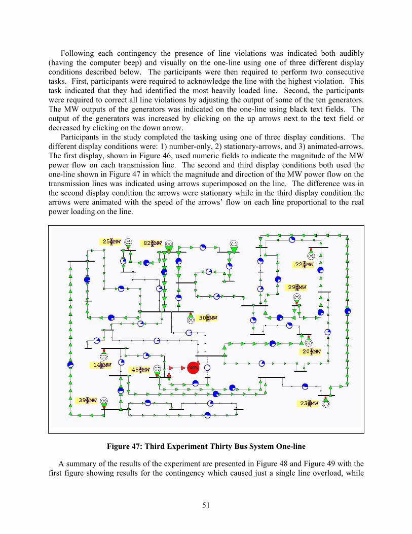
51
Following each contingency the presence of line violations was indicated both audibly (having the computer beep) and visually on the one-line using one of three different display conditions described below. The participants were then required to perform two consecutive tasks. First, participants were required to acknowledge the line with the highest violation. This task indicated that they had identified the most heavily loaded line. Second, the participants were required to correct all line violations by adjusting the output of some of the ten generators. The MW outputs of the generators was indicated on the one-line using black text fields. The output of the generators was increased by clicking on the up arrows next to the text field or decreased by clicking on the down arrow.
Participants in the study completed the tasking using one of three display conditions. The different display conditions were: 1) number-only, 2) stationary-arrows, and 3) animated-arrows. The first display, shown in Figure 46, used numeric fields to indicate the magnitude of the MW power flow on each transmission line. The second and third display conditions both used the one-line shown in Figure 47 in which the magnitude and direction of the MW power flow on the transmission lines was indicated using arrows superimposed on the line. The difference was in the second display condition the arrows were stationary while in the third display condition the arrows were animated with the speed of the arrows’ flow on each line proportional to the real power loading on the line.
Figure 47: Third Experiment Thirty Bus System One-line
A summary of the results of the experiment are presented in Figure 48 and Figure 49 with the first figure showing results for the contingency which caused just a single line overload, while
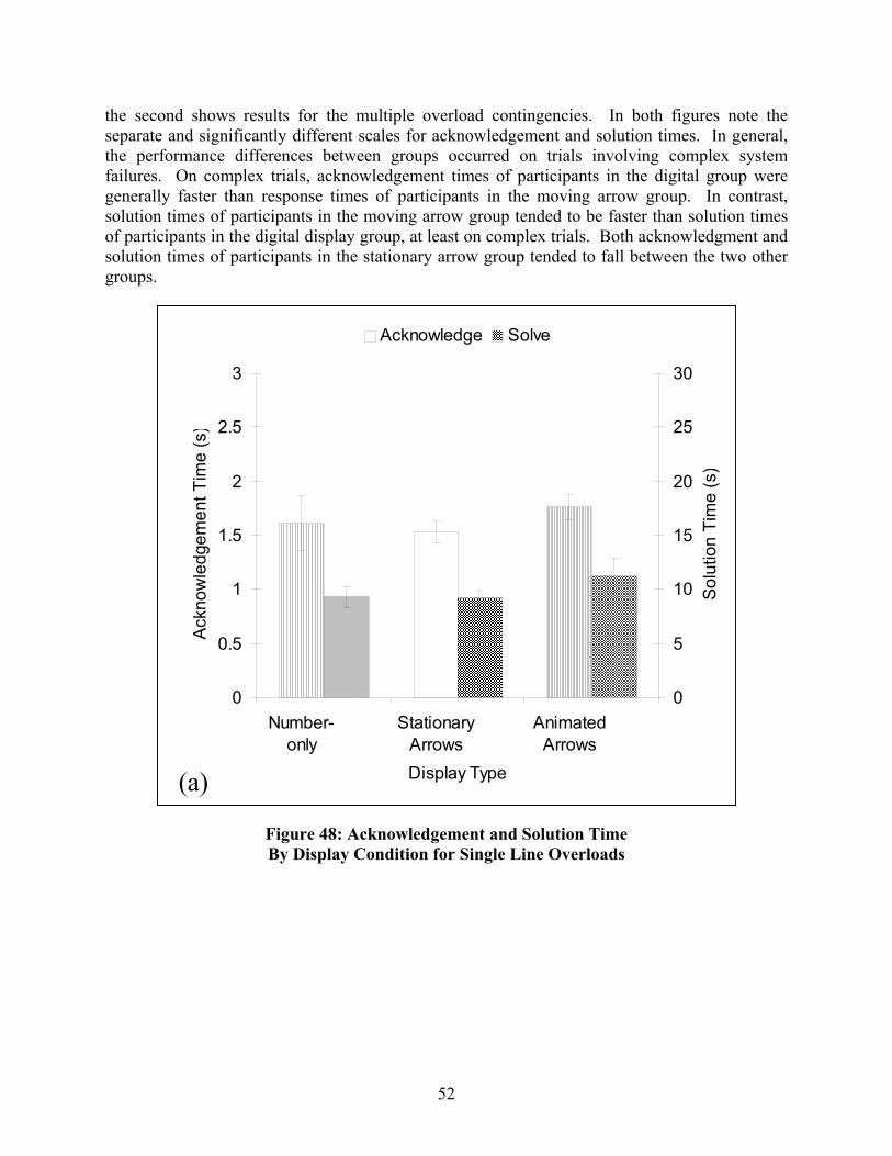
the second shows results for the multiple overload contingencies. In both figures note the separate and significantly different scales for acknowledgement and solution times. In general, the performance differences between groups occurred on trials involving complex system failures. On complex trials, acknowledgement times of participants in the digital group were generally faster than response times of participants in the moving arrow group. In contrast, solution times of participants in the moving arrow group tended to be faster than solution times of participants in the digital display group, at least on complex trials. Both acknowledgment and solution times of participants in the stationary arrow group tended to fall between the two other groups.
Acknowledge Solve
52
Figure 48: Acknowledgement and Solution Time By Display Condition for Single Line Overloads
0
0.5
1
1.5
2
2.5
3
Number-only
StationaryArrows
AnimatedArrows
Display Type
Ackn
owle
dgem
ent T
ime
(s)
0
5
10
15
20
25
30
Solu
tion
Tim
e (s
)
(a)
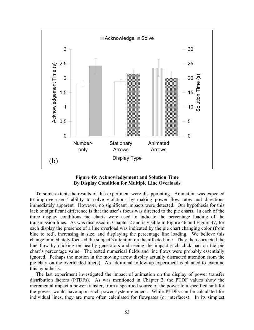
53
Figure 49: Acknowledgement and Solution Time By Display Condition for Multiple Line Overloads
To some extent, the results of this experiment were disappointing. Animation was expected to improve users’ ability to solve violations by making power flow rates and directions immediately apparent. However, no significant impacts were detected. Our hypothesis for this lack of significant difference is that the user’s focus was directed to the pie charts. In each of the three display conditions pie charts were used to indicate the percentage loading of the transmission lines. As was discussed in Chapter 2 and is visible in Figure 46 and Figure 47, for each display the presence of a line overload was indicated by the pie chart changing color (from blue to red), increasing in size, and displaying the percentage line loading. We believe this change immediately focused the subject’s attention on the affected line. They then corrected the line flow by clicking on nearby generators and seeing the impact each click had on the pie chart’s percentage value. The tested numerical fields and line flows were probably essentially ignored. Perhaps the motion in the moving arrow display actually distracted attention from the pie chart on the overloaded line(s). An additional follow-up experiment is planned to examine this hypothesis.
The last experiment investigated the impact of animation on the display of power transfer distribution factors (PTDFs). As was mentioned in Chapter 2, the PTDF values show the incremental impact a power transfer, from a specified source of the power to a specified sink for the power, would have upon each power system element. While PTDFs can be calculated for individual lines, they are more often calculated for flowgates (or interfaces). In its simplest
0
0.5
1
1.5
2
2.5
3
Number-only
StationaryArrows
AnimatedArrows
Display Type
Ackn
owle
dgem
ent T
ime
(s)
0
5
10
15
20
25
30
Solu
tion
Tim
e (s
)
Acknowledge Solve
(b)

54
form, a flowgate is a collection of transmission system lines and/or transformers. Then, the flowgate limit is able to serve as a proxy for a combined limitation on the flow of the branches. Grouping the branches into a flowgate reduces the amount of information that must be monitored when doing system analysis. A common flowgate is the sum of the tie line flows between two areas. The PTDFs associated with a power transfer could then be visualized by first drawing the areas, then drawing lines between the areas, and finally superimposing values on this lines to represent the aggregate of the PTDFs for the tie-lines joining the areas.
The last experiment was performed using the fictitious (but still somewhat accurate) representation of operating areas in the U.S. portion of the Eastern Interconnect shown in Figure 50. Here the blue ovals correspond to operating areas, while the lines (branches) joining the ovals represent equivalent transmission lines that approximate the impedance characteristics of the thousands of transmission lines in the actual grid. Superimposed on the figure are arrows visualizing the PTDFs associated with a particular power transfer, which the magnitude of the arrow proportional to the size of the PTDF on the branch. For example, Figure 50 shows the PTDFs for a power transfer from area 37 in Northern Wisconsin to area 19 in Tennessee.
Figure 50: Fourth Experiment Display
During the experiment the participants were presented with a sequence of 54 trials (four practice trials and then 50 actual trials), with each trial visualizing the PTDFs for a particular seller/buyer pair (e.g., a transaction) using the Figure 50 display. The mechanics of each trial were as follows. At the beginning of each trial there was no transaction present. Then, after a variable time period of between 2 and 12 seconds a transaction occurred, indicated by arrows appearing on the display. The participants were then required to perform two consecutive tasks.

55
First, they were to determine as quickly as possible the seller and the buyer by clicking on their respective ovals on the display (in either order). When selected, the seller oval immediately turned green while the buyer oval immediately turned red. Participants could not proceed to the second task until both the seller and the buyer had been selected. Then, once they had successfully completed the first task, they needed to determine what they viewed as the “best” path between the seller and buyer. Participants were told to use whatever criteria they desired to quantify “best” (e.g., shortest or path with the fewest intermediary areas), but to complete the task as quickly as possible. The participants selected the path by clicking on other ovals to form a complete path joining the seller to the buyer. Once selected, an oval on the path turned white; ovals could not be de-selected. The trial immediately ended when a complete path had been selected.
Similar to the earlier experiments, the participants completed the tasks using one of three display conditions, all of which were based upon Figure 50. The three display conditions were 1) no motion in which the arrows did not move, 2) uniform motion in which the arrows were animated so that all the arrows flowed at the same rate, and 3) proportional motion in which the speed of the arrows on a branch was proportional to the branch’s PTDF value. Figure 51 to Figure 53 summarize the key findings of this experiment. Here animation was found to have a significant positive impact on the ability of the participants to select the seller/pair. The animation display conditions resulted in the participants not only selecting these areas quicker, but also more accurately.
0123456789
1011
No Motion Uniform Motion Proportional Motion
Display Group
Mea
n R
espo
nse
Tim
ePe
r Tria
l (s)
Figure 51: Time to Select Both Seller and Buyer
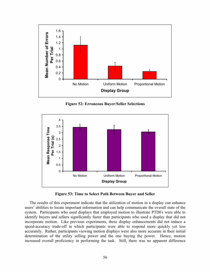
The reusers’ absystem. identify bincorporaspeed-accaccurateldeterminincreased
1.4
1.6
ors
Figure 52: Erroneous Buyer/Seller Selections
siliPuteu
y.at
0
0.20.4
0.60.8
1
1.2
No Motion Uniform Motion Proportional Motion
Display Group
Mea
n N
umbe
r of E
rrPe
r Tria
l
4
56
Figure 53: Time to Select Path Between Buyer and Seller
ults of this experiment indicate that the utilization of motion in a display can enhance ties to locate important information and can help communicate the overall state of the articipants who used displays that employed motion to illustrate PTDFs were able to yers and sellers significantly faster than participants who used a display that did not motion. Like previous experiments, these display enhancements did not induce a racy trade-off in which participants were able to respond more quickly yet less Rather, participants viewing motion displays were also more accurate in their initial ion of the utility selling power and the one buying the power. Hence, motion overall proficiency in performing the task. Still, there was no apparent difference
0
0.5
1
1.5
2
2.5
3
3.5
No Motion Uniform Motion Proportional Motion
Display Group
Mea
n R
espo
nse
Tim
ePe
r Tria
l (s)

57
between the benefits afforded by the types of motion utilized. In general, uniform motion was equivalent to proportional motion in this experiment. Still, across all measures of performance, the proportional motion condition appears to have consistently produce slightly better performance. Additional research is needed, however, to further examine this potential trend.

58
Chapter 6 Conclusions
Restructuring in the electricity industry is resulting in a need for innovative new methods for representing large amounts of system data. This research project has developed several new methods that could be quite useful for the representation of this data, performed formal human factors experiments to test the effectiveness of several of these techniques, and assisted in the actual implementation of research results in the ComED and TVA control centers. Nevertheless, significant challenges remain. Key challenges are the problem of visualizing not just the current system state but also the potentially large number of contingency states, and the problem of visualizing not just a single time snapshot but rather the variation in the system operating conditions over time. More research is needed to develop better methods for visualizing this data, performing human factors assessments on these new techniques, and rapidly transferring the results to industry.

59
Chapter 7 Project Publications and Presentations
A. T. J. Overbye and J. D. Weber, "Visualization of Power System Data," Proc. 33th Hawaii International Conference on System Sciences, Maui, HI, January 2000.
B. T. J. Overbye, "New Techniques for Power System Visualization Under Deregulation," Proc. IEEE PES 2000 Winter Meeting, Singapore, January 2000.
C. T.J. Overbye, "Transmission System Visualization and the Bottom Line," Power Economics, May 2000, pp. 21-23.
D. T.J. Overbye, J.D. Weber, “New Methods for the Visualization of Electric Power System Information,” Proc. IEEE Symposium on Information Visualization 2000, Salt Lake City, UT, October 2000, pp. 131-136c.
E. C.M. Martini, T.J. Overbye, “Visualization of Oscillation Mode Shapes and Participation Factors,” Proc. 32nd North American Power Symposium, Waterloo, ON, October 2000, pp. 4-11 to 4-16.
F. N.A. DiIorio, T.J. Overbye, “Power System Visualization,” Proc. Electrical Insulation Conf. and Electrical Manufacturing & Coil Winding Conf., Cincinnati, OH, pp. 331-336, November 2000.
G. T.J. Overbye, D.A. Wiegmann, A.M. Rich, Y. Sun, “Human Factors Analysis of Power System Visualizations”, Proc. 34th Hawaii International Conference on System Sciences, Maui, HI, January 2001.
H. D.R. Hale, T.J. Overbye, “Optimization and Visualization of the North American Eastern Interconnect Power Market”, Proc. 34th Hawaii International Conference on System Sciences, Maui, HI, January 2001.
I. T.J. Overbye, J.D. Weber, K.J. Patten "Analysis and Visualization of Market Power in Electric Power Systems," Decision Support Systems, vol. 30, January 2001, pp. 229-241.
J. T.J. Overbye, J.D. Weber, “Visualizing the Electric Grid,” IEEE Spectrum, February 2001, pp. 52-58.
K. T.J. Overbye, "Visualizing the Interaction Between the Transmission System and Power Markets," Proc. IEEE PES 2001 Summer Meeting, Vancouver, Canada, July 2001.
L. D.R. Smith, T.J. Overbye, “Transmission Impacts and Visualization of New Generation,” Proc. Electrical Insulation Conf. and Electrical Manufacturing & Coil Winding Conf., Cincinnati, OH, pp. 393-398, October 2001.
M. A.M. Rich, D.A Wiegmann, T.J. Overbye. Visualization of power systems data: A human factors analysis. (Technical Report ARL-01-5/PESERC-01-1). Savoy, IL: University of Illinois, Aviation Research Lab, 2001.
N. D.A.Wiegmann, A.M. Rich, T.J. Overbye, H. Zhang. Effects of color contouring on the detection and diagnosis of voltage violations within electrical power systems. (Technical Report ARL-01-10). Savoy, IL: University of Illinois, Aviation Research Lab, 2001.

60
O. D.A. Wiegmann, A.M. Rich, T.J. Overbye, Y. Sun, “Human Factors Aspects of Power System Voltage Visualizations,” Proc. 35th Hawaii International Conference on System Sciences, Kona, HI, January 2002.
P. D.A. Wiegmann, G.R. Essenber, T.J. Overbye, A.M Rich. “Motion in Mimic Displays: Effects on the Detection and Diagnosis of Electrical Power Failures.” Proc. 46th Meeting of the Human Factors an Ergonomics Society, 2002.
Q. R.P. Klump, D. Schoole, T.J. Overbye, “An Advanced Visualization Platform for Real-Time Power System Operations,” Proc. 14th Power Systems Computation Conference (PSCC), Seville, Spain, June 2002.
R. T.J. Overbye, D.A. Wiegmann, A.M. Rich, Y. Sun, “Human Factors Aspects of Power System Visualizations: An Empirical Investigation,” Electric Power Components and Systems, vol. 30, August 2002, pp 877-888.
S. R.K. Klump, W. Wu, G. Dooley, “Displaying Aggregate Data, Interrelated Quantities, and Data Trends in Electric Power Systems,” accepted for presentation at 36th Hawaii International Conference on System Sciences, Kona, HI, January 2003.
T. T. J. Overbye, "Estimating the Actual Cost of Transmission System Congestion," accepted for presentation at 36th Hawaii International Conference on System Sciences, Kona, HI, January 2003.
U. T.J. Overbye, D.A. Wiegmann, A.M. Rich, Y. Sun, “Human Factors Aspects of Power System Voltage Contour Visualizations”, accepted for publication in IEEE Trans. on Power Systems.
Top Related