


Languages
Pages
Legal


秋の JavaScript 祭 in mixi
React で CSS カプセル化の可能性を考える

Yutaro Miyazaki (@vwxyutarooo)
ニート
フリーランス (Web 制作)会社員 (フロントエンド)


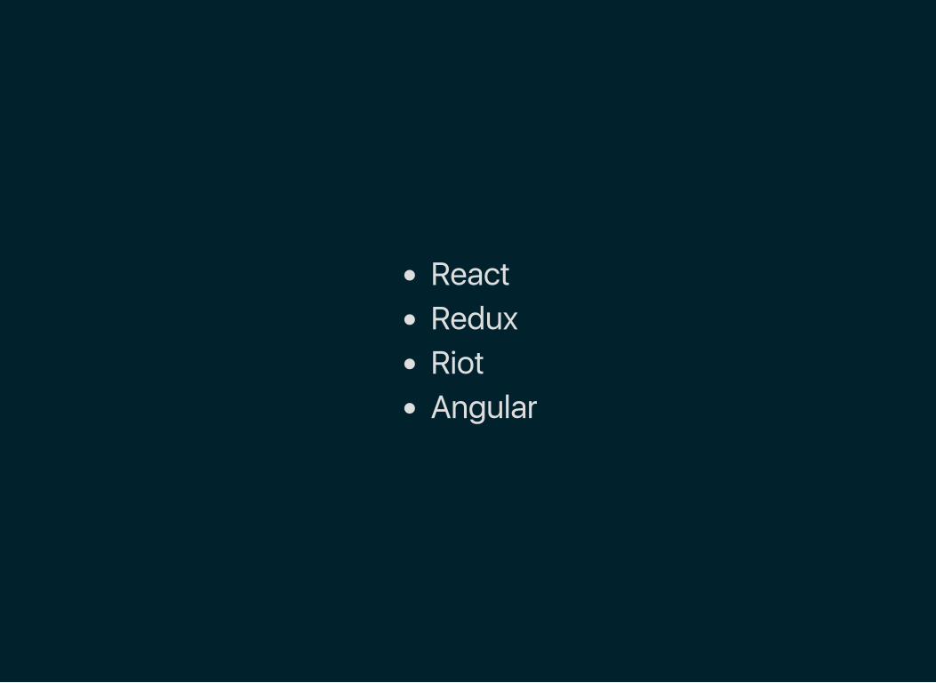
ReactReduxRiotAngular

CSS カプセル化
全てがグローバルスコープ
有効範囲を制限する
Scoped CSS
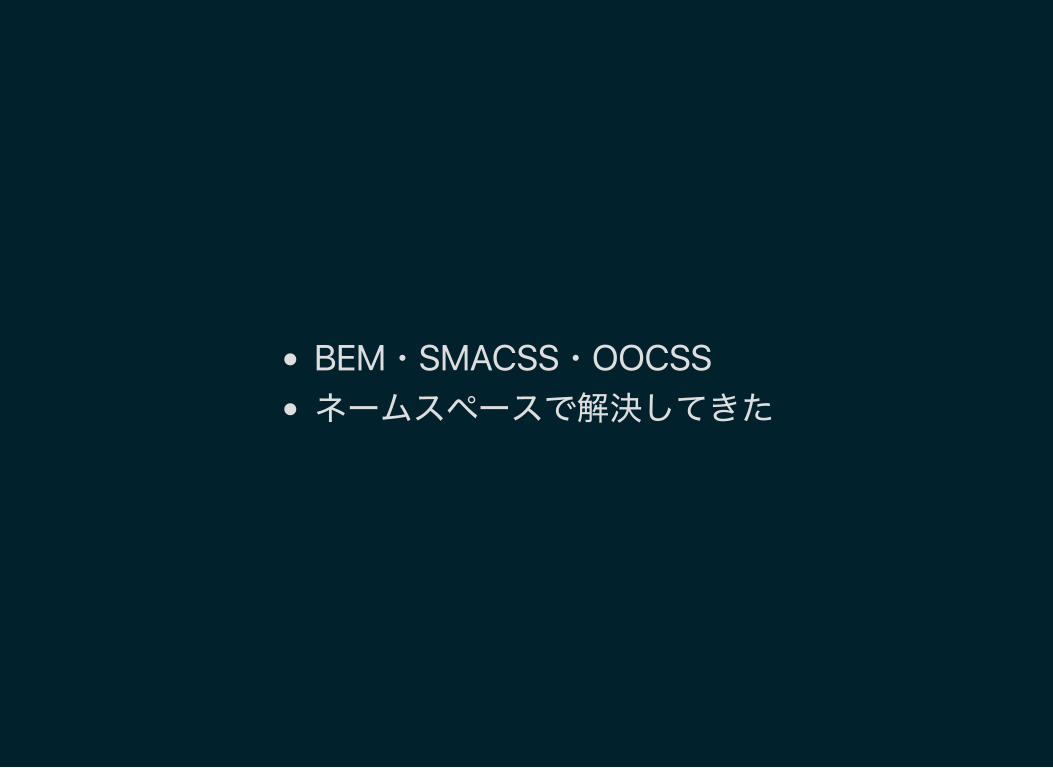
BEM・SMACSS・OOCSSネームスペースで解決してきた
フロントエンド意外お断り
そんな CSS も Web Components ライクな
JS フレームワークの台頭により変化の兆しが
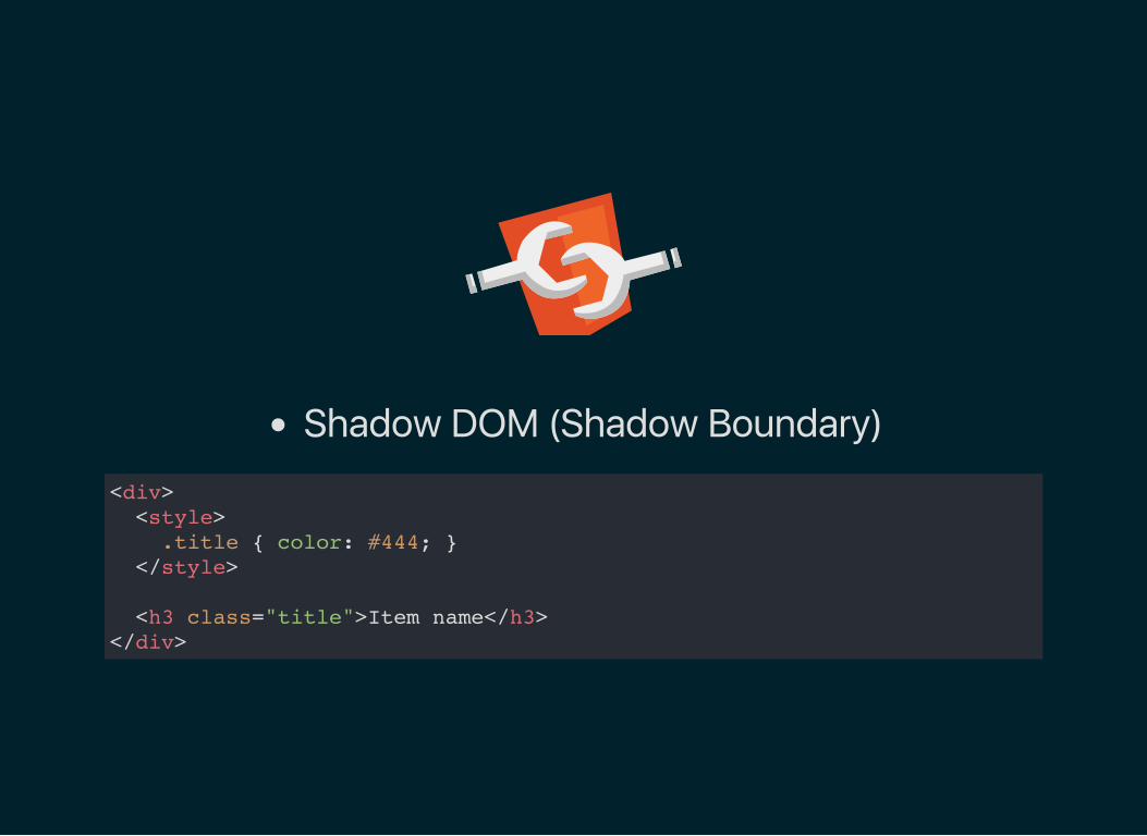
Shadow DOM (Shadow Boundary)
<div> <style> .title { color: #444; } </style>
<h3 class="title">Item name</h3> </div>
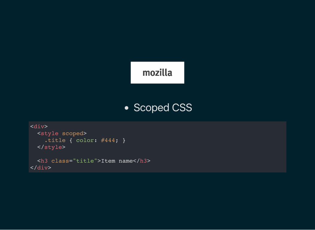
Scoped CSS
<div> <style scoped> .title { color: #444; } </style>
<h3 class="title">Item name</h3> </div>
encapsulation: ViewEncapsulation.Emulatedencapsulation: ViewEncapsulation.Native
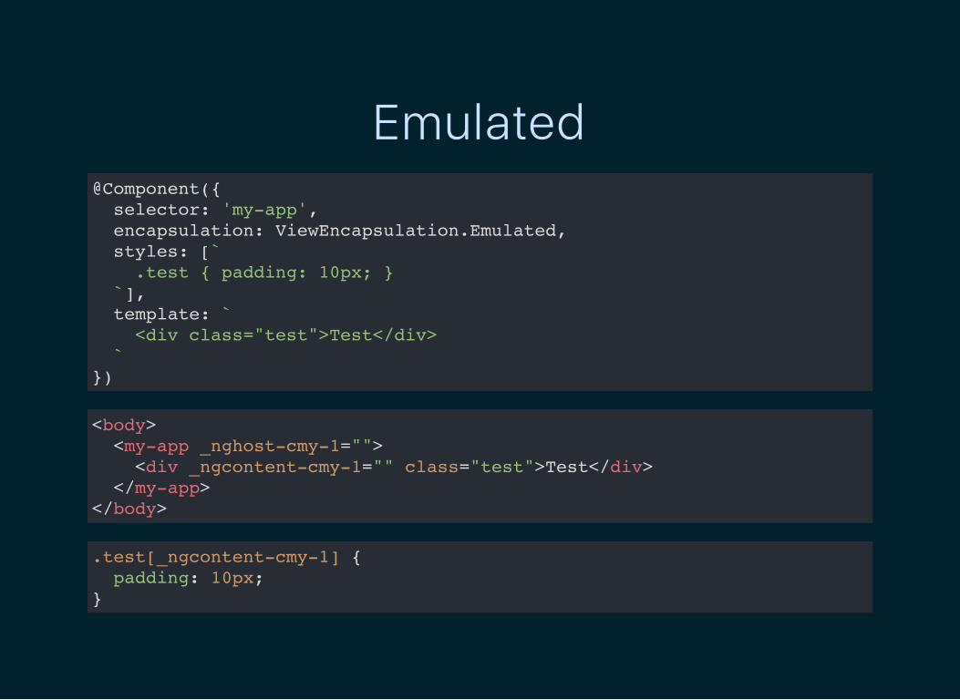
Emulated@Component({ selector: 'my-app', encapsulation: ViewEncapsulation.Emulated, styles: [` .test { padding: 10px; } `], template: ` <div class="test">Test</div> ` })
<body> <my-app _nghost-cmy-1=""> <div _ngcontent-cmy-1="" class="test">Test</div> </my-app> </body>
.test[_ngcontent-cmy-1] { padding: 10px;}
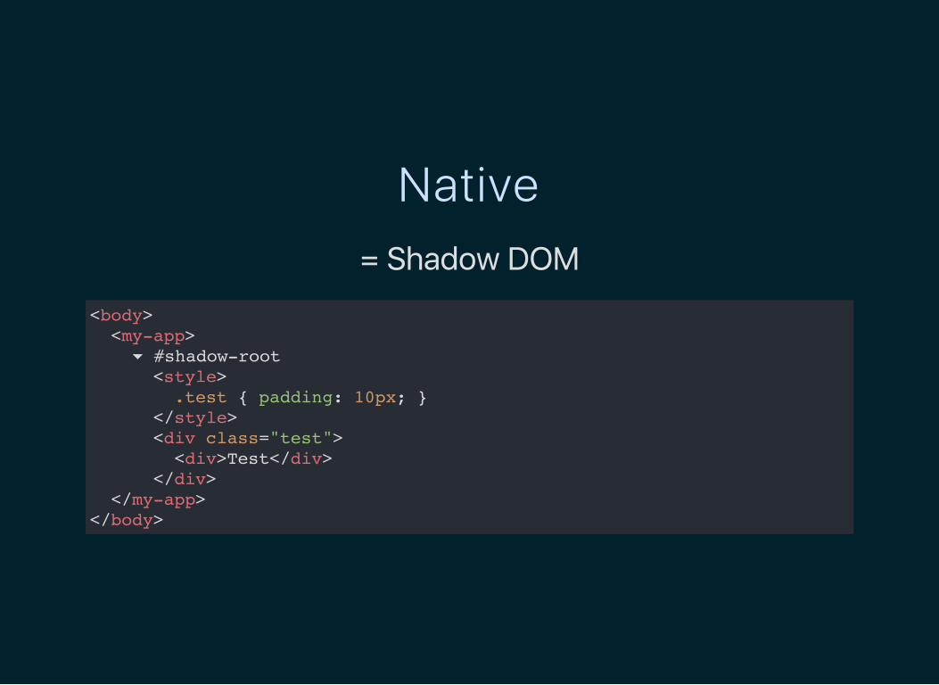
Native= Shadow DOM
<body> <my-app> ▾ #shadow-root <style> .test { padding: 10px; } </style> <div class="test"> <div>Test</div> </div> </my-app> </body>

<my-tag> <h3>{ opts.title }</h3>
<style scoped> :scope { display: block; border: 2px } h3 { color: blue } </style> </my-tag>
↓<style> my-tag { display: block; border: 2px } my-tag h3 { color: blue } </style>
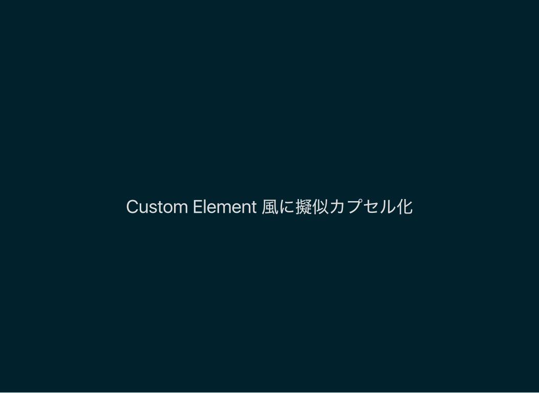
Custom Element 風に擬似カプセル化

vue‑loader

<style scoped> .example { color: red; } </style>
<template> <div class="example">hi</div> </template>
↓<style> .example[_v-f3f3eg9] { color: red; } </style>
<template> <div class="example" _v-f3f3eg9>hi</div> </template>
React で CSS カプセル化の可能性
前提認識
ネイティブな Shadow DOM によるカプセル化は一旦忘れる

前提認識
全てのクラス・スタイルをカプセル化する必要はない

前提認識
グローバルのままがいい
Layout 要素Utility
カプセル化したい
Module 要素コンポーネントで完結するもの
可能性その1CSS in JS
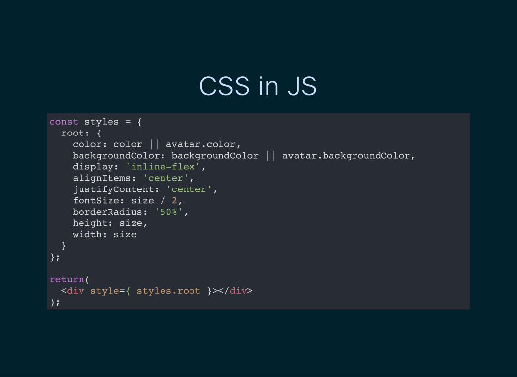
CSS in JSconst styles = { root: { color: color || avatar.color, backgroundColor: backgroundColor || avatar.backgroundColor, display: 'inline-flex', alignItems: 'center', justifyContent: 'center', fontSize: size / 2, borderRadius: '50%', height: size, width: size } };
return( <div style={ styles.root }></div> );

採用している React Component
Material UIReact Toolboxreactjs/react‑modal

ない

ない

ない

ない

ない

ない

ない

ない

ない

ない

キモい

嫌だ

ない

ごめん

言いすぎた

CSS in JS の問題擬似クラス (:hover, :before, :after)メディアクエリ
CSS アニメーションシンタックス

CSS in JS 系リポジトリ
cssinjs/jsscssinjs/react‑jssFormidableLabs/radiummartinandert/react‑inlinesmyte/jsxstyle

var Radium = require('radium'); var React = require('react'); var color = require('color');
@Radium class Button extends React.Component { render() { return ( <button style={[ styles.base, styles[this.props.kind] ]}></button> ); } }
var styles = { base: { color: '#fff', ':hover': { background: color('#0074d9').lighten(0.2).hexString() } }, ... };

アップサイド
シンタックス意外の問題は解決された
Style の 一部は Prop で渡せる考える必要なし
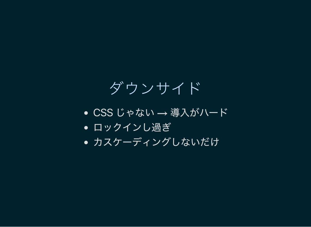
ダウンサイド
CSS じゃない → 導入がハードロックインし過ぎ
カスケーディングしないだけ

(因みに) こうなった@charset 'utf-8'; @import 'core/config';
.datepicker,
.timepicker { font-size: 12px !important; display: block !important; overflow: hidden; width: 100px !important; height: auto !important; border-width: 0 !important; > div { &:first-child { line-height: inherit !important; width: auto !important; height: auto !important; } } input { line-height: 2 !important; height: 36px !important; padding: 0 10px !important; text-align: center; color: $colorFont !important; border: 1px solid #ccc !important; background-color: #fff !important; }
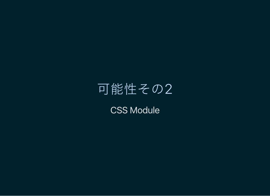
可能性その2CSS Module

特徴
CSS を CSS として書けるCSS クラスに一意のハッシュを自動で付与
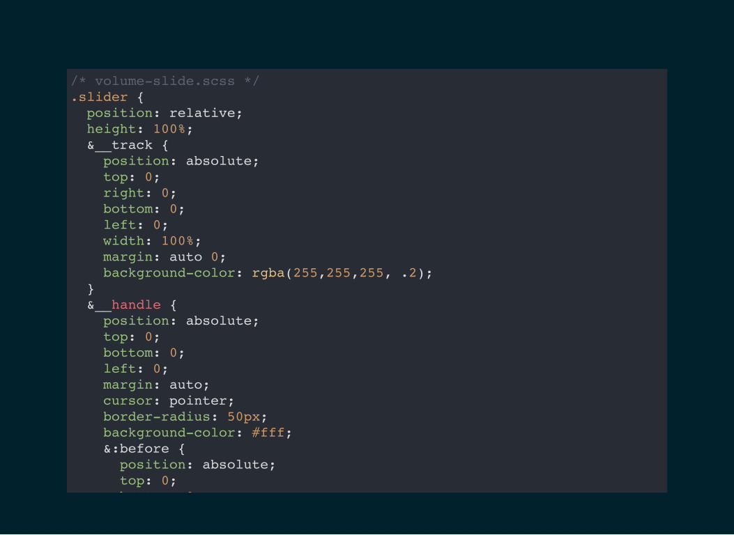
/* volume-slide.scss */ .slider { position: relative; height: 100%; &__track { position: absolute; top: 0; right: 0; bottom: 0; left: 0; width: 100%; margin: auto 0; background-color: rgba(255,255,255, .2); } &__handle { position: absolute; top: 0; bottom: 0; left: 0; margin: auto; cursor: pointer; border-radius: 50px; background-color: #fff; &:before { position: absolute; top: 0; bottom: 0;

// volume-slider.react.js import styles from './volume-slider.scss';
render:
<slider className={ styles.slider }> <div className={ styles.slider__track + ' ' + styles.black }></div> <div className={ classnames(styles.slider__handle, styles.black) }></div</slider>
出力:
<slider class="volume-slider__slider___2qmBE"> <div class="volume-slider__slider__track___1Okwk volume-slider__black___3-0A8" <div class="volume-slider__slider__handle___X_x8Q volume-slider__black___3-0A8"</slider>
ファイル名__クラス名__5桁のハッシュ

アップサイド
ファイル分割さえしていれば移行はスムーズ
SMACSS の Module だけを置き換えcss‑module やめるときも特に何もしなくていい

ダウンサイド
Webpack とか Browserify の設定が必要配布側では使えない
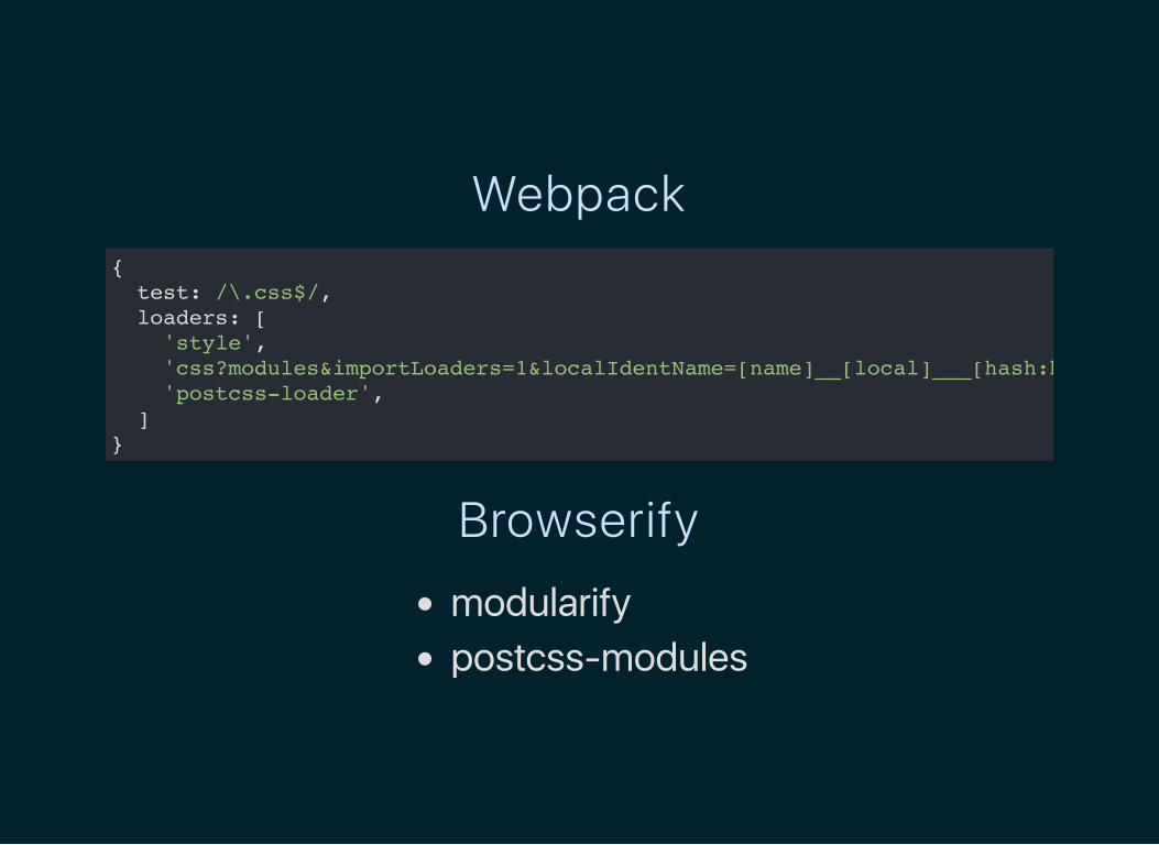
Webpack{ test: /\.css$/, loaders: [ 'style', 'css?modules&importLoaders=1&localIdentName=[name]__[local]___[hash:base64:5]' 'postcss-loader', ] }
Browserify
modularifypostcss‑modules

可能性その2.5React CSS Module

React CSS Modules
CSS Modules だと not enough

CSS Modules はキャメルケースのクラス名に制限
style オブジェクトの利用グローバル, ローカルスコープのクラスの分別未定義の CSS クラス参照時 (エラー出ない)
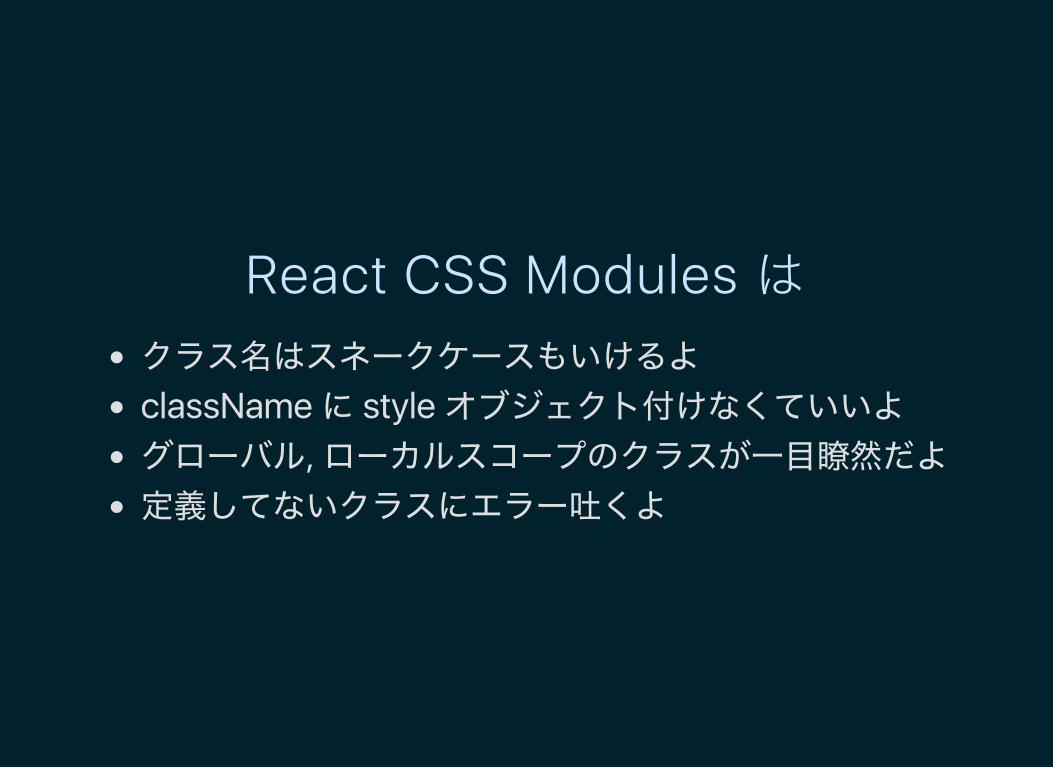
React CSS Modules はクラス名はスネークケースもいけるよ
className に style オブジェクト付けなくていいよグローバル, ローカルスコープのクラスが一目瞭然だよ定義してないクラスにエラー吐くよ
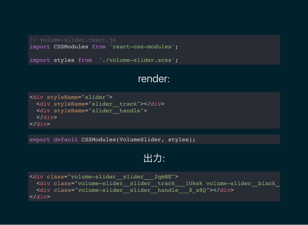
// volume-slider.react.js import CSSModules from 'react-css-modules';
import styles from './volume-slider.scss';
render:
<div styleName="slider"> <div styleName="slider__track"></div> <div styleName="slider__handle"> </div></div>
export default CSSModules(VolumeSlider, styles);
出力:
<div class="volume-slider__slider___2qmBE"> <div class="volume-slider__slider__track___1Okwk volume-slider__black___3-0A8" <div class="volume-slider__slider__handle___X_x8Q"></div> </div>
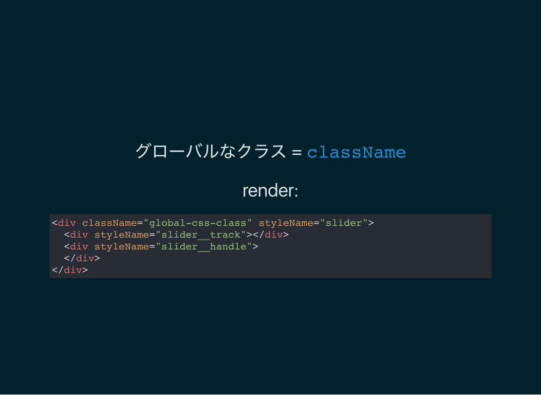
グローバルなクラス = className
render:
<div className="global-css-class" styleName="slider"> <div styleName="slider__track"></div> <div styleName="slider__handle"> </div></div>

ES7 Decorator がおすすめ
@CSSModules(styles, { allowMultiple: true }) export default class VolumeSlider extends React.Component {}

アップサイド
いいかも
ES7 の Decorator 使えば綺麗
ダウンサイド
依存関係が1個増える

可能性その3Custom Element 風

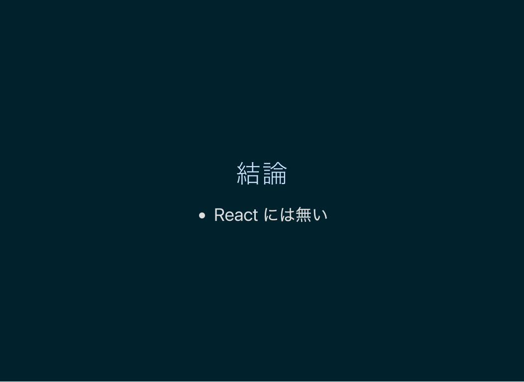
結論
React には無い

ただし

コンポーネントを配布する側では使いたい
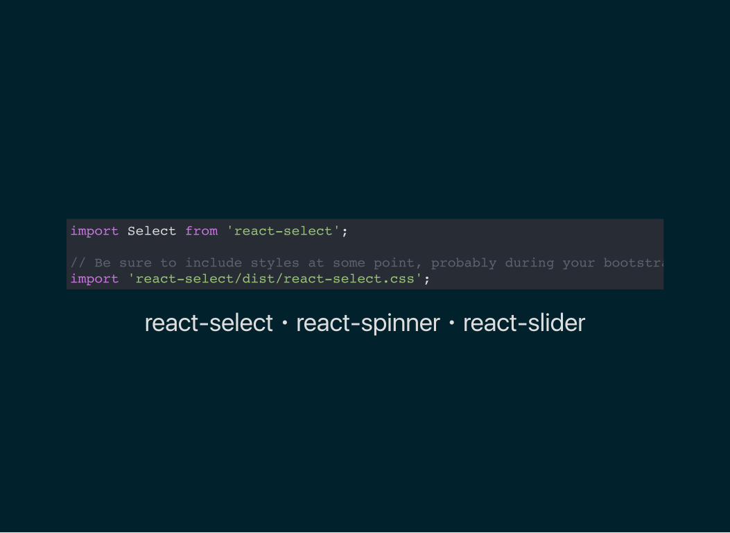
import Select from 'react-select';
// Be sure to include styles at some point, probably during your bootstrappingimport 'react-select/dist/react-select.css';
react‑select・react‑spinner・react‑slider
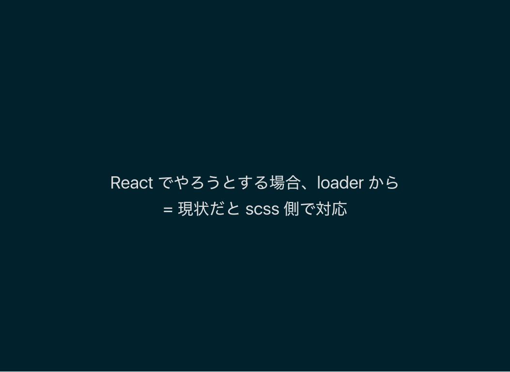
React でやろうとする場合、loader から
= 現状だと scss 側で対応

ダウンサイド
外部からの影響は受ける
グローバルがクリーンである必要
多少ユニークなクラス名が必要
HTMLUnknownElement...?
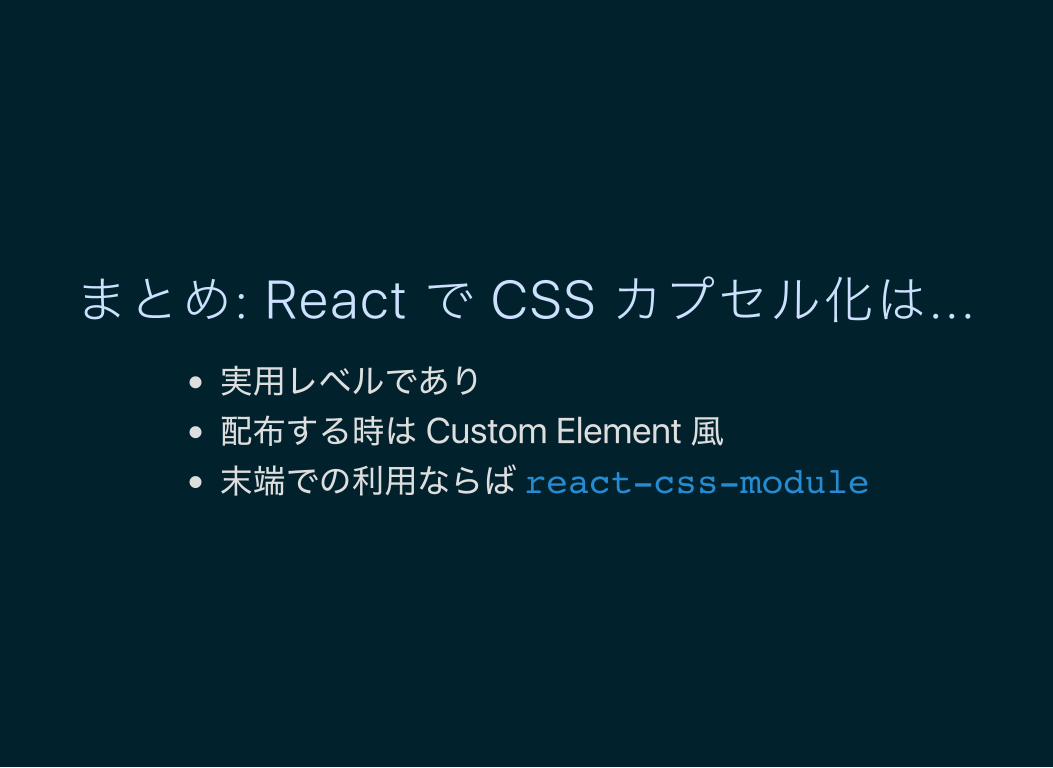
まとめ: React で CSS カプセル化は...実用レベルであり
配布する時は Custom Element 風末端での利用ならば react-css-module