What is a Logo? Lo gos: Developing a symbol for communicating identity.
16
What is a Logo? Logos: Developing a symbol for communicating identity.
-
Upload
osborn-gray -
Category
Documents
-
view
218 -
download
0
Transcript of What is a Logo? Lo gos: Developing a symbol for communicating identity.

What is a Logo?
Logos: Developing a symbol for communicating identity.
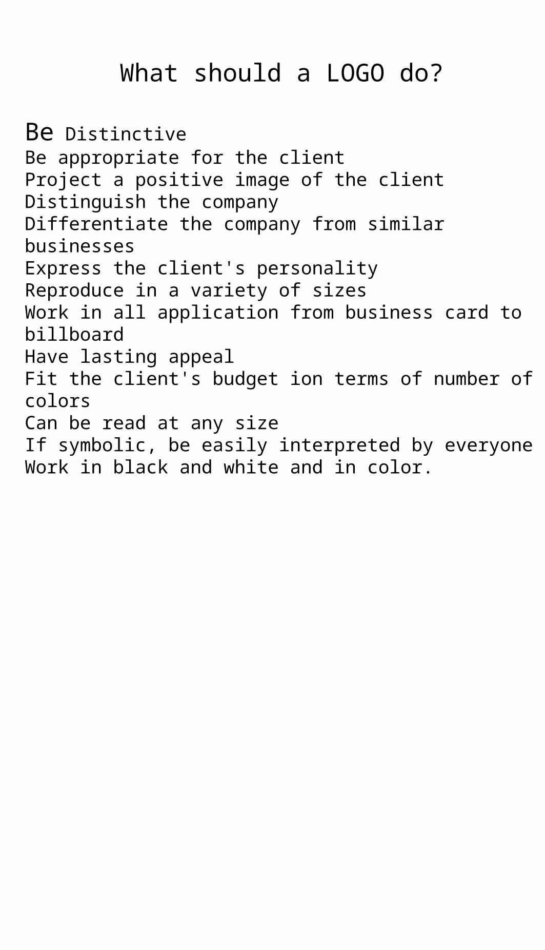
What should a LOGO do?
Be DistinctiveBe appropriate for the clientProject a positive image of the clientDistinguish the companyDifferentiate the company from similar businessesExpress the client's personalityReproduce in a variety of sizesWork in all application from business card to billboardHave lasting appealFit the client's budget ion terms of number of colorsCan be read at any sizeIf symbolic, be easily interpreted by everyoneWork in black and white and in color.
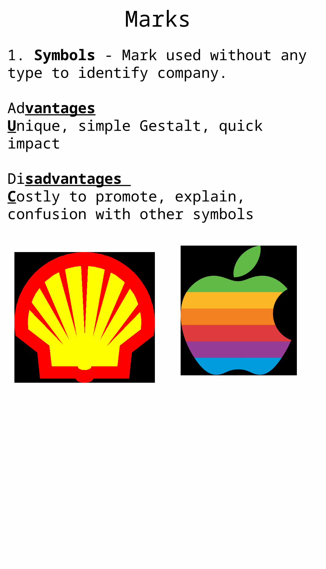
1. Symbols - Mark used without any type to identify company.
AdvantagesUnique, simple Gestalt, quick impact
Disadvantages Costly to promote, explain, confusion with other symbols
Marks
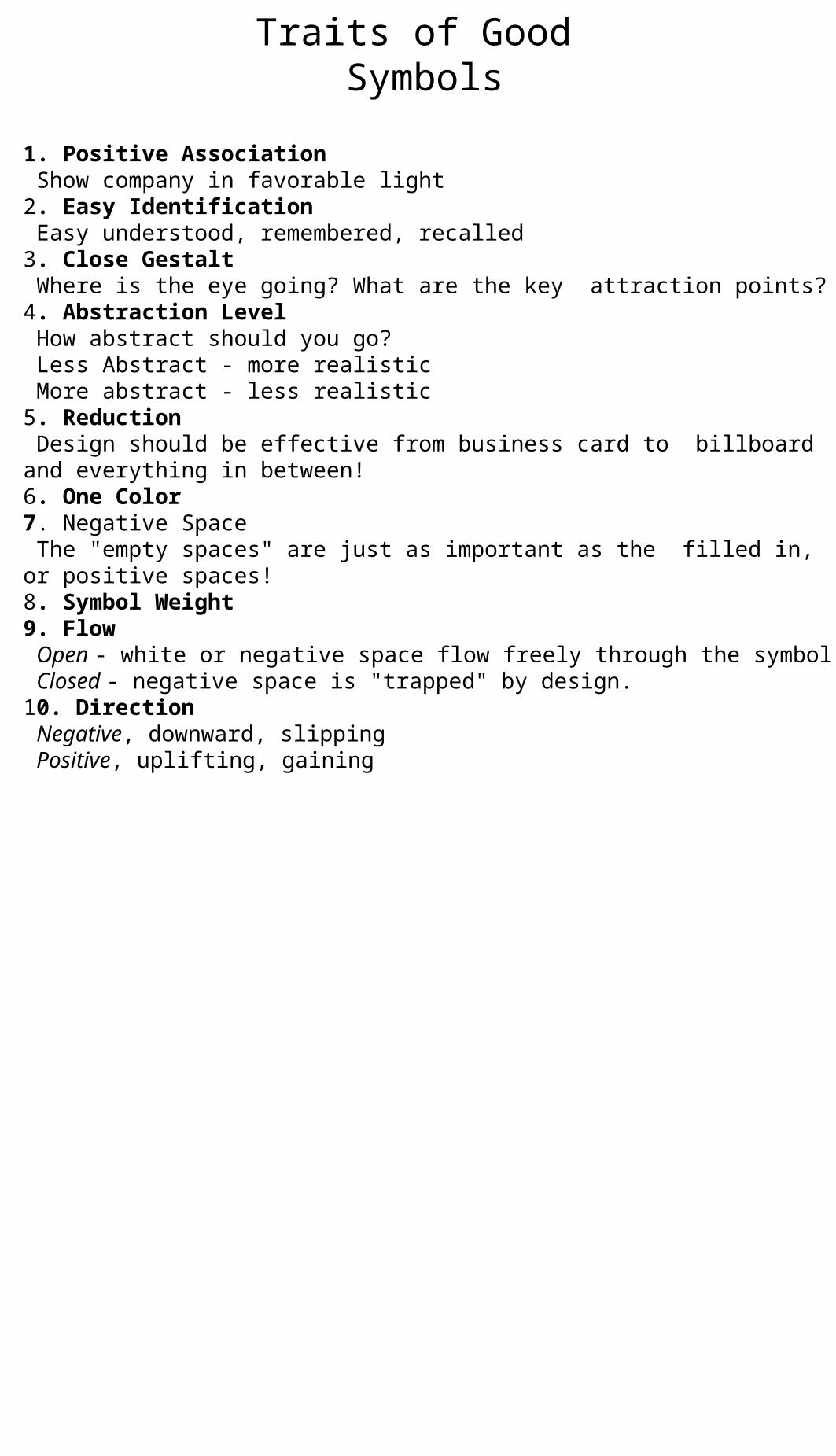
1. Positive Association Show company in favorable light2. Easy Identification Easy understood, remembered, recalled3. Close Gestalt Where is the eye going? What are the key attraction points?4. Abstraction Level How abstract should you go? Less Abstract - more realistic More abstract - less realistic5. Reduction Design should be effective from business card to billboard and everything in between!6. One Color7. Negative Space The "empty spaces" are just as important as the filled in, or positive spaces!8. Symbol Weight9. Flow Open - white or negative space flow freely through the symbol Closed - negative space is "trapped" by design.10. Direction Negative, downward, slipping Positive, uplifting, gaining
Traits of Good Symbols
Symbols should:
Indicate, rather than DUPLICATESuggest, rather than REPRESENTBecome Quick Recognition Devices
StagesPreliminary SketchesSmall Idea Sketches (Thumbnails) about 1/2 inchDone QUICKLY and in GREAT QUANTITYShared between you and your art director (teacher and classmates) not the client!
Refined Sketches Larger SketchesSize convenient to show qualities of the markDrawn with tools (rulers, compass)
Presentation SketchesFor client viewDrawn with toolsIndicate color
Methods1. ResearchUse research to confirm your ideas are ORIGINAL2. PaperUse quality paperSufficient for tracing, and can hold a sharp edge3. MediaUse pencil to "rough out" ideas then refine using fine tip marker4. SizeFinal sketches should be small to indicate reproduction quality as well as sketches to indicate quality of the mark.5. TracingUse a window or light table to reproduce symbol to show variations in color, etc. 6. AlternativesProvide multiple options for the client7. Organization Organize sketches using consistent paper size and mediaKeep sketches similar size to eliminate biasLeave space around each symbol for viewing.

2. Pictographs - Public symbols used to cross language barriers for directory, safety, transportation, etc.
Advantages:Substitute for words, Can be used internationally
Disadvantages:Confusion with corporate marks, Cultural confusion
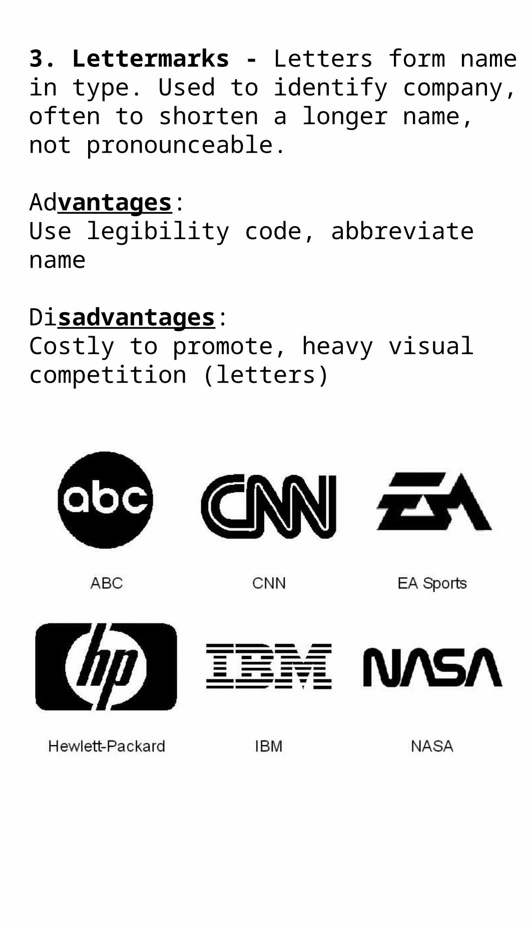
3. Lettermarks - Letters form name in type. Used to identify company, often to shorten a longer name, not pronounceable.
Advantages:Use legibility code, abbreviate name
Disadvantages:Costly to promote, heavy visual competition (letters)
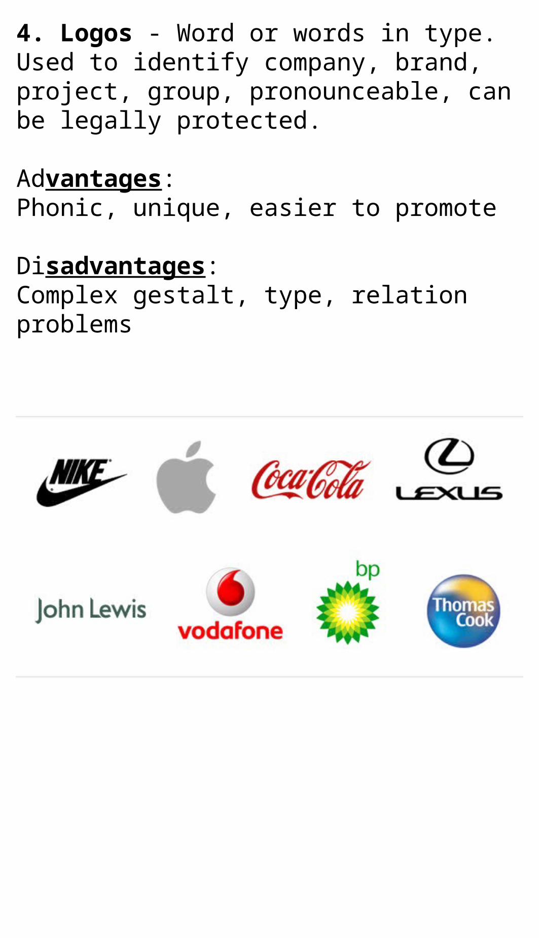
4. Logos - Word or words in type. Used to identify company, brand, project, group, pronounceable, can be legally protected.
Advantages:Phonic, unique, easier to promote
Disadvantages:Complex gestalt, type, relation problems
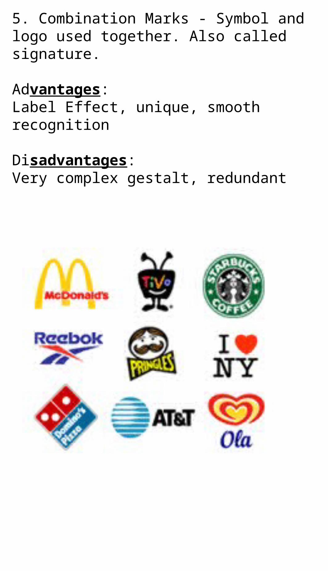
5. Combination Marks - Symbol and logo used together. Also called signature.
Advantages:Label Effect, unique, smooth recognition
Disadvantages:Very complex gestalt, redundant
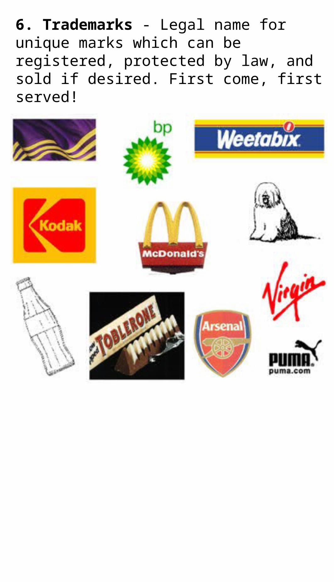
6. Trademarks - Legal name for unique marks which can be registered, protected by law, and sold if desired. First come, first served!

Find at least 5 logos/marks/symbols around the room
Sketch onto a piece of paper and describe each. Identify as symbol, mark, logo, etc. Answer the following questions for each (you do not have to rewrite on your paper):
1. What type of logo is this (symbol, mark, pictograph, etc). Explain.2. Do you feel this is effective/ineffective (support your answers)?3. Describe the colors of the logo. Describe the layout. What would you change on this? SKETCH a solution for an improved logo (thumbnail).
Assignment:Using the Design Code worksheet, sketch two logos per
design code. Label EACH.
Example:
1. Basic Shapes
2. Basic Directions
3. Basic Relationships
4. Basic Removals
5. Basic Depth Cues
6. Compositional Devices