Useful Macro Graphs - Stanford Universityweb.stanford.edu/~chadj/Chad-UsefulGraphs.pdfUseful Macro...
32
Useful Macro Graphs Charles I. Jones Stanford GSB January 12, 2015 Many of these graphs are updated versions of graphs in the Short-Run section of my Macroeconomics textbook (W.W. Norton, 2014). Others are just graphs that I find useful in my teaching.| Chad Jones, Updated Graphs – January 12, 2015 – p. 1
Transcript of Useful Macro Graphs - Stanford Universityweb.stanford.edu/~chadj/Chad-UsefulGraphs.pdfUseful Macro...

Useful Macro Graphs
Charles I. Jones
Stanford GSB
January 12, 2015
Many of these graphs are updated versions of graphs in the Short-Run
section of my Macroeconomics textbook (W.W. Norton, 2014). Others are just
graphs that I find useful in my teaching.|
Chad Jones, Updated Graphs – January 12, 2015 – p. 1
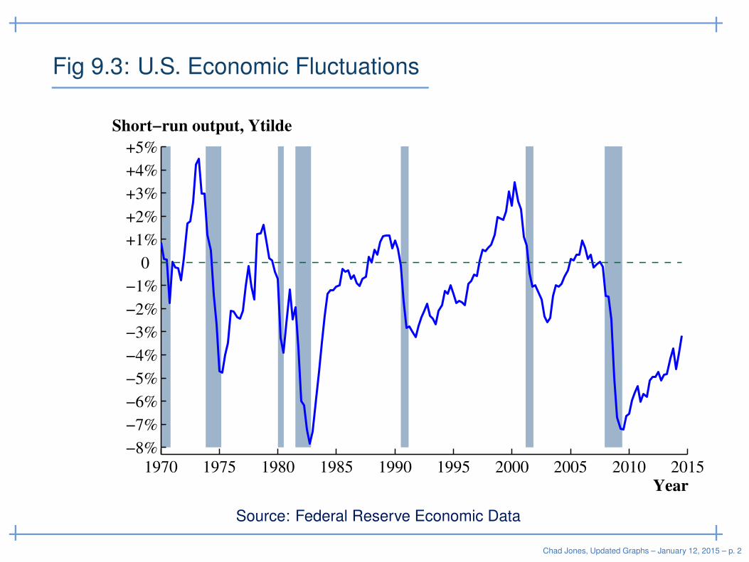
Fig 9.3: U.S. Economic Fluctuations
Year
Short−run output, Ytilde
1970 1975 1980 1985 1990 1995 2000 2005 2010 2015
−8%
−7%
−6%
−5%
−4%
−3%
−2%
−1%
0
+1%
+2%
+3%
+4%
+5%
Source: Federal Reserve Economic Data
Chad Jones, Updated Graphs – January 12, 2015 – p. 2
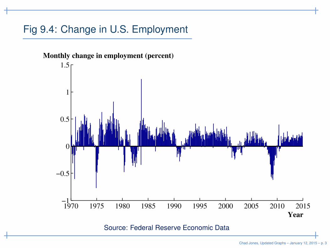
Fig 9.4: Change in U.S. Employment
1970 1975 1980 1985 1990 1995 2000 2005 2010 2015−1
−0.5
0
0.5
1
1.5
Year
Monthly change in employment (percent)
Source: Federal Reserve Economic Data
Chad Jones, Updated Graphs – January 12, 2015 – p. 3
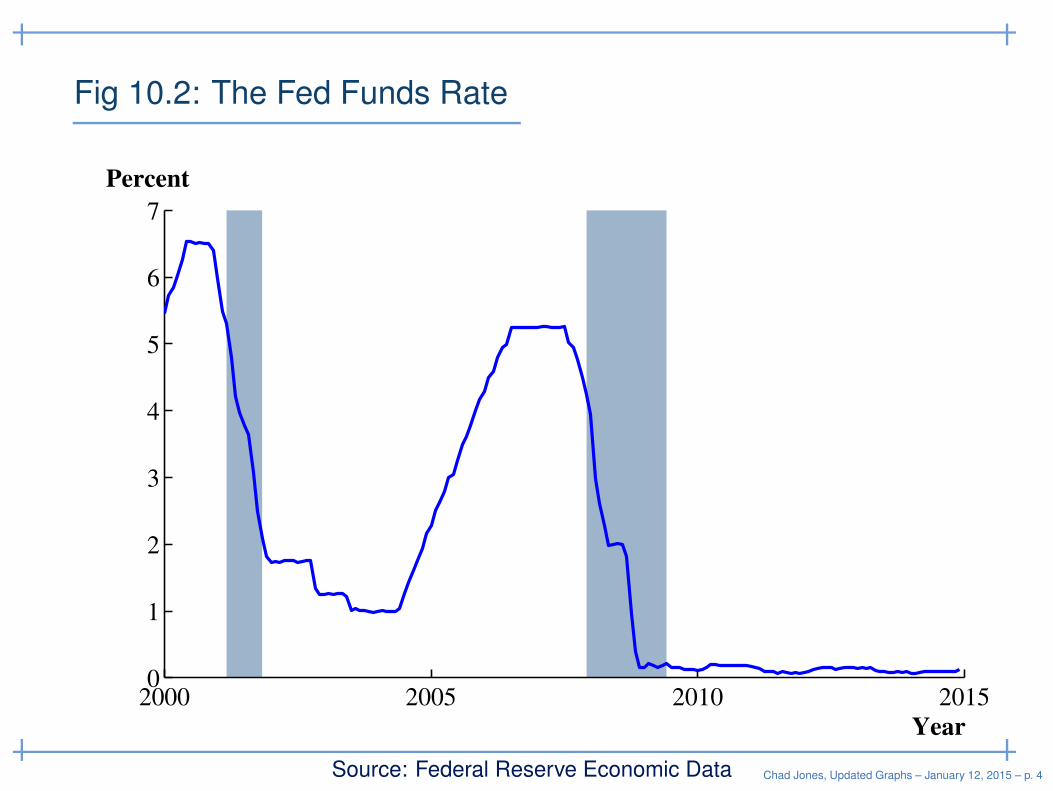
Fig 10.2: The Fed Funds Rate
Year
Percent
2000 2005 2010 20150
1
2
3
4
5
6
7
Source: Federal Reserve Economic Data Chad Jones, Updated Graphs – January 12, 2015 – p. 4
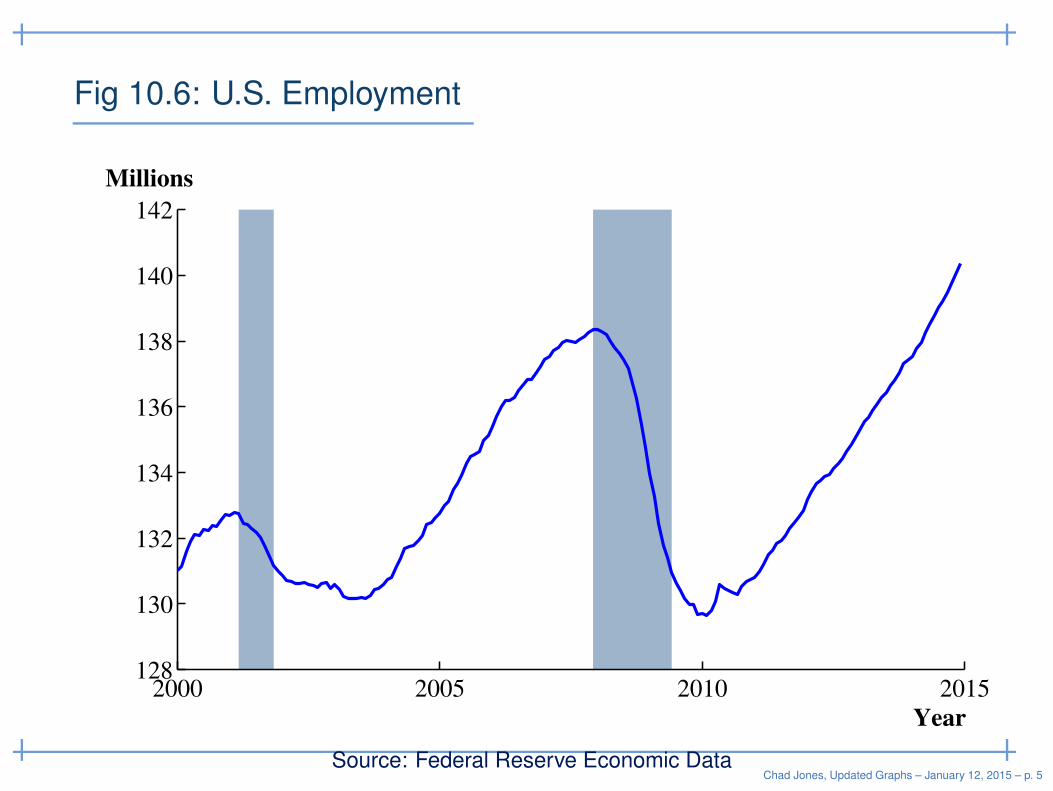
Fig 10.6: U.S. Employment
Year
Millions
2000 2005 2010 2015128
130
132
134
136
138
140
142
Source: Federal Reserve Economic DataChad Jones, Updated Graphs – January 12, 2015 – p. 5
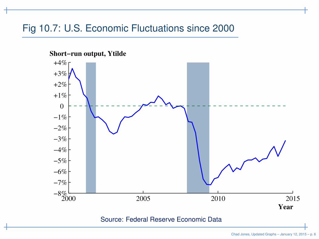
Fig 10.7: U.S. Economic Fluctuations since 2000
Year
Short−run output, Ytilde
2000 2005 2010 2015−8%
−7%
−6%
−5%
−4%
−3%
−2%
−1%
0
+1%
+2%
+3%
+4%
Source: Federal Reserve Economic Data
Chad Jones, Updated Graphs – January 12, 2015 – p. 6
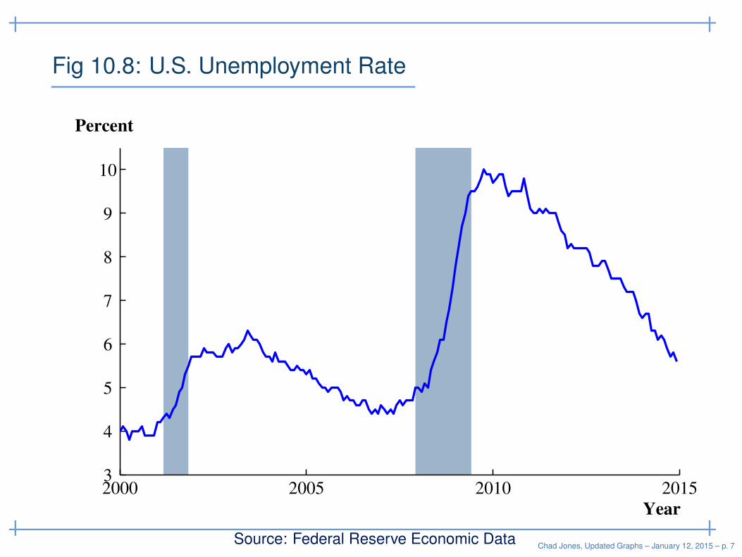
Fig 10.8: U.S. Unemployment Rate
Year
Percent
2000 2005 2010 20153
4
5
6
7
8
9
10
Source: Federal Reserve Economic DataChad Jones, Updated Graphs – January 12, 2015 – p. 7
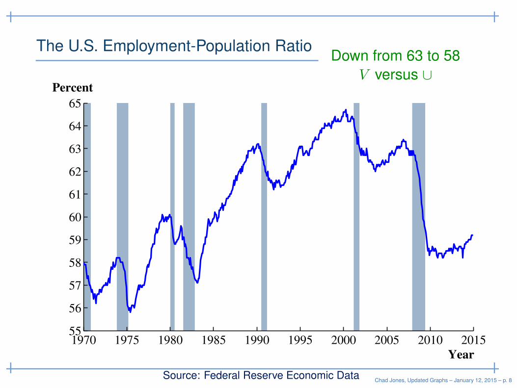
The U.S. Employment-Population Ratio
Year
Percent
1970 1975 1980 1985 1990 1995 2000 2005 2010 201555
56
57
58
59
60
61
62
63
64
65
Source: Federal Reserve Economic Data
Down from 63 to 58
V versus ∪
Chad Jones, Updated Graphs – January 12, 2015 – p. 8
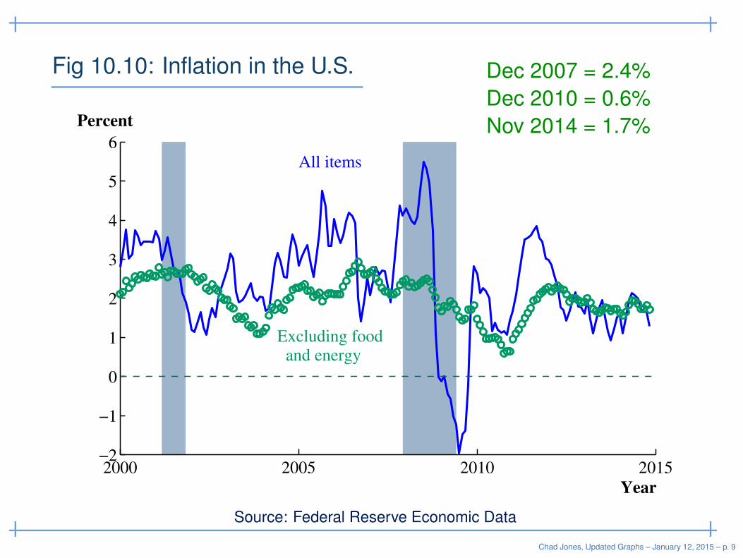
Fig 10.10: Inflation in the U.S.
Year
Percent
Excluding food and energy
All items
2000 2005 2010 2015−2
−1
0
1
2
3
4
5
6
Source: Federal Reserve Economic Data
Dec 2007 = 2.4%
Dec 2010 = 0.6%
Nov 2014 = 1.7%
Chad Jones, Updated Graphs – January 12, 2015 – p. 9
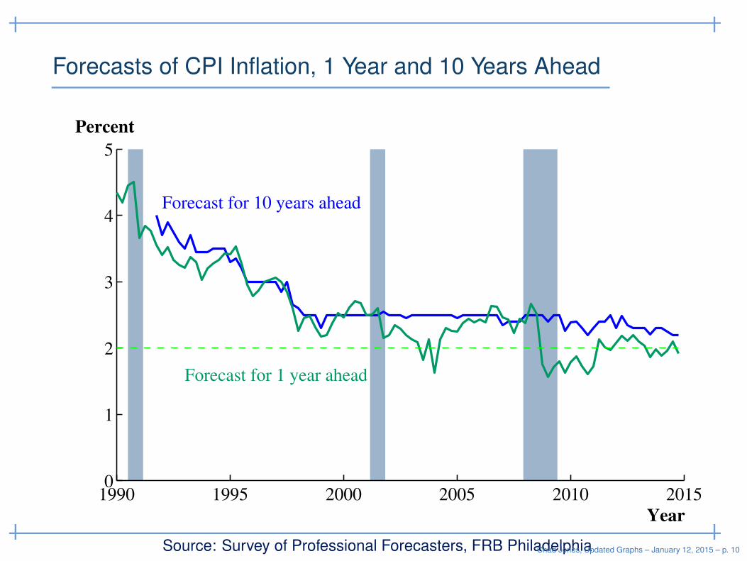
Forecasts of CPI Inflation, 1 Year and 10 Years Ahead
Forecast for 10 years ahead
Forecast for 1 year ahead
Year
Percent
1990 1995 2000 2005 2010 20150
1
2
3
4
5
Source: Survey of Professional Forecasters, FRB PhiladelphiaChad Jones, Updated Graphs – January 12, 2015 – p. 10
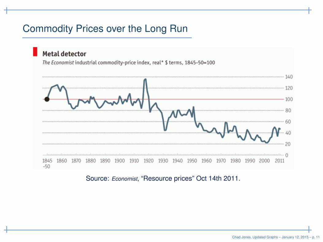
Commodity Prices over the Long Run
Source: Economist, “Resource prices” Oct 14th 2011.
Chad Jones, Updated Graphs – January 12, 2015 – p. 11
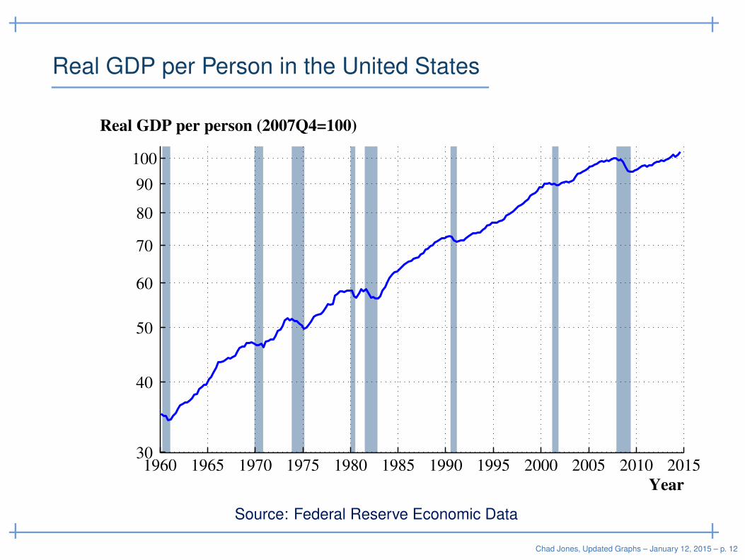
Real GDP per Person in the United States
Year
Real GDP per person (2007Q4=100)
1960 1965 1970 1975 1980 1985 1990 1995 2000 2005 2010 201530
40
50
60
70
80
90
100
Source: Federal Reserve Economic Data
Chad Jones, Updated Graphs – January 12, 2015 – p. 12
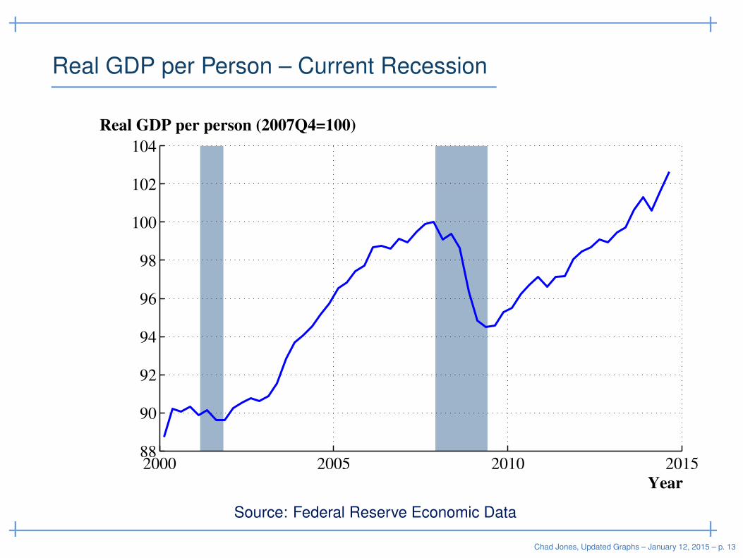
Real GDP per Person – Current Recession
Year
Real GDP per person (2007Q4=100)
2000 2005 2010 201588
90
92
94
96
98
100
102
104
Source: Federal Reserve Economic Data
Chad Jones, Updated Graphs – January 12, 2015 – p. 13
Real GDP per Employee – Current Recession
Year
GDP per Employee
2000 2005 2010 201588
90
92
94
96
98
100
102
104
106
108
Source: Federal Reserve Economic Data
Chad Jones, Updated Graphs – January 12, 2015 – p. 14
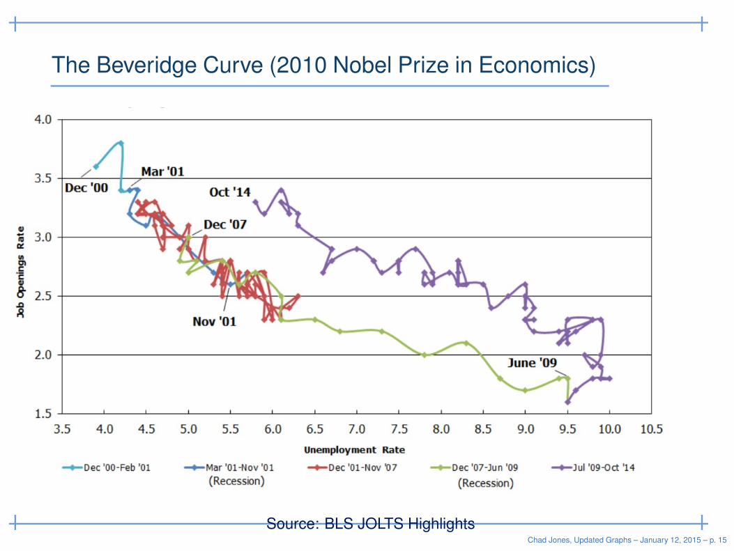
The Beveridge Curve (2010 Nobel Prize in Economics)
Source: BLS JOLTS HighlightsChad Jones, Updated Graphs – January 12, 2015 – p. 15
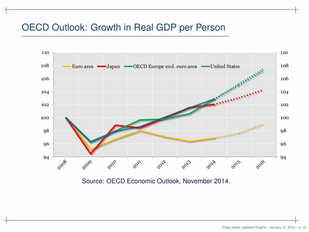
OECD Outlook: Growth in Real GDP per Person
Source: OECD Economic Outlook, November 2014.
Chad Jones, Updated Graphs – January 12, 2015 – p. 16
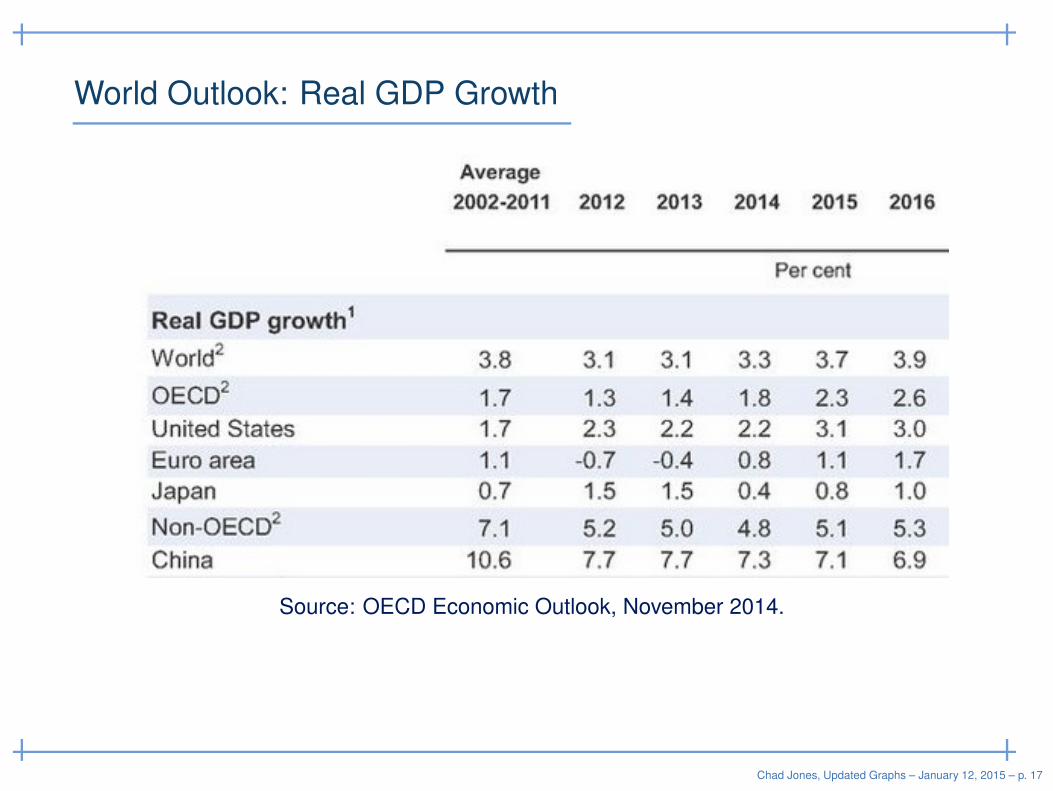
World Outlook: Real GDP Growth
Source: OECD Economic Outlook, November 2014.
Chad Jones, Updated Graphs – January 12, 2015 – p. 17
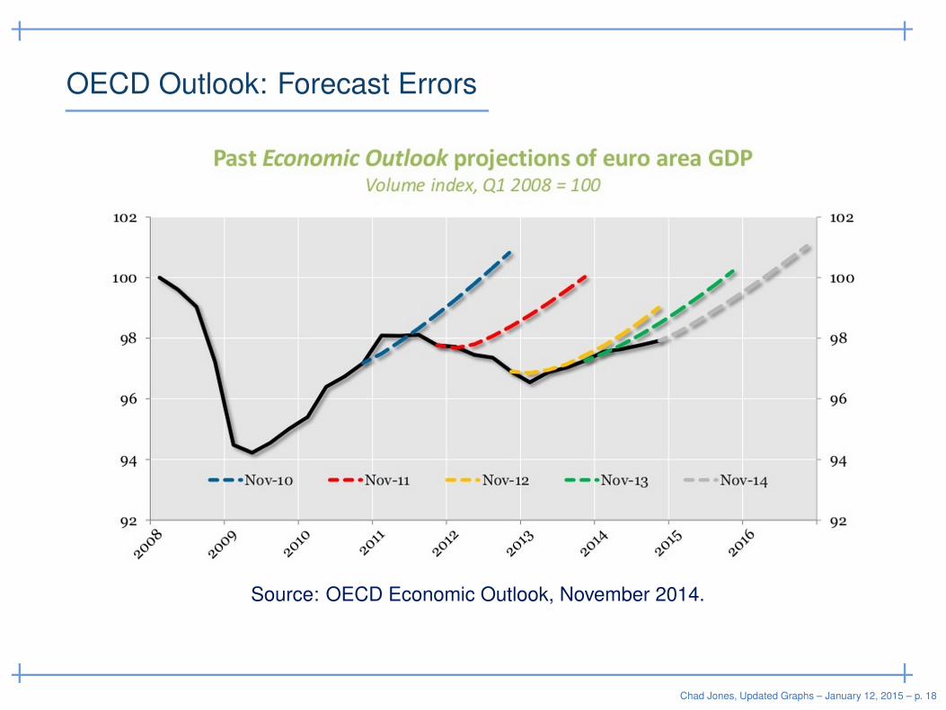
OECD Outlook: Forecast Errors
Source: OECD Economic Outlook, November 2014.
Chad Jones, Updated Graphs – January 12, 2015 – p. 18
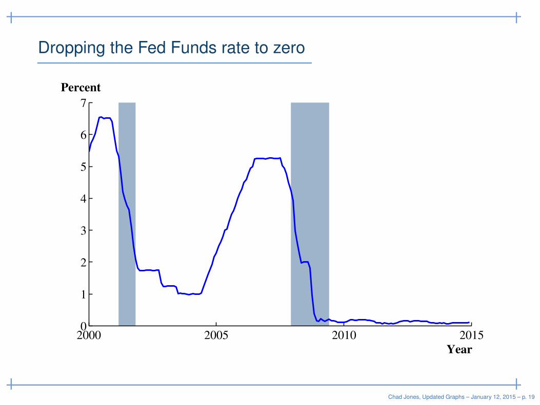
Dropping the Fed Funds rate to zero
Year
Percent
2000 2005 2010 20150
1
2
3
4
5
6
7
Chad Jones, Updated Graphs – January 12, 2015 – p. 19
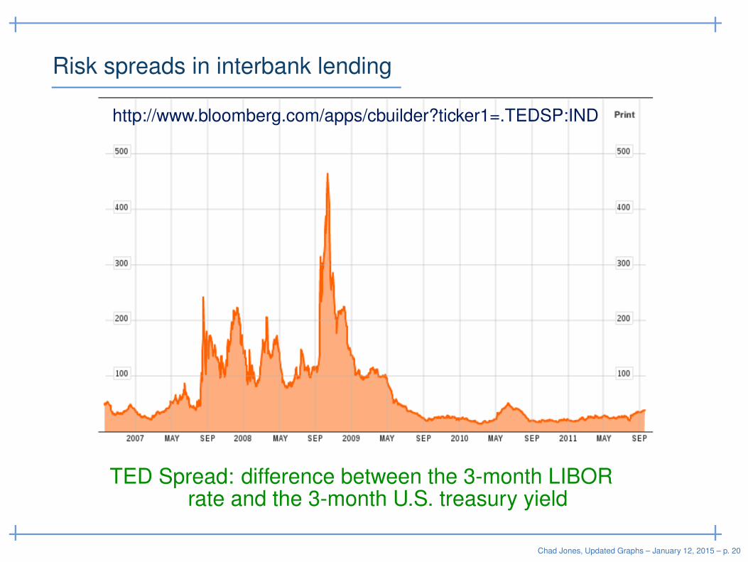
Risk spreads in interbank lending
TED Spread: difference between the 3-month LIBORrate and the 3-month U.S. treasury yield
http://www.bloomberg.com/apps/cbuilder?ticker1=.TEDSP:IND
Chad Jones, Updated Graphs – January 12, 2015 – p. 20
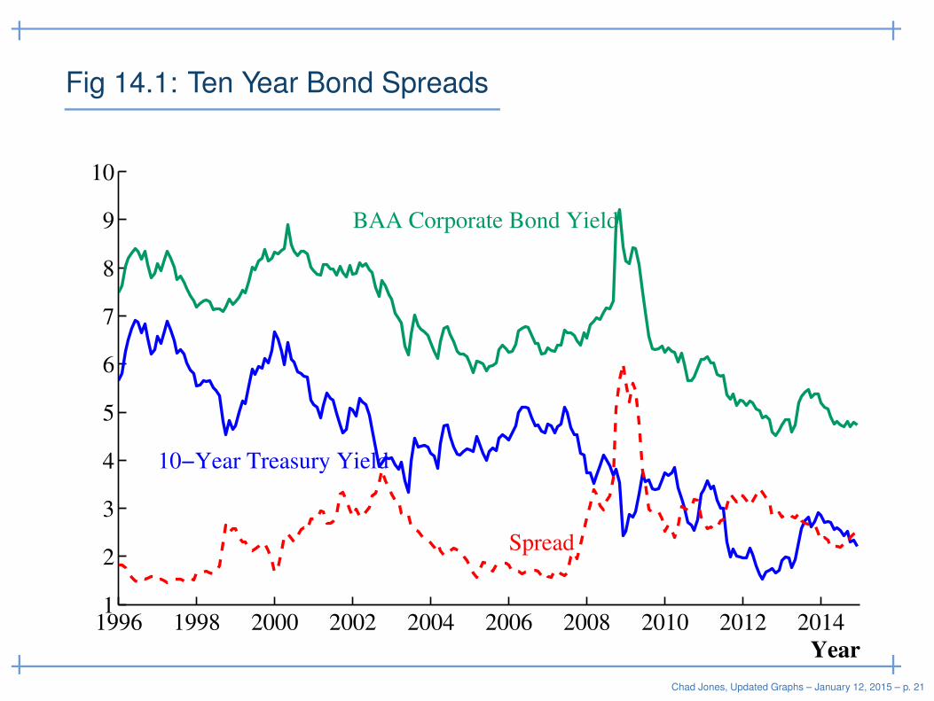
Fig 14.1: Ten Year Bond Spreads
1996 1998 2000 2002 2004 2006 2008 2010 2012 20141
2
3
4
5
6
7
8
9
10
Year
BAA Corporate Bond Yield
10−Year Treasury Yield
Spread
Chad Jones, Updated Graphs – January 12, 2015 – p. 21
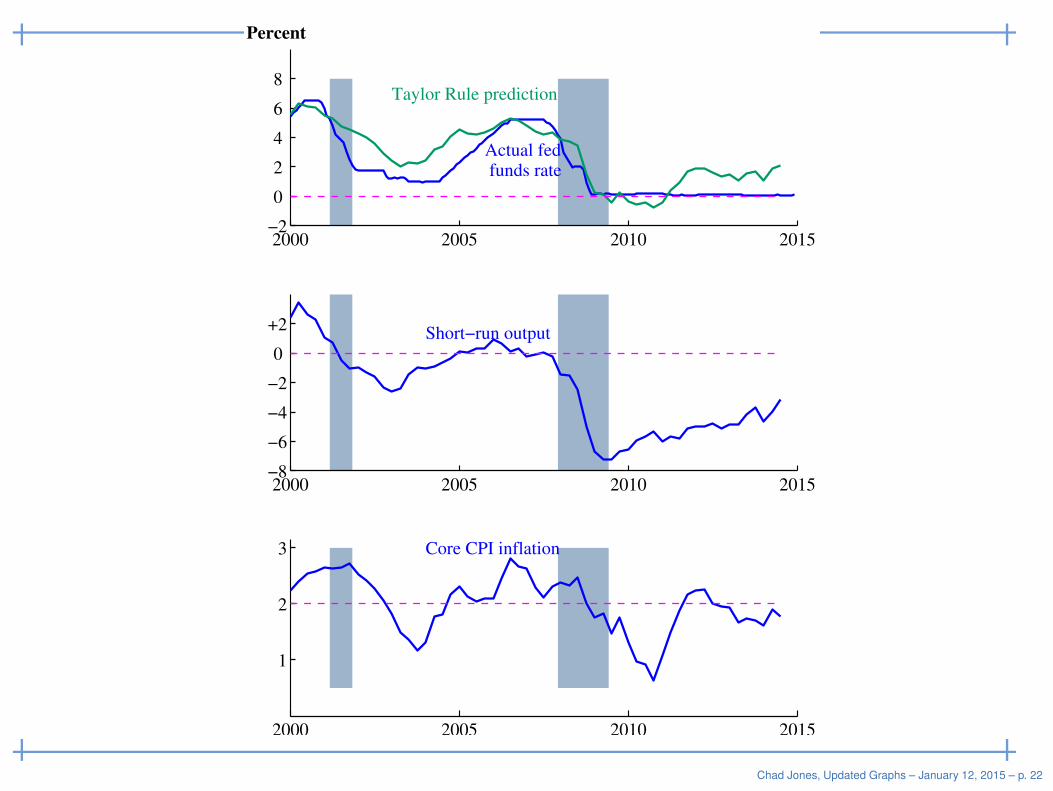
Percent
Actual fed funds rate
Taylor Rule prediction
2000 2005 2010 2015−2
0
2
4
6
8
Short−run output
2000 2005 2010 2015−8
−6
−4
−2
0
+2
Core CPI inflation
2000 2005 2010 2015
1
2
3
Chad Jones, Updated Graphs – January 12, 2015 – p. 22
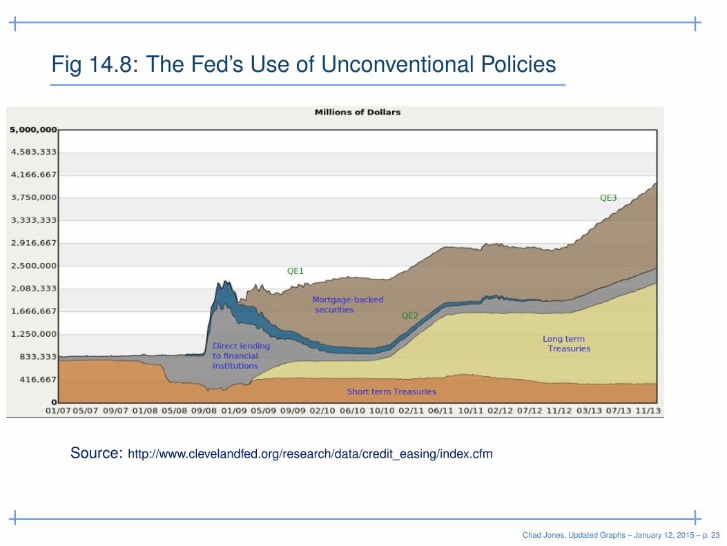
Fig 14.8: The Fed’s Use of Unconventional Policies
Source: http://www.clevelandfed.org/research/data/credit_easing/index.cfm
Chad Jones, Updated Graphs – January 12, 2015 – p. 23
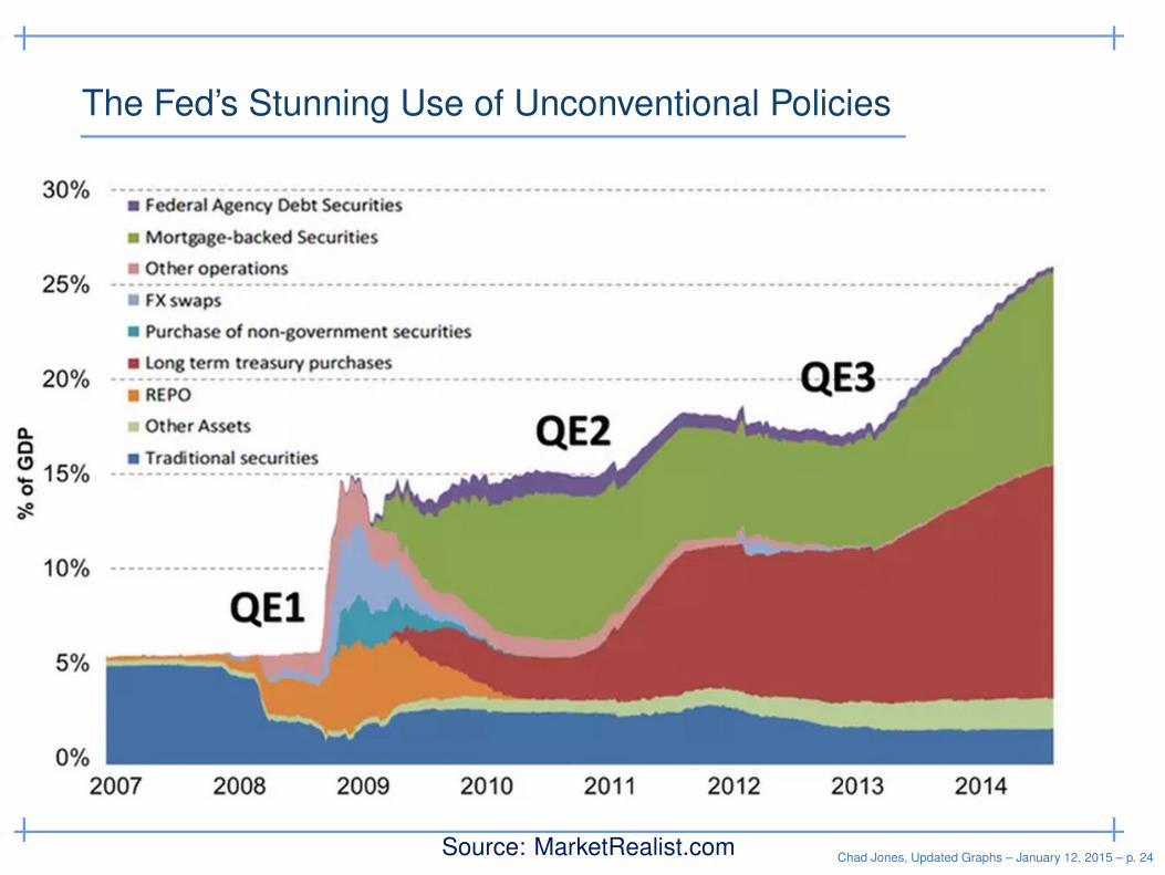
The Fed’s Stunning Use of Unconventional Policies
Source: MarketRealist.comChad Jones, Updated Graphs – January 12, 2015 – p. 24
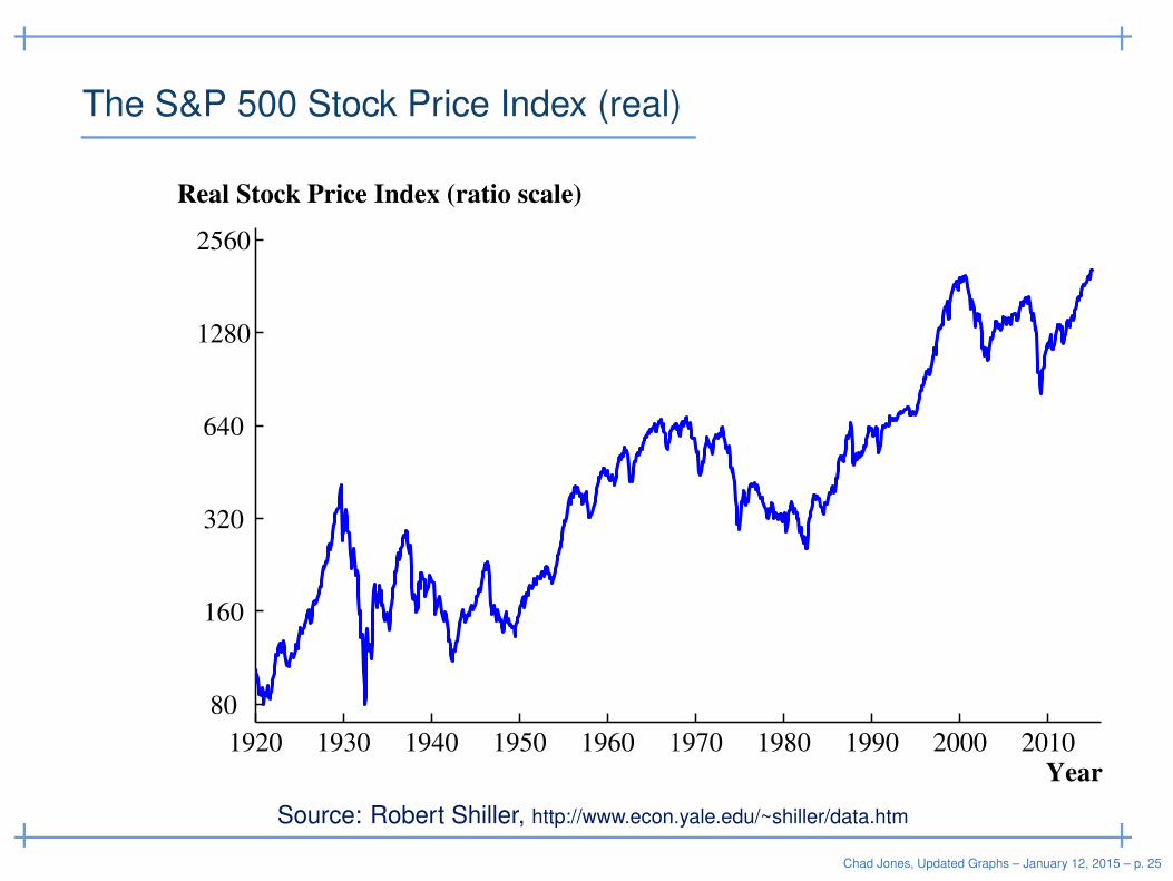
The S&P 500 Stock Price Index (real)
1920 1930 1940 1950 1960 1970 1980 1990 2000 2010
80
160
320
640
1280
2560
Year
Real Stock Price Index (ratio scale)
Source: Robert Shiller, http://www.econ.yale.edu/~shiller/data.htm
Chad Jones, Updated Graphs – January 12, 2015 – p. 25
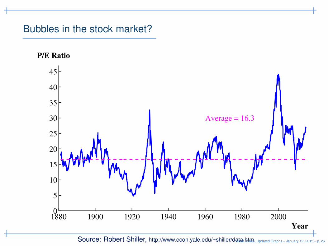
Bubbles in the stock market?
1880 1900 1920 1940 1960 1980 20000
5
10
15
20
25
30
35
40
45
Year
P/E Ratio
Average = 16.3
Source: Robert Shiller, http://www.econ.yale.edu/~shiller/data.htmChad Jones, Updated Graphs – January 12, 2015 – p. 26
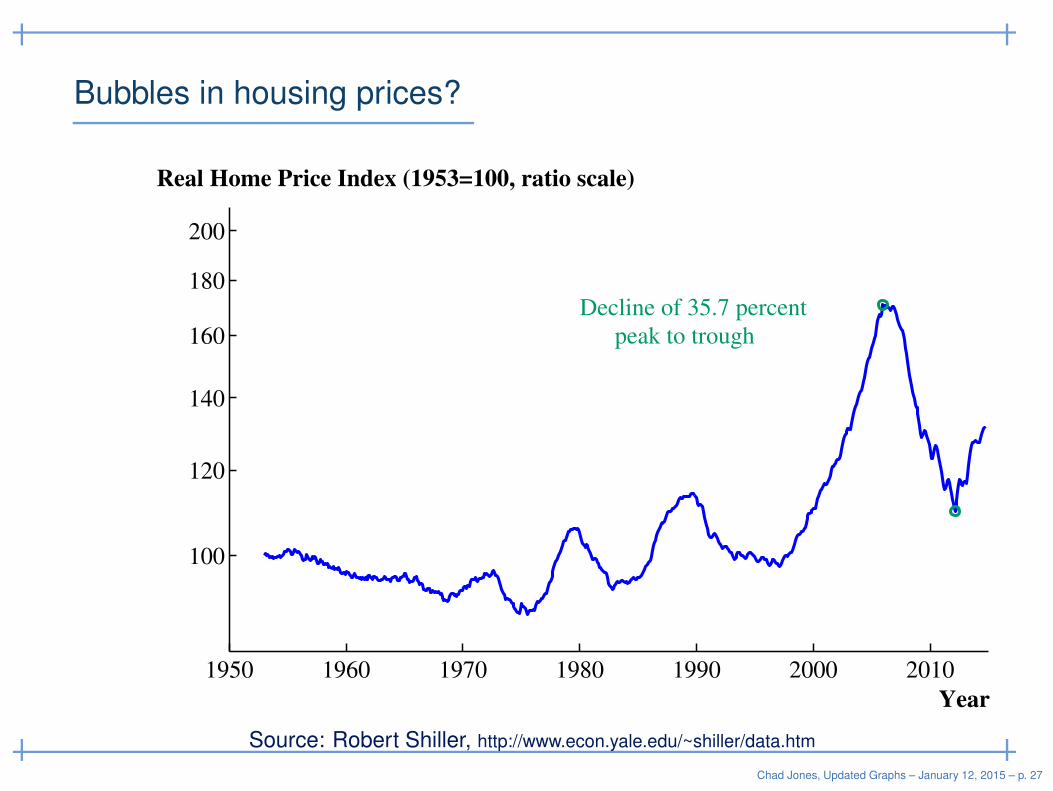
Bubbles in housing prices?
1950 1960 1970 1980 1990 2000 2010
100
120
140
160
180
200
Year
Real Home Price Index (1953=100, ratio scale)
Decline of 35.7 percent
peak to trough
Source: Robert Shiller, http://www.econ.yale.edu/~shiller/data.htm
Chad Jones, Updated Graphs – January 12, 2015 – p. 27
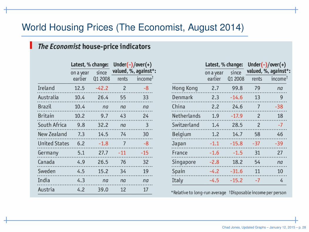
World Housing Prices (The Economist, August 2014)
Chad Jones, Updated Graphs – January 12, 2015 – p. 28
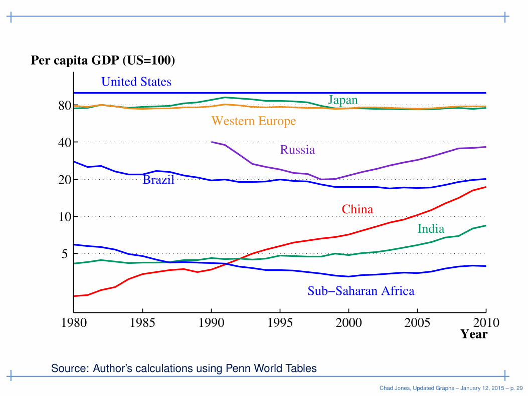
1980 1985 1990 1995 2000 2005 2010
5
10
20
40
80
Year
Per capita GDP (US=100)
United States
Japan
Western Europe
Brazil
Russia
China
India
Sub−Saharan Africa
Source: Author’s calculations using Penn World Tables
Chad Jones, Updated Graphs – January 12, 2015 – p. 29
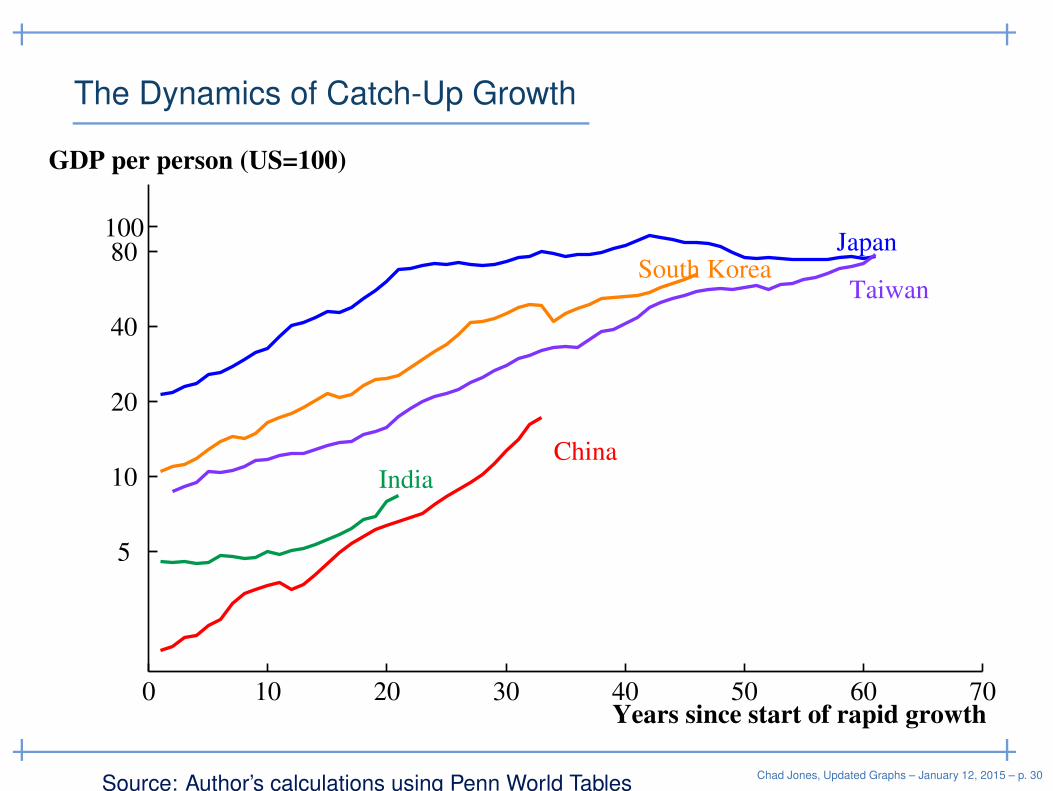
The Dynamics of Catch-Up Growth
0 10 20 30 40 50 60 70
5
10
20
40
80 100
JapanSouth Korea
Taiwan
ChinaIndia
Years since start of rapid growth
GDP per person (US=100)
Source: Author’s calculations using Penn World TablesChad Jones, Updated Graphs – January 12, 2015 – p. 30
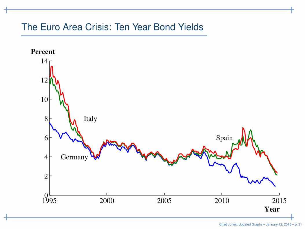
The Euro Area Crisis: Ten Year Bond Yields
1995 2000 2005 2010 20150
2
4
6
8
10
12
14
Year
Percent
Germany
Spain
Italy
Chad Jones, Updated Graphs – January 12, 2015 – p. 31
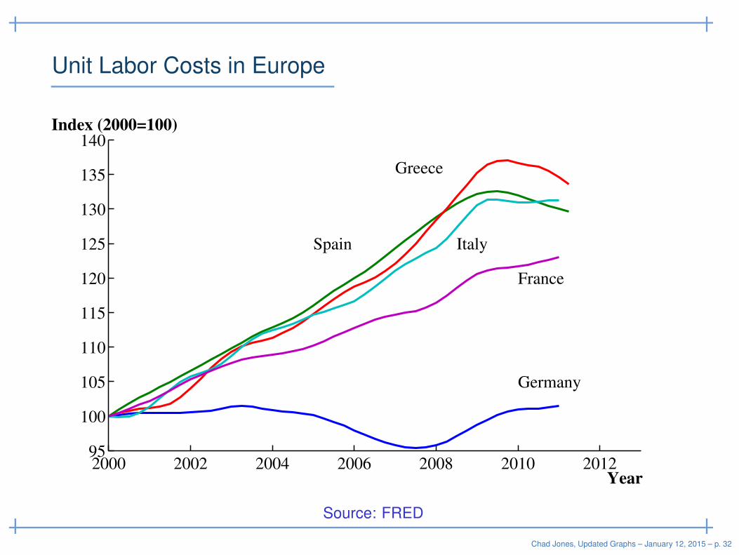
Unit Labor Costs in Europe
2000 2002 2004 2006 2008 2010 201295
100
105
110
115
120
125
130
135
140
Year
Index (2000=100)
Greece
Germany
Spain Italy
France
Source: FRED
Chad Jones, Updated Graphs – January 12, 2015 – p. 32