
STİL DOSYASI KULLANIMI (Cascading style sheets)-(CSS) · STİL DOSYASI KULLANIMI (Cascading style...
50
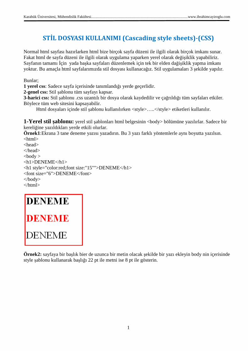
Karabük Üniversitesi, Mühendislik Fakültesi.......................................................................................................www.ibrahimcayiroglu.com 1 STİL DOSYASI KULLANIMI (Cascading style sheets)-(CSS) Normal html sayfası hazırlarken html bize birçok sayfa düzeni ile ilgili olarak birçok imkanı sunar. Fakat html de sayfa düzeni ile ilgili olarak uygulama yaparken yerel olarak değişiklik yapabiliriz. Sayfanın tamamı İçin yada başka sayfaları düzenlemek için tek bir elden dağişiklik yapma imkanı yoktur. Bu amaçla html sayfalarımızda stil dosyası kullanacağız. Stil uygulamaları 3 şekilde yapılır. Bunlar; 1 yerel css: Sadece sayfa içerisinde tanımlandığı yerde geçerlidir. 2-genel css: Stil şablonu tüm sayfayı kapsar. 3-harici css: Stil şablonu .css uzantılı bir dosya olarak kaydedilir ve çağrıldığı tüm sayfaları etkiler. Böylece tüm web sitesini kapsayabilir. Html dosyaları içinde stil şablonu kullanılırken <style>…..</style> etiketleri kullanılır. 1-Yerel stil şablonu: yerel stil şablonları html belgesinin <body> bölümüne yazılırlar. Sadece bir kereliğine yazıldıkları yerde etkili olurlar. Örnek1:Ekrana 3 tane deneme yazısı yazadırın. Bu 3 yazı farklı yöntemlerle aynı boyutta yazılsın. <html> <head> </head> <body > <h1>DENEME</h1> <h1 style="color:red;font size:"15"">DENEME</h1> <font size="6">DENEME</font> </body> </html> Örnek2: sayfaya bir başlık bier de uzunca bir metin olacak şekilde bir yazı ekleyin body nin içerisinde style şablonu kullanarak başlığı 22 pt ile metni ise 8 pt ile gösterin.
Transcript of STİL DOSYASI KULLANIMI (Cascading style sheets)-(CSS) · STİL DOSYASI KULLANIMI (Cascading style...
Karabük Üniversitesi, Mühendislik Fakültesi.......................................................................................................www.ibrahimcayiroglu.com
1
STİL DOSYASI KULLANIMI (Cascading style sheets)-(CSS) Normal html sayfası hazırlarken html bize birçok sayfa düzeni ile ilgili olarak birçok imkanı sunar. Fakat html de sayfa düzeni ile ilgili olarak uygulama yaparken yerel olarak değişiklik yapabiliriz. Sayfanın tamamı İçin yada başka sayfaları düzenlemek için tek bir elden dağişiklik yapma imkanı yoktur. Bu amaçla html sayfalarımızda stil dosyası kullanacağız. Stil uygulamaları 3 şekilde yapılır. Bunlar; 1 yerel css: Sadece sayfa içerisinde tanımlandığı yerde geçerlidir. 2-genel css: Stil şablonu tüm sayfayı kapsar. 3-harici css: Stil şablonu .css uzantılı bir dosya olarak kaydedilir ve çağrıldığı tüm sayfaları etkiler. Böylece tüm web sitesini kapsayabilir. Html dosyaları içinde stil şablonu kullanılırken <style>…..</style> etiketleri kullanılır. 1-Yerel stil şablonu: yerel stil şablonları html belgesinin <body> bölümüne yazılırlar. Sadece bir kereliğine yazıldıkları yerde etkili olurlar. Örnek1:Ekrana 3 tane deneme yazısı yazadırın. Bu 3 yazı farklı yöntemlerle aynı boyutta yazılsın. <html> <head> </head> <body > <h1>DENEME</h1> <h1 style="color:red;font size:"15"">DENEME</h1> <font size="6">DENEME</font> </body> </html>
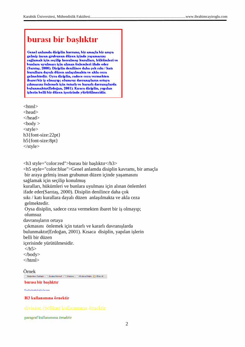
Örnek2: sayfaya bir başlık bier de uzunca bir metin olacak şekilde bir yazı ekleyin body nin içerisinde style şablonu kullanarak başlığı 22 pt ile metni ise 8 pt ile gösterin.
Karabük Üniversitesi, Mühendislik Fakültesi.......................................................................................................www.ibrahimcayiroglu.com
2
<html> <head> </head> <body > <style> h3{font-size:22pt} h5{font-size:8pt} </style> <h3 style="color:red">burası bir başlıktır</h3> <h5 style="color:blue">Genel anlamda disiplin kavramı, bir amaçla bir araya gelmiş insan grubunun düzen içinde yaşamasını sağlamak için seçilip konulmuş kuralları, hükümleri ve bunlara uyulması için alınan önlemleri ifade eder(Sarıtaş, 2000). Disiplin denilince daha çok sıkı / katı kurallara dayalı düzen anlaşılmakta ve akla ceza gelmektedir. Oysa disiplin, sadece ceza vermekten ibaret bir iş olmayıp; olumsuz davranışların ortaya çıkmasını önlemek için tutarlı ve kararlı davranışlarda bulunmaktır(Erdoğan, 2001). Kısaca disiplin, yapılan işlerin belli bir düzen içerisinde yürütülmesidir. </h5> </body> </html> Örnek
Karabük Üniversitesi, Mühendislik Fakültesi.......................................................................................................www.ibrahimcayiroglu.com
3
<html> <head> <style> h3{font-size:22pt;color:red} h5{font-size:8pt;color:blue} div{font-size:28pt;color:yellow} p{font-size:20pt;color:green} </style> </head> <body > <h3>burası bir başlıktır</h3> <h5 >Genel anlamda disiplin kavramı </h5> <h3> H3 kullanımına örnektir</h3> <div>division (bölüm) kullanımına örnektir</div> <p>paragraf kullanımına örnektir</p> </body> </html> Açıklama: stil etiketleri içerisinde biçim özelliklerinde değişiklik yapılmak istenen deyimler önce yazılır. (<h1> h3 gibi) daha sonra {} içerisinde parametreler ve değerleri verilir. Parametre ile değerleri arasında : kullanılır. Her parametrenin arasında ise ; kullanılır. Örnek1: <h1 style="color:red;font size:"15"">DENEME</h1> <style>…..</style>etiketinin parametreleri Font-size:”8pt”: bu parametre yazının punto büyüklüğünü belirtir. Color:red: bu parametre yazının rengini belirtir. Font-style: yazının italik normal ya da oblique(eğik, yatık, eğimli) olarak biçimlenmesini sağlar. Font-weight:bold: metnin kalın ya da normal görünmesini sağlar. Font-family :Arial:yazının tipini belirtir. 2-Genel stil şablonu: Bu şablonlar html belgesinin <head > bölümüne yazılırlar ve belgenin tamamını etkilerler. Örnek2: <html> <head> </head> <body > <STYLE> H3{color: red; font-size:22pt} H5{font-size:8pt} </STYLE> <h3>BURASI BİR BAŞLIKTIR</h3>
Karabük Üniversitesi, Mühendislik Fakültesi.......................................................................................................www.ibrahimcayiroglu.com
4
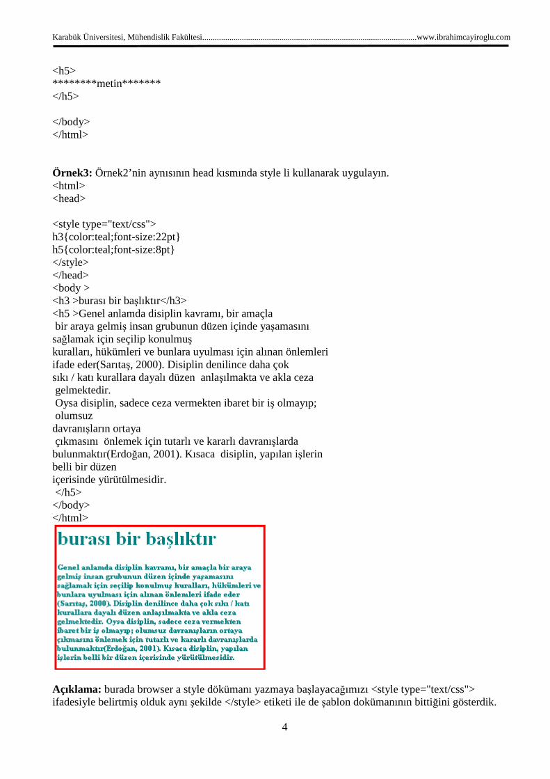
<h5> ********metin******* </h5> </body> </html> Örnek3: Örnek2’nin aynısının head kısmında style li kullanarak uygulayın. <html> <head> <style type="text/css"> h3{color:teal;font-size:22pt} h5{color:teal;font-size:8pt} </style> </head> <body > <h3 >burası bir başlıktır</h3> <h5 >Genel anlamda disiplin kavramı, bir amaçla bir araya gelmiş insan grubunun düzen içinde yaşamasını sağlamak için seçilip konulmuş kuralları, hükümleri ve bunlara uyulması için alınan önlemleri ifade eder(Sarıtaş, 2000). Disiplin denilince daha çok sıkı / katı kurallara dayalı düzen anlaşılmakta ve akla ceza gelmektedir. Oysa disiplin, sadece ceza vermekten ibaret bir iş olmayıp; olumsuz davranışların ortaya çıkmasını önlemek için tutarlı ve kararlı davranışlarda bulunmaktır(Erdoğan, 2001). Kısaca disiplin, yapılan işlerin belli bir düzen içerisinde yürütülmesidir. </h5> </body> </html>
Açıklama: burada browser a style dökümanı yazmaya başlayacağımızı <style type="text/css"> ifadesiyle belirtmiş olduk aynı şekilde </style> etiketi ile de şablon dokümanının bittiğini gösterdik.
Karabük Üniversitesi, Mühendislik Fakültesi.......................................................................................................www.ibrahimcayiroglu.com
5
Arada kullanılan <!-- ve --> bu işaretler eski browser ların yani css yi bilmeyen browser ların hata yapmasının engellemek için konulmuştur. Yeni tipbrowserlar css yi tanıdığından bu işaretler yazılmayabilir. 3- Harici stil şablonu: bu yöntem tüm web sitesinin içerisindeki sayfaları tek tek düzenlemekten bizi kurtaran önemli nir yöntemdir. Bu teknikte önce bir stil dosyasının şablonu oluşturulur .css uzantısı ile kaydedilir. Daha sonra stil dosyasının kullanılacağı tüm sayfaların başında çağırılır. Örnek4: örnek 3 de kullanılan uygulamayı 2 ayrı dosya şeklinde kaydedin(sayfa1.htm,sayfa2.htm) daha sonra bu 2 dosyayı dışarıdan sablon.css adında bir stil dosyası ile kontrol edin. Başlıkları ve metni farklı punto ve renklerle gösterin. Sablon.css: h3{color:teal;font-size:22pt} h5{color:teal;font-size:8pt} Sayfa2.htm: <html> <head> <link rel="stylesheet" type="text/css" href="sablon.css"> </head> <body > deneme </body> </html> Sayfa1.htm: <html> <head> <link rel="stylesheet" type="text/css" href="sablon.css"> </head> <body > deneme </body> </html> **************** BURADAN SONRASI DÜZENLENECEK*************************** Örnek p { color:red; text-align:center; }
Yorum Satırı Yazma, /*This is a comment*/ p { text-align:center;
Karabük Üniversitesi, Mühendislik Fakültesi.......................................................................................................www.ibrahimcayiroglu.com
6
/*This is another comment*/ color:black; font-family:arial; }
Id ile nesneleri birbirinden ayırma
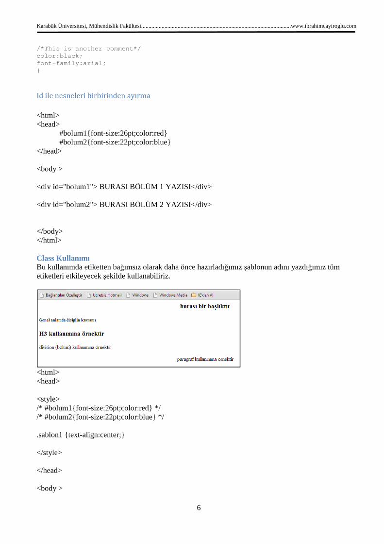
<html> <head> #bolum1{font-size:26pt;color:red} #bolum2{font-size:22pt;color:blue} </head> <body > <div id="bolum1"> BURASI BÖLÜM 1 YAZISI</div> <div id="bolum2"> BURASI BÖLÜM 2 YAZISI</div> </body> </html> Class Kullanımı Bu kullanımda etiketten bağımsız olarak daha önce hazırladığımız şablonun adını yazdığımız tüm etiketleri etkileyecek şekilde kullanabiliriz.
<html> <head> <style> /* #bolum1{font-size:26pt;color:red} */ /* #bolum2{font-size:22pt;color:blue} */ .sablon1 {text-align:center;} </style> </head> <body >
Karabük Üniversitesi, Mühendislik Fakültesi.......................................................................................................www.ibrahimcayiroglu.com
7
<h3 class="sablon1">burası bir başlıktır</h3> <h5>Genel anlamda disiplin kavramı </h5> <h3> H3 kullanımına örnektir</h3> <div>division (bölüm) kullanımına örnektir</div> <p class="sablon1">paragraf kullanımına örnektir</p> </body> </html> Class kullanımının etikete bağlı olarak kullanımı
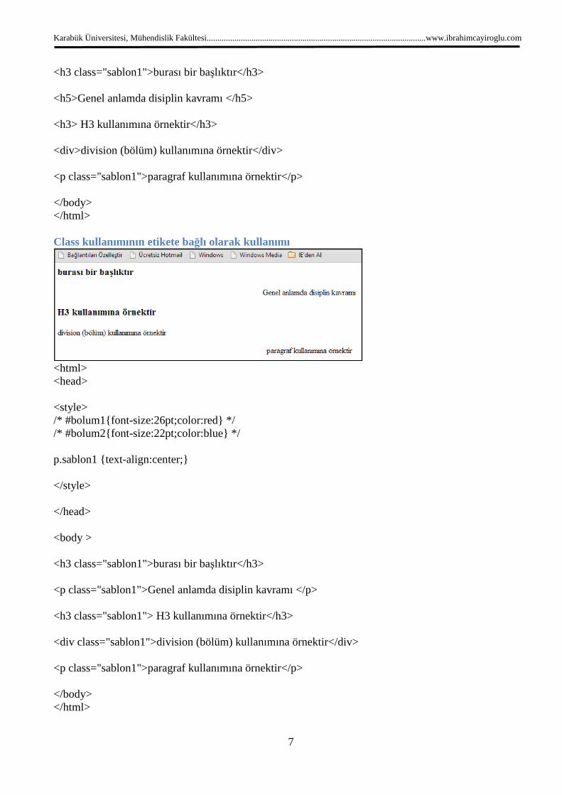
<html> <head> <style> /* #bolum1{font-size:26pt;color:red} */ /* #bolum2{font-size:22pt;color:blue} */ p.sablon1 {text-align:center;} </style> </head> <body > <h3 class="sablon1">burası bir başlıktır</h3> <p class="sablon1">Genel anlamda disiplin kavramı </p> <h3 class="sablon1"> H3 kullanımına örnektir</h3> <div class="sablon1">division (bölüm) kullanımına örnektir</div> <p class="sablon1">paragraf kullanımına örnektir</p> </body> </html>
Karabük Üniversitesi, Mühendislik Fakültesi.......................................................................................................www.ibrahimcayiroglu.com
8
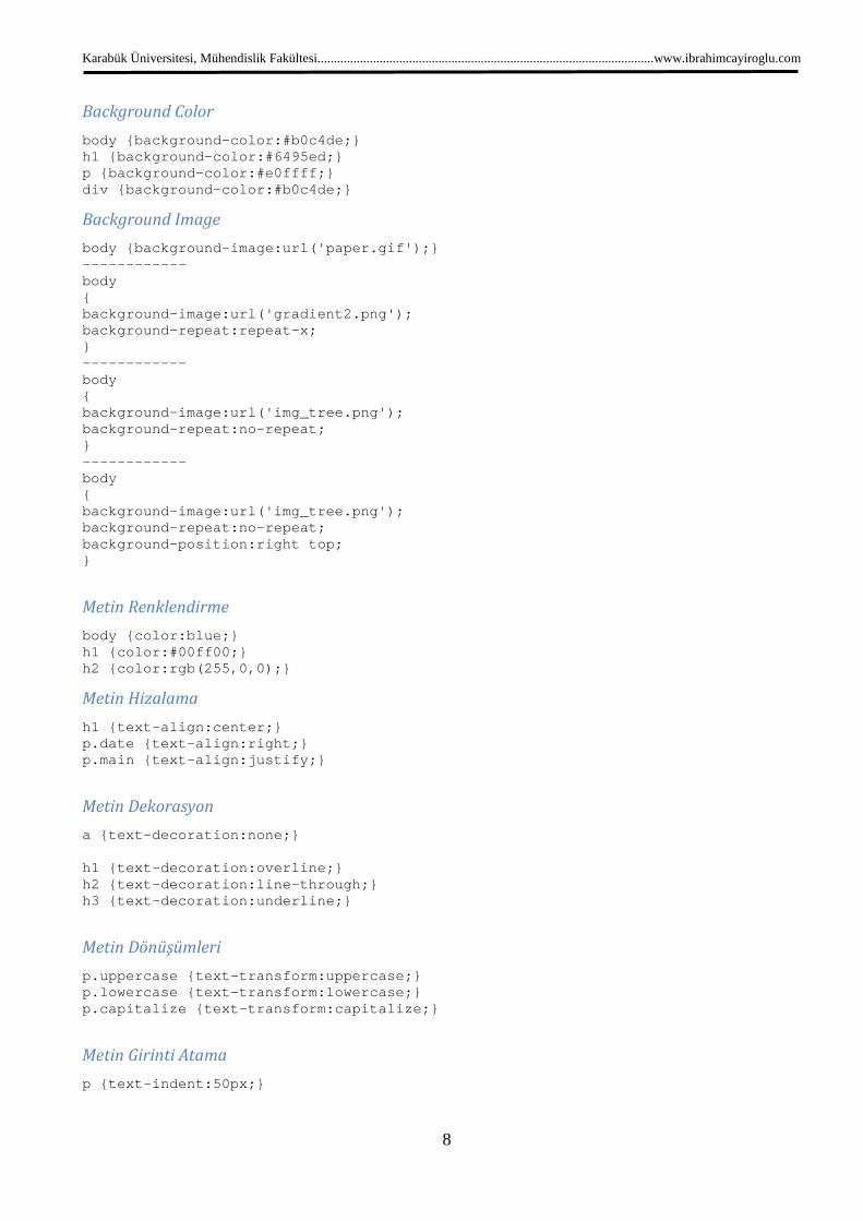
Background Color
body {background-color:#b0c4de;} h1 {background-color:#6495ed;} p {background-color:#e0ffff;} div {background-color:#b0c4de;}
Background Image
body {background-image:url('paper.gif');} ------------ body { background-image:url('gradient2.png'); background-repeat:repeat-x; } ------------ body { background-image:url('img_tree.png'); background-repeat:no-repeat; } ------------ body { background-image:url('img_tree.png'); background-repeat:no-repeat; background-position:right top; }
Metin Renklendirme
body {color:blue;} h1 {color:#00ff00;} h2 {color:rgb(255,0,0);}
Metin Hizalama
h1 {text-align:center;} p.date {text-align:right;} p.main {text-align:justify;}
Metin Dekorasyon
a {text-decoration:none;} h1 {text-decoration:overline;} h2 {text-decoration:line-through;} h3 {text-decoration:underline;}
Metin Dönüşümleri
p.uppercase {text-transform:uppercase;} p.lowercase {text-transform:lowercase;} p.capitalize {text-transform:capitalize;}
Metin Girinti Atama
p {text-indent:50px;}

Karabük Üniversitesi, Mühendislik Fakültesi
Font Family
p{font- family:"Times New Roman", Times, serif;}
Font Style
p.normal {font- style:normal;}p.italic {font- style:italic;}
Font Size
The font-size property sets the size of the text.
Being able to manage the text size
adjustments to make paragraphs look like headings, or headings look like paragraphs.
Always use the proper HTML tags, like <h1>
The font-size value can be an absolute, or relative size.
Absolute size:
• Sets the text to a specified size
• Does not allow a user to change the text size in all browsers (bad for accessibility reasons)
• Absolute size is useful when the physical size of the output is known
Relative size:
• Sets the size relative to surrounding elements
• Allows a user to change the text size in browsers
If you do not specify a font size, the default size for normal text, like paragraphs, is 16px (16px=1em).
Set Font Size With Pixels
Setting the text size with pixels gives you full control over the text size:
Example
h1 {font-size:40px;} h2 {font-size:30px;} p {font-size:14px;}
Try it yourself »
The example above allows Internet Explorer 9, Firefox, Chrome, Opera, and Safari to resize the text.
Note: The example above does not work in IE, prior version 9.
The text can be resized in all browsers using the zoom tool (however, this resizes the entire
text).
Karabük Üniversitesi, Mühendislik Fakültesi.......................................................................................................www.ibrahimcayiroglu.c
9
family:"Times New Roman", Times, serif;}
style:normal;} style:italic;}
size property sets the size of the text.
is important in web design. However, you should not use font size
adjustments to make paragraphs look like headings, or headings look like paragraphs.
Always use the proper HTML tags, like <h1> - <h6> for headings and <p> for paragraphs.
ue can be an absolute, or relative size.
Sets the text to a specified size
Does not allow a user to change the text size in all browsers (bad for accessibility reasons)
Absolute size is useful when the physical size of the output is known
Sets the size relative to surrounding elements
Allows a user to change the text size in browsers
If you do not specify a font size, the default size for normal text, like paragraphs, is 16px (16px=1em).
Set Font Size With Pixels
the text size with pixels gives you full control over the text size:
example above allows Internet Explorer 9, Firefox, Chrome, Opera, and Safari to resize the text.
The example above does not work in IE, prior version 9.
The text can be resized in all browsers using the zoom tool (however, this resizes the entire
.......................................................................................................www.ibrahimcayiroglu.com
is important in web design. However, you should not use font size
adjustments to make paragraphs look like headings, or headings look like paragraphs.
<h6> for headings and <p> for paragraphs.
Does not allow a user to change the text size in all browsers (bad for accessibility reasons)
If you do not specify a font size, the default size for normal text, like paragraphs, is 16px (16px=1em).
example above allows Internet Explorer 9, Firefox, Chrome, Opera, and Safari to resize the text.
The text can be resized in all browsers using the zoom tool (however, this resizes the entire page, not just the

Karabük Üniversitesi, Mühendislik Fakültesi.......................................................................................................www.ibrahimcayiroglu.com
10
Set Font Size With Em
To avoid the resizing problem with older versions of Internet Explorer, many developers use em instead of
pixels.
The em size unit is recommended by the W3C.
1em is equal to the current font size. The default text size in browsers is 16px. So, the default size of 1em is
16px.
The size can be calculated from pixels to em using this formula: pixels/16=em
Example
h1 {font-size:2.5em;} /* 40px/16=2.5em */ h2 {font-size:1.875em;} /* 30px/16=1.875em */ p {font-size:0.875em;} /* 14px/16=0.875em */
Try it yourself »
In the example above, the text size in em is the same as the previous example in pixels. However, with the
em size, it is possible to adjust the text size in all browsers.
Unfortunately, there is still a problem with older versions of IE. The text becomes larger than it should when
made larger, and smaller than it should when made smaller.
Use a Combination of Percent and Em
The solution that works in all browsers, is to set a default font-size in percent for the <body> element:
Example
body {font-size:100%;} h1 {font-size:2.5em;} h2 {font-size:1.875em;} p {font-size:0.875em;}
Try it yourself »
Our code now works great! It shows the same text size in all browsers, and allows all browsers to zoom or
resize the text!
Styling Links
Links can be styled with any CSS property (e.g. color, font-family, background, etc.).
Special for links are that they can be styled differently depending on what state they are in.
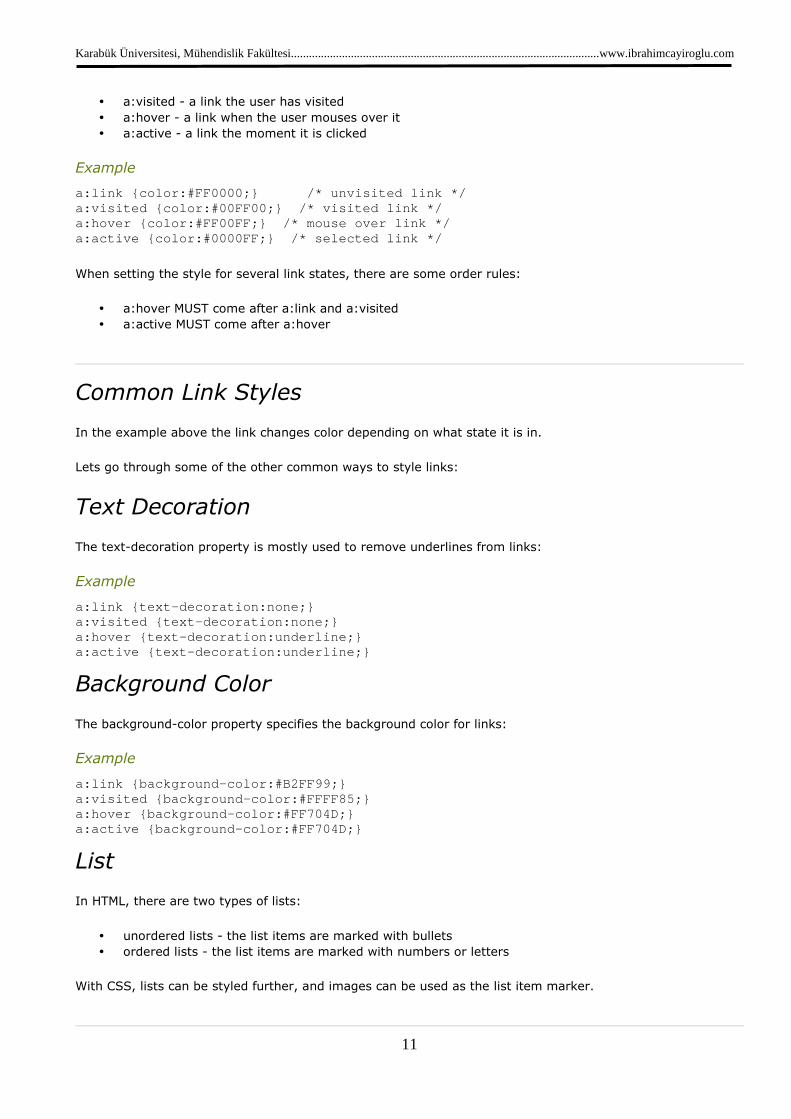
The four links states are:
• a:link - a normal, unvisited link
Karabük Üniversitesi, Mühendislik Fakültesi.......................................................................................................www.ibrahimcayiroglu.com
11
• a:visited - a link the user has visited
• a:hover - a link when the user mouses over it
• a:active - a link the moment it is clicked
Example
a:link {color:#FF0000;} /* unvisited link */ a:visited {color:#00FF00;} /* visited link */ a:hover {color:#FF00FF;} /* mouse over link */ a:active {color:#0000FF;} /* selected link */
When setting the style for several link states, there are some order rules:
• a:hover MUST come after a:link and a:visited
• a:active MUST come after a:hover
Common Link Styles
In the example above the link changes color depending on what state it is in.
Lets go through some of the other common ways to style links:
Text Decoration
The text-decoration property is mostly used to remove underlines from links:
Example
a:link {text-decoration:none;} a:visited {text-decoration:none;} a:hover {text-decoration:underline;} a:active {text-decoration:underline;}
Background Color
The background-color property specifies the background color for links:
Example
a:link {background-color:#B2FF99;} a:visited {background-color:#FFFF85;} a:hover {background-color:#FF704D;} a:active {background-color:#FF704D;}
List
In HTML, there are two types of lists:
• unordered lists - the list items are marked with bullets
• ordered lists - the list items are marked with numbers or letters
With CSS, lists can be styled further, and images can be used as the list item marker.

Karabük Üniversitesi, Mühendislik Fakültesi.......................................................................................................www.ibrahimcayiroglu.com
12
Different List Item Markers
The type of list item marker is specified with the list-style-type property:
Example
ul.a {list-style-type: circle;} ul.b {list-style-type: square;} ol.c {list-style-type: upper-roman;} ol.d {list-style-type: lower-alpha;}
An Image as The List Item Marker
To specify an image as the list item marker, use the list-style-image property:
Example
ul { list-style-image: url('sqpurple.gif'); }
Table Borders
To specify table borders in CSS, use the border property.
The example below specifies a black border for table, th, and td elements:
Example
table, th, td { border: 1px solid black; }
Notice that the table in the example above has double borders. This is because both the table and the th/td
elements have separate borders.
To display a single border for the table, use the border-collapse property.
Collapse Borders
The border-collapse property sets whether the table borders are collapsed into a single border or separated:
Example
table { border-collapse:collapse; } table,th, td { border: 1px solid black; }
Karabük Üniversitesi, Mühendislik Fakültesi.......................................................................................................www.ibrahimcayiroglu.com
13
Table Width and Height
Width and height of a table is defined by the width and height properties.
The example below sets the width of the table to 100%, and the height of the th elements to 50px:
Example
table { width:100%; } th { height:50px; }
Table Text Alignment
The text in a table is aligned with the text-align and vertical-align properties.
The text-align property sets the horizontal alignment, like left, right, or center:
Example
td { text-align:right; }
The vertical-align property sets the vertical alignment, like top, bottom, or middle:
Example
td { height:50px; vertical-align:bottom; }
Table Padding
To control the space between the border and content in a table, use the padding property on td and th
elements:
Example
td { padding:15px; }
Table Color
The example below specifies the color of the borders, and the text and background color of th elements:
Karabük Üniversitesi, Mühendislik Fakültesi.......................................................................................................www.ibrahimcayiroglu.com
14
Example
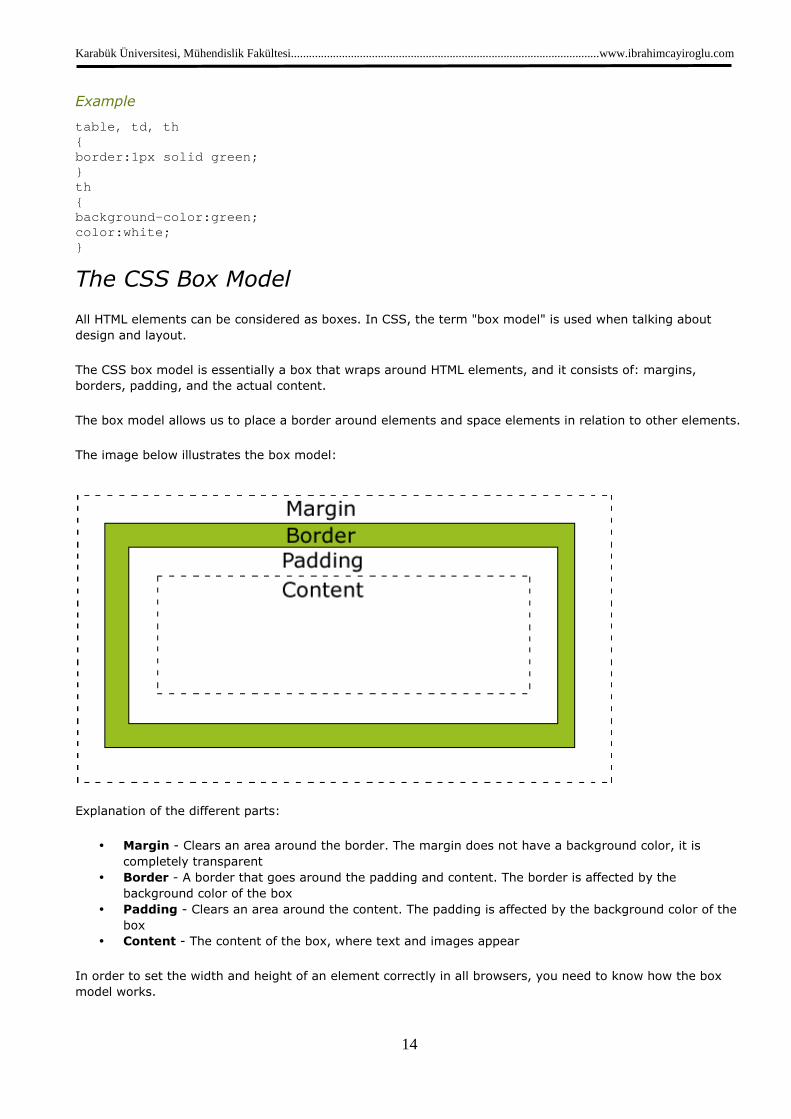
table, td, th { border:1px solid green; } th { background-color:green; color:white; }
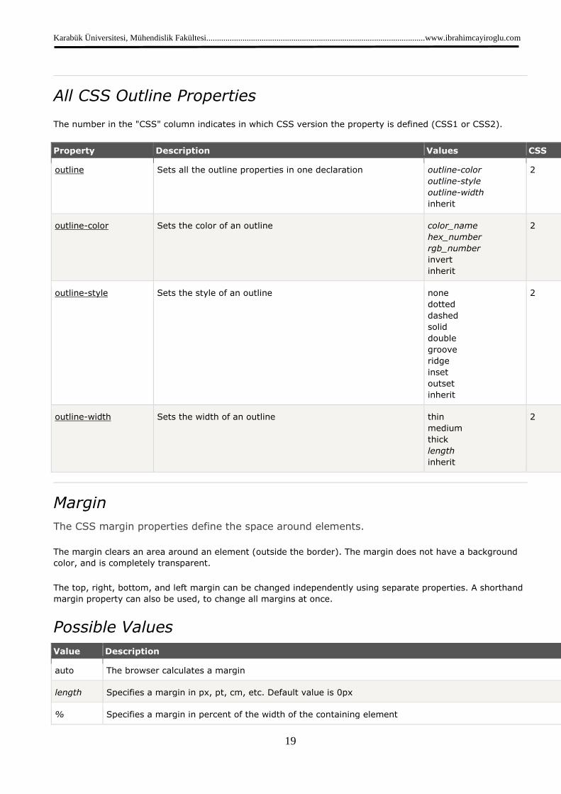
The CSS Box Model
All HTML elements can be considered as boxes. In CSS, the term "box model" is used when talking about
design and layout.
The CSS box model is essentially a box that wraps around HTML elements, and it consists of: margins,
borders, padding, and the actual content.
The box model allows us to place a border around elements and space elements in relation to other elements.
The image below illustrates the box model:
Explanation of the different parts:
• Margin - Clears an area around the border. The margin does not have a background color, it is
completely transparent
• Border - A border that goes around the padding and content. The border is affected by the
background color of the box
• Padding - Clears an area around the content. The padding is affected by the background color of the
box
• Content - The content of the box, where text and images appear
In order to set the width and height of an element correctly in all browsers, you need to know how the box
model works.
Karabük Üniversitesi, Mühendislik Fakültesi
Width and Height of an Element
Important: When you set the width and height properties of an element with CSS, you just set the width
and height of the content area. To calculate the full size of an element, you must also add the
borders and margins.
The total width of the element in the example below is 300px:
width:250px; padding:10px; border:5px solid gray; margin:10px;
Let's do the math:
250px (width)
+ 20px (left + right padding)
+ 10px (left + right border)
+ 20px (left + right margin)
= 300px
Assume that you had only 250px of space. Let's make an element with a total width of 250px:
Example
width:220px; padding:10px; border:5px solid gray; margin:0px;
The total width of an element should be calculated like this:
Total element width = width + left padding + right padding + left border + right border + left margin + right
margin
The total height of an element should be calculated like this:
Total element height = height + top padding + bottom padding + top border + bottom
bottom margin
Border Style
The border-style property specifies what kind of border to display.
None of the border properties will have ANY effect unless the
border-style values:
none: Defines no border
dotted: Defines a dotted border
Karabük Üniversitesi, Mühendislik Fakültesi.......................................................................................................www.ibrahimcayiroglu.c
15
Width and Height of an Element
When you set the width and height properties of an element with CSS, you just set the width
. To calculate the full size of an element, you must also add the
The total width of the element in the example below is 300px:
Assume that you had only 250px of space. Let's make an element with a total width of 250px:
The total width of an element should be calculated like this:
element width = width + left padding + right padding + left border + right border + left margin + right
The total height of an element should be calculated like this:
Total element height = height + top padding + bottom padding + top border + bottom
style property specifies what kind of border to display.
None of the border properties will have ANY effect unless the border-style property is set!
style values:
.......................................................................................................www.ibrahimcayiroglu.com
When you set the width and height properties of an element with CSS, you just set the width
. To calculate the full size of an element, you must also add the padding,
Assume that you had only 250px of space. Let's make an element with a total width of 250px:
element width = width + left padding + right padding + left border + right border + left margin + right
Total element height = height + top padding + bottom padding + top border + bottom border + top margin +
property is set!
Karabük Üniversitesi, Mühendislik Fakültesi.......................................................................................................www.ibrahimcayiroglu.com
16
dashed: Defines a dashed border
solid: Defines a solid border
double: Defines two borders. The width of the two borders are the same as the border-width value
groove: Defines a 3D grooved border. The effect depends on the border-color value
ridge: Defines a 3D ridged border. The effect depends on the border-color value
inset: Defines a 3D inset border. The effect depends on the border-color value
outset: Defines a 3D outset border. The effect depends on the border-color value
Try it yourself: Set the style of the border
Border Width
The border-width property is used to set the width of the border.
The width is set in pixels, or by using one of the three pre-defined values: thin, medium, or thick.
Note: The "border-width" property does not work if it is used alone. Use the "border-style" property to set the
borders first.
Example
p.one { border-style:solid; border-width:5px; } p.two { border-style:solid; border-width:medium; }
Try it yourself »
Border Color
The border-color property is used to set the color of the border. The color can be set by:
• name - specify a color name, like "red"
• RGB - specify a RGB value, like "rgb(255,0,0)"
Karabük Üniversitesi, Mühendislik Fakültesi.......................................................................................................www.ibrahimcayiroglu.com
17
• Hex - specify a hex value, like "#ff0000"
You can also set the border color to "transparent".
Note: The "border-color" property does not work if it is used alone. Use the "border-style" property to set the
borders first.
Example
p.one { border-style:solid; border-color:red; } p.two { border-style:solid; border-color:#98bf21; }
Try it yourself »
Border - Individual sides
In CSS it is possible to specify different borders for different sides:
Example
p { border-top-style:dotted; border-right-style:solid; border-bottom-style:dotted; border-left-style:solid; }
Try it yourself »
The example above can also be set with a single property:
Example
border-style:dotted solid;
Try it yourself »
The border-style property can have from one to four values.
• border-style:dotted solid double dashed;
o top border is dotted
o right border is solid
o bottom border is double
o left border is dashed
• border-style:dotted solid double;
o top border is dotted
o right and left borders are solid

Karabük Üniversitesi, Mühendislik Fakültesi.......................................................................................................www.ibrahimcayiroglu.com
18
o bottom border is double
• border-style:dotted solid;
o top and bottom borders are dotted
o right and left borders are solid
• border-style:dotted;
o all four borders are dotted
The border-style property is used in the example above. However, it also works with border-width and border-
color.
Border - Shorthand property
As you can see from the examples above, there are many properties to consider when dealing with borders.
To shorten the code, it is also possible to specify all the individual border properties in one property. This is
called a shorthand property.
The border property is a shorthand for the following individual border properties:
• border-width
• border-style (required)
• border-color
Example
border:5px solid red;
CSS Outline
An outline is a line that is drawn around elements (outside the borders) to make the element "stand out".
However, the outline property is different from the border property.
The outline is not a part of an element's dimensions; the element's total width and height is not affected by
the width of the outline.
Karabük Üniversitesi, Mühendislik Fakültesi.......................................................................................................www.ibrahimcayiroglu.com
19
All CSS Outline Properties
The number in the "CSS" column indicates in which CSS version the property is defined (CSS1 or CSS2).
Property Description Values CSS
outline Sets all the outline properties in one declaration outline-color
outline-style
outline-width
inherit
2
outline-color Sets the color of an outline color_name
hex_number
rgb_number
invert
inherit
2
outline-style Sets the style of an outline none
dotted
dashed
solid
double
groove
ridge
inset
outset
inherit
2
outline-width Sets the width of an outline thin
medium
thick
length
inherit
2
Margin
The CSS margin properties define the space around elements.
The margin clears an area around an element (outside the border). The margin does not have a background
color, and is completely transparent.
The top, right, bottom, and left margin can be changed independently using separate properties. A shorthand
margin property can also be used, to change all margins at once.
Possible Values
Value Description
auto The browser calculates a margin
length Specifies a margin in px, pt, cm, etc. Default value is 0px
% Specifies a margin in percent of the width of the containing element
Karabük Üniversitesi, Mühendislik Fakültesi
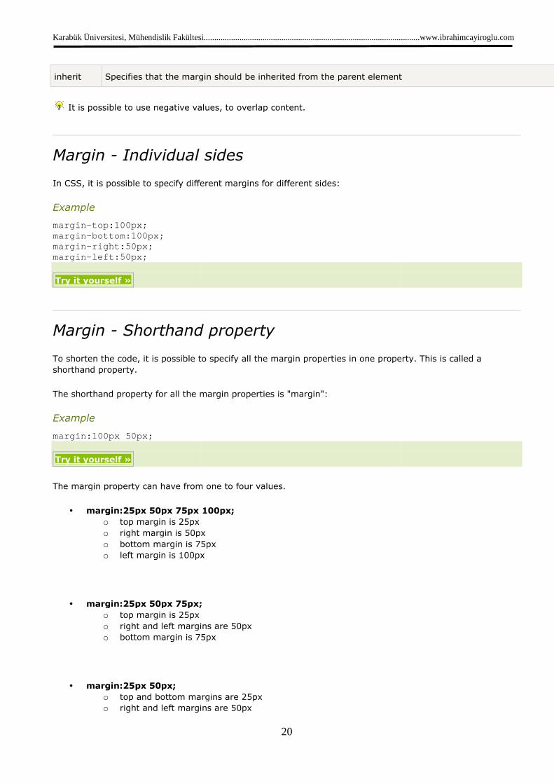
inherit Specifies that the margin should be inherited from the parent element
It is possible to use negative values, to overlap content.
Margin - Individual sides
In CSS, it is possible to specify different margins for different sides:
Example
margin-top:100px; margin-bottom:100px; margin-right:50px; margin-left:50px;
Try it yourself »
Margin - Shorthand property
To shorten the code, it is possible to specify all the margin properties in one property. This is called a
shorthand property.
The shorthand property for all the margin properties is "margin":
Example
margin:100px 50px;
Try it yourself »
The margin property can have from one to four values.
• margin:25px 50px 75px 100px;
o top margin is 25px
o right margin is 50px
o bottom margin is 75px
o left margin is 100px
• margin:25px 50px 75px;
o top margin is 25px
o right and left margins are 50px
o bottom margin is 75px
• margin:25px 50px;
o top and bottom margins are 25px
o right and left margins are 50px
Karabük Üniversitesi, Mühendislik Fakültesi.......................................................................................................www.ibrahimcayiroglu.c
20
Specifies that the margin should be inherited from the parent element
It is possible to use negative values, to overlap content.
Individual sides
specify different margins for different sides:
Shorthand property
To shorten the code, it is possible to specify all the margin properties in one property. This is called a
The shorthand property for all the margin properties is "margin":
The margin property can have from one to four values.
margin:25px 50px 75px 100px;
right margin is 50px
bottom margin is 75px
is 100px
margin:25px 50px 75px;
right and left margins are 50px
bottom margin is 75px
top and bottom margins are 25px
right and left margins are 50px
.......................................................................................................www.ibrahimcayiroglu.com
Specifies that the margin should be inherited from the parent element
To shorten the code, it is possible to specify all the margin properties in one property. This is called a
Karabük Üniversitesi, Mühendislik Fakültesi.......................................................................................................www.ibrahimcayiroglu.com
21
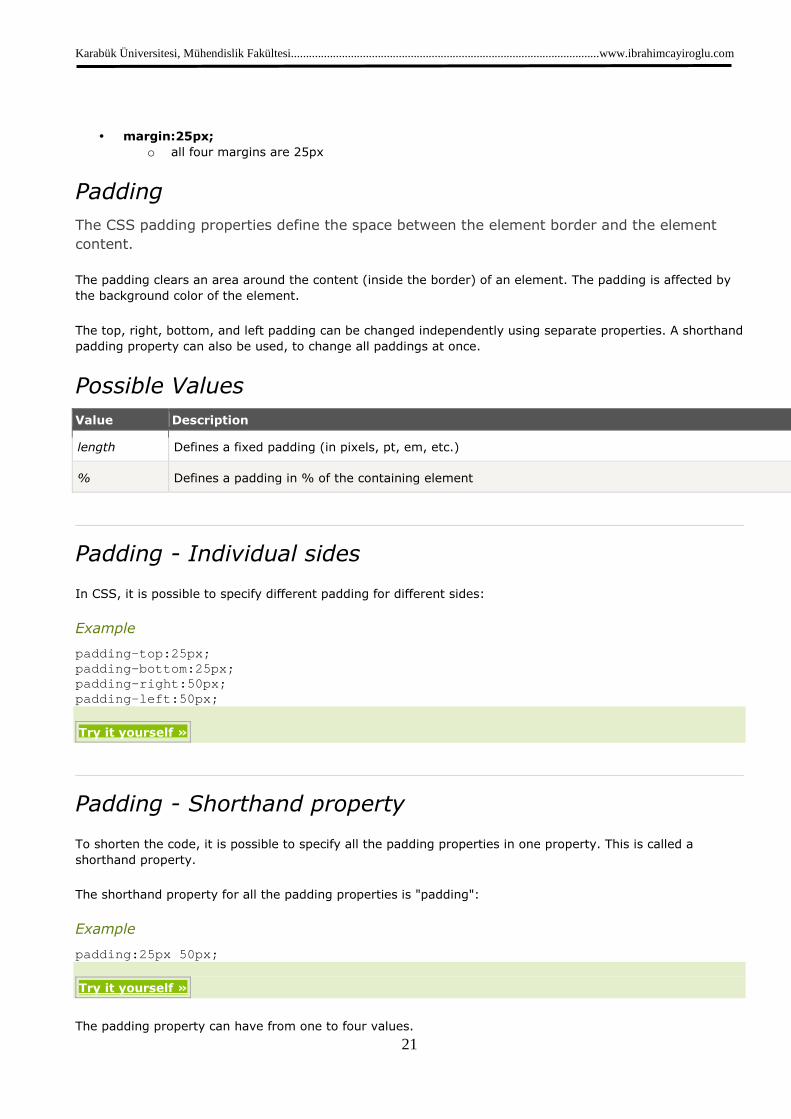
• margin:25px;
o all four margins are 25px
Padding
The CSS padding properties define the space between the element border and the element
content.
The padding clears an area around the content (inside the border) of an element. The padding is affected by
the background color of the element.
The top, right, bottom, and left padding can be changed independently using separate properties. A shorthand
padding property can also be used, to change all paddings at once.
Possible Values
Value Description
length Defines a fixed padding (in pixels, pt, em, etc.)
% Defines a padding in % of the containing element
Padding - Individual sides
In CSS, it is possible to specify different padding for different sides:
Example
padding-top:25px; padding-bottom:25px; padding-right:50px; padding-left:50px;
Try it yourself »
Padding - Shorthand property
To shorten the code, it is possible to specify all the padding properties in one property. This is called a
shorthand property.
The shorthand property for all the padding properties is "padding":
Example
padding:25px 50px;
Try it yourself »
The padding property can have from one to four values.

Karabük Üniversitesi, Mühendislik Fakültesi.......................................................................................................www.ibrahimcayiroglu.com
22
• padding:25px 50px 75px 100px;
o top padding is 25px
o right padding is 50px
o bottom padding is 75px
o left padding is 100px
• padding:25px 50px 75px;
o top padding is 25px
o right and left paddings are 50px
o bottom padding is 75px
• padding:25px 50px;
o top and bottom paddings are 25px
o right and left paddings are 50px
• padding:25px;
o all four paddings are 25px
Grouping Selectors
In style sheets there are often elements with the same style.
h1 { color:green; } h2 { color:green; } p { color:green; }
To minimize the code, you can group selectors.
Separate each selector with a comma.
In the example below we have grouped the selectors from the code above:
Example
h1,h2,p { color:green; }
Try it yourself »
Nesting Selectors
It is possible to apply a style for a selector within a selector.
In the example below, one style is specified for all p elements, one style is specified for all elements with
class="marked", and a third style is specified only for p elements within elements with class="marked":

Karabük Üniversitesi, Mühendislik Fakültesi.......................................................................................................www.ibrahimcayiroglu.com
23
Example
p { color:blue; text-align:center; } .marked { background-color:red; } .marked p { color:white; }
CSS Display and Visibility « Previous
Next Chapter »
The display property specifies if/how an element is displayed, and the visibility property
specifies if an element should be visible or hidden.
Box 1
Box 2
Box 3
Hiding an Element - display:none or visibility:hidden
Hiding an element can be done by setting the display property to "none" or the visibility property to "hidden".
However, notice that these two methods produce different results:
visibility:hidden hides an element, but it will still take up the same space as before. The element will be
hidden, but still affect the layout.
Example
h1.hidden {visibility:hidden;}
Karabük Üniversitesi, Mühendislik Fakültesi.......................................................................................................www.ibrahimcayiroglu.com
24
Try it yourself »
display:none hides an element, and it will not take up any space. The element will be hidden, and the page
will be displayed as if the element is not there:
Example
h1.hidden {display:none;}
Try it yourself »
CSS Display - Block and Inline Elements
A block element is an element that takes up the full width available, and has a line break before and after it.
Examples of block elements:
• <h1>
• <p>
• <div>
An inline element only takes up as much width as necessary, and does not force line breaks.
Examples of inline elements:
• <span>
• <a>
Changing How an Element is Displayed
Changing an inline element to a block element, or vice versa, can be useful for making the page look a
specific way, and still follow web standards.
The following example displays list items as inline elements:
Example
li {display:inline;}
Try it yourself »
The following example displays span elements as block elements:
Example
span {display:block;}
Try it yourself »
Karabük Üniversitesi, Mühendislik Fakültesi.......................................................................................................www.ibrahimcayiroglu.com
25
Note: Changing the display type of an element changes only how the element is displayed, NOT what kind of
element it is. For example: An inline element set to display:block is not allowed to have a block element
nested inside of it.
CSS Positioning « Previous
Next Chapter »
Positioning can be tricky sometimes!
Decide which element to display in front!
Elements can overlap!
Positioning
The CSS positioning properties allow you to position an element. It can also place an element behind another,
and specify what should happen when an element's content is too big.
Elements can be positioned using the top, bottom, left, and right properties. However, these properties will
not work unless the position property is set first. They also work differently depending on the positioning
method.
There are four different positioning methods.
Static Positioning
HTML elements are positioned static by default. A static positioned element is always positioned according to
the normal flow of the page.
Static positioned elements are not affected by the top, bottom, left, and right properties.
Fixed Positioning
An element with fixed position is positioned relative to the browser window.
It will not move even if the window is scrolled:
Example
p.pos_fixed { position:fixed; top:30px;
Karabük Üniversitesi, Mühendislik Fakültesi.......................................................................................................www.ibrahimcayiroglu.com
26
right:5px; }
Try it yourself »
Note: IE7 and IE8 support the fixed value only if a !DOCTYPE is specified.
Fixed positioned elements are removed from the normal flow. The document and other elements behave like
the fixed positioned element does not exist.
Fixed positioned elements can overlap other elements.
Relative Positioning
A relative positioned element is positioned relative to its normal position.
Example
h2.pos_left { position:relative; left:-20px; } h2.pos_right { position:relative; left:20px; }
Try it yourself »
The content of relatively positioned elements can be moved and overlap other elements, but the reserved
space for the element is still preserved in the normal flow.
Example
h2.pos_top { position:relative; top:-50px; }
Try it yourself »
Relatively positioned elements are often used as container blocks for absolutely positioned elements.
Absolute Positioning
An absolute position element is positioned relative to the first parent element that has a position other than
static. If no such element is found, the containing block is <html>:
Karabük Üniversitesi, Mühendislik Fakültesi.......................................................................................................www.ibrahimcayiroglu.com
27
Example
h2 { position:absolute; left:100px; top:150px; }
Try it yourself »
Absolutely positioned elements are removed from the normal flow. The document and other elements behave
like the absolutely positioned element does not exist.
Absolutely positioned elements can overlap other elements.
Overlapping Elements
When elements are positioned outside the normal flow, they can overlap other elements.
The z-index property specifies the stack order of an element (which element should be placed in front of, or
behind, the others).
An element can have a positive or negative stack order:
Example
img { position:absolute; left:0px; top:0px; z-index:-1; }
Try it yourself »
An element with greater stack order is always in front of an element with a lower stack order.
Note: If two positioned elements overlap, without a z-index specified, the element positioned last in the HTML
code will be shown on top.
More Examples
Set the shape of an element
This example demonstrates how to set the shape of an element. The element is clipped into this shape, and
displayed.

Karabük Üniversitesi, Mühendislik Fakültesi.......................................................................................................www.ibrahimcayiroglu.com
28
How to show overflow in an element using scroll
This example demonstrates how to set the overflow property to create a scroll bar when an element's content
is too big to fit in a specified area.
How to set the browser to automatically handle overflow
This example demonstrates how to set the browser to automatically handle overflow.
Change the cursor
This example demonstrates how to change the cursor.
All CSS Positioning Properties
The number in the "CSS" column indicates in which CSS version the property is defined (CSS1 or CSS2).
Property Description Values CSS
bottom Sets the bottom margin edge for a positioned
box
auto
length
%
inherit
2
clip Clips an absolutely positioned element shape
auto
inherit
2
cursor Specifies the type of cursor to be displayed url
auto
crosshair
default
pointer
move
e-resize
ne-resize
nw-resize
n-resize
se-resize
sw-resize
s-resize
w-resize
text
wait
help
2
left Sets the left margin edge for a positioned box auto
length
%
inherit
2
overflow Specifies what happens if content overflows an
element's box
auto
hidden
scroll
visible
inherit
2
position Specifies the type of positioning for an element absolute 2
Karabük Üniversitesi, Mühendislik Fakültesi.......................................................................................................www.ibrahimcayiroglu.com
29
fixed
relative
static
inherit
right Sets the right margin edge for a positioned box auto
length
%
inherit
2
top Sets the top margin edge for a positioned box auto
length
%
inherit
2
z-index Sets the stack order of an element number
auto
inherit
2
CSS Float « Previous
Next Chapter »
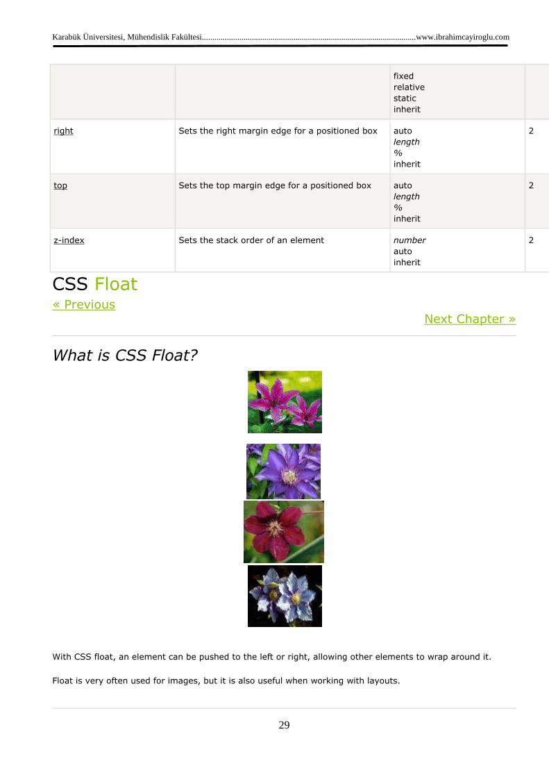
What is CSS Float?
With CSS float, an element can be pushed to the left or right, allowing other elements to wrap around it.
Float is very often used for images, but it is also useful when working with layouts.
Karabük Üniversitesi, Mühendislik Fakültesi.......................................................................................................www.ibrahimcayiroglu.com
30
How Elements Float
Elements are floated horizontally, this means that an element can only be floated left or right, not up or
down.
A floated element will move as far to the left or right as it can. Usually this means all the way to the left or
right of the containing element.
The elements after the floating element will flow around it.
The elements before the floating element will not be affected.
If an image is floated to the right, a following text flows around it, to the left:
Example
img { float:right; }
Try it yourself »
Floating Elements Next to Each Other
If you place several floating elements after each other, they will float next to each other if there is room.
Here we have made an image gallery using the float property:
Example
.thumbnail { float:left; width:110px; height:90px; margin:5px; }
Try it yourself »
Turning off Float - Using Clear
Elements after the floating element will flow around it. To avoid this, use the clear property.
The clear property specifies which sides of an element other floating elements are not allowed.
Add a text line into the image gallery, using the clear property:

Karabük Üniversitesi, Mühendislik Fakültesi.......................................................................................................www.ibrahimcayiroglu.com
31
Example
.text_line { clear:both; }
CSS Horizontal Align « Previous
Next Chapter »
In CSS, several properties are used to align elements horizontally.
Aligning Block Elements
A block element is an element that takes up the full width available, and has a line break before and after it.
Examples of block elements:
• <h1>
• <p>
• <div>
For aligning text, see the CSS Text chapter.
In this chapter we will show you how to horizontally align block elements for layout purposes.
Center Aligning Using the margin Property
Block elements can be aligned by setting the left and right margins to "auto".
Note: Using margin:auto will not work in IE8 and earlier, unless a !DOCTYPE is declared.
Setting the left and right margins to auto specifies that they should split the available margin equally. The
result is a centered element:
Example
.center { margin-left:auto; margin-right:auto; width:70%; background-color:#b0e0e6; }
Try it yourself »
Karabük Üniversitesi, Mühendislik Fakültesi.......................................................................................................www.ibrahimcayiroglu.com
32
Tip: Aligning has no effect if the width is 100%.
Note: In IE5 there is a margin handling bug for block elements. To make the example above work in IE5, add
some extra code. Try it yourself
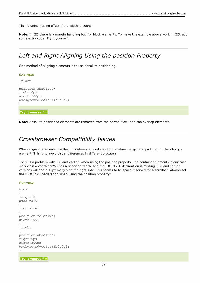
Left and Right Aligning Using the position Property
One method of aligning elements is to use absolute positioning:
Example
.right { position:absolute; right:0px; width:300px; background-color:#b0e0e6; }
Try it yourself »
Note: Absolute positioned elements are removed from the normal flow, and can overlap elements.
Crossbrowser Compatibility Issues
When aligning elements like this, it is always a good idea to predefine margin and padding for the <body>
element. This is to avoid visual differences in different browsers.
There is a problem with IE8 and earlier, when using the position property. If a container element (in our case
<div class="container">) has a specified width, and the !DOCTYPE declaration is missing, IE8 and earlier
versions will add a 17px margin on the right side. This seems to be space reserved for a scrollbar. Always set
the !DOCTYPE declaration when using the position property:
Example
body { margin:0; padding:0; } .container { position:relative; width:100%; } .right { position:absolute; right:0px; width:300px; background-color:#b0e0e6; }
Try it yourself »
Karabük Üniversitesi, Mühendislik Fakültesi.......................................................................................................www.ibrahimcayiroglu.com
33
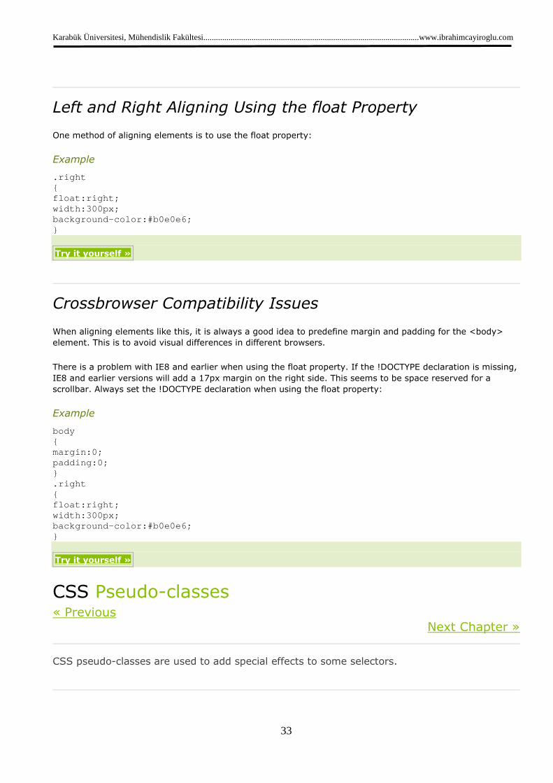
Left and Right Aligning Using the float Property
One method of aligning elements is to use the float property:
Example
.right { float:right; width:300px; background-color:#b0e0e6; }
Try it yourself »
Crossbrowser Compatibility Issues
When aligning elements like this, it is always a good idea to predefine margin and padding for the <body>
element. This is to avoid visual differences in different browsers.
There is a problem with IE8 and earlier when using the float property. If the !DOCTYPE declaration is missing,
IE8 and earlier versions will add a 17px margin on the right side. This seems to be space reserved for a
scrollbar. Always set the !DOCTYPE declaration when using the float property:
Example
body { margin:0; padding:0; } .right { float:right; width:300px; background-color:#b0e0e6; }
Try it yourself »
CSS Pseudo-classes « Previous
Next Chapter »
CSS pseudo-classes are used to add special effects to some selectors.

Karabük Üniversitesi, Mühendislik Fakültesi.......................................................................................................www.ibrahimcayiroglu.com
34
Syntax
The syntax of pseudo-classes:
selector:pseudo-class {property:value;}
CSS classes can also be used with pseudo-classes:
selector.class:pseudo-class {property:value;}
Anchor Pseudo-classes
Links can be displayed in different ways in a CSS-supporting browser:
Example
a:link {color:#FF0000;} /* unvisited link */ a:visited {color:#00FF00;} /* visited link */ a:hover {color:#FF00FF;} /* mouse over link */ a:active {color:#0000FF;} /* selected link */
Try it yourself »
Note: a:hover MUST come after a:link and a:visited in the CSS definition in order to be effective!!
Note: a:active MUST come after a:hover in the CSS definition in order to be effective!!
Note: Pseudo-class names are not case-sensitive.
Pseudo-classes and CSS Classes
Pseudo-classes can be combined with CSS classes:
a.red:visited {color:#FF0000;} <a class="red" href="css_syntax.asp">CSS Syntax</a>
If the link in the example above has been visited, it will be displayed in red.
CSS - The :first-child Pseudo-class
The :first-child pseudo-class matches a specified element that is the first child of another element.
Note: For :first-child to work in IE8 and earlier, a <!DOCTYPE> must be declared.
Karabük Üniversitesi, Mühendislik Fakültesi.......................................................................................................www.ibrahimcayiroglu.com
35
Match the first <p> element
In the following example, the selector matches any <p> element that is the first child of any element:
Example
<html> <head> <style> p:first-child { color:blue; } </style> </head> <body> <p>I am a strong man.</p> <p>I am a strong man.</p> </body> </html>
Try it yourself »
Match the first <i> element in all <p> elements
In the following example, the selector matches the first <i> element in all <p> elements:
Example
<html> <head> <style> p > i:first-child { color:blue; } </style> </head> <body> <p>I am a <i>strong</i> man. I am a <i>strong</i> m an.</p> <p>I am a <i>strong</i> man. I am a <i>strong</i> m an.</p> </body> </html>
Try it yourself »
Match all <i> elements in all first child <p> elements
In the following example, the selector matches all <i> elements in <p> elements that are the first child of
another element:
Karabük Üniversitesi, Mühendislik Fakültesi.......................................................................................................www.ibrahimcayiroglu.com
36
Example
<html> <head> <style> p:first-child i { color:blue; } </style> </head> <body> <p>I am a <i>strong</i> man. I am a <i>strong</i> m an.</p> <p>I am a <i>strong</i> man. I am a <i>strong</i> m an.</p> </body> </html>
Try it yourself »
CSS - The :lang Pseudo-class
The :lang pseudo-class allows you to define special rules for different languages.
Note: IE8 supports the :lang pseudo-class only if a <!DOCTYPE> is specified.
In the example below, the :lang class defines the quotation marks for q elements with lang="no":
Example
<html> <head> <style> q:lang(no) {quotes: "~" "~";} </style> </head> <body> <p>Some text <q lang="no">A quote in a paragraph</q > Some text.</p> </body> </html>
Try it yourself »
Demo: Navigation Bar
• HOME
• NEWS
• ARTICLES
• FORUM
• CONTACT
• ABOUT
Karabük Üniversitesi, Mühendislik Fakültesi.......................................................................................................www.ibrahimcayiroglu.com
37
Navigation Bars
Having easy-to-use navigation is important for any web site.
With CSS you can transform boring HTML menus into good-looking navigation bars.
Navigation Bar = List of Links
A navigation bar needs standard HTML as a base.
In our examples we will build the navigation bar from a standard HTML list.
A navigation bar is basically a list of links, so using the <ul> and <li> elements makes perfect sense:
Example
<ul> <li><a href="default.asp">Home</a></li> <li><a href="news.asp">News</a></li> <li><a href="contact.asp">Contact</a></li> <li><a href="about.asp">About</a></li> </ul>
Try it yourself »
Now let's remove the bullets and the margins and padding from the list:
Example
ul { list-style-type:none; margin:0; padding:0; }
Try it yourself »
Example explained:
• list-style-type:none - Removes the bullets. A navigation bar does not need list markers
• Setting margins and padding to 0 to remove browser default settings
The code in the example above is the standard code used in both vertical, and horizontal navigation bars.
Vertical Navigation Bar
To build a vertical navigation bar we only need to style the <a> elements, in addition to the code above:

Karabük Üniversitesi, Mühendislik Fakültesi.......................................................................................................www.ibrahimcayiroglu.com
38
Example
a { display:block; width:60px; }
Try it yourself »
Example explained:
• display:block - Displaying the links as block elements makes the whole link area clickable (not just the
text), and it allows us to specify the width
• width:60px - Block elements take up the full width available by default. We want to specify a 60 px
width
Tip: Also take a look at our fully styled vertical navigation bar example.
Note: Always specify the width for <a> elements in a vertical navigation bar. If you omit the width, IE6 can
produce unexpected results.
Horizontal Navigation Bar
There are two ways to create a horizontal navigation bar. Using inline or floating list items.
Both methods work fine, but if you want the links to be the same size, you have to use the floating method.
Inline List Items
One way to build a horizontal navigation bar is to specify the <li> elements as inline, in addition to the
"standard" code above:
Example
li { display:inline; }
Try it yourself »
Example explained:
• display:inline; - By default, <li> elements are block elements. Here, we remove the line breaks before
and after each list item, to display them on one line
Tip: Also take a look at our fully styled horizontal navigation bar example.
Floating List Items
In the example above the links have different widths.
Karabük Üniversitesi, Mühendislik Fakültesi.......................................................................................................www.ibrahimcayiroglu.com
39
For all the links to have an equal width, float the <li> elements and specify a width for the <a> elements:
Example
li { float:left; } a { display:block; width:60px; }
Try it yourself »
Example explained:
• float:left - use float to get block elements to slide next to each other
• display:block - Displaying the links as block elements makes the whole link area clickable (not just the
text), and it allows us to specify the width
• width:60px - Since block elements take up the full width available, they cannot float next to each
other. We specify the width of the links to 60px
Tip: Also take a look at our fully styled horizontal navigation bar example.
CSS Image Gallery « Previous
Next Chapter »
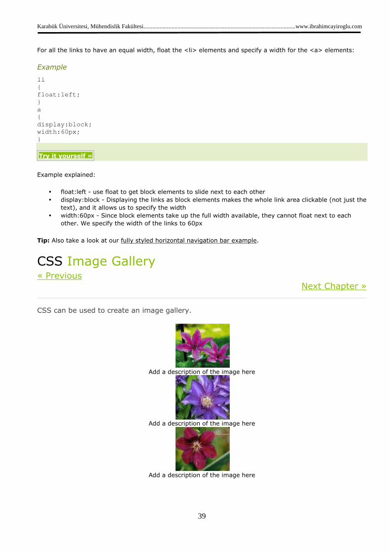
CSS can be used to create an image gallery.
Add a description of the image here
Add a description of the image here
Add a description of the image here
Karabük Üniversitesi, Mühendislik Fakültesi.......................................................................................................www.ibrahimcayiroglu.com
40
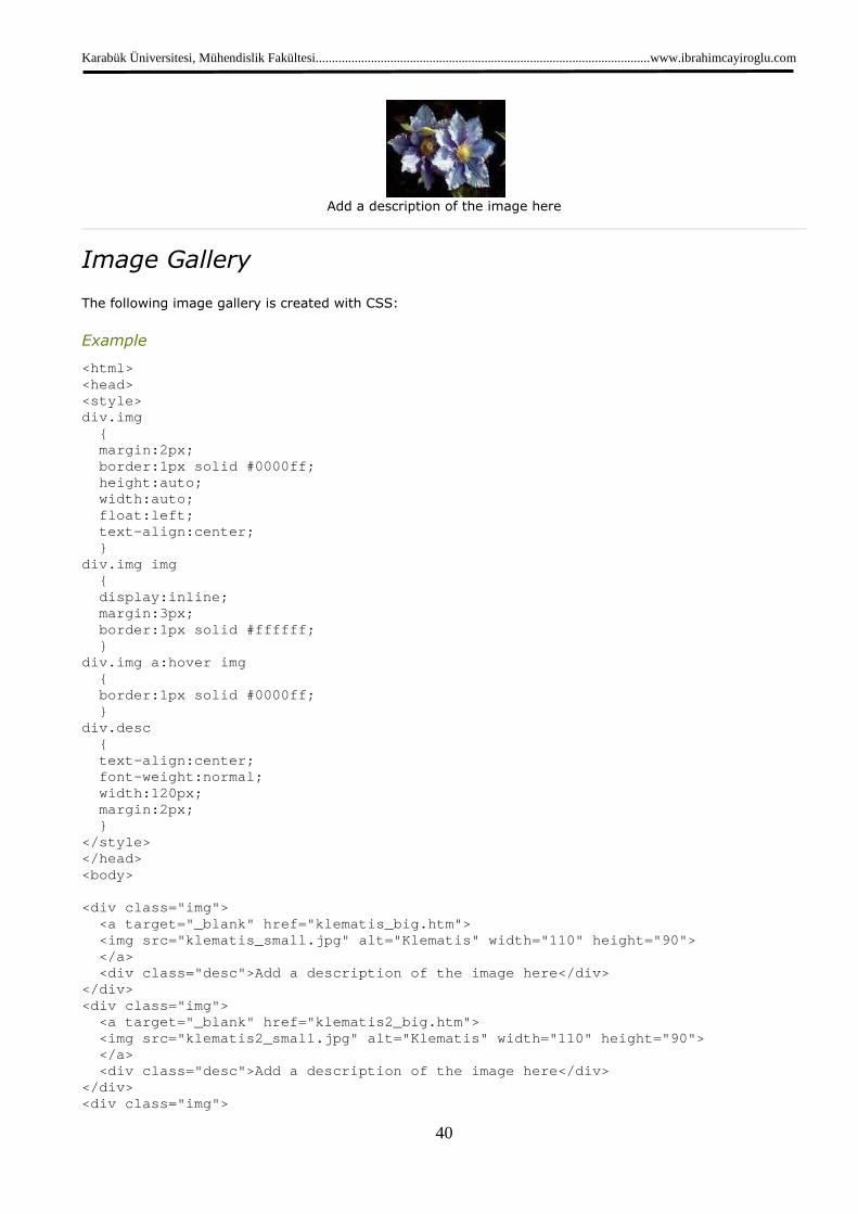
Add a description of the image here
Image Gallery
The following image gallery is created with CSS:
Example
<html> <head> <style> div.img { margin:2px; border:1px solid #0000ff; height:auto; width:auto; float:left; text-align:center; } div.img img { display:inline; margin:3px; border:1px solid #ffffff; } div.img a:hover img { border:1px solid #0000ff; } div.desc { text-align:center; font-weight:normal; width:120px; margin:2px; } </style> </head> <body> <div class="img"> <a target="_blank" href="klematis_big.htm"> <img src="klematis_small.jpg" alt="Klematis" widt h="110" height="90"> </a> <div class="desc">Add a description of the image here</div> </div> <div class="img"> <a target="_blank" href="klematis2_big.htm"> <img src="klematis2_small.jpg" alt="Klematis" wid th="110" height="90"> </a> <div class="desc">Add a description of the image here</div> </div> <div class="img">
Karabük Üniversitesi, Mühendislik Fakültesi.......................................................................................................www.ibrahimcayiroglu.com
41
<a target="_blank" href="klematis3_big.htm"> <img src="klematis3_small.jpg" alt="Klematis" wid th="110" height="90"> </a> <div class="desc">Add a description of the image here</div> </div> <div class="img"> <a target="_blank" href="klematis4_big.htm"> <img src="klematis4_small.jpg" alt="Klematis" wid th="110" height="90"> </a> <div class="desc">Add a description of the image here</div> </div> </body> </html>
Try it yourself »
CSS Image Opacity / Transparency « Previous
Next Chapter »
Creating transparent images with CSS is easy.
Note: The CSS opacity property is a part of the W3C CSS3 recommendation.
Try it Yourself - Examples
Creating transparent images - Hover effect
Creating a transparent box with text on a background image
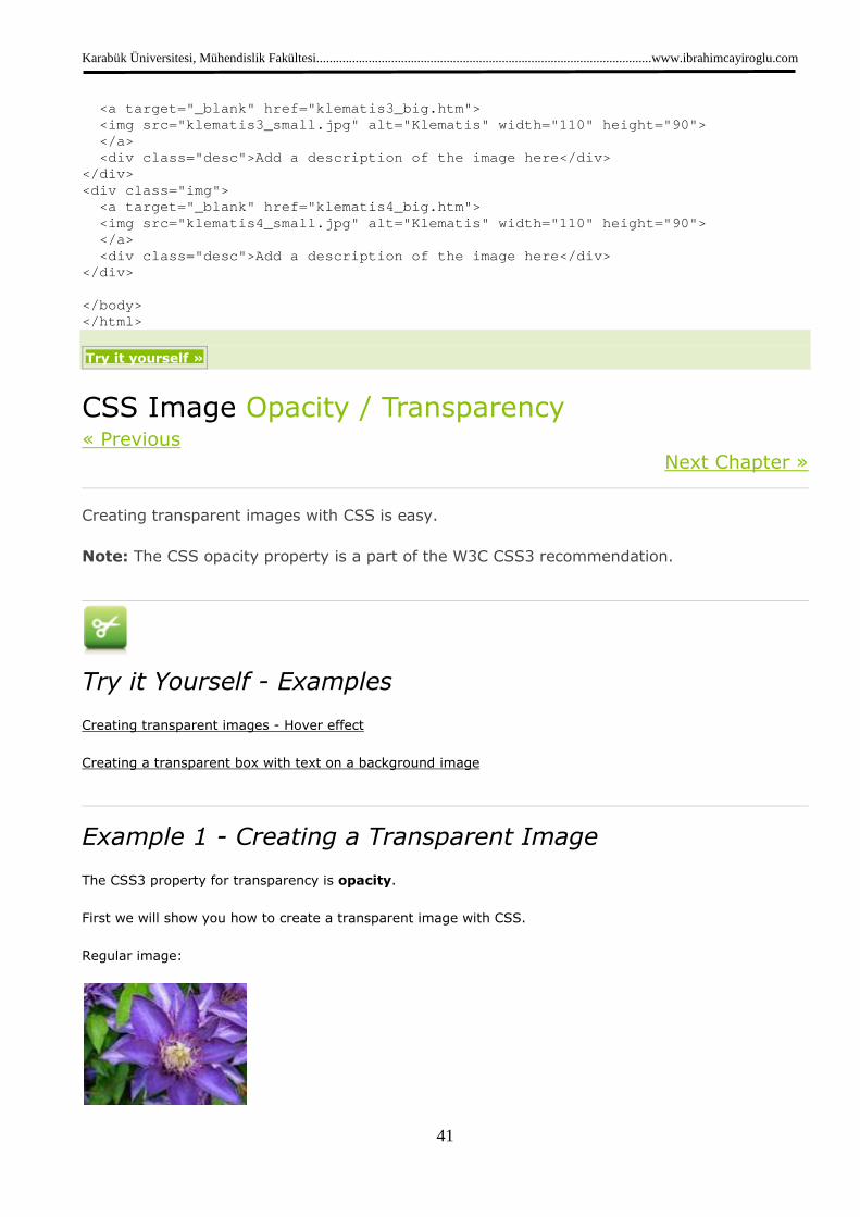
Example 1 - Creating a Transparent Image
The CSS3 property for transparency is opacity.
First we will show you how to create a transparent image with CSS.
Regular image:
Karabük Üniversitesi, Mühendislik Fakültesi.......................................................................................................www.ibrahimcayiroglu.com
42
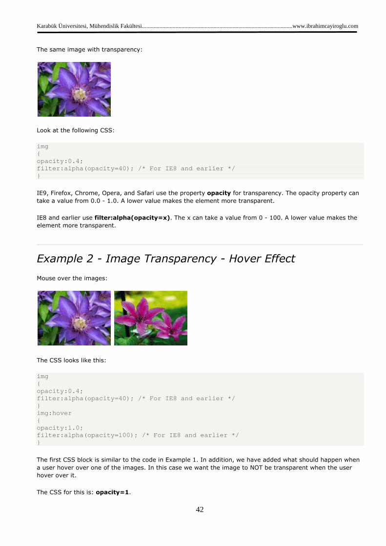
The same image with transparency:
Look at the following CSS:
img { opacity:0.4; filter:alpha(opacity=40); /* For IE8 and earlier */ }
IE9, Firefox, Chrome, Opera, and Safari use the property opacity for transparency. The opacity property can
take a value from 0.0 - 1.0. A lower value makes the element more transparent.
IE8 and earlier use filter:alpha(opacity=x). The x can take a value from 0 - 100. A lower value makes the
element more transparent.
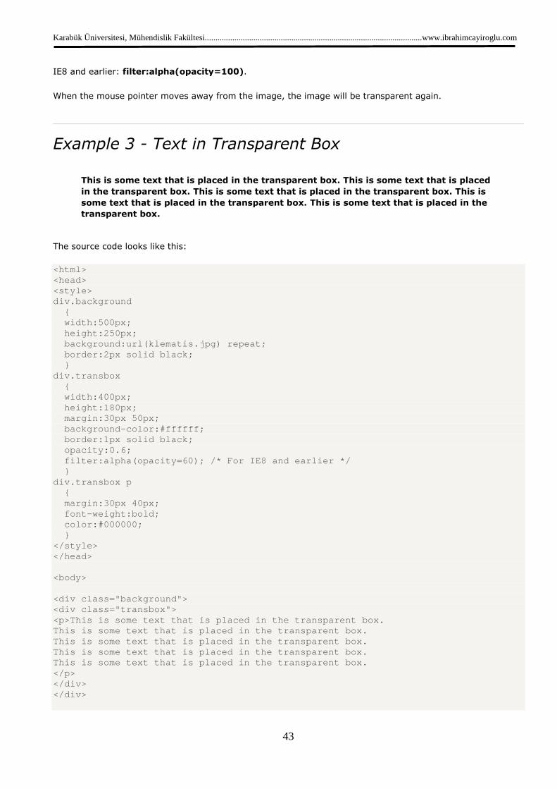
Example 2 - Image Transparency - Hover Effect
Mouse over the images:
The CSS looks like this:
img { opacity:0.4; filter:alpha(opacity=40); /* For IE8 and earlier */ } img:hover { opacity:1.0; filter:alpha(opacity=100); /* For IE8 and earlier * / }
The first CSS block is similar to the code in Example 1. In addition, we have added what should happen when
a user hover over one of the images. In this case we want the image to NOT be transparent when the user
hover over it.
The CSS for this is: opacity=1.
Karabük Üniversitesi, Mühendislik Fakültesi.......................................................................................................www.ibrahimcayiroglu.com
43
IE8 and earlier: filter:alpha(opacity=100).
When the mouse pointer moves away from the image, the image will be transparent again.
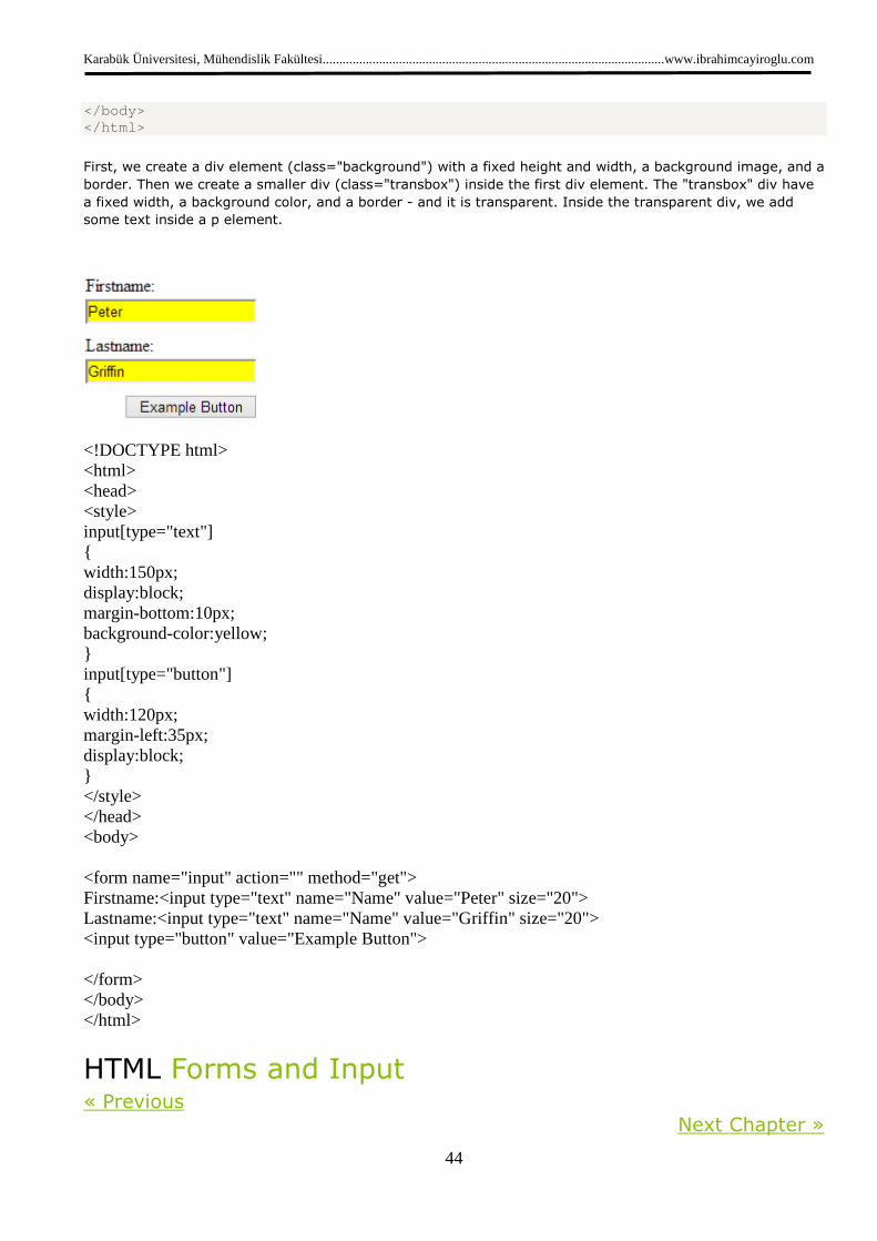
Example 3 - Text in Transparent Box
This is some text that is placed in the transparent box. This is some text that is placed
in the transparent box. This is some text that is placed in the transparent box. This is
some text that is placed in the transparent box. This is some text that is placed in the
transparent box.
The source code looks like this:
<html> <head> <style> div.background { width:500px; height:250px; background:url(klematis.jpg) repeat; border:2px solid black; } div.transbox { width:400px; height:180px; margin:30px 50px; background-color:#ffffff; border:1px solid black; opacity:0.6; filter:alpha(opacity=60); /* For IE8 and earlier */ } div.transbox p { margin:30px 40px; font-weight:bold; color:#000000; } </style> </head> <body> <div class="background"> <div class="transbox"> <p>This is some text that is placed in the transpar ent box. This is some text that is placed in the transparent box. This is some text that is placed in the transparent box. This is some text that is placed in the transparent box. This is some text that is placed in the transparent box. </p> </div> </div>
Karabük Üniversitesi, Mühendislik Fakültesi.......................................................................................................www.ibrahimcayiroglu.com
44
</body> </html>
First, we create a div element (class="background") with a fixed height and width, a background image, and a
border. Then we create a smaller div (class="transbox") inside the first div element. The "transbox" div have
a fixed width, a background color, and a border - and it is transparent. Inside the transparent div, we add
some text inside a p element.
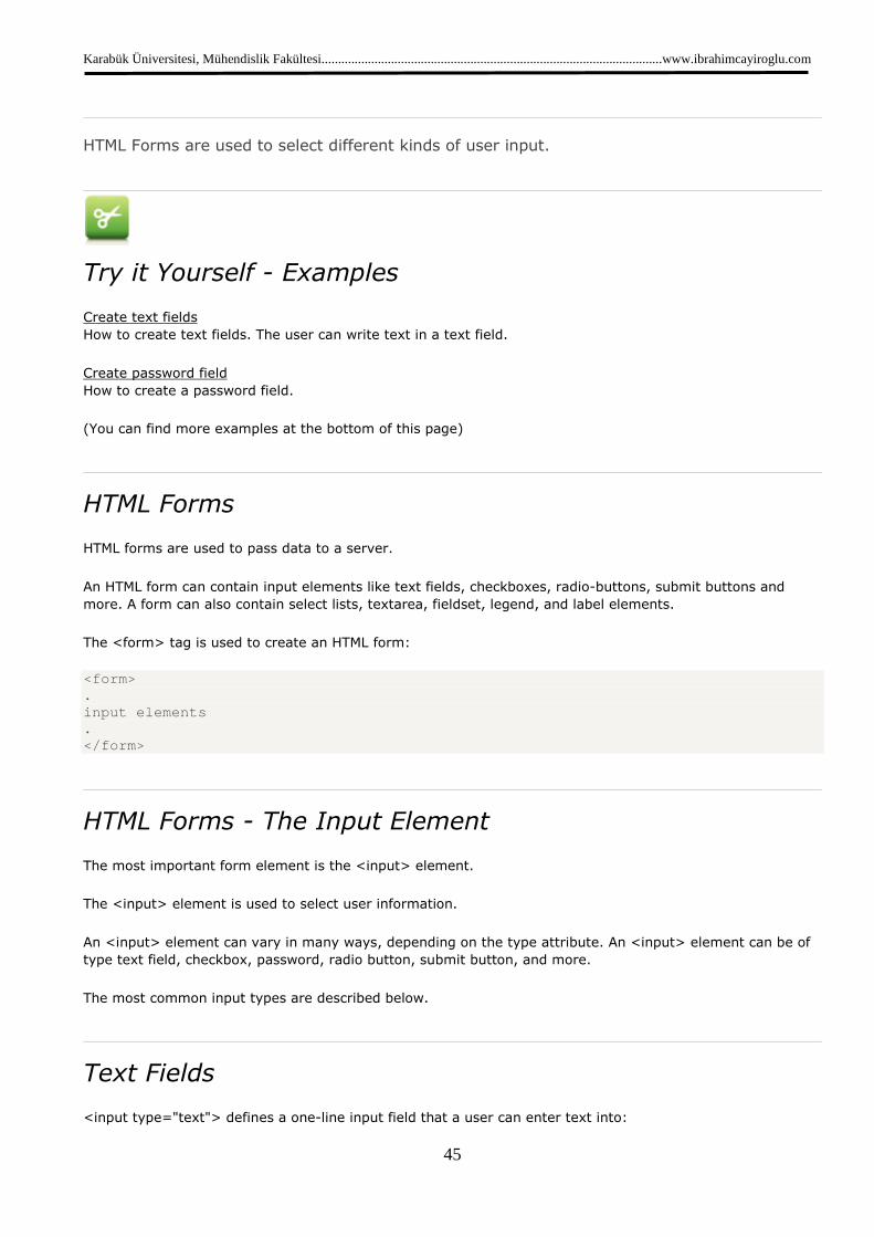
<!DOCTYPE html> <html> <head> <style> input[type="text"] { width:150px; display:block; margin-bottom:10px; background-color:yellow; } input[type="button"] { width:120px; margin-left:35px; display:block; } </style> </head> <body> <form name="input" action="" method="get"> Firstname:<input type="text" name="Name" value="Peter" size="20"> Lastname:<input type="text" name="Name" value="Griffin" size="20"> <input type="button" value="Example Button"> </form> </body> </html>
HTML Forms and Input « Previous
Next Chapter »
Karabük Üniversitesi, Mühendislik Fakültesi.......................................................................................................www.ibrahimcayiroglu.com
45
HTML Forms are used to select different kinds of user input.
Try it Yourself - Examples
Create text fields
How to create text fields. The user can write text in a text field.
Create password field
How to create a password field.
(You can find more examples at the bottom of this page)
HTML Forms
HTML forms are used to pass data to a server.
An HTML form can contain input elements like text fields, checkboxes, radio-buttons, submit buttons and
more. A form can also contain select lists, textarea, fieldset, legend, and label elements.
The <form> tag is used to create an HTML form:
<form> . input elements . </form>
HTML Forms - The Input Element
The most important form element is the <input> element.
The <input> element is used to select user information.
An <input> element can vary in many ways, depending on the type attribute. An <input> element can be of
type text field, checkbox, password, radio button, submit button, and more.
The most common input types are described below.
Text Fields
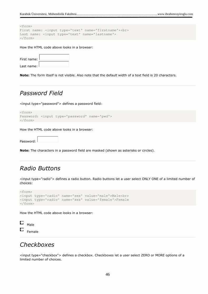
<input type="text"> defines a one-line input field that a user can enter text into:
Karabük Üniversitesi, Mühendislik Fakültesi.......................................................................................................www.ibrahimcayiroglu.com
46
<form> First name: <input type="text" name="firstname"><br > Last name: <input type="text" name="lastname"> </form>
How the HTML code above looks in a browser:
First name:
Last name:
Note: The form itself is not visible. Also note that the default width of a text field is 20 characters.
Password Field
<input type="password"> defines a password field:
<form> Password: <input type="password" name="pwd"> </form>
How the HTML code above looks in a browser:
Password:
Note: The characters in a password field are masked (shown as asterisks or circles).
Radio Buttons
<input type="radio"> defines a radio button. Radio buttons let a user select ONLY ONE of a limited number of
choices:
<form> <input type="radio" name="sex" value="male">Male<br > <input type="radio" name="sex" value="female">Femal e </form>
How the HTML code above looks in a browser:
Male
Female
Checkboxes
<input type="checkbox"> defines a checkbox. Checkboxes let a user select ZERO or MORE options of a
limited number of choices.

Karabük Üniversitesi, Mühendislik Fakültesi.......................................................................................................www.ibrahimcayiroglu.com
47
<form> <input type="checkbox" name="vehicle" value="Bike"> I have a bike<br> <input type="checkbox" name="vehicle" value="Car">I have a car </form>
How the HTML code above looks in a browser:
I have a bike
I have a car
Submit Button
<input type="submit"> defines a submit button.
A submit button is used to send form data to a server. The data is sent to the page specified in the form's
action attribute. The file defined in the action attribute usually does something with the received input:
<form name="input" action="html_form_action.asp" me thod="get"> Username: <input type="text" name="user"> <input type="submit" value="Submit"> </form>
How the HTML code above looks in a browser:
Username: Submit
If you type some characters in the text field above, and click the "Submit" button, the browser will send your
input to a page called "html_form_action.asp". The page will show you the received input.
More Input Examples
Radio buttons
How to create radio buttons.
Checkboxes
How to create checkboxes. A user can select or unselect a checkbox.
Simple drop-down list
How to create a simple drop-down list.
Drop-down list with a pre-selected value
How to create a drop-down list with a pre-selected value.
Textarea
How to create a multi-line text input control. In a text-area the user can write an unlimited number of
characters.
Create a button
How to create a button.

Karabük Üniversitesi, Mühendislik Fakültesi.......................................................................................................www.ibrahimcayiroglu.com
48
Form Examples
Fieldset around form-data
How to create a border around elements in a form.
Form with text fields and a submit button
How to create a form with two text fields and a submit button.
Form with checkboxes
How to create a form with two checkboxes and a submit button.
Form with radio buttons
How to create a form with two radio buttons, and a submit button.
Send e-mail from a form
How to send e-mail from a form.
HTML Form Tags
New : New tags in HTML5.
Tag Description
<form> Defines an HTML form for user input
<input> Defines an input control
<textarea> Defines a multiline input control (text area)
<label> Defines a label for an <input> element
<fieldset> Groups related elements in a form
<legend> Defines a caption for a <fieldset> element
<select> Defines a drop-down list
<optgroup> Defines a group of related options in a drop-down list
<option> Defines an option in a drop-down list
<button> Defines a clickable button
<datalist>New Specifies a list of pre-defined options for input controls
<keygen>New Defines a key-pair generator field (for forms)
<output>New Defines the result of a calculation
Karabük Üniversitesi, Mühendislik Fakültesi.......................................................................................................www.ibrahimcayiroglu.com
49
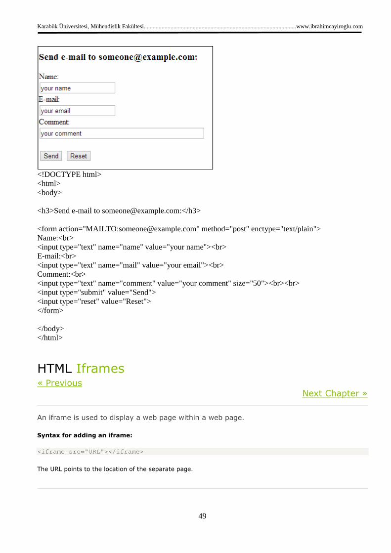
<!DOCTYPE html> <html> <body> <h3>Send e-mail to [email protected]:</h3> <form action="MAILTO:[email protected]" method="post" enctype="text/plain"> Name:<br> <input type="text" name="name" value="your name"><br> E-mail:<br> <input type="text" name="mail" value="your email"><br> Comment:<br> <input type="text" name="comment" value="your comment" size="50"><br><br> <input type="submit" value="Send"> <input type="reset" value="Reset"> </form> </body> </html>
HTML Iframes « Previous
Next Chapter »
An iframe is used to display a web page within a web page.
Syntax for adding an iframe:
<iframe src=" URL"></iframe>
The URL points to the location of the separate page.
Karabük Üniversitesi, Mühendislik Fakültesi.......................................................................................................www.ibrahimcayiroglu.com
50
Iframe - Set Height and Width
The height and width attributes are used to specify the height and width of the iframe.
The attribute values are specified in pixels by default, but they can also be in percent (like "80%").
Example
<iframe src="demo_iframe.htm" width="200" height="2 00"></iframe>
Try it yourself »
Iframe - Remove the Border
The frameborder attribute specifies whether or not to display a border around the iframe.
Set the attribute value to "0" to remove the border:
Example
<iframe src="demo_iframe.htm" frameborder="0"></ifr ame>
Try it yourself »
Use iframe as a Target for a Link
An iframe can be used as the target frame for a link.
The target attribute of a link must refer to the name attribute of the iframe:
Example
<iframe src="demo_iframe.htm" name="iframe_a"></ifr ame> <p><a href="http://www.w3schools.com" target="ifram e_a">W3Schools.com</a></p>
Try it yourself »
HTML iframe Tag
Tag Description
<iframe> Defines an inline frame