Color design - StoneSoup Consulting, Maureen C. Stone Slides.pdf · Graphical presentation of...
14
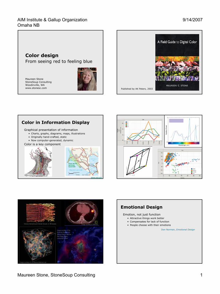
AIM Institute & Gallup Organization Omaha NB 9/14/2007 Maureen Stone, StoneSoup Consulting 1 Color design From seeing red to feeling blue Maureen Stone StoneSoup Consulting Woodinville, WA www.stonesc.com Published by AK Peters, 2003 Color in Information Display Graphical presentation of information • Charts, graphs, diagrams, maps, illustrations • Originally hand-crafted, static • Now computer-generated, dynamic Color is a key component www.nps.gov Image courtesy of Siemens Image courtesy of Los Alamos National Lab Image courtesy of the American Museum of Natural History and the San Diego Super- computing Center Victoria Interrante and Chester Grosch, U. Minnesota Emotional Design Emotion, not just function • Attractive things work better • Compensates for lack of function • People choose with their emotions Don Norman, Emotional Design
Transcript of Color design - StoneSoup Consulting, Maureen C. Stone Slides.pdf · Graphical presentation of...
AIM Institute & Gallup OrganizationOmaha NB
9/14/2007
Maureen Stone, StoneSoup Consulting 1
Color designFrom seeing red to feeling blue
Maureen StoneStoneSoup ConsultingWoodinville, WAwww.stonesc.com Published by AK Peters, 2003
Color in Information Display
Graphical presentation of information• Charts, graphs, diagrams, maps, illustrations• Originally hand-crafted, static• Now computer-generated, dynamic
Color is a key component
www.nps.gov
Image courtesy of Siemens
Image courtesy of Los Alamos National Lab
Image courtesy of the American Museum of Natural History and the San Diego Super-computing Center
Victoria Interrante and Chester Grosch, U. Minnesota
Emotional Design
Emotion, not just function• Attractive things work better• Compensates for lack of function• People choose with their emotions
Don Norman, Emotional Design

AIM Institute & Gallup OrganizationOmaha NB
9/14/2007
Maureen Stone, StoneSoup Consulting 2
Can we predict behavior from color preferences?
Do colored environments affect behavior?• Calm or stimulate behavior?• Make the room feel warmer or cooler?• Affect what and how much people buy?
Are there inherent color “messages?”• At a psychological level?• At a cultural level?• At a marketing level?
Emotional Color?
ColorVoodoo, Colorcom
Colorgenics Profile, Lüscher Colour Test
Color and Moods
Color & Language
Language for color• Color names (simple & complex)• Basic names (Berlin & Kay)
Color in language• Seeing red, red-letter day• Feeling blue, true blue• Green-eyed monster• Purple prose, purple heart• Yellow streak, white feather• Black-hearted, in the black
Colorful language
Black, white, grayRed, green, blue, yellow
Orange, purple, brown, pink
FactMonster.com
How important is color?
Maps courtesy of the National Park Service (www.nps.gov)
Visualization of isoelectron density surfaces around molecules
Marc Levoy (1988)
Does color add any information?Which would you rather look at?
People LIKE color

AIM Institute & Gallup OrganizationOmaha NB
9/14/2007
Maureen Stone, StoneSoup Consulting 3
People Like Color
Norman’s Design Levels
Visceral• “I want it…what does it do?”• Immediate emotional response
Behavioral• User, task, solution• Functional design• Feels good to use
Reflective• Message, culture, meaning• Reflects self-image• Thought & emotion
Color Marketing Group
“Made in the Shade”
What creates good color design?
“Good ideas executed with superb craft”—E.R. Tufte, Envisioning Information
Materials
Aesthetics
Perception
Materials: Pigments & Paints
Scattered light
The Bright Earth, Philip Ball
Materials: Dyes
Organic molecules• Biological origin (snails, bugs,
plants, etc.)• Synthetic (William Perkin)• Dyed pigments are “lakes”
Mauve, Simon Garfield

AIM Institute & Gallup OrganizationOmaha NB
9/14/2007
Maureen Stone, StoneSoup Consulting 4
Print & Film
Layered color• CMY primaries • Film: dye layers• Print: Halftone patterns• Black for contrast
Light
Summed spectra• RGB primaries• Displays, projectors• Basis for digital color
CRT DisplayLCD Display
Physical World Visual System Mental Models
Lights, surfaces, objects
Eye, optic nerve, visual
cortex
Red, green, brown
Apple, leaf, bark
Stop, go, state park
Warm, cool, neutral
Attractive, ugly, blah
Powerful, nurturing, …
Materials Perception Aesthetics
Color design
Physical World Visual System Mental Models
Opponent Encoding
Separate lightness, chroma
(A,R-G,Y-B)
LightEnergy
Spectral distribution functions
F(λ)
ConeResponse
Encode as three values
(L,M,S)
CIE (X,Y,Z)
Appearance Models
Color in Context
Adaptation,Background,
Size, …
CIECAM02
Perceptual Models
Color “Space”
Hue, lightnesssaturation
CIELABMunsell(HVC)
“Perceptual” Color Spaces
Hue• Color’s “name”• Angular scale
Lightness (brightness)• Linear scale• Black to white
Chroma (saturation)• Intensity or purity• Radial scale
Lightness
Hue
Chroma
AIM Institute & Gallup OrganizationOmaha NB
9/14/2007
Maureen Stone, StoneSoup Consulting 5
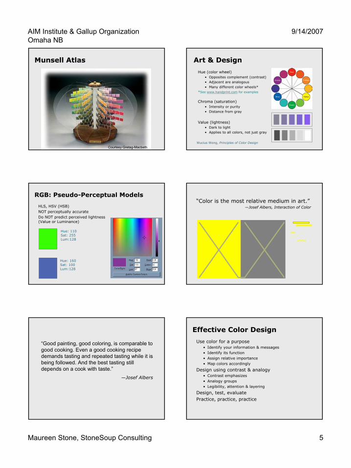
Munsell Atlas
Courtesy Gretag-Macbeth
Art & Design
Hue (color wheel)• Opposites complement (contrast)• Adjacent are analogous• Many different color wheels*
*See www.handprint.com for examples
Chroma (saturation) • Intensity or purity• Distance from gray
Value (lightness)• Dark to light• Applies to all colors, not just gray
Wucius Wong, Principles of Color Design
RGB: Pseudo-Perceptual Models
HLS, HSV (HSB)NOT perceptually accurateDo NOT predict perceived lightness (Value or Luminance)
Hue: 110Sat: 255Lum:128
Hue: 160Sat: 100Lum:128
“Color is the most relative medium in art.”—Josef Albers, Interaction of Color
yellow
“Good painting, good coloring, is comparable to good cooking. Even a good cooking recipe demands tasting and repeated tasting while it is being followed. And the best tasting still depends on a cook with taste.”
—Josef Albers
Effective Color Design
Use color for a purpose• Identify your information & messages• Identify its function• Assign relative importance• Map colors accordingly
Design using contrast & analogy• Contrast emphasizes• Analogy groups• Legibility, attention & layering
Design, test, evaluatePractice, practice, practice

AIM Institute & Gallup OrganizationOmaha NB
9/14/2007
Maureen Stone, StoneSoup Consulting 6
Envisioning Information
“… avoiding catastrophe becomes the first principle in bringing color to information:Above all, do no harm.”
—E. R. Tufte
www.edwardtufte.com
Fundamental Uses
To labelTo measureTo represent or to imitate realityTo enliven or decorate
Color and Function
To label• Primarily hue variation• Associated with color names
To measure• Vary lightness & chroma• Map to data distribution
Cynthia Brewer, Pennsylvania State University
ColorBrewer
Color and Function
To evoke nature• Metaphor, symbolic• Illustration: distilled experience
Color and Function
To decorate, beautify• Emotional design• Visceral & reflective
Contrast and Analogy
Hue, chroma, value Value only
Contrast & Analogy• Contrast (difference) separates• Analogy (similarity) groups
AIM Institute & Gallup OrganizationOmaha NB
9/14/2007
Maureen Stone, StoneSoup Consulting 7
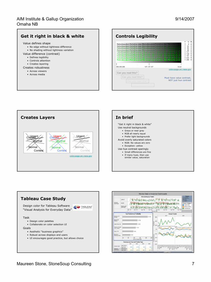
Get it right in black & white
Value defines shape• No edge without lightness difference• No shading without lightness variation
Value difference (contrast)• Defines legibility• Controls attention• Creates layering
Creates robustness• Across viewers• Across media
Controls Legibility
colorusage.arc.nasa.gov
Can you read this?
Can you read this?
Can you read this?
Can you read this?
Must have value contrast, NOT just hue contrast
Creates Layers
Context
Context
Normal
Normal
UrgentContext
Context
Normal
Normal
Urgent Context
Context
Normal
Normal
Urgent
colorusage.arc.nasa.gov
In brief“Get it right in black & white”Use neutral backgrounds
• Grays or near gray• RGB all nearly equal• Prefer light backgrounds
Avoid overly saturated colors• RGB: No values are zero• Exception: yellow
Use hue contrast sparingly• Small differences are fine• If many hues, then use
similar value, saturation
Tableau Case Study
Design color for Tableau Software“Visual Analysis for Everyday Data”
Task• Design color palettes• Collaborate on color selection UI
Goals• Aesthetic “business graphics”• Robust across displays and users• UI encourages good practice, but allows choice

AIM Institute & Gallup OrganizationOmaha NB
9/14/2007
Maureen Stone, StoneSoup Consulting 8
Color design tasks
Categorical color palettes + UI• Color as label• Distinctly different, similar visual weight• Scatter plots, line graphs, bar charts, text
Quantitative color palettes + UI• Color as quantity• Sequential and diverging scales• Heat maps, scatter plots (but could be any above)
Formatting colors + UI• Color to decorate (also group and label)• Row, column and header shading• Annotations (lines and text)
Global Issues
Subtlety vs. robustnessWhat can we assume about the display?Not calibrated (except mine)
Clarity vs. expressivenessHow many colors? What about the “color blind?”
Simplicity vs. power in the UIOptimized for good practiceData-to-color control, not color control
Categorical Colors Issues
Color palettes• How many? Algorithmic?• Extensible? Customizable?
Color appearance• As a function of size• As a function of background
Robust and reliable color namesUI to encourage good practice
―But, must allow for personal expression
Sample pages
Sample pages
Questions• What are parameters for legibility?• Can we adapt color to size?• Richness vs. clarity
Categorical Colors
10 basic colors• Simple names• Increase number with
lightness variation
Designed to balance• Legibly colored dots, lines
and text• But not too gaudy for bars• Tasteful, yet colorful

AIM Institute & Gallup OrganizationOmaha NB
9/14/2007
Maureen Stone, StoneSoup Consulting 9
Tableau names
Basic names (11)• Black, white, gray• Red, green, blue, yellow• Orange, purple, brown,
pink
Tableau names (10)• Minus black & white• Plus teal• Yellow => gold
Palette-based UI
1. Select whole palettes2. Individual colors from different palettes3. Standard color picker
Formatting Colors
…Fix this Formatting Color Issues
Taste and style• Aesthetic, professional• Lots of choices
Shading colors• How light can we go?• Visibility in the UI
Annotation colors• Text legibility• Different from data colors• Harmonious with formatting, data colors
Limited space and time for UI implementation

AIM Institute & Gallup OrganizationOmaha NB
9/14/2007
Maureen Stone, StoneSoup Consulting 10
UI Evolution Expanded Palette

AIM Institute & Gallup OrganizationOmaha NB
9/14/2007
Maureen Stone, StoneSoup Consulting 11
Quantitative Color Issues
Color sequences• What colors, what sequences?• Continuous or quantized? (and how?)• Work at all sizes, and in isolation
Real numeric data• All distributions, including outliers• Can’t visualize the histogram
UI to encourage good practice• UI must be simple, not intimidating• Users not expert in color or statistics
Color Brewer
www.colorbrewer.org
Ramp Design
Start with Brewer ramps• Available as RGB• Not calibrated
Modify• For sRGB• Eliminate darkest colors• Reduce hue shift
Interpolate• Custom Python code• CIELAB, RGB• Piecewise linear
From ColorBrewer
Sequential Ramps Diverging Ramps

AIM Institute & Gallup OrganizationOmaha NB
9/14/2007
Maureen Stone, StoneSoup Consulting 12
Data Distribution
Mapping Census 2000: The Geography of U.S. Diversity
Proportional Distribution
Skewed Data
www.tableausoftware.com
Slightly negative
Full Range
Skewed Data
Stepped
Skewed Data
Threshold
Skewed Data
StoneSoup Consulting, 2005

AIM Institute & Gallup OrganizationOmaha NB
9/14/2007
Maureen Stone, StoneSoup Consulting 13
Quantitative UI Color Vision Deficiencies (CVD)
Non-standard cone (SML) response• Genetic• Medical• Mild to missing
Three modes• L-weak (protanope)• M-weak (deuteranope)• S-weak (tritanope)
Modeled in opponent space• Achromatic axis• R-G and Y-B axis
Incidence of CVD
Monochromacy - 0.003%Dichromacy
• Protanopia 1%• Deuteranopia 1.1%• Tritanopia 0.002%
Anomalous trichromacy• Protanomaly 1%• Deuteranomaly 4.9%• Tritanomaly -
Total - 8.005%
R. W. G. Hunt. Measuring Colour. Fountain Press,1998.
Vischeck
Simulates dichromatic color vision deficiencies• Web service or Photoshop plug-in• Robert Dougherty and Alex Wade
Deuteranope Protanope Tritanope
vischeck.com
AIM Institute & Gallup OrganizationOmaha NB
9/14/2007
Maureen Stone, StoneSoup Consulting 14
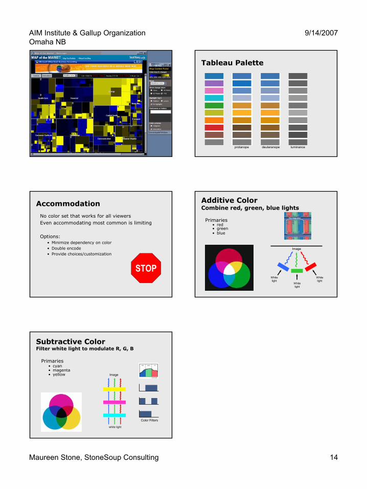
Smart Money Tableau Palette
protanope deuteranope luminance
Accommodation
No color set that works for all viewersEven accommodating most common is limiting
Options:• Minimize dependency on color• Double encode• Provide choices/customization
STOP
Additive ColorCombine red, green, blue lights
Primaries• red• green• blue
Whitelight
Image
Whitelight
Whitelight
Subtractive ColorFilter white light to modulate R, G, B
Primaries• cyan• magenta• yellow Image
white light
Color Filters


![Color Psychology and its Effect on Hospital Design …shefayekhatam.ir/article-1-1366-fa.pdfZÆ],¹Á{à Z¼ ,ºnÀaà Á{ Color Psychology and its Effect on Hospital Design and Patient](https://static.fdocument.pub/doc/165x107/5e51edece3f22f47f27ee857/color-psychology-and-its-effect-on-hospital-design-zf-z-naf-.jpg)