Chapter 132 Part 1Part 1 3333 Chapter 1 Line Graph 유형 설명 IELTS Academic Writing Task 1에서...
17
32 Chapter 1 Line Graph 유형 설명 IELTS Academic Writing Task 1에서 가장 많이 볼 수 있는 형태는 Line Graph이다. Line Graph는 특정한 선이 나타내는 기울기에 따라 다르게 표현된다. 기울기의 차이가 있을 수는 있지 만 기본적으로는 올라가는 경우, 내려가는 경우, 또는 변화를 나타내지 않는 경우 등의 형태에서 벗 어나지 않는다. 복잡한 Line Graph의 경우에도 기본적으로는 이런 라인들이 각각 어떤 형태로 이 동하는가를 판단하고 이들간의 관계를 생각해 보는 단계를 거친다. 그래프 분석방법 1. 주제 파악하기 : 맨 먼저, 그래프의 주제가 무엇인지를 파악한다. 그래프의 주제는 주로 그래프 상 단에 적혀져 있다. 물론 지시문( instruction)에도 같은 주제가 나오므로 이를 밑줄 그어둘 필요가 있다. 2. X축과 Y축의 의미 확인하기 : X축과 Y축이 의미하는 것을 빨리 간파할 필요가 있다. X축은 주 로 연도가 나오는데 이는 연도의 흐름에 따라 달라지고 있는 Y의 값을 확인하면 된다. Y축이 만 약 percentage라면 이는 각각의 연도에 따른 비율의 흐름을 나타내고 있는 것이다. 3. 각각의 Line이 무엇을 나타내는지 파악하기 : 실전에서 한 개의 단순한 선이 나오기보다는 복수 의 선이 나올 가능성이 높은데 그렇다면 각각의 Line이 무엇을 나타내는지를 확인할 필요가 있 다. 주로 개체들을 구분하기 위해 실선과 점선으로 나타낼 수도 있고 세 개 이상일 땐 다른 특이한 구분을 해준다(세모, 네모 표시 등). 한 개의 선이 국가명, 도시명, 또는 특이한 다른 것일 수 있다. 만약 국가라면 개별 국가에서의 흐름을 나타내고 있는 것이다. 4. 선들에 대한 Trend 확인하기 : 우선 최고점과 최저점을 확인하고 각각의 선들에 대한 Trend를 확인해야 한다. 한 개의 선에 대한 전반적인 상승, 하락, 또는 정체 상황 등을 확인하고 이를 각각 의 다른 선들과 비교해 본다. 동반 상승한다든지 또는 한 개는 상승하는데 비해 또 다른 한 개는 하락하고 있다든지 하는 비교 분석을 곁들인다. 그래프 중점사항 1개의 Line이 의미하는 것이 제대로 머릿속에 잡혔다면 X축이 변함에 따라 Y축이 어떻게 변하는 지를 살펴본다. 이때 기울기가 올라가는지, 내려가는지, 오르락내리락하고 있는지, 또는 전혀 변화를 나타내지 않는지 등을 구분할 수 있으면 되고, 복수의 Line이 있다면 그들간의 의미 있는 관계가 있 는지 등을 생각해본다. 예를 들어 한쪽이 오르니까 다른 한쪽도 오른다든지, 아니면 한쪽이 오르니 까 다른 한쪽은 내려간다든지 등을 추론해 볼 수 있다.
Transcript of Chapter 132 Part 1Part 1 3333 Chapter 1 Line Graph 유형 설명 IELTS Academic Writing Task 1에서...
32 Part 1 3332 Part 1 33
Chapter 1Line Graph
유형 설명
IELTS Academic Writing Task 1에서 가장 많이 볼 수 있는 형태는 Line Graph이다. Line
Graph는 특정한 선이 나타내는 기울기에 따라 다르게 표현된다. 기울기의 차이가 있을 수는 있지
만 기본적으로는 올라가는 경우, 내려가는 경우, 또는 변화를 나타내지 않는 경우 등의 형태에서 벗
어나지 않는다. 복잡한 Line Graph의 경우에도 기본적으로는 이런 라인들이 각각 어떤 형태로 이
동하는가를 판단하고 이들간의 관계를 생각해 보는 단계를 거친다.
그래프 분석방법
1. 주제 파악하기 : 맨 먼저, 그래프의 주제가 무엇인지를 파악한다. 그래프의 주제는 주로 그래프 상
단에 적혀져 있다. 물론 지시문(instruction)에도 같은 주제가 나오므로 이를 밑줄 그어둘 필요가
있다.
2. X축과 Y축의 의미 확인하기 : X축과 Y축이 의미하는 것을 빨리 간파할 필요가 있다. X축은 주
로 연도가 나오는데 이는 연도의 흐름에 따라 달라지고 있는 Y의 값을 확인하면 된다. Y축이 만
약 percentage라면 이는 각각의 연도에 따른 비율의 흐름을 나타내고 있는 것이다.
3. 각각의 Line이 무엇을 나타내는지 파악하기 : 실전에서 한 개의 단순한 선이 나오기보다는 복수
의 선이 나올 가능성이 높은데 그렇다면 각각의 Line이 무엇을 나타내는지를 확인할 필요가 있
다. 주로 개체들을 구분하기 위해 실선과 점선으로 나타낼 수도 있고 세 개 이상일 땐 다른 특이한
구분을 해준다(세모, 네모 표시 등). 한 개의 선이 국가명, 도시명, 또는 특이한 다른 것일 수 있다.
만약 국가라면 개별 국가에서의 흐름을 나타내고 있는 것이다.
4. 선들에 대한 Trend 확인하기 : 우선 최고점과 최저점을 확인하고 각각의 선들에 대한 Trend를
확인해야 한다. 한 개의 선에 대한 전반적인 상승, 하락, 또는 정체 상황 등을 확인하고 이를 각각
의 다른 선들과 비교해 본다. 동반 상승한다든지 또는 한 개는 상승하는데 비해 또 다른 한 개는
하락하고 있다든지 하는 비교 분석을 곁들인다.
그래프 중점사항
1개의 Line이 의미하는 것이 제대로 머릿속에 잡혔다면 X축이 변함에 따라 Y축이 어떻게 변하는
지를 살펴본다. 이때 기울기가 올라가는지, 내려가는지, 오르락내리락하고 있는지, 또는 전혀 변화를
나타내지 않는지 등을 구분할 수 있으면 되고, 복수의 Line이 있다면 그들간의 의미 있는 관계가 있
는지 등을 생각해본다. 예를 들어 한쪽이 오르니까 다른 한쪽도 오른다든지, 아니면 한쪽이 오르니
까 다른 한쪽은 내려간다든지 등을 추론해 볼 수 있다.
32 Part 1 3332 Part 1 33
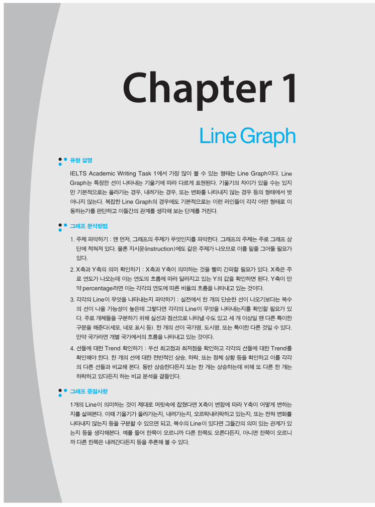
Sample Question
1. Line이 1개인 경우
2. Line이 2개 이상인 경우
This line graph shows the percentage of women who were employed
in the USA from 1985 to 2005.
USA
Percentage of Women Employed
80
70
60
50
40
30
20
10
0
Percentage
Year
1985 1990 1995 2000 2005
This chart below shows the percentage of the city’s population that
does not have any sort of health insurance. There is information from
1981 to 2005 for two cities.
Percentage of City Population Without Health Insurance
60
50
40
30
20
10
0
Percentage
1981 1985 1989 1993 1997 2001 2005
Boston, MASeattle, WA

34 Part 1 3534 Part 1 35
Essential Expressions
Warm-up
Line Graph에서의 증감을 나타내는 표현법을 배워 보도록 한다.
Case 01 가격이 상승할 때
1 기본 표현
① The price rises[increases, goes up].
② The price is rising[increasing, going up].
③ The price ends up higher.
2 부가 표현 [‘지속적으로’]
① The price continues to rise[increase, go up].
② The price is climbing upward.
③ There is an upward trend in the price.
④ There is continuing growth in the price.
Case 02 양이 감소할 때
1 기본 표현
① The amount falls[decreases, goes down].
② The amount is falling[decreasing, going down].
③ The amount ends up lower.
2 부가 표현 [‘지속적으로’]
① The amount continues to fall[decrease, go down, decline].
② The amount is descending.
③ There is a downward trend in the amount.
Case 03 항목들의 수치가 하락하다가 상승할 때
1 기본 표현
① The number of items falls and then rises.
② The number of items decreases and then increases.
③ The number of items goes down and then goes up.
2 부가 표현 [‘처음에는, 나중에는’]
① The number of items falls[decreases, goes down] at first
and then begins to rise[increase, go up].
② At first, there is a downward trend in the number of items,
and then it turns into an upward trend.
③ In the beginning, the number of items decreases, and after
awhile there is an increase.
34 Part 1 3534 Part 1 35
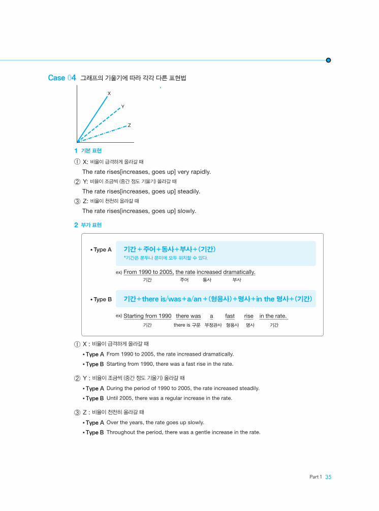
Case 04 그래프의 기울기에 따라 각각 다른 표현법
1 기본 표현
① X: 비율이 급격하게 올라갈 때
The rate rises[increases, goes up] very rapidly.
② Y: 비율이 조금씩 (중간 정도 기울기) 올라갈 때
The rate rises[increases, goes up] steadily.
③ Z: 비율이 천천히 올라갈 때
The rate rises[increases, goes up] slowly.
2 부가 표현
① X : 비율이 급격하게 올라갈 때
● Type A From 1990 to 2005, the rate increased dramatically.
● Type B Starting from 1990, there was a fast rise in the rate.
② Y : 비율이 조금씩 (중간 정도 기울기) 올라갈 때
● Type A During the period of 1990 to 2005, the rate increased steadily.
● Type B Until 2005, there was a regular increase in the rate.
③ Z : 비율이 천천히 올라갈 때
● Type A Over the years, the rate goes up slowly.
● Type B Throughout the period, there was a gentle increase in the rate.
• Type A
• Type B
기간 + 주어+동사+부사+(기간) *기간은 문두나 문미에 모두 위치할 수 있다.
ex) From 1990 to 2005, the rate increased dramatically. 기간 주어 동사 부사
기간+there is/was+a/an+(형용사)+명사+in the 명사+(기간)
ex) Starting from 1990 there was a fast rise in the rate.
기간 there is 구문 부정관사 형용사 명사 기간
X
Y
Z
36 Part 1 3736 Part 1 37
Practice Test 1
Question
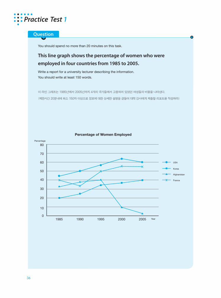
You should spend no more than 20 minutes on this task.
This line graph shows the percentage of women who were
employed in four countries from 1985 to 2005.
Write a report for a university lecturer describing the information. You should write at least 150 words.
이 라인 그래프는 1985년에서 2005년까지 4개의 국가들에서 고용되어 있었던 여성들의 비율을 나타낸다.
(제한시간 20분내에 최소 150자 이상으로 정보에 대한 상세한 설명을 곁들여 대학 강사에게 제출할 리포트를 작성하라)
Percentage of Women Employed
80
70
60
50
40
30
20
10
01985 1990 1995 2000 2005
Percentage
Year
USA
Korea
Afghanistan
France

36 Part 1 3736 Part 1 37
What the X and Y axes represent X축과 Y축이 나타내는 것
1. X from 1985 to 2005
Y percentage of women employed
What the graph is measuring or displaying 그래프가 나타내는 수치 또는 정보
2. USA, Korea, Afghanistan, and France
Description of trends for each line in the graph 그래프에서 나타나는 경향에 대한 설명
3. USA 1985~2000 1985~2000 상승
4. 2000 and 2005 1985~2000 하락
5. Korea no 감소 없음
6. Afghanistan increase 1985~19957. drop 1995
1995년 이후 하락
8. go in 2005 2005년 하락
9. France 1985~1990 1985~1990 하락
increase 2005 2005년까지 상승
Make general statements about whole graph 전체 그래프에 관한 일반적인 언급
10. All countries, 2005>1985, for Afghanistan 아프가니스탄을 제외한 모든 나라들, 2005년이 1985년보다 더 높음
Make comparative statements 비교적인 언급
11. USA, France, of women 미국, 프랑스, 대부분의 여성들
Step 1 Discovering Key Words
When looking at any chart, graph, or process, break the visual down into key words. Use these key words to help write your essay.차트나 그래프 등의 그림에서 주요한 부분과 관련된 중요 단어들을 생각해 보십시오 이 단어들이 에세이를 쓸 때 도움이 되도록 할 것입니다.
38 Part 1 3938 Part 1 39
Introduction : ‘이것은 어떤 graph다’라는 것만 밝히면 된다. 문제에서 주어진 어구를 똑같이 써서는 안 된다. 두 문장 이내로
기술하는 것이 좋다.
1. the percentage of women , four , over an interval of 여성 고용 비율, 4개국, 20년에 걸쳐
2. USA, Korea, Afghanistan, France, 1985 to 2005 미국, 한국, 아프가니스탄, 프랑스, 1985년부터 2005년까지
Body : 주어진 도표의 주요 특징들만을 골라서 분석하도록 한다. 데이터의 증감이나 정체를 적절한 단어를 사용하여 간단, 명료
하게 표현하도록 한다. 비슷한 내용을 표현할 때 다양한 단어를 사용하여 중복되지 않도록 한다.
3. USA show a increase, from 1985 until 2000 1985년부터 2000년까지 지속적인 증가를 보임
4. drop for the year 2005 2005년에 약간 하락함
5. Korea steady twenty-year with no decrease 감소없이 20년간 지속적인 증가
6. Afghanistan increase from 1985 to 1995 1985년부터 1995년까지 증가
7. after 1995, drop to about 10 percent in 2000 1995년 이후, 2000년에 약 10%로의 상당한 하락
8. go down further in 2005
9. France fall slightly in the first five years, increase until 2005 처음 5년 내에 약간 떨어짐, 2005년까지 계속 증가
Conclusion : 서론의 연장이나 반복 또는 본론의 반복이어서는 안 된다. 중요한 점을 다시 한 번 강조하거나, 전반적인 내용을
통해 새로운 사실을 모아 결론으로 마무리한다. 또한 특징적인 데이터를 비교하여 나온 결론을 추가한다.
10. all countries except for Afghanistan, percentage of employed women in 2005 in 1985 아프가니스탄을 제외한 모든 나라들, 1985년보다 2005년에 더 높은 여성 고용 비율
11. USA and France, majority of women are employed in 2005
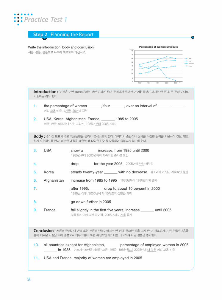
Step 2 Planning the Report
Write the introduction, body and conclusion.서론, 본론, 결론으로 나누어 써보도록 하십시오.
Practice Test 1
Percentage of Women Employed80
70
60
50
40
30
20
10
01985 1990 1995 2000 2005
Percentage
Year
USA
Korea
Afghanistan
France
38 Part 1 3938 Part 1 39
Introduction
1. This chart the percentage of women in four countries an of twenty years.
이 차트는 20년 기간 동안 4개 국가에서의 여성 고용 비율을 나타낸다.
2. Information is the USA, Korea, Afghanistan, and France from 1985 to 2005.
1985년부터 2005년까지의 미국, 한국, 아프카니스탄, 그리고 프랑스에 관한 정보가 나타난다.
Body
3. The United States a increase from 1985 until 2000. 미국은 1985년부터 2000년까지 지속적인 성장을 보여준다.
4. The percentage of women employed then and is for the year
2005. 고용된 여성의 비율이 약간 떨어지고 2005년에는 약간 하락세를 나타낸다.
5. In Korea, there is a twenty-year with decrease in the of employment for women.
한국에서는 여성 고용률이 20년간 전혀 감소하지 않고 지속적인 성장세를 보여준다.
6. ten years from 1985 to 1995, Afghanistan’s percentage of employed women . 1985년에서 1995년까지 10년간 아프카니스탄의 여성 고용률이 증가한다.
7. 1995, however, there is a to 10 percent in the year 2000. 하지만 1995년 이후에는 많은 하락세를 보이다가 2000년에 약 10퍼센트까지 내려간다.
8. This goes in 2005. 이 하락세가 2005년에는 더욱 내려간다.
9. France’s percentage of employed women in the five years of the shown then until 2005.
프랑스의 여성 고용률이 주어진 첫 5년 기간 내에 약간 떨어지다가 2005년까지 지속적으로 상승한다.
Conclusion
10. According the chart, all countries have a percentage of employed women in 2005 in 1985 Afghanistan.
차트에 따르면 아프카니스탄을 제외하고 1985년보다 2005년에 여성 고용률이 더 높게 나타난다.
11. Among the countries, the USA and France are the ones where the of women are employed in the year 2005.
여러 다른 나라 중에서 미국과 프랑스가 2005년에 대부분의 여성들이 고용되어 있는 유일한 나라들이다.
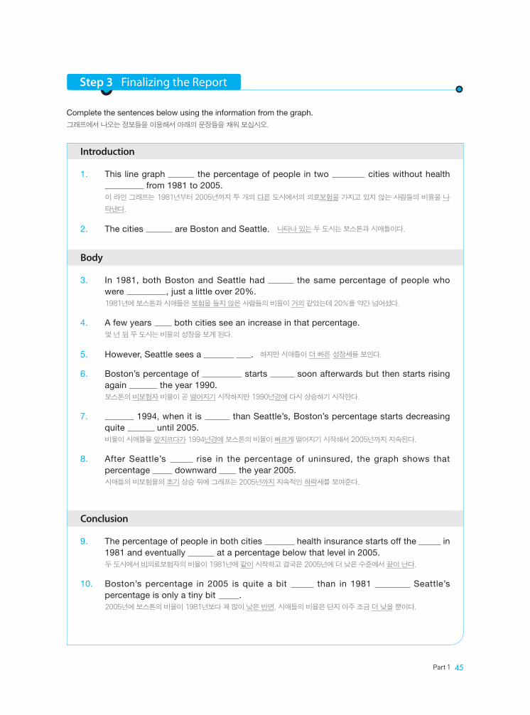
Step 3 Finalizing the Report
Complete the sentences below using the information from the graph.그래프에서 나오는 정보들을 이용해서 아래의 문장들을 채워 보십시오.

40 Part 1 4140 Part 1 41
Step 4 Write Your Own
Try writing a report on your own. Provided below are some prompts to help you.직접 리포트를 적어 보도록 하십시오. 몇 개의 단어들이 도움을 주기 위해 미리 적혀져 있습니다.
Practice Test 1
1. This chart shows
of twenty years. 2. Information is shown
1985 to 2005.
3. The United States 1985 until 2000. 4. The percentage of
for the year 2005. 5. In Korea, there
employment for women. 6. For ten
years employed women increases. 7. After
1995, however, the year 2000. 8. This
goes in 2005. 9. France’s percentage of
continuously until 2005.
10. According to the
except for Afghanistan. 11. Among the other
the year 2005.
Percentage of Women Employed80
70
60
50
40
30
20
10
01985 1990 1995 2000 2005
Percentage
Year
USA
Korea
Afghanistan
France

40 Part 1 4140 Part 1 41
Model Answer
두 개의 에세이를 서로 비교해 가면서 살펴보십시오. 특히, 같거나 비슷한 단어,구, 또는 문장들에 주의를 기울이는 게 좋습니다.
This chart shows the percentage of women employed in four countries over an interval of twenty years. Information is shown for the USA, Korea, Afghanistan and France from 1985 to 2005.
It can be seen in the graph that the percentage of working women in the USA went up steadily between the year of 1985 and 2000, until it was followed by a slight decrease by 2005. The percentage of working women in Korea shows a steady increase as well , but with no decrease. The data on the rate of women employed in Afghanistan shows a different trend. There were about 33 percent of women working in 1985 and the rate rose moderately until 1995. However, for some reason, the rate dropped dramatically from 1995 to 2000 to 10 percent and it continued to drop in 2005. In the case of France, there was a sudden decrease of around 10 percent from 1985 to 1990, which was followed by a swift growth of approximately 20 percent in 1995. The rate of women employed in France then stabilized until 2005.
In conclus ion, the rates of work ing women in all countries are higher in 2005 than those in 1985 with an exception of Afghanistan. Out of four countries, the USA and France are the countries where the majority of women are employed in the year 2005.
(224 words)
This chart shows the percentage of women employed in four countries over an interval of twenty years. Information is shown for the USA, Korea, Afghanistan, and France from 1985 to 2005.
The United States shows a steady increase from 1985 until 2000. The percentage of women employed then drops slightly and is lower for the year 2005. In Korea, there is a steady twenty-year rise with no decrease in the rate of employment for women. For ten years from 1985 to 1995, Afghanistan’s percentage of employed women increases. After 1995, however, there is a substantial drop to about 10 percent in the year 2000. This goes down further in 2005. France’s percentage of employed women falls slightly in the first five years of the period shown then increases continuously until 2005.
According to the chart, all countries have a higher percentage of employed women in 2005 than in 1985 except for Afghanistan. Among the other countries , the USA and France are the only ones where the majority of women are employed in the year 2005.
(191 words)
Type A Type B

42 Part 1 4342 Part 1 43
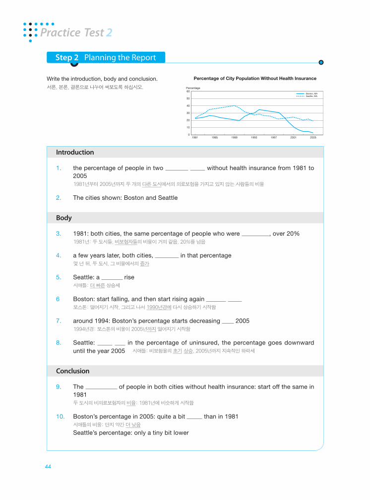
Practice Test 2
Question
You should spend no more than 20 minutes on this task.
This chart below shows the percentage of the city’s population
that does not have any sort of health insurance. There is
information from 1981 to 2005 for two cities. Write a report for a university lecturer describing the information.
You should write at least 150 words.
이 차트는 의료보험을 가지고 있지 않는 도시인들의 비율을 나타낸다. 두 개의 도시에 대한 정보가 1981년부터 2005
년까지 있다.
(제한시간 20분내에 최소 150자 이상으로 정보에 대한 상세한 설명을 곁들여 대학 강사에게 제출할 리포트를 작성하라)
Percentage of City Population Without Health Insurance
60
50
40
30
20
10
0
Percentage
1981 1985 1989 1993 1997 2001 2005
Boston, MASeattle, WA

42 Part 1 4342 Part 1 43
What the X and Y axes represent X축과 Y축이 나타내는 것
1. X from 1981 to 2005
Y percentage of city population without health insurance
What the graph is measuring or displaying 그래프가 나타내는 수치 또는 정보
2. Boston, Seattle
Description of trends for each line in the graph 그래프에서 나타나는 경향에 대한 설명
3. Boston, Seattle 1981, percentage 1981년, 같은 비율
4. a few years later, 몇 년 뒤, 성장
5. Seattle steeper 더 가파른 성장 하락
6. Boston fall, again in 1990 하락, 1990년에 다시 상승
7. 1994, than Seattle’s, decrease until 2005 1994년, 시애틀보다 더 높음, 2005년까지 감소
8. Seattle go until 2005 2005년까지 하락
General statements about whole graph 전체 그래프에 관한 일반적인 언급
9. Boston, Seattle start off the same in 1981, settle at level in 2005 1981년에 같이 시작, 2005년에 더 낮은 레벨에 정착
Comparative statements 비교적인 언급
10. 2005<1981 Boston, quite a bit lower Seattle, a tiny bit lower
Step 1 Discovering Key Words
When looking at any chart, graph, or process, break the visual down into key expressions. Use these key words to help write your report.차트나 그래프 등의 그림에서 주요한 부분과 관련된 중요 단어들을 생각해 보십시오 이 단어들이 에세이를 쓸 때 도움이 되도록 할 것입니다.
44 Part 1 4544 Part 1 45
Introduction
1. the percentage of people in two without health insurance from 1981 to 2005
1981년부터 2005년까지 두 개의 다른 도시에서의 의료보험을 가지고 있지 않는 사람들의 비율
2. The cities shown: Boston and Seattle
Body
3. 1981: both cities, the same percentage of people who were , over 20% 1981년: 두 도시들, 비보험자들의 비율이 거의 같음, 20%를 넘음
4. a few years later, both cities, in that percentage 몇 년 뒤, 두 도시, 그 비율에서의 증가
5. Seattle: a rise 시애틀: 더 빠른 상승세
6 Boston: start falling, and then start rising again 보스톤: 떨어지기 시작, 그리고 나서 1990년경에 다시 상승하기 시작함
7. around 1994: Boston’s percentage starts decreasing 2005 1994년경: 보스톤의 비율이 2005년까지 떨어지기 시작함
8. Seattle: in the percentage of uninsured, the percentage goes downward until the year 2005 시애틀: 비보험율의 초기 상승, 2005년까지 지속적인 하락세
Conclusion
9. The of people in both cities without health insurance: start off the same in 1981
두 도시의 비의료보험자의 비율: 1981년에 비슷하게 시작함
10. Boston’s percentage in 2005: quite a bit than in 1981 시애틀의 비율: 단지 약간 더 낮음
Seattle’s percentage: only a tiny bit lower
Step 2 Planning the Report
Write the introduction, body and conclusion.서론, 본론, 결론으로 나누어 써보도록 하십시오.
Practice Test 2
60
50
40
30
20
10
0
Percentage
1981 1985 1989 1993 1997 2001 2005
Boston, MASeattle, WA
Percentage of City Population Without Health Insurance
44 Part 1 4544 Part 1 45
Introduction
1. This line graph the percentage of people in two cities without health from 1981 to 2005.
이 라인 그래프는 1981년부터 2005년까지 두 개의 다른 도시에서의 의료보험을 가지고 있지 않는 사람들의 비율을 나
타낸다.
2. The cities are Boston and Seattle. 나타나 있는 두 도시는 보스톤과 시애틀이다.
Body
3. In 1981, both Boston and Seattle had the same percentage of people who were , just a little over 20%.
1981년에 보스톤과 시애틀은 보험을 들지 않은 사람들의 비율이 거의 같았는데 20%를 약간 넘어섰다.
4. A few years both cities see an increase in that percentage. 몇 년 뒤 두 도시는 비율의 성장을 보게 된다.
5. However, Seattle sees a . 하지만 시애틀이 더 빠른 성장세를 보인다.
6. Boston’s percentage of starts soon afterwards but then starts rising again the year 1990.
보스톤의 비보험자 비율이 곧 떨어지기 시작하지만 1990년경에 다시 상승하기 시작한다.
7. 1994, when it is than Seattle’s, Boston’s percentage starts decreasing quite until 2005.
비율이 시애틀을 앞지르다가 1994년경에 보스톤의 비율이 빠르게 떨어지기 시작해서 2005년까지 지속된다.
8. After Seattle’s rise in the percentage of uninsured, the graph shows that percentage downward the year 2005.
시애틀의 비보험율의 초기 상승 뒤에 그래프는 2005년까지 지속적인 하락세를 보여준다.
Conclusion
9. The percentage of people in both cities health insurance starts off the in 1981 and eventually at a percentage below that level in 2005.
두 도시에서 비의료보험자의 비율이 1981년에 같이 시작하고 결국은 2005년에 더 낮은 수준에서 끝이 난다.
10. Boston’s percentage in 2005 is quite a bit than in 1981 Seattle’s percentage is only a tiny bit .
2005년에 보스톤의 비율이 1981년보다 꽤 많이 낮은 반면, 시애틀의 비율은 단지 아주 조금 더 낮을 뿐이다.
Step 3 Finalizing the Report
Complete the sentences below using the information from the graph.그래프에서 나오는 정보들을 이용해서 아래의 문장들을 채워 보십시오.
46 Part 1 4746 Part 1 47
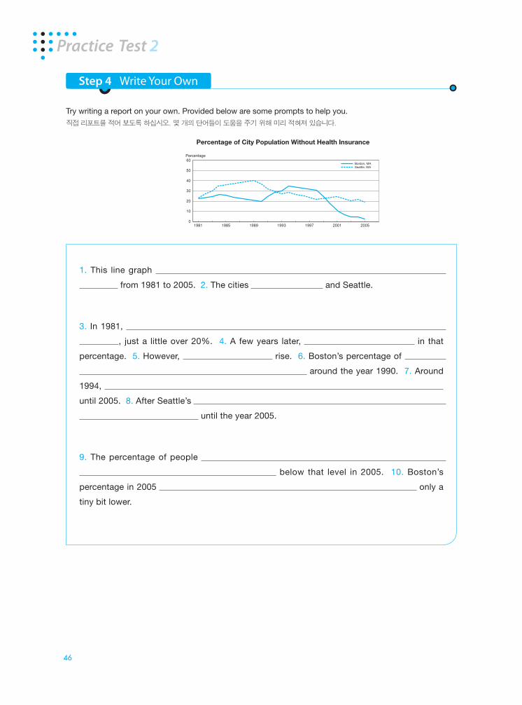
Step 4 Write Your Own
Try writing a report on your own. Provided below are some prompts to help you.직접 리포트를 적어 보도록 하십시오. 몇 개의 단어들이 도움을 주기 위해 미리 적혀져 있습니다.
Practice Test 2
1. This line graph
from 1981 to 2005. 2. The cities and Seattle.
3. In 1981,
, just a little over 20%. 4. A few years later, in that
percentage. 5. However, rise. 6. Boston’s percentage of
around the year 1990. 7. Around
1994,
until 2005. 8. After Seattle’s
until the year 2005.
9. The percentage of people
below that level in 2005. 10. Boston’s
percentage in 2005 only a
tiny bit lower.
60
50
40
30
20
10
0
Percentage
1981 1985 1989 1993 1997 2001 2005
Boston, MASeattle, WA
Percentage of City Population Without Health Insurance

46 Part 1 4746 Part 1 47
Model Answer
두 개의 에세이를 서로 비교해 가면서 살펴보십시오. 특히, 같거나 비슷한 단어,구, 또는 문장들에 주의를 기울이는 게 좋습니다.
Type A Type B
This line graph shows the percentage of people in two different cities without health insurance from 1981 to 2005. The cities shown are Boston and Seattle.
In 1981, both Boston and Seattle had nearly the same percentage of people who were uninsured, just a little over 20%. A few years later, both cities see an increase in that percentage. However, Seattle sees a steeper rise. Boston’s percentage of uninsured starts falling soon afterwards but then starts rising again around the year 1990. Around 1994, when it is higher than Seattle’s, Boston’s percentage starts decreasing quite rapidly until 2005. After Seattle’s initial rise in the percentage of uninsured, the graph shows that percentage cycling downward until the year 2005.
The percentage of people in both cities without health insurance starts off the same in 1981 and eventually settles at a percentage below that level in 2005. Boston’s percentage in 2005 is quite a bit lower than in 1981 whereas Seattle’s percentage is only a tiny bit lower.
(166 words)
The line graph shows the percentage of population without health insurance in two American cities; Boston and Seattle, from 1981 to 2005.
There were about 23% of Bostonians who did not have any health insurance in 1981. The percentage slightly increased for the next 4 years, and then started decreasing for the following 6 years to 20%. The number then consistently went up until 1994 where it reached its peak at 35%. However, the percentage started falling again for the next few years to just over 30%. From 1999 to 2006, there is a significant decrease in the rate of people without health insurance.
In Seattle, the rate of uninsured people quickly increased by about 10% until 1985. The rise slowed down a little bit until it reached its peak at 40% by 1990. Then the rate started fluctuating many times, but mainly continued to drop until it reached its lowest point at 20% by 2006.
It can be seen that, in general, both Boston and Seattle had nearly the same percentage of people who were uninsured, just a little over 20%. It can also be seen that the number of people who have no health insurance decreased over twenty-five years. It might be due to the fact that the current living conditions are better than those in the past.
(221 words)
48 Part 1 4948 Part 1 49
Chapter 2Bar Graph
유형 설명
IELTS Academic Writing Task 1에서 Line Graph와 함께 가장 많이 사용되는 그래프가 바로
Bar Graph이다. Bar Graph는 특성상 Line Graph와 큰 차이가 없기 때문에 Line Graph에서
배운 증감에 대한 표현들을 직접 활용할 수 있는 부분이 많다. Bar Graph에서 막대가 수직 또는 가
로로 있는 두 가지 경우에 다 익숙하도록 해야 하며, Bar Graph를 읽을 때는 항상 X축과 Y축이 의
미하는 것과 각각의 막대가 나타내는 것을 잘 이해하도록 한다.
그래프 분석방법
1. 주제 파악하기: Line Graph에서와 마찬가지로 그림 상단에 나와 있는 주제를 확인해둔다.
2. X축과 Y축의 의미 확인하기: 그래프가 세로 막대인지 가로 막대인지에 따라 각각의 항목들이 X
축, 또는 Y축에 해당할 수 있는데 어느 쪽이든 쉽게 이해 할 수 있게 해 둔다. 대개, 세로로 된 Bar
Graph라면 각각의 항목들이 순서대로 X축에 나타나고 Y축에는 주로 단위들(비율 등)이 나온다.
3. 각각의 막대가 무엇을 나타내는지 파악하기: 한 항목에 대해서도 여러 개의 막대가 나올 것인데
이것 한 개가 무엇을 나타내는지를 확인한다. 가령, 연도별로 구분해 둔 것인지 또는 연령별로 구
분한 것인지 등을 파악한다.
4. 막대들에 대한 trend 확인하기: 우선 최고점과 최저점을 확인하고 각각의 막대들에 대한 trend
를 확인해야 한다. 즉, 복수의 막대들이 한 항목에서 어떻게 이동하는지, 그리고 각 항목들간의 관
계는 어떠한지를 알아본다.
그래프 중점사항
같은 항목에서 막대들이 어떻게 이동하고 있는지를 확인한다. 주로 연도에 따라 달라지고 있는 변화
를 생각해 보면 된다. 시간의 흐름에 따라 상승, 하락, 정체, 또는 오르락내리락하고 있는지를 눈여겨
보고 이것이 파악되었다면 다른 항목들과도 이들의 변화를 서로 연결해서 비교해 본다. 가령 A는 시
간이 경과함에 따라 올라가고 있는 반면, B는 내려가고 있다든지 하는 변화를 찾아낼 수 있어야 한다.