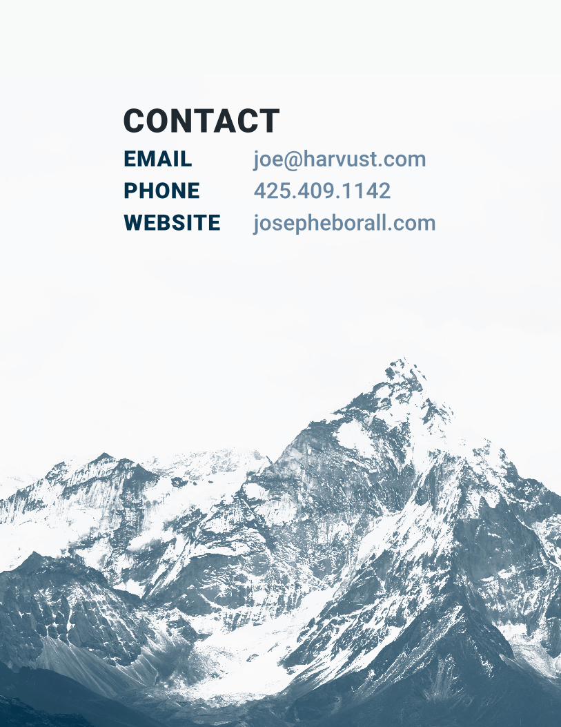

BYU-I Comm130 Portfolio
21
DESIGN PORTFOLIO JOSEPH EBORALL
-
Upload
joseph-eborall -
Category
Education
-
view
251 -
download
1
Transcript of BYU-I Comm130 Portfolio
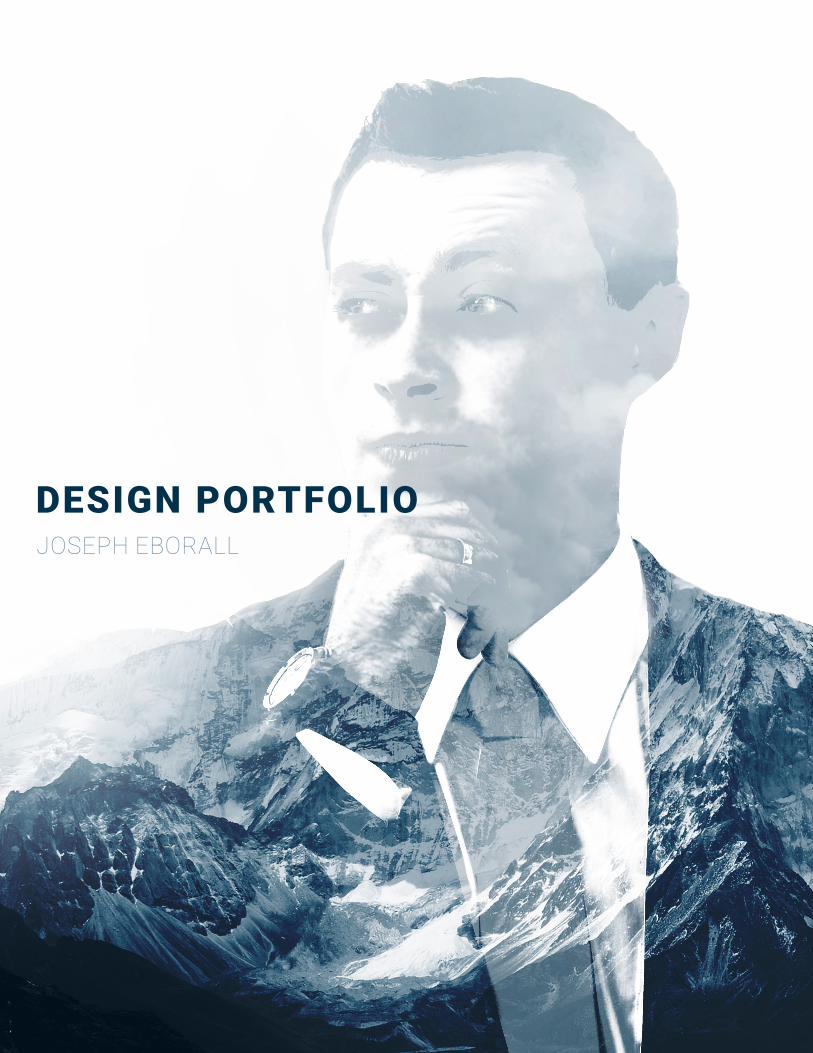
DESIGN PORTFOLIOJOSEPH EBORALL
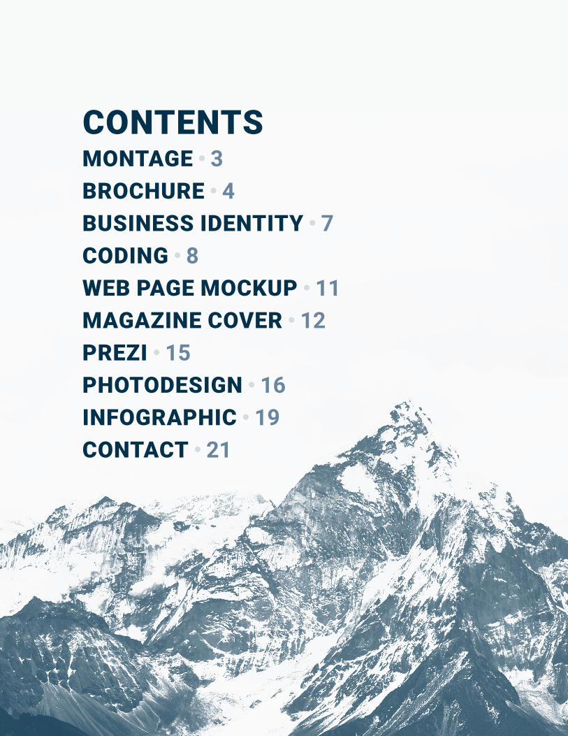
CONTENTSMONTAGE • 3BROCHURE • 4BUSINESS IDENTITY • 7CODING • 8WEB PAGE MOCKUP • 11MAGAZINE COVER • 12PREZI • 15PHOTODESIGN • 16INFOGRAPHIC • 19CONTACT • 21
BY JOSEPH EBORALL
PG // 3
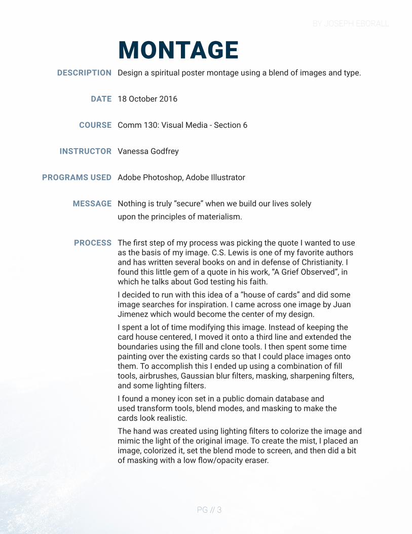
MONTAGEDESCRIPTION
DATE
COURSE
INSTRUCTOR
PROGRAMS USED
MESSAGE
PROCESS
Design a spiritual poster montage using a blend of images and type.
18 October 2016
Comm 130: Visual Media - Section 6
Vanessa Godfrey
Adobe Photoshop, Adobe Illustrator
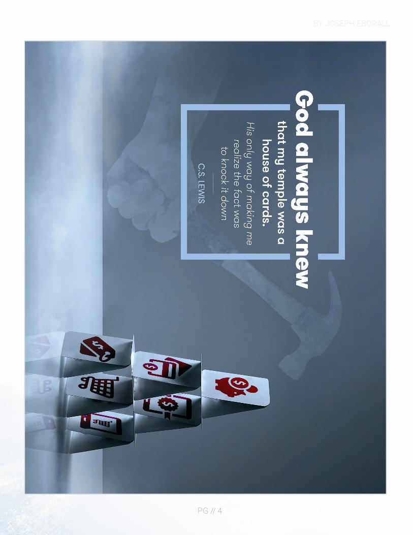
Nothing is truly “secure” when we build our lives solely upon the principles of materialism.
The first step of my process was picking the quote I wanted to use as the basis of my image. C.S. Lewis is one of my favorite authors and has written several books on and in defense of Christianity. I found this little gem of a quote in his work, “A Grief Observed”, in which he talks about God testing his faith.I decided to run with this idea of a “house of cards” and did some image searches for inspiration. I came across one image by Juan Jimenez which would become the center of my design.I spent a lot of time modifying this image. Instead of keeping the card house centered, I moved it onto a third line and extended the boundaries using the fill and clone tools. I then spent some time painting over the existing cards so that I could place images onto them. To accomplish this I ended up using a combination of fill tools, airbrushes, Gaussian blur filters, masking, sharpening filters, and some lighting filters.I found a money icon set in a public domain database and used transform tools, blend modes, and masking to make the cards look realistic.The hand was created using lighting filters to colorize the image and mimic the light of the original image. To create the mist, I placed an image, colorized it, set the blend mode to screen, and then did a bit of masking with a low flow/opacity eraser.
BY JOSEPH EBORALL
PG // 4
BY JOSEPH EBORALL
PG // 5
BROCHUREDESCRIPTION
DATE
COURSE
INSTRUCTOR
PROGRAMS USED
MESSAGE
PROCESS
Design a brochure for a company.
30 November 2016
Comm 130: Visual Media - Section 6
Vanessa Godfrey
Adobe Indesign, Adobe Illustrator, Adobe Photoshop
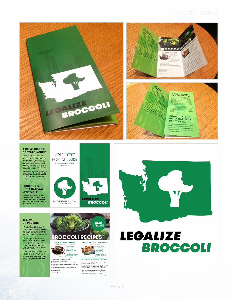
Broccoli is an often misunderstood vegetable.
After a conversation with my sister sparked the fires of inspiration, I began the process of my design by creating a logo in Illustrator for the fake movement to “Legalize Broccoli”.In Illustrator I took a vector outline of Washington state I found online and subtracted a custom shape of broccoli from it. It was also in this phase that I settled on an emerald shade of green as the primary color of my design.Next, I took an 8.5 x 11 piece of paper and folded it into a trifold brochure. I labeled the different faces of the folded paper and then unfolded the piece of paper as a template for how I should design my brochure in InDesign.The next part of the design process, and dare I say the longest, was to brainstorm jokes that I could put on my brochure. Many of the elements that ended up in my final draft are a result of these brainstorming sessions with friends and family.
BY JOSEPH EBORALL
PG // 6
BY JOSEPH EBORALL
PG // 7
BUSINESS IDENTITYDESCRIPTION
DATE
COURSE
INSTRUCTOR
PROGRAMS USED
MESSAGE
PROCESS
Create a logo for a company/service/organization and establish a visual identity across documents.
27 October 2016
Comm 130: Visual Media - Section 6
Vanessa Godfrey
Adobe InDesign, Adobe Illustrator, Adobe Photoshop
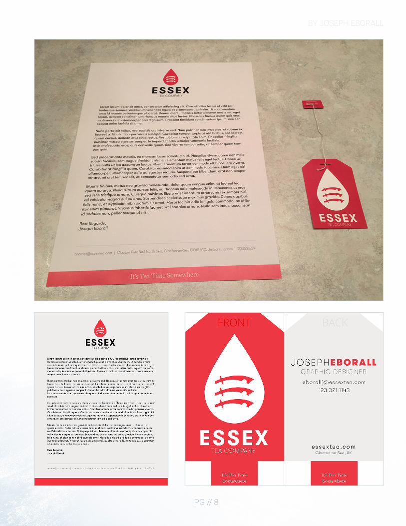
“It’s Tea Time Somewhere.”
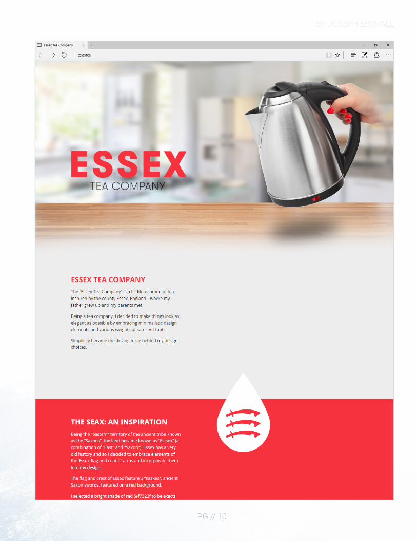
The first step in my design process was deciding which “company” I would create branding materials for. Since my father has a love for herbal tea and is from the English county of Essex, I decided that I would create the fictional “Essex Tea Company”.The coat of arms of Essex features three seaxes on a red background, and so from an early part in the development I knew I wanted to use those elements.I began creating the logo by sketching out some basic shapes associated with tea such as a water droplet, teabag, and teacup. With each shape I tried incorporating the color red and the three seaxes in some form. After several people reviewed my drawings, elements from different logos were compiled into one. From this feedback period came the idea that I could turn the business card itself into a teabag by making a vertically oriented business card and cutting off the top corners at angles.I later had the idea that by cutting off the bottom edge of the business card I would have not only a better-looking teabag but that by using a piece of string and two staples I could reattach the excess to make an actual teabag out of my design. I made a prototype as a proof of concept,and really came to like the concept.The letterhead was created using the same colors (red and gray) and fonts as my business cards, with minimalism in mind. The most important aspect of any letter is the letter itself, with the branding there to quietly suggest uniformity as a brand.
BY JOSEPH EBORALL
PG // 8
BY JOSEPH EBORALL
PG // 9
CODINGDESCRIPTION
DATE
COURSE
INSTRUCTOR
PROGRAMS USED
MESSAGE
PROCESS
Code a custom webpage with HTML and CSS.
10 November 2016
Comm 130: Visual Media - Section 6
Vanessa Godfrey
Adobe Photoshop, Adobe Illustrator, Brackets
Simplicity can be elegant.
I created a rough mockup in Photoshop giving me some design ideas.I created an SVG version of my logo so that no matter the size of the logo on the page there would be no pixelation.I identified different content boxes in my mockup design that I would need to make in HTMLI created my HTML file and linked the CSS stylesheet to itI began writing HTML and CSS to create a layout similar to my mockupI programmed some JavaScript functions to animate different elements. The amount you have scrolled down is used as a variable to change CSS transformation values. I added media queries in my CSS to create an adaptive layout. If you resize your window or are using a phone the elements adjust accordinglyI validated my HTML and CSS and made little adjustments.
BY JOSEPH EBORALL
PG // 10
BY JOSEPH EBORALL
PG // 11
WEB PAGE MOCKUPDESCRIPTION
DATE
COURSE
INSTRUCTOR
PROGRAMS USED
MESSAGE
PROCESS
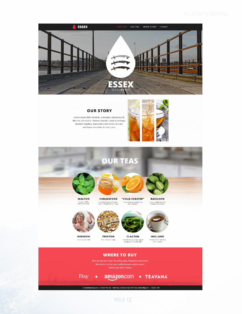
Design a website homepage using a grid.
6 October, 2016
Comm 130: Visual Media - Section 6
Vanessa Godfrey
Adobe Photoshop, Adobe Illustrator
Create a full bleed magazine cover.
One of the most important aspects of modern web design is for your website to look good regardless of the device your visitor is using. To accommodate a mixture of screen sizes, fluid designs have become the standard, with many of the aspects of the website being controlled by percentages based on the width of the visitor’s device.For optimal readability, 960px was decided as the best width for the main body of content. I decided that I would build my main content within the constraints of the 960 grid and that I would use the “margin: auto;” CSS property to center the content on what I named content “panes”. These “panes” adapt to the width of the viewer’s browser.To begin the visualization process, I started drawing out a few concept layouts on paper.Next, I created a “Shape Map” in Photoshop using a 960px grid to help me place content.For those who are unfamiliar with my work, The Essex Tea company is a fictional tea brand that I have developed over the course of several projects. From those projects, I have defined some of the color swatches and fonts that are signature to the brand.The rest of my time was spent finding various images I liked and writing content to populate the page.
BY JOSEPH EBORALL
PG // 12
BY JOSEPH EBORALL
PG // 13
MAGAZINE COVERDESCRIPTION
DATE
COURSE
INSTRUCTOR
PROGRAMS USED
MESSAGE
PROCESS
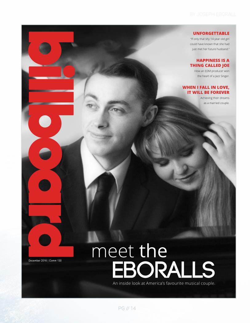
Design a magazine cover that showcases a self-portrait.
28 September 2016
Comm 130: Visual Media - Section 6
Vanessa Godfrey
Adobe InDesign, Adobe Illustrator, Adobe Photoshop
My wife and I share a love of music and things of elegance. I tried to convey this through the picture, the magazine I chose toparody, monochromatic color scheme, and minimalist approach.
The first decision I made was in regards to what photograph I would choose for my cover, as I knew that it would be the focal point of the cover and set the tone for the magazine.As I searched through my computer for a photograph, I remembered that my cousin had taken some engagement pictures of my wife and I seated at a piano. I opened the image in Photoshop and made a few adjustments to the levels, reduced the color saturation, applied noise reduction, and used some airbrush techniques to improve the image.The magazine I decided to parody for my cover was Billboard as I enjoy their minimalist approach to magazine cover design.I was unable to find an existing vector of the Billboard logo, so I created one in Illustrator so that I could make it any color and scale it up with no pixelation.Once the logo was complete, I opened InDesign and placed the photograph and Billboard logo into the design. The rest of my time was spent brainstorming the titles for my articles and placing the text in InDesign.
BY JOSEPH EBORALL
PG // 14
meet the EBORALLS
December 2016 | Comm 130
An inside look at America’s favourite musical couple.
UNFORGETTABLE“If only that shy 14-year-old girl
could have known that she had
just met her future husband.”
HAPPINESS IS A THING CALLED JOE
How an EDM producer won
the heart of a Jazz Singer.
WHEN I FALL IN LOVE, IT WILL BE FOREVER
Achieving their dreams
as a married couple.
DESIGN PORTFOLIO
PG // 15
PREZIDESCRIPTION
DATE
COURSE
INSTRUCTOR
PROGRAMS USED
MESSAGE
PROCESS
Create an instructional presentation using the Prezi software to demonstrate it’s features and capabilities.
6 October 2016
Comm 130: Visual Media - Section 6
Vanessa Godfrey
Adobe Photoshop, Prezi.com platform
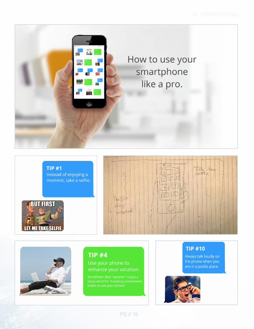
Societal norms have been mutated by the mobile phone. With aheavy dose of sarcasm, I tried to point out some of the things that Ifind annoying about our overly phone saturated culture.
I first began the design process by brainstorming on a piece of paper. My idea was to show a hand holding a phone with the presentation itself on the phone’s screen. After playing around with Prezi software, I noticed that when you add a background that there is a bit of a parallax scrolling effect. By creating a background and then placing the hand with iPhone on a different layer it creates a depth-of-field 3D effect.To accomplish this, I found a picture of a nice-looking office and applied a Gaussian blur to create the background. I then placed the iPhone hand on a separate layer creating the effect I wanted.As for the user interface, it was originally inspired by my Windows phone. My reasoning was that it would be easier to create rectangles within Prezi.However, after receiving Sister Godfrey’s critique I decided to go back to the drawing board and make the user interface more like Apple’s iMessage. I used the eyedropper tool in Photoshop to determine the colors used in Apple’s iMessage service and use it as my color scheme.Open Sans, the typeface I used throughout the design, was designed by Google for their Android operating system. It’s like Apple’s “San Francisco” proprietary typeface with Thin, Regular, and Bold variations.
BY JOSEPH EBORALL
PG // 16
BY JOSEPH EBORALL
PG // 17
PHOTODESIGNDESCRIPTION
DATE
COURSE
INSTRUCTOR
PROGRAMS USED
MESSAGE
PROCESS
By using photography and design skills, create a project that encompasses a consistent color scheme from the image.
12 October 2016
Comm 130: Visual Media - Section 6
Vanessa Godfrey
Adobe Photoshop
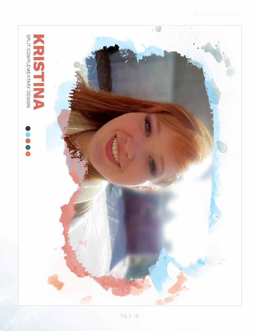
Your design’s message will be more powerful if you unify the color scheme of your design elements with your photography.
I started by taking a couple different pictures around campus. After sorting through the different photographs, I decided to go with this image of my wife as it had the best lighting, focus, and composition.In Photoshop I edited the levels, increased the vibrancy, enhanced the red in her hair, increased the level of green in her eyes, created a mask around her, and then applied a tilt-blur filter to the background to mimic lens focus.I took the edited image and placed it on an 8.5 x 11-inch document to get a feel of how large the image would print. After I saw that the image covered the whole page, I decided that instead of printing it out full-bleed, I would fade the borders of the image out to white.To do this, I created a mask over the image of my wife and used a special watercolor brush set to make only the “painted” areas show the image. Since there is white light in the right corner of the image itself, I decided to put some paint splatters behind the image using different colors from my color pallet.For the color pallet, I decided that the image was split complementary since it had a lot of blues, reds, and orange in it.
BY JOSEPH EBORALL
PG // 18
DESIGN PORTFOLIO
PG // 19
INFOGRAPHICDESCRIPTION
DATE
COURSE
INSTRUCTOR
PROGRAMS USED
MESSAGE
PROCESS
Create an infographic that organizes data in a visually pleasing way.
2 November 2016
Comm 130: Visual Media - Section 6
Vanessa Godfrey
Adobe Photoshop, Adobe Illustrator
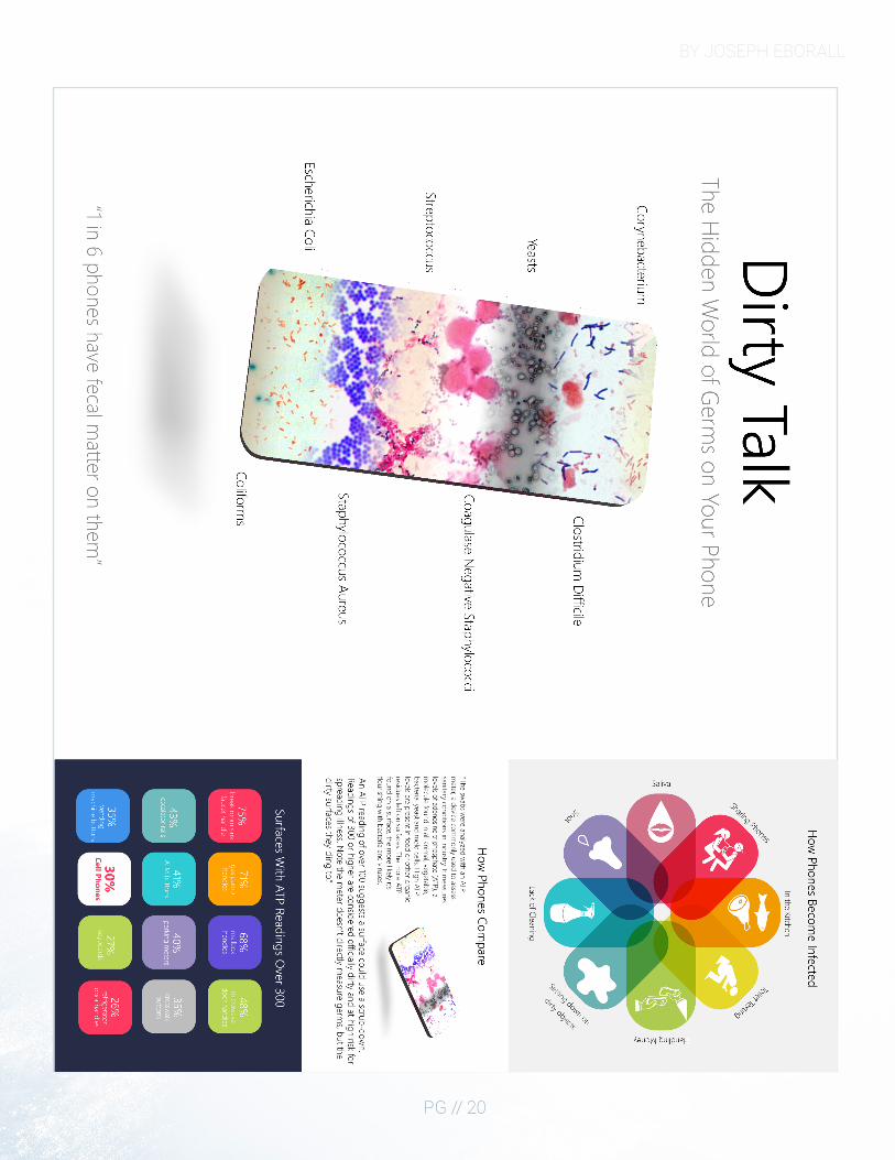
We touch our cell phones all day and are clueless to how dirty they actually are.
I started my design process in class with a couple of layout concept drawings. I then began working in Photoshop using some of the 3D features to create the shape of a cell phone and then texturing the model with various germs found on cell phones.When people think of smartphones, it is hard not to think of Apple’s iPhone. I decided to mimic some of the UI elements of Apple’s iOS platform so that there is some familiarity to my infographic.
BY JOSEPH EBORALL
PG // 20